查看完整案例


收藏

下载

翻译
The Dou Dou children’s clothing store is located in Milano Marittima, a city in the province of Ravenna. The intervention is an extension of the existing store into the space next to it and therefore the boundary walls between the two commercial spaces were demolished.
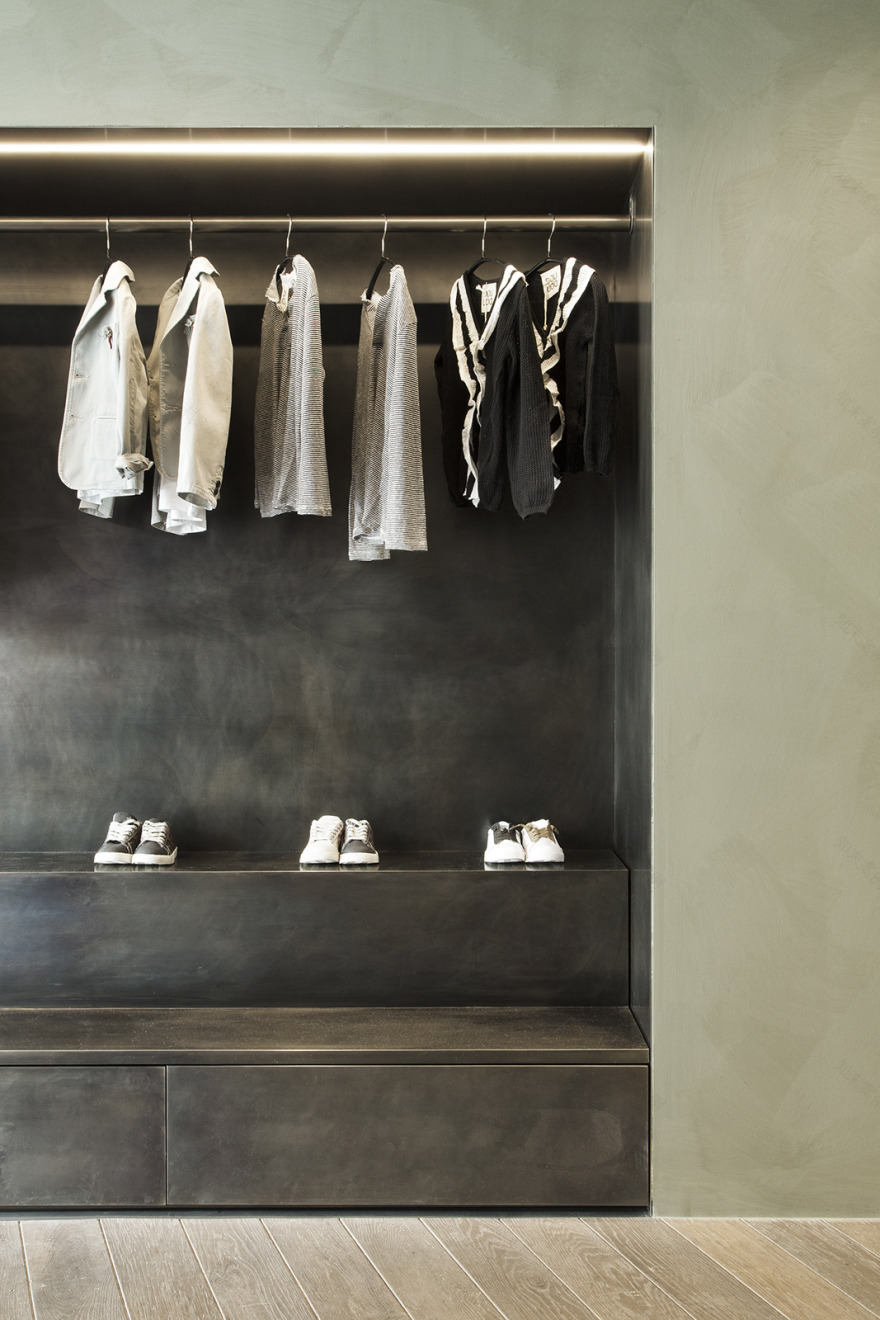
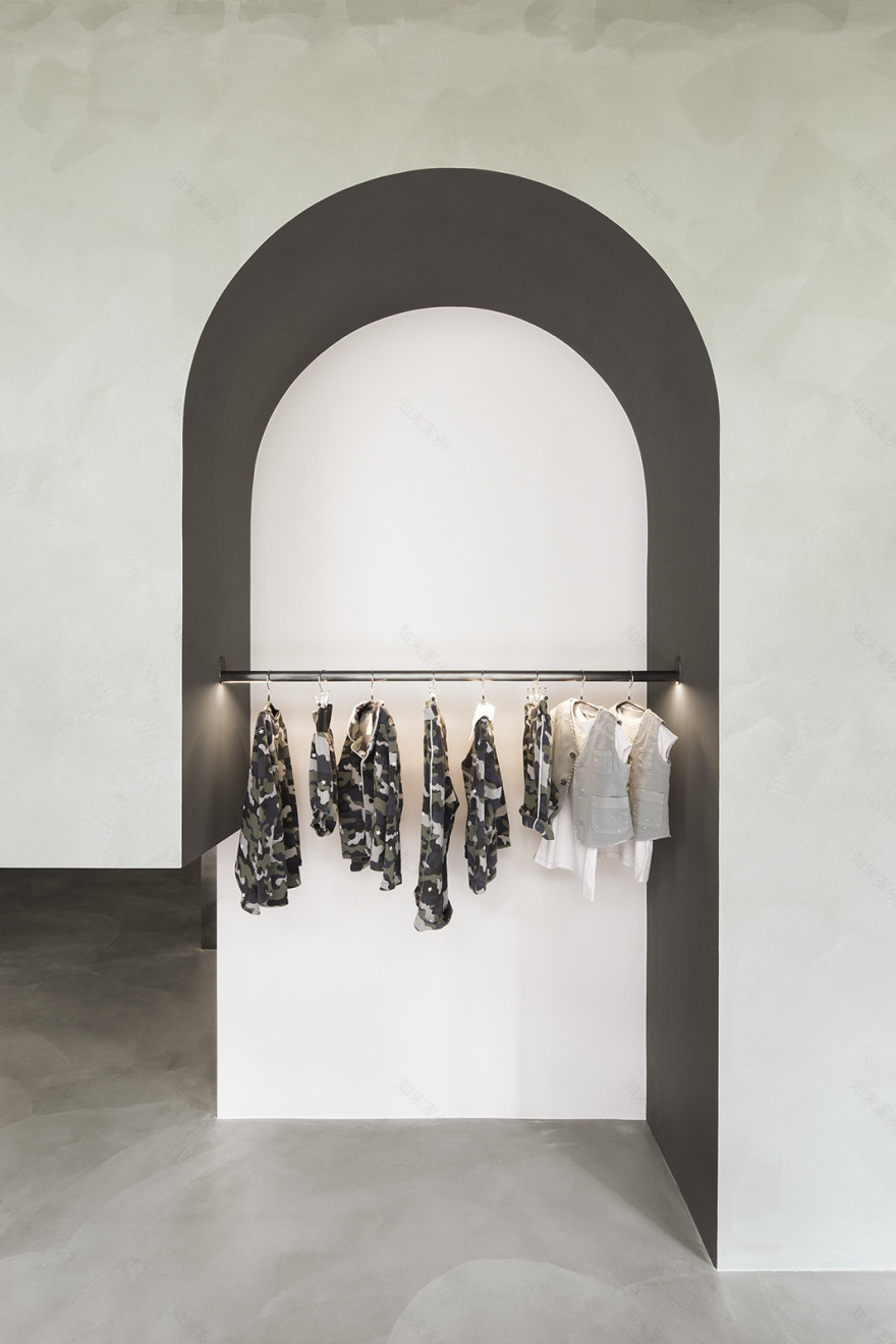
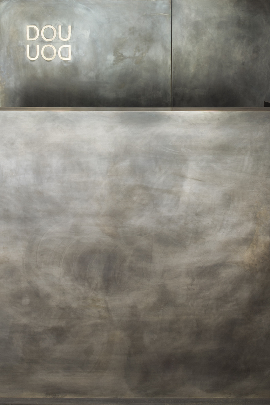
The central pillar has been hidden by a large volume a “children’s house”, a metal carpentry structure covered in plasterboard and finished with a green color, whose pastel tone recalls the world of childhood. The original storefront has been maintained while the storefront of the annexed space has been removed and replaced with an all glass and brightly lit façade. Entering on the right there is a long display shelf, recovered from the original store, at the center are tables for the display of folded clothing, and towards the end is the cash register. The composition is held together by a burnished sheet metal paneling, the material of the original shelving.
The DouDou brand behind the cash register is made of brass. The Cash register is covered in sheet metal towards the customers whereas the operative side is in MDF. Continuing around the “children’s house” we find the hanger for garments for bigger kids, consisting of tubular profiles in burnished iron. A light is recessed in the hanging profile. In front of the hangers, a metal staircase rises inside the “children’s house”. Next to the stair is a dressing room, dug out of the volume of the house itself and hidden by a linen curtain. A second reclaimed shelf runs through the entire left side of the shop. The oak wood floor of the original store has been maintained, while in the new extension the floor is resin with a concrete finish. The walls have been painted a dark brown, along with the lowered ceiling that hides the concrete beams of the existing building structure. The new ceiling generates continuity between the two spaces and emphasizes the presence of the central body, which through the subtraction of volumes is sculptural, generating niches, arches, lower spaces and upper spaces and a space that can be used as a second dressing room or simply as storage. The lighting is technical using recessed spotlights for the general lighting and linear lights to emphasize the hanging clothing. The back of the shop contains a bathroom and a storage space. The new mullions are in burnished steel. The logo is cut into the central column and backlit.
客服
消息
收藏
下载
最近


