查看完整案例


收藏

下载

翻译
Project name: monochrome store Architects: Anton Lysko, Anastasia Zaytseva Project location: Malaya Nikitskaya Ulitsa, 10 Moscow, 121069, Russian Federation Foto: Ivan Erofeev Completion Year: 2020 Area: 76 sqm
The store on Malaya Nikitskaya Street is not the first joint project that we have implemented with the guys from MONOCHROME.
We had already performed both of their workshops for the brand, that’s why we were completely prepared for the fact that sooner or later they would open their first flagship store.
We were not faced with the task of making a salespoint, because these guys were successfully existing online for a long time, and it was not the goal for them to represent the brand. Conceptually, the store has been planned to a greater extent as a gallery/museum, where somebody could meet the creators of the brand (Alesya and Nikolai), could get acquainted with the products for oneself, order a cup of aromatic coffee to go, chat with the sellers and continue to shop online.
The guys chose the space in the center of Moscow in a house that was built in 1910; the windows of this house overlook the stunning temple and square.
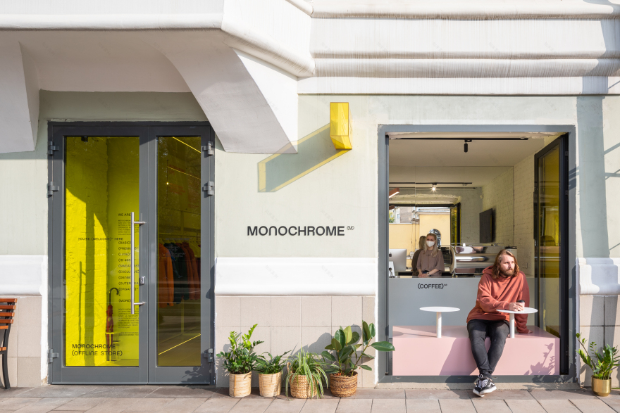
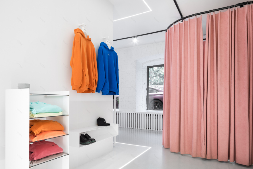
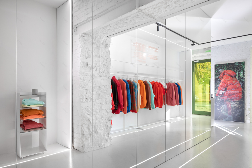
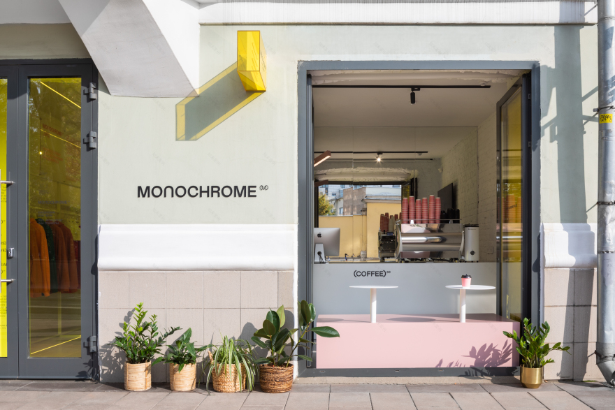
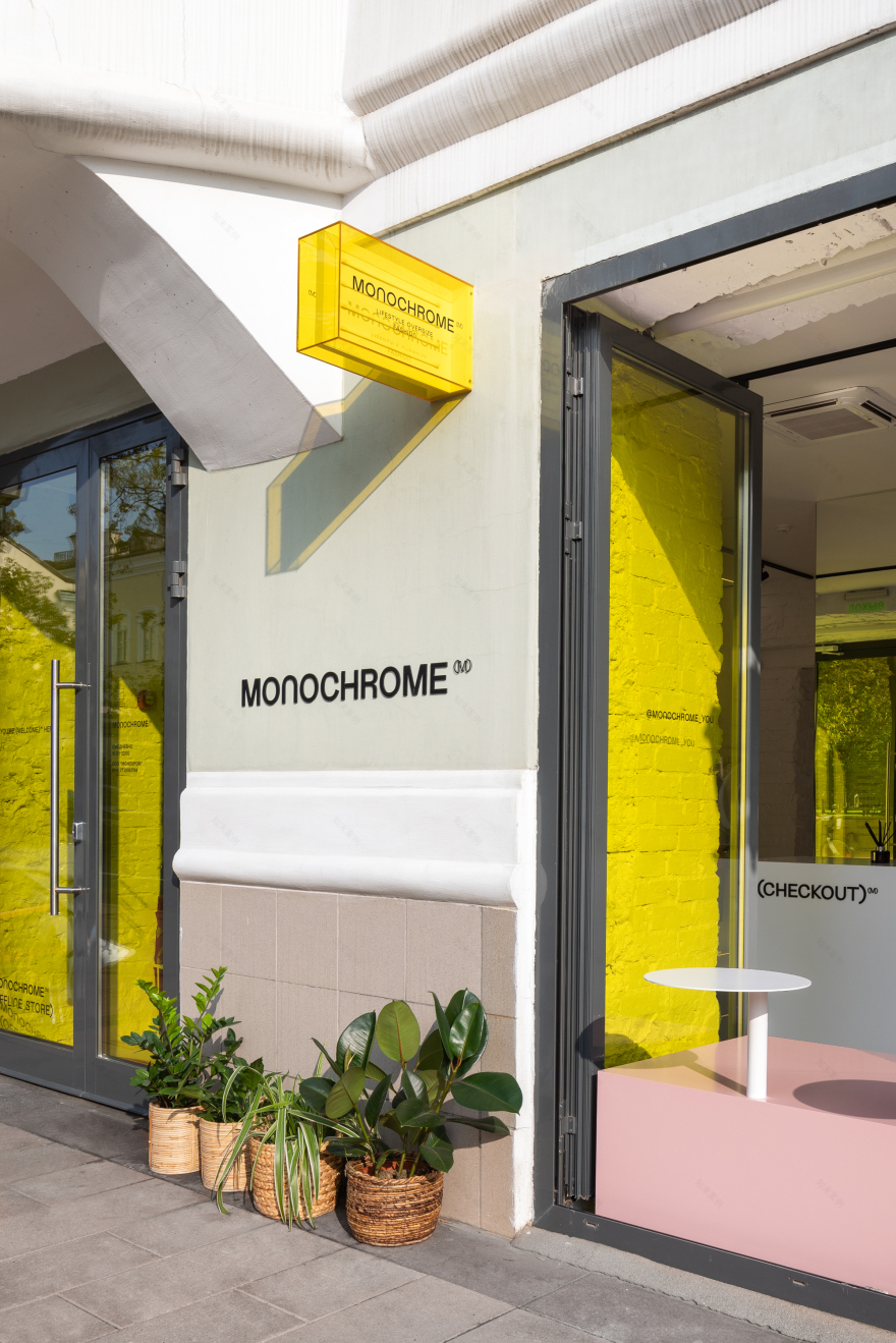
Before us, there was a bar-restaurant in this space, but upon our first viewing, even in the daylight, this space looked rather moody and broken. So we wanted to make it as bright and modern as possible, but at the same time it was important for us that our space would look harmonious from the facade of the building and that it would not blemish the panorama of one of the most beautiful streets of Moscow.
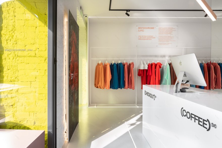
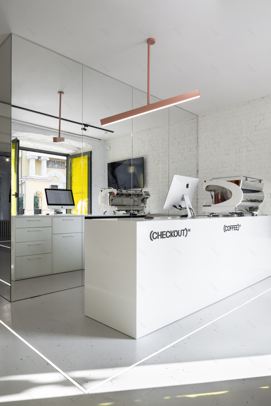
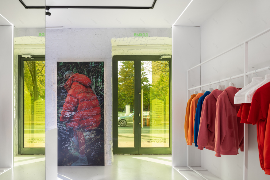
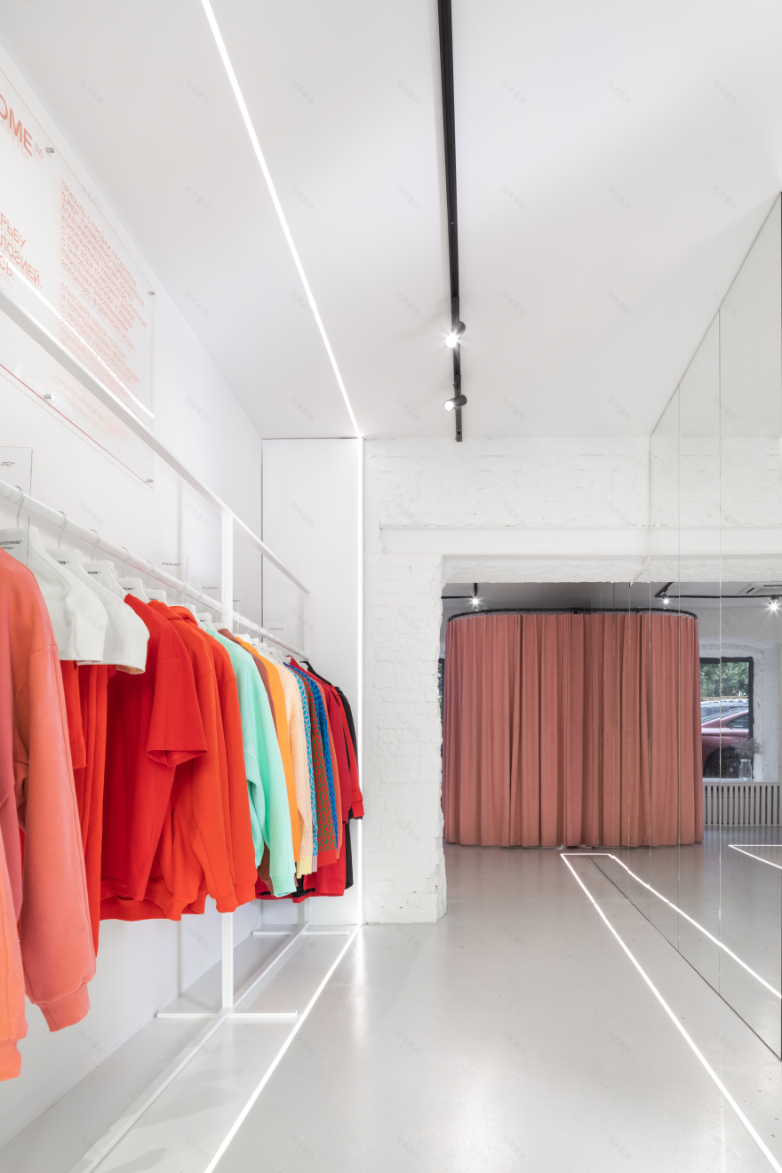
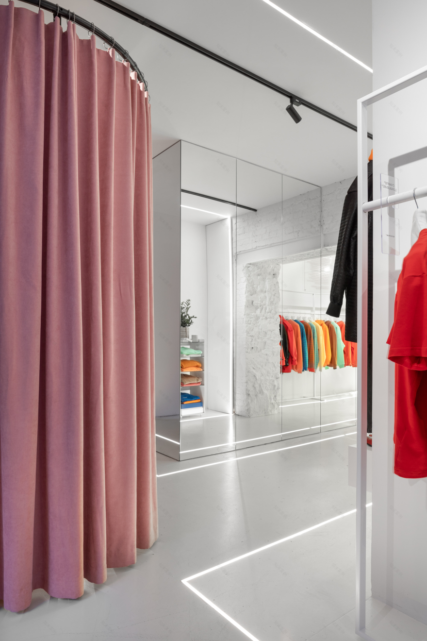
We scarcely changed the layout of the space. Initially, there were two halls, which we have combined with a mirror cube and thus we have solved several problems at once: inside the cube we have placed the utility rooms, and we have visually enlarged (due to the mirrors installed) the space itself and have created one of several Instagrammable spots in our interior.
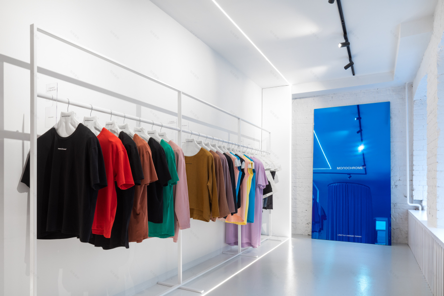
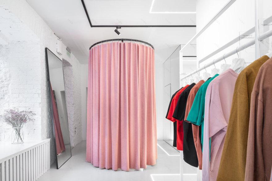
White color has been chosen as the main color so the items (being presented in the store) were in the foreground, but it was also important to take into account the request from the chief designer of the brand Alesya and to use the color in the details. And because we already knew perfectly that her favorite color was pink, so we decided to dress the changing area in the brand's signature tint – PUDRA (Pink powder). In such a way, we have created another Instagrammable spot, and we designed the lighting there as much as possible, we have implemented it in such a way that the shadows and lights contribute to a propitious perception of one’s own reflection in the mirror and so that these shadows and lights would naturally convey the shades of fabrics and the fitting.
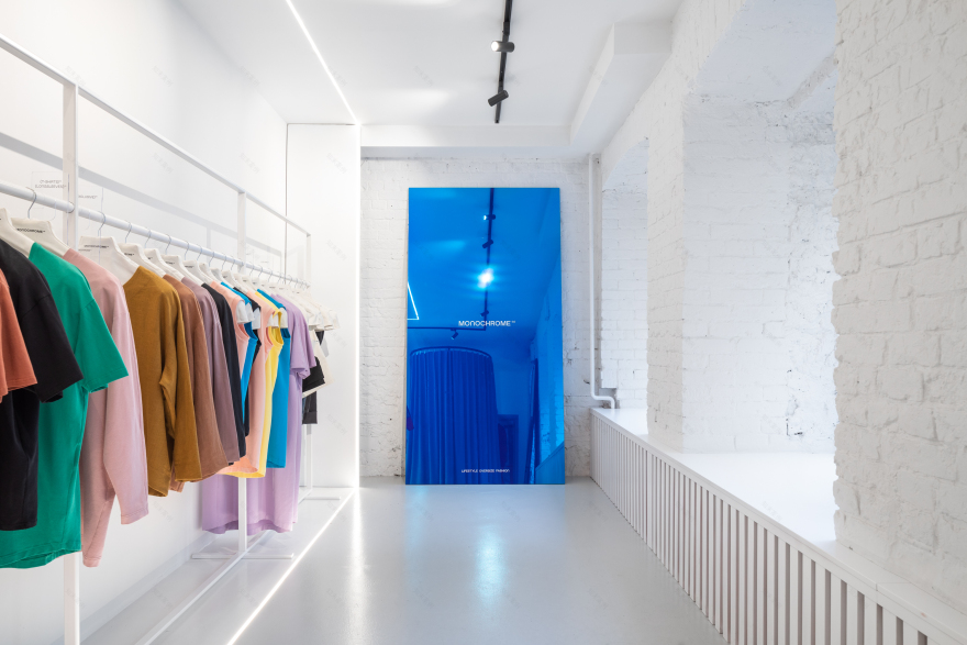
Another place of attraction and photos on Instagram was a huge blue mirror, suggested by guys; this mirror attracts the attention of the guests, and it already became a kind of flash mob in the social media feed.
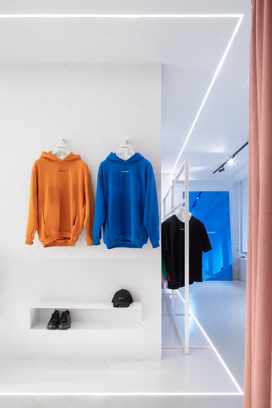
The topic of Instagram interiors (although it is a new topic in the architectural environment) has not yet been overused, and we wanted to explore it in this interior. Almost every corner has been thought out from the photogenicity point of view; it may be a pink console in the coffee shop area, yellow showcases or contour lighting; and considering the fact of the street retail format and the historical value of the architectural object itself, the following parameters also have been taken into account: its aesthetics, functionality and ergonomics.
客服
消息
收藏
下载
最近


