查看完整案例


收藏

下载
建筑师提供的文字说明。北京理工大学附属医院位于北京市朝阳区,是一座高度22m的建筑,总建筑面积为3,800平方米,毗邻东四环南路南侧,位于校园北侧。
Text description provided by the architects. Located in Chaoyang District, Beijing, the hospital affiliated with Beijing University of Technology is a building with a height of 22m and a total construction area of 3,800m2, adjacent to the South Side of East 4th Ring Road, lying at the north entrance of the campus.
Text description provided by the architects. Located in Chaoyang District, Beijing, the hospital affiliated with Beijing University of Technology is a building with a height of 22m and a total construction area of 3,800m2, adjacent to the South Side of East 4th Ring Road, lying at the north entrance of the campus.
ground level plaza. Image Courtesy of United Design U10 Atelier
地面广场。U10型联合设计机的形象造型
这是上世纪90年代的一栋建筑,没有合理的底层规划,导致校园北门一天地陷入混乱,原本花哨的灰泥外墙严重剥落,室外空调和相关电线被不规则的拆卸和安装弄得乱七八糟。此外,医院位于校园和城市街道之间的边界上。需要改善边界地带,为医院工作人员、教师、学生和公众创造一个全新的公共空间,让他们一起享受互动交流。因此,该项目包括两项主要任务:重建外墙和重新设计边界区。
It was a building in the 1990s without reasonable planning for the ground floor, leading the north entrance of the campus into chaos day by day, the original granitic plaster façade heavily exfoliated, outdoor units of air conditioners and related wires cluttered by irregular disassembling and installing again and again. In addition, the hospital sits on the boundary between the campus and the city street. The boundary zone needs to be improved to create a brand new public space for hospital staff, teachers, students, and the public to enjoy interactive communications together. Hence, two main tasks are included in this project: to reconstruct the façade and to redesign the boundary zone.
It was a building in the 1990s without reasonable planning for the ground floor, leading the north entrance of the campus into chaos day by day, the original granitic plaster façade heavily exfoliated, outdoor units of air conditioners and related wires cluttered by irregular disassembling and installing again and again. In addition, the hospital sits on the boundary between the campus and the city street. The boundary zone needs to be improved to create a brand new public space for hospital staff, teachers, students, and the public to enjoy interactive communications together. Hence, two main tasks are included in this project: to reconstruct the façade and to redesign the boundary zone.
Courtesy of United Design U10 Atelier
由U10Atelier统一设计
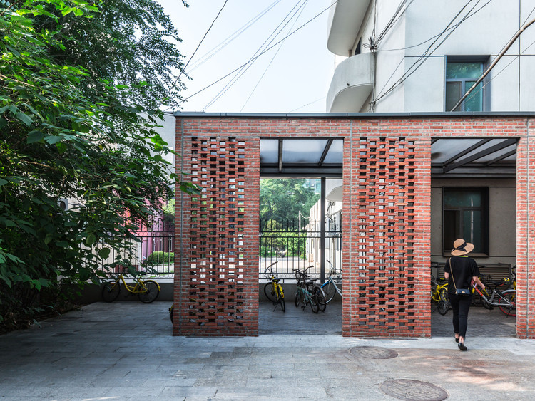
设计理念设计从思考边界改进开始。医院、校园和城市街道边界上的人与人之间的冲突应该通过以下三个层次空间的设计来解决。作为外围建筑的主遮阳棚,建在一个小坡道广场上,面向城市街道,起到了过渡的作用。结合底层空间,将现有自行车停车区设计为中间部分为格子红砖走廊,以缓解自行车停放不整洁的问题。
Design Concept The design begins with thinking about the boundary improving. Conflicts among people on the boundary from the hospital, the campus and the city street should be resolved by the design of following three hierarchical spaces. As the outer part, the main awning of the building built on a mini ramp plaza faces the city street to play a role of transition. Integrated with the ground floor space, the existing parking area for bicycles is designed as the middle part to be a lattice red brick corridor, so as to ease the problem of untidy bicycle parking.
Design Concept The design begins with thinking about the boundary improving. Conflicts among people on the boundary from the hospital, the campus and the city street should be resolved by the design of following three hierarchical spaces. As the outer part, the main awning of the building built on a mini ramp plaza faces the city street to play a role of transition. Integrated with the ground floor space, the existing parking area for bicycles is designed as the middle part to be a lattice red brick corridor, so as to ease the problem of untidy bicycle parking.
bicycle parking. Image © Daqian Yin
自行车停车场。图三大前音
走廊,包括医院的主要入口,也用作室外和室内空间之间的过渡。采用垂直绿化设计、景观美化、设计、景观美化的法方,是建立三层空间的内在组成部分,以提高医院的外观,改善边界地带的环境质量。
The corridor, including the main entrance to the hospital, also acts as a transition between its outdoor and indoor spaces. The façade, dotting designed and landscaped by vertical greening, is built to be the inner part of three hierarchical spaces to enhance the appearance of the hospital, and to improve the environmental quality in the boundary zone.
The corridor, including the main entrance to the hospital, also acts as a transition between its outdoor and indoor spaces. The façade, dotting designed and landscaped by vertical greening, is built to be the inner part of three hierarchical spaces to enhance the appearance of the hospital, and to improve the environmental quality in the boundary zone.
entrance. Image © Daqian Yin
入口图三大前音
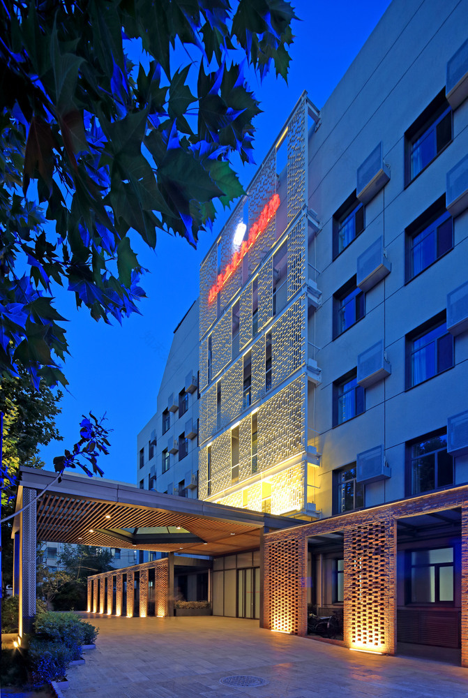
由于使用不同的材料和颜色,这三个层次空间以不同的表达方式进行重构。由外向内的空间渗透是由深灰色交叉穿孔钢板、格子红砖、灰色张力网格、白植钢网格和银灰穿孔铝板进行的。
The three hierarchical spaces are reconstructed with different expressions due to the use of different materials and colors. The space penetration from the outside to the inside is practiced by dark grey cross-punched steel plates, lattice red bricks, gray tension meshes, white planting steel meshes and silver-gray perforated aluminum plates.
The three hierarchical spaces are reconstructed with different expressions due to the use of different materials and colors. The space penetration from the outside to the inside is practiced by dark grey cross-punched steel plates, lattice red bricks, gray tension meshes, white planting steel meshes and silver-gray perforated aluminum plates.
entrance. Image © Guangyuan Zhang
入口。形象:广元张
在三个层次空间的设计之后,对建筑物本身存在的问题进行了进一步的详细设计。首先,通过在旧漆上喷涂类似花岗岩的涂层,而不是直接用水力巨无霸冲刷,以避免原来的剥落,这一点至关重要。在此基础上,介绍了深灰色外窗格栅设计,并与穿孔空调面板相结合,形成了一个点缀状的立面。
The design of three hierarchical spaces is followed by further detailed designs for the problems existing in the building itself. It is vitally important to get the strong polluted existing façade refurbished at first by spraying granite-like coating on the old finish instead of by directly scouring with hydraulic giant to avoid the original keeping exfoliated. On this basis, dark grey outer window grill design is introduced, integrated with perforated air conditioning panels to create a dotting-like façade.
The design of three hierarchical spaces is followed by further detailed designs for the problems existing in the building itself. It is vitally important to get the strong polluted existing façade refurbished at first by spraying granite-like coating on the old finish instead of by directly scouring with hydraulic giant to avoid the original keeping exfoliated. On this basis, dark grey outer window grill design is introduced, integrated with perforated air conditioning panels to create a dotting-like façade.
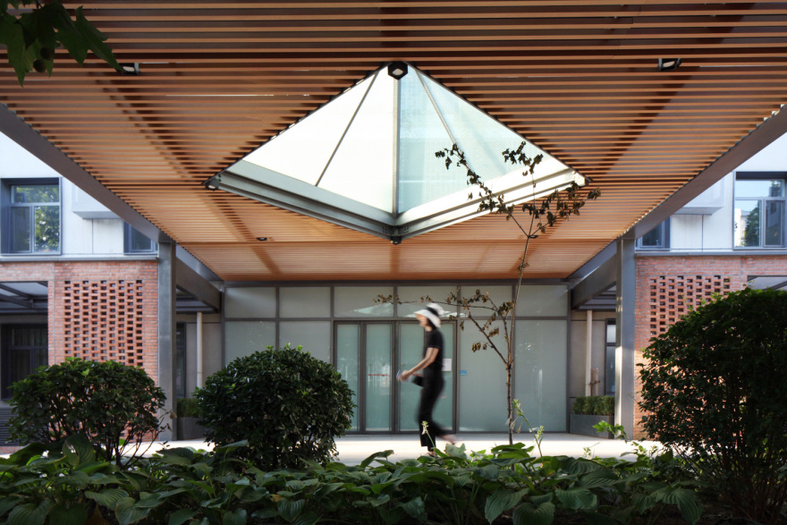
glass pyramid. Image © Guangyuan Zhang
玻璃金字塔。张光远
在新的南方入口处设置遮阳系统,便于大规模的曝晒,并在原有的重混凝土结构的基础上建造了轻钢雨篷和铝格栅。辅助入口通过张紧网半阻塞视线而在西部,同时封闭空间以扩大面向垃圾站的初始相对小的入口空间。
A sunshade system is set at the new southern entrance to ease large-scale insolation, and a light-steel awning and aluminum grilles are built with the original heavy concrete structure removed. An auxiliary entrance is built on the west by the tension mesh half-occluding the line of sight and simultaneously enclosing a space to enlarge the original relatively small entrance space facing the garbage station.
A sunshade system is set at the new southern entrance to ease large-scale insolation, and a light-steel awning and aluminum grilles are built with the original heavy concrete structure removed. An auxiliary entrance is built on the west by the tension mesh half-occluding the line of sight and simultaneously enclosing a space to enlarge the original relatively small entrance space facing the garbage station.
Courtesy of United Design U10 Atelier
由U10Atelier统一设计
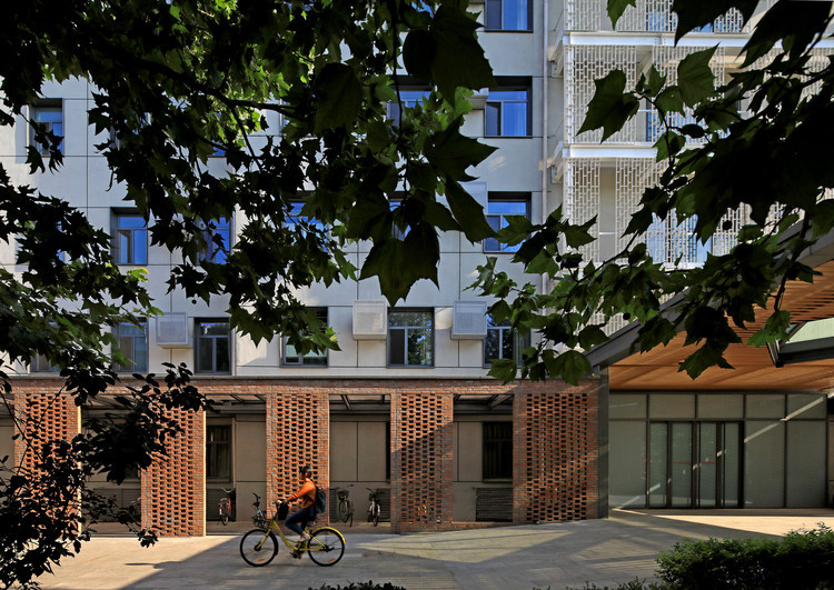
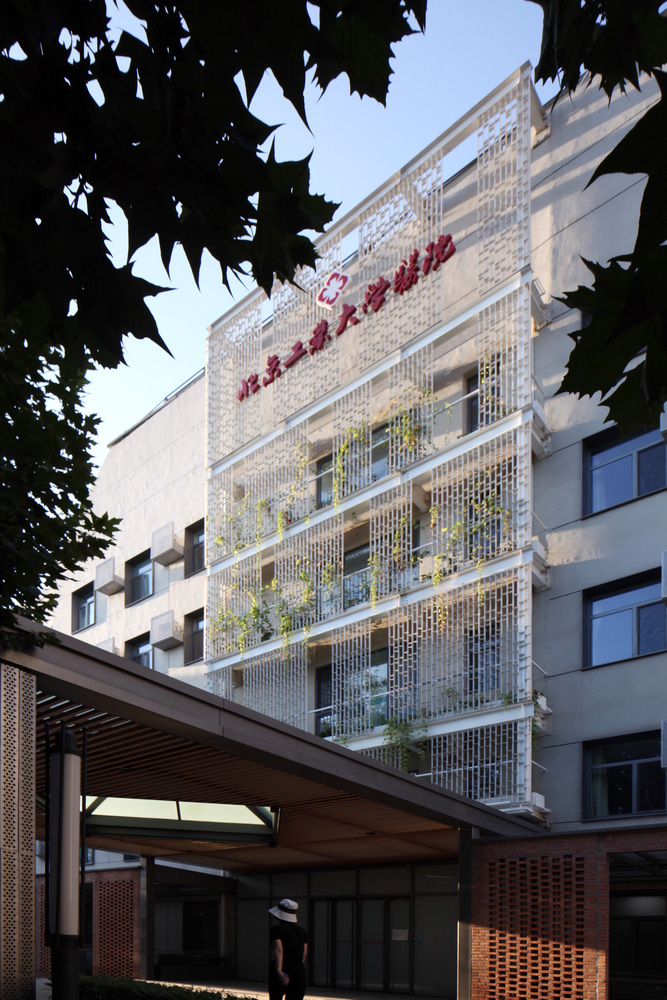
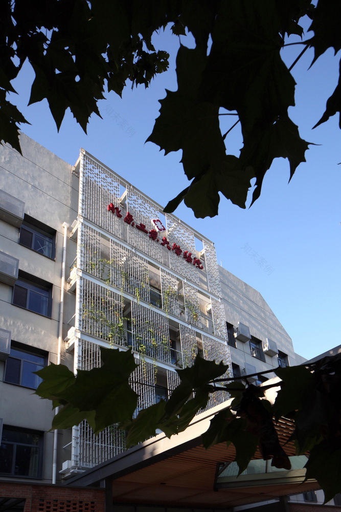
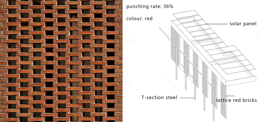
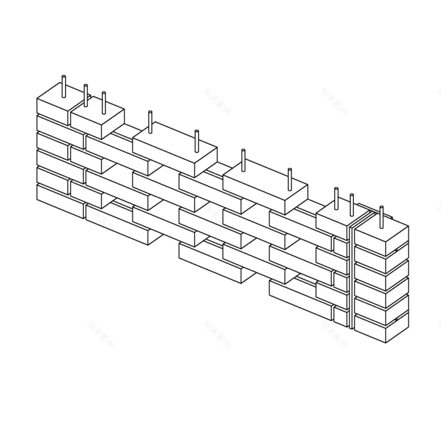
在北面,采用了白钢筛分垂直绿化系统,便于种植、灌溉和维护。格状红砖走廊采用单层砌体结构,砖与钢结构紧密结合,在单层空间中既保证了建筑的美观,又保证了承重因素。
On the northern façade, a white steel screened vertical greening system is introduced, easy to be planted, irrigated and maintained. The lattice red brick corridor is built with single-layer masonry, the bricks closely combined with the steel structure to ensure both architectural beauty and load-bearing factors in a single-layer space.
On the northern façade, a white steel screened vertical greening system is introduced, easy to be planted, irrigated and maintained. The lattice red brick corridor is built with single-layer masonry, the bricks closely combined with the steel structure to ensure both architectural beauty and load-bearing factors in a single-layer space.
lattice red brick corridor. Image © Guangyuan Zhang
格子红砖走廊。形象:广元张
客服
消息
收藏
下载
最近


