查看完整案例


收藏

下载

翻译
Tapí, which began operations with a food truck, migrated to the physical store with the challenge of planning the combination of Brazil’s regionalism (north/northeast) with cosmopolitan aspects of a young and sophisticated brand. The client wanted a low-cost project in Rio de Janeiro’s urban scenarios without leaving aside artifice of the origin of its raw material food – tapioca (a starch extracted from cassava root). The research considered colors and textures - from the way food is prepared for the region's aesthetic traits.
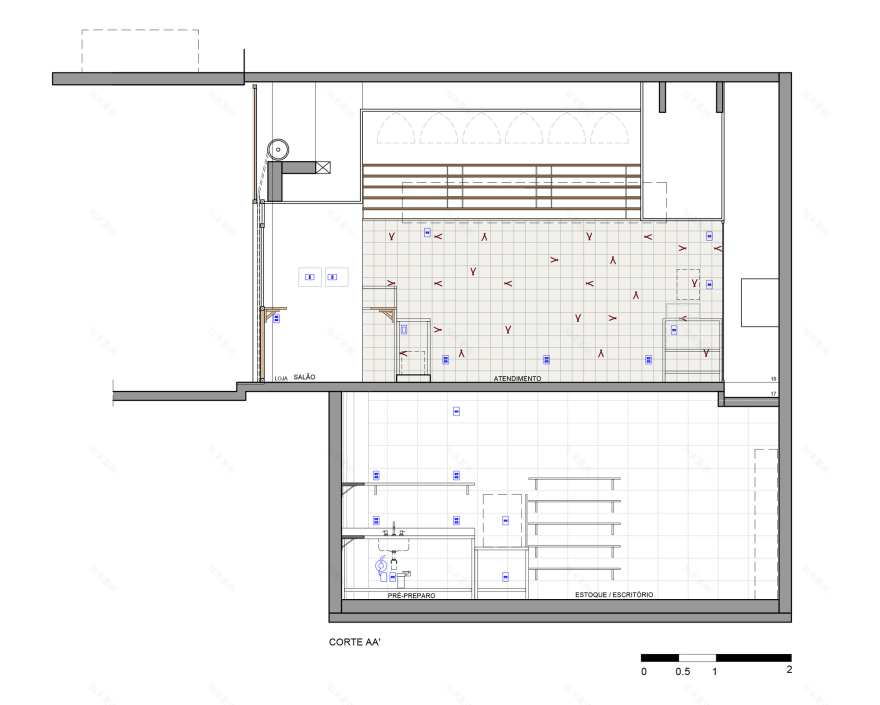
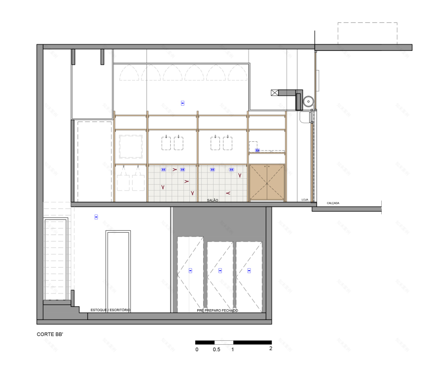
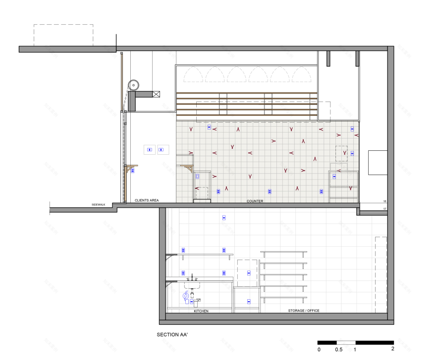
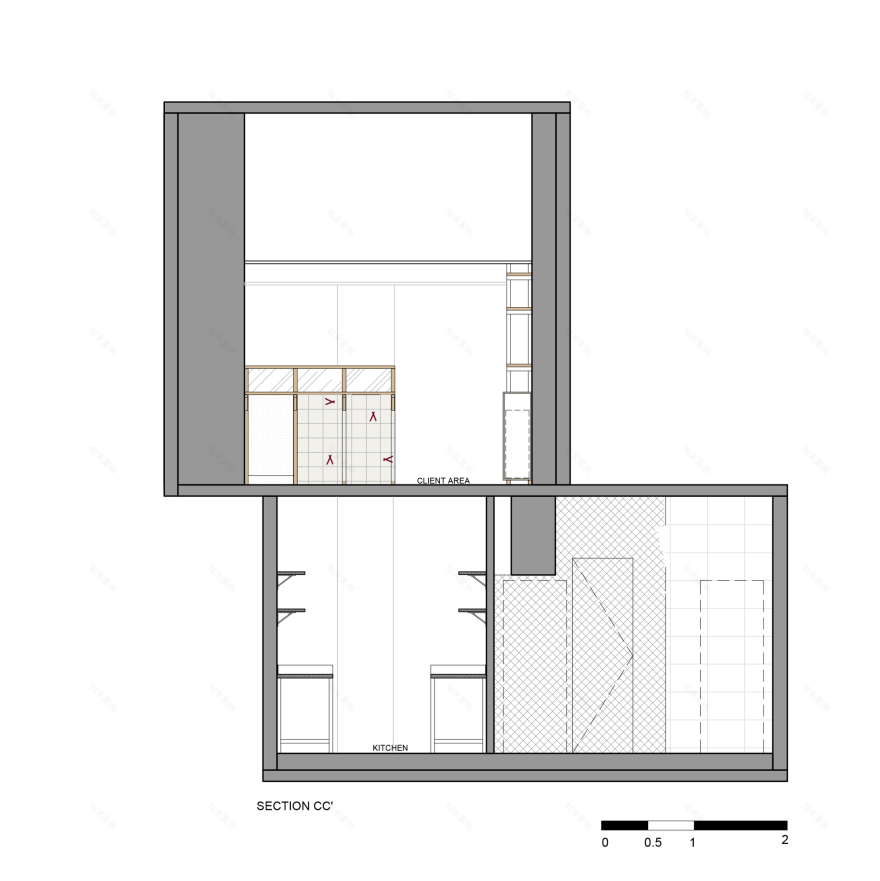
We have defined a clear and neutral basis for the store. Shades of sand, wood, and straw. From this organization, all the elements of the store played a fundamental role in the experience of the visitors. Simple design joinery enhances the "handmade" aspect. Elements of the logo were printed on part of the wall tiles. The baskets lamps were found in North Brazil. The bipartite door, typical of the North / Northeast, along with the composition of the frames of the facade, take the viewer to a trip through Brazil. The counter has a copper detail inspired by indigenous art, and also part of Tapí’s branding.
As in many of our projects, we offer creative solutions that make small new brand's plans viable and that translate the brand’s soul, having in mind the low budget aspect. Given the high rental costs of urban centers, to innovate is to combine low-cost construction with good design solutions. The project is designed to be a franchise network in the future.
In this way, all devices - signpost, shelf, coverings, etc. - can be easily adjusted to new spots. The result is a fusion between the cosmopolitan universe of young entrepreneurs and Brazil’s regionalism. We believe it is possible to innovate, surprise and improve the quality of the commercial establishments of our cities through a serious and creative look, bearing in mind lower financial investments.
▼项目更多图片
客服
消息
收藏
下载
最近


