查看完整案例


收藏

下载

翻译
Retail spaces for fashion are about negotiating existing visual references in the form of a fashion aesthetic that celebrates the brand as well as its customers. In a world of competing pop-up stores and online shopping, the approach to retail is not just about the aesthetic but also exploring issues of sustainability and conscious designs.
Drawing on such elements is Vão, an architecture and urban office based in São Paulo, Brazil that works on different scales, typologies and contexts – who are the brains behind this environmentally innovative retail interior.
ACOLA store in Brazil’s Sao Paulo is a distinctive retail space spanning across two levels at its new address, a former plant townhouse that was once used as a hair salon. The store is a stunning example of thoughtful retail design that’s inviting, delightful and surprising.
The architects in charge, Anna Juni, Enk Te Winkel and Gustavo Delonero were given the challenge of merging the brand’s values of natural techniques and fabrics and giving it a home in its new location in the 120sqm space. The nature of that challenge began with desire to bring light into the store since the original dwelling had only four windows on the main façade.
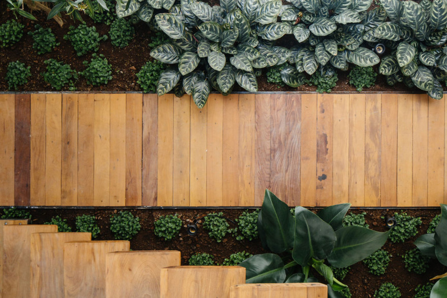
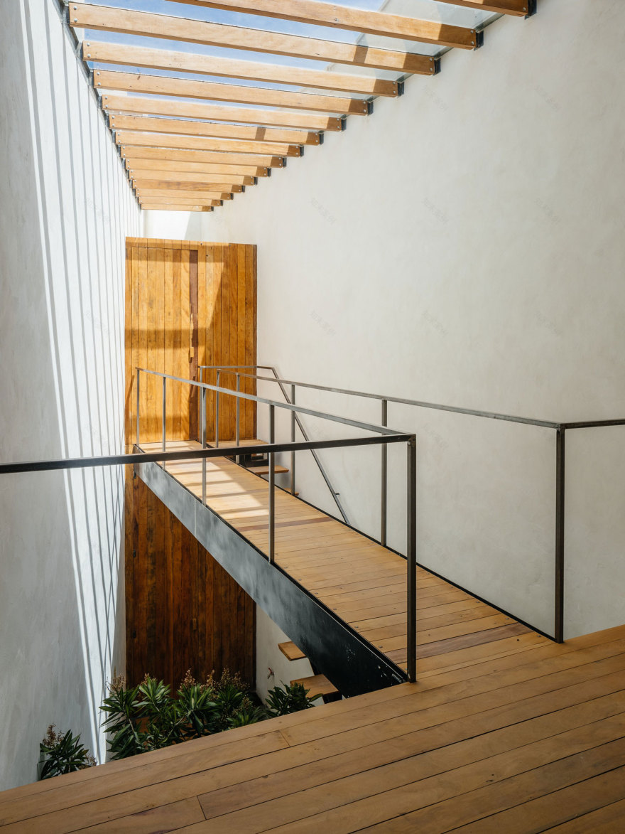
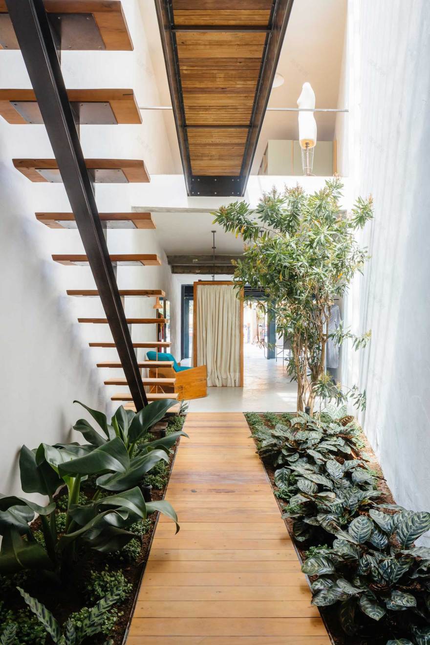
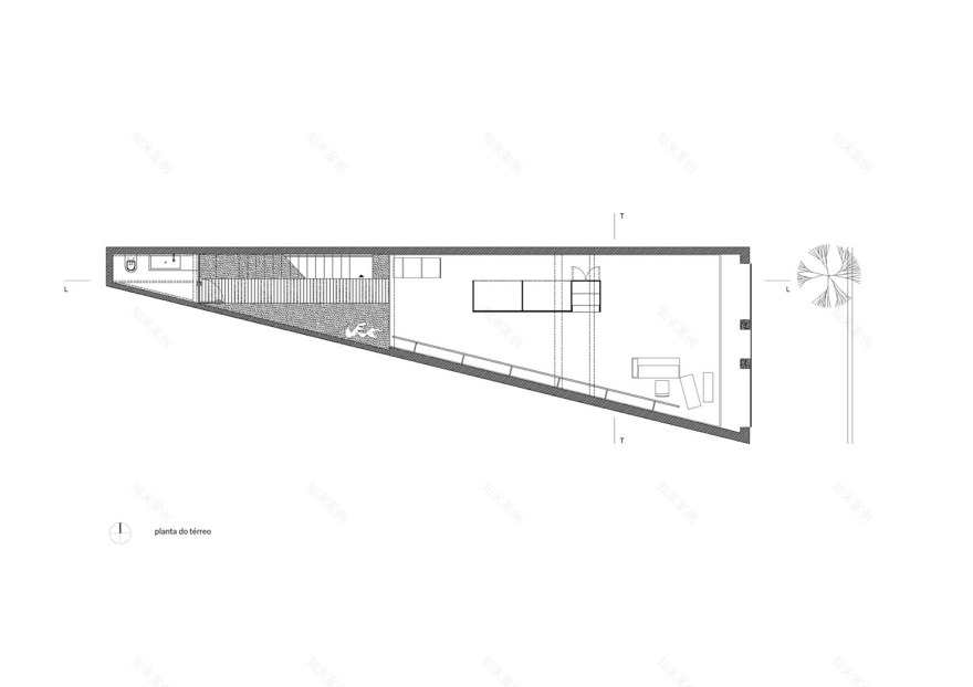
The long triangular building had part of the roof replaced by a glass ceiling to visually integrate two levels led to demolishing the upper slab and creating a garden sanctuary that allows the flow between the ground and mezzanine levels. A carefully crafted timber staircase that appears to be floating in air and the suspended walkway that crosses the void, delivers individuality, warmth and personality in a space dominated by very few materials – timber and metal.
The space is strategically organized in two double height sections: in the first one, the store and the office are closest to the street, while the rear is connected through the internal garden to staff bathroom and pantry on the upper level.
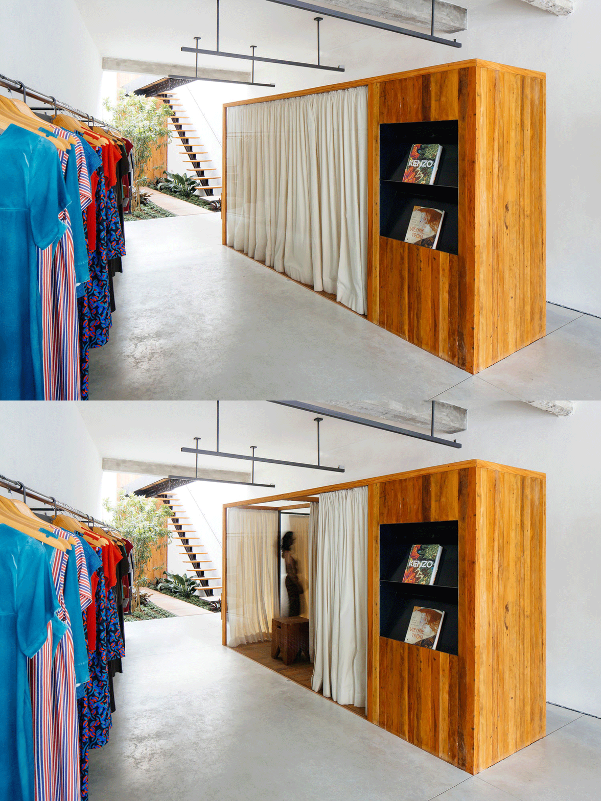
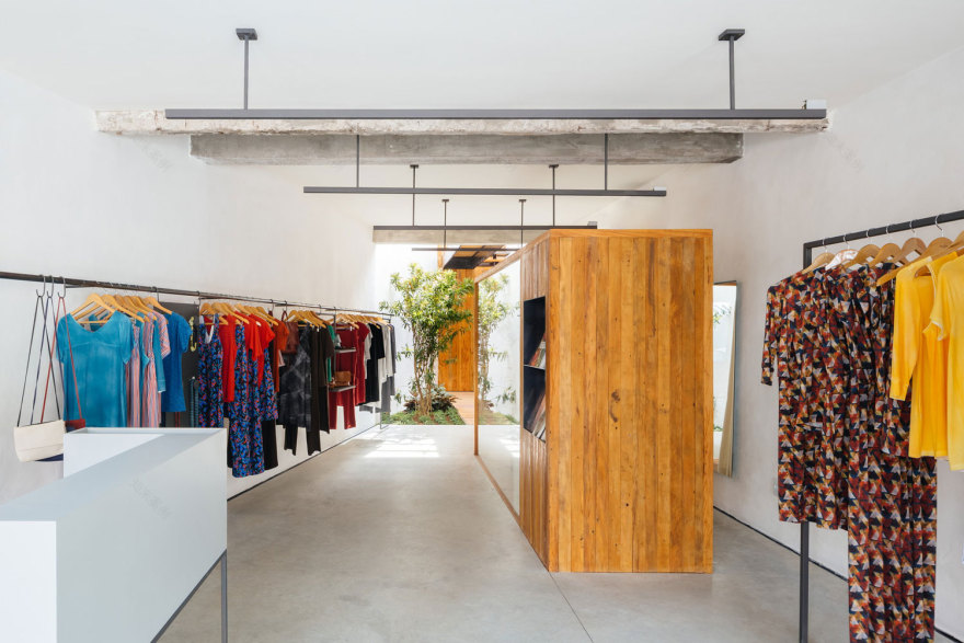
The interior is not about applied decorative finishes; it’s really a blank canvas for the clothes to stand out. This is an aligned way the architects responded to the clothes produced by Acola, which uses natural fabrics with handmade techniques of dyeing and stamping. A selection of handpicked materials, timber, metal and concrete line the interior, giving the space a sleek and clean edge. Timber dominates through the staircase, footbridge and changing room booths all the while contrasting and complementing the minimal white walls. The woodworking used the demolished ‘peroba rosa’ wood and parts of the metal work found in the stairway and clothing rails, were made in the country side using local machinery and labour.
The simplicity in concrete polished floors and bare walls create the sense of the infinite expansion of the space, offset with warm timber tones and suspended black lighting fixtures, ending on the ceiling just before the integrated green sanctuary. The exterior façade is raw and exposed brickwork for its simple, elemental beauty and the metal window framing neatly boxed in, offering views as far as the entire length of the building.
The overall feel is like a minimalist urban gallery as much as a retail space, where clothes are art and are in turn, given their due space.
[Images courtesy of Vão Arquitetura. Photography by Pedro Kok.]
客服
消息
收藏
下载
最近


