查看完整案例


收藏

下载

翻译
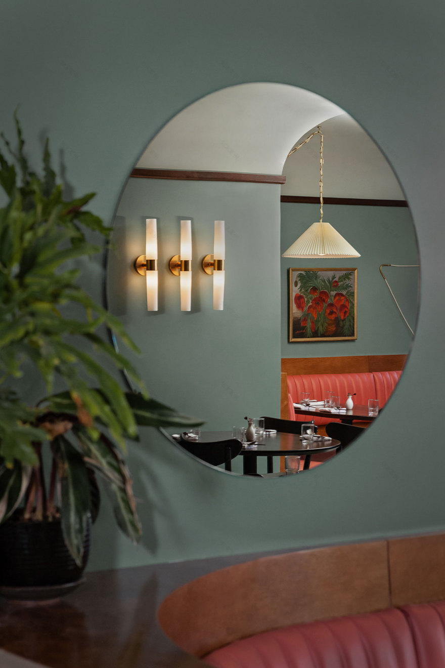
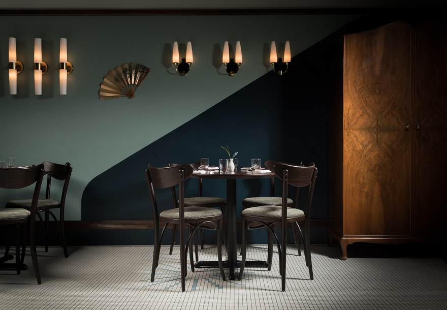
Designed by Ste. Marie and tucked into the upper story of a delightfully faded building in Vancouver‘s Chinatown, Kissa Tanto invites you into the little jewel that is the ‘House of Plenty’. First we will eat! Such supreme satisfaction we take from the delicate flavours of Japan and the warmth of ltalian cooking and feel it’s right to bring these culinary forces together to do a little dance. Why not? Soul mates are they not with their mutual love of noodles, rice, and proteins in their pure, delicious uncooked form? Think of the cool elegant crudo and cruda, crisp exotic salads, playful pastas, and rich, tender meats that we shall sink our teeth into. And whilst doing so, we will drink! We will wipe the frost off of the Singapore Sling, inhale the burgundy scent of Barolo, sip tiny glasses of fine sake, and down chilly glasses of beer.
And we will laugh, tell stories, escape to soulful places that only great music can take us, and hold hands in dark corners. So please fix your hair and wipe the mud from your boots and please come in.
“Our client had a very specific inspiration for her Japanese-Italian restaurant in Chinatown: the vanishing 1960s jazz café, or jazu kissa of Japan. A distinct sub-culture, people would go to these jazz cafes to just sip whiskey and listen to jazz records play all night. Our goal was to elicit that sense of escape, revel in its moodiness, and transport people to a different place and time,” explains Ste. Marie‘s design team.
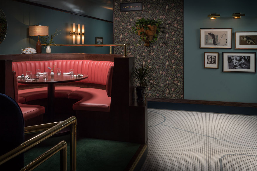
Taking advantage of Kissa Tanto’s second-storey location, Ste. Marie used the faded Chinatown entrance to foster a feeling of departure and discovery; where people would walk up the stairs and stumble upon this dark, eccentric space that looked like it had been left to develop behind the scenes all this time. “Doming the low ceiling and bringing the lights down helped us create a fairly dark and moody atmosphere in a space where the bar dominates—something central to its ethos was that it be equally bar and restaurant,” share the designers.
Pink vinyl banquettes, tilework based off Haruki Murakami book covers, typographic art taken from a Kenji Miyazawa poem, and touches of Italian modernist Gio Ponti all coalesce here in a social hangout that’s romantic, interesting—perhaps even a bit strange — but wholly singular; a direct counterpoint to the fast-casual, light and airy restaurants that currently dominate the local area.
Read on for a little Q+A with Jessica MacDonald, Project Lead and Conrad Brown, Floor + Lighting Industrial Designer, about further insight into this project.
+ What was your design inspiration for this project – i.e was it a result of client’s brief, a particular concept or an idea etc?
+ What are some design details you’ve used – materials, colour palette, etc.?
+ Your favourite thing about this project?
+ Tell is a little bit about the design of the floor patterns and it’s meaning?
+ You payed careful attention to the lighting. Tells us about your approach.
+ What was the most challenging aspect, and how did you overcome it?
[Images courtesy of Ste. Marie. Photography by Knauf & Brown.]
客服
消息
收藏
下载
最近


