查看完整案例


收藏

下载
千两源于日本关东栎木县,以时令食材和传统精湛职人手艺为特色。但同价位日料同质化竞争日趋严重,年轻消费者也渴望更具品质更现代的体验。如何凸显品牌特色吸引Z时代消费者是我们面对的问题。
Sen-ryo originated from Okiki Prefecture, Kanto, Japan, featuring seasonal ingredients and traditional craftsmanship. However, the homogenization of Japanese cuisine at the same price is becoming more and more serious, and young consumers are also eager for a more high-quality and modern experience. How to highlight the brand characteristics to attract consumers of Gen-Z is the problem we are facing.
项目所在地为国内高端地产的标杆式项目-前滩太古里,是上海稀缺的街区购物中心特色的奢侈品集中地。该区域的办公和购物人群居多,主要客流为25-40岁的白领。就餐属性主要为中午工作餐,商务会客以及购物打卡消费。他们对潮流和品质尤为挑剔,希望寻找满足自身消费属性的餐饮,也期待品牌能带给他们创新和惊喜。
The location of the project is the benchmark project of domestic high-end real estate - Taikoo Li Qiantan, which is a luxury center with the features of a scarce street shopping center in Shanghai. There are many office and shopping crowds in this area, and the main passenger flow is white-collar workers aged 25-40. Dining attributes are mainly working lunch, business meetings and shopping consumption. They are particularly picky about trends and quality, hoping to find catering that meets their consumption attributes, and expect brands to bring them innovation and surprises.
为了满足消费人群不同时段的就餐需求,门店的就餐时间除了传统的正餐时段之外还增加了下午茶和晚市酒吧时段,对于消费者来说就是一场从清晨到日暮不间断的“流动盛宴”。同时,为了给消费者带来更轻盈的视觉和味觉感受,收获更年轻更轻松自在的就餐体验,新升级的门店大胆与西式料理融合。据此,
我们提出了 [
] 和 [
] 的概念
In order to meet the dining needs of consumers at different times, besides the traditional dinner time, the restaurant also adds afternoon tea and evening bar time, which is an uninterrupted "flowing feast from morning to sunset". At the same time, in order to bring consumers a lighter visual and taste experience and gain a more relaxed dining experience, the newly upgraded stores are boldly integrated with Western cuisine. Accordingly, we propose the concepts of "Light" and "Cai".
[轻] 也就是年轻化和轻松感。为了减轻日料店自带的严肃和厚重,让年轻消费者在店内更轻松自在。除了菜品与西式料理融合之外,在空间上我们以大面积的纺纱膜来增添空间的通透感,同时在空间上去除了传统日式格栅材料,更多以线条来处理空间,让整体空间的结构形式更为丰富也更具亲和力。
"Light" means relaxation and rejuvenation. In order to reduce the seriousness and heaviness of Japanese cuisine, let young consumers feel more comfortable in the store. We use a large area of spinning film to increase the transparency of the space, and get rid of the traditional Japanese grille material, and more lines to deal with the space, so that the overall structure of the space is full of change and more friendly.
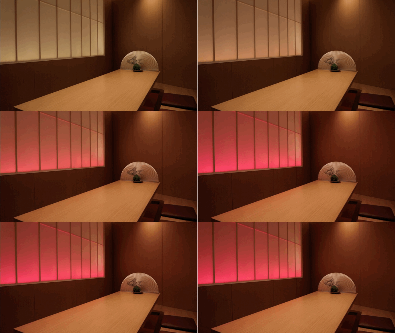
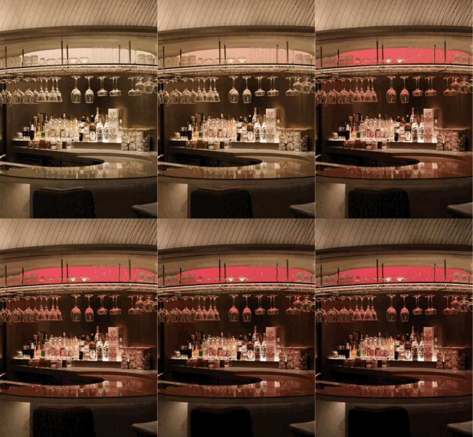
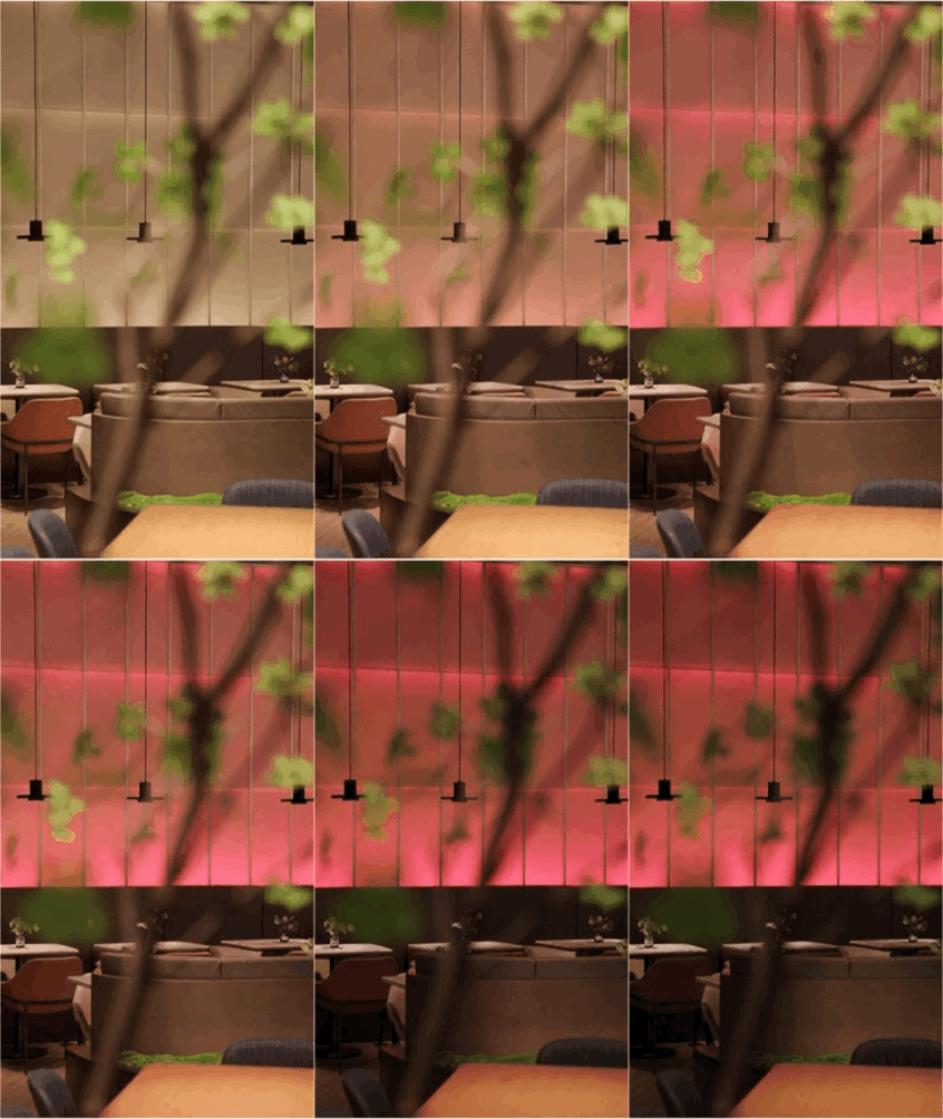
[彩] 意味着丰富和变化。千两创新性的多时段运营带来了更为丰富的菜品,也就要求更为丰富的就餐场景和感官变化。我们以品牌色为基石,店铺在不同时间段内做了调光处理,呈现光色的变化来强调时间这一变量以呼应品牌在运营时段的突破。
"Cai" means richness and variety. Sen-ryo’s innovative multi-period operation has brought more dishes, which requires more abundant dining scenes. Taking the brand color as the cornerstone, the store is dimmed in different periods of time, presenting the change of light color to emphasize breakthrough of operation time.
店铺整体空间结构形态围绕着建筑本身的形态展开,通过外立面结构,外摆花槽的各种曲面的呼应让空间变得更加自由生动。
The overall spatial structure of the store is developed around the shape of the building itself. Through a variety of curved surfaces to echo the facade structure to make the space more vivid.
Taikoo Li is a garden-style open shopping mall, with strong sunlight during the day, and the reflection of the glass curtain wall makes the indoor information completely hidden from consumers. At the same time, the main color of the mall is dark coffee, and the store is located on the third floor of the mall. In order to gain the attention of consumers on different floors, we added light-emitting columns to enhance the vision indoors, and added brand colors at the top of the façade and the floor light at the bottom to make the whole brighter and softer.
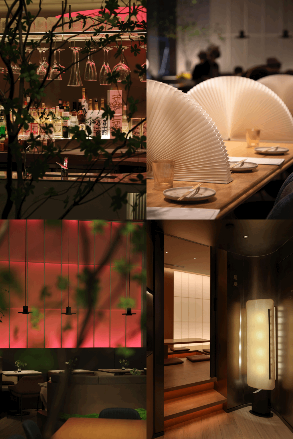
除了室外灯带之外,酒吧和包间墙壁颜色都会随着夜晚降临而逐渐变化,日间白色灯光随着夜色渐浓逐渐变为绛红,呼应时段变化,增添夜晚休闲氛围并巧妙延长消费时间。
In addition to the outdoor light strips, the color of the walls of the bar and private rooms will gradually change as the night falls. During the day, the white lights gradually turn into crimson as the night becomes darker, echoing the change of time periods, adding a leisure atmosphere at night and subtly extending the consumption time.
门口高低错落的绿植来自于日本枯山水理念,与日式和伞呼应品牌溯源地暗示菜品属性。
The scattered green plants at the entrance come from the concept of Japanese rock garden, and the Japanese style umbrella echoes origin of the brand.
厨房顶面被特意压低以强化消费者的视线聚焦,让消费者关注到半开放厨房内餐品的制作过程,在疫情时代更具安全感。厨房顶部以钢丝拉制呈现出纱织的轻盈感,同时呼应传统日料窗格交错的形态,强化千两更富创新和当代的品牌基因。
The top of the kitchen is deliberately lowered to strengthen the focus of consumers' attention, so that consumers can pay attention to the production process of the food in the semi-open kitchen, making them feel more secure in the epidemic era. The top of the kitchen is drawn with steel wire to present the lightsome feeling of yarn weaving, and at the same time echoes the interlaced shape of traditional Japanese panes, strengthening Sen-ryo more innovative and contemporary brand genes.
桌上的和风折扇极具日式风情,同时在午市时段又可以作为隔断保护拼桌客人的隐私。
The Japanese-style folding fan on the table is very Japanese style, and can be used as a partition to protect the privacy of table guests during the lunch time.
包厢位于区域内侧,为了引起客人的注意,醒目而形态现代的灯光放置在必经路上,让客人意识到包厢的可入内性。
The box is located on the inner side of the area. In order to attract guests, striking and modern lights are placed on the path to make the guests aware of the accessibility of the box.
包厢采用纺纱膜仿日式和纸,并以暖光做背景透光处理,让空间显得更透气和简洁。
The box is made of spinning film to imitate Japanese paper, and the background is treated with warm light to make the space more breathable and concise.
在家具的选择上,为了减轻厚重正餐感,让餐厅商务感和休闲感兼具。椅子也选取强烈线条感,让人感觉更加轻盈。家具的围合感也较强,在营造私密氛围的同时让消费者愿意留下久坐。同时,整体空间选用了较为低调的灰粉色/灰蓝色/深紫色去丰富原本比较简洁的空间。
In the choice of furniture, in order to reduce the heavy dining feeling, to make the restaurant has both a sense of business and leisure. The chairs are with strong line sense, which makes people feel more lightsome. The surrounding feeling of furniture is also strong, creating a private atmosphere while making consumers willing to stay for a long time. At the same time, the overall space uses gray pink/gray blue/dark purple to enrich the space.
通过对日式传统灯具以及绿化的研究,我们选择了符合空间的现代形态,只抽象的提取日式元素。灯具虽来源自于日式灯笼意向,但形态简化,打造柔和温馨的就餐环境,让空间更为现代。
Through the study of traditional Japanese lamps and greenery, we chose a modern form that conforms to the space, and only abstractly extracted Japanese elements. Although the lamps are derived from the intention of Japanese lanterns, the shape is simplified, creating a soft and warm dining environment and making the space more modern.
项目名称 | 千两 上海前滩太古里店
项目地点 | 上海前滩太古里木区
设计范围 | 空间设计
项目面积 | 226㎡
创意总监 | 李睿
室内设计 | 张洪荣,顾晓娟,顾银辉
摄影师 | 顾银辉
项目管理 | 顾晓娟
完成时间 | 2021年9月
客服
消息
收藏
下载
最近


