查看完整案例


收藏

下载
2020 年开始 90 年出生的一代人过半进入工作岗位
在设计的事业中他们开始发光发热,寻找自己
今年 CUN 全面推出
CUN90
这是属于 90 代的设计师参与的作品
将把更多的设计机会交给 90 代
每个时代都有自己的使命,我们的不同才是魅力所在
美是理念的感性显现,由内而外的交融,内外兼并形成了美的本质。关于美的定义,每个人都有彼此独树一帜的偏爱,也从未停歇去找寻。而有人,选择从诠释自身独特的美开始,驻足于美学的灯塔,去分享,去绽放。
As the perceptual appearance of the idea, the nature of aesthetics owns the feature of blend and harmony between inner and outer. On the definition of beauty, different people have their unique preference, and their pursuits for the beauty is always on the road. However, some people regard the explaining their particular charming temperament as a start, sharing and shining in the aesthetic style.
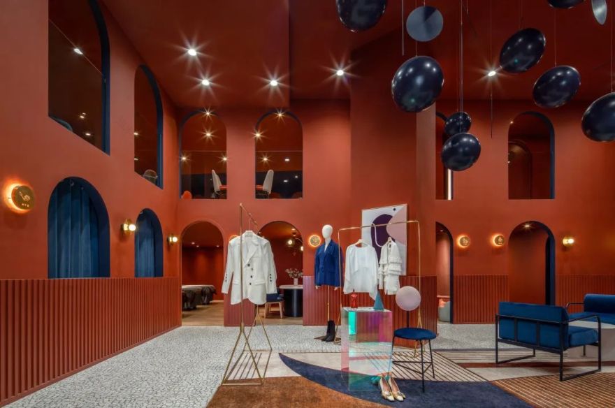
Percent——美学集合店,一间孕育美妙与生机的栖息地。甲方找到我们的时候,希望创造一个可以完美结合美甲美睫、聚会分享、概念摄影以及设计女装为一体的综合空间。
Percent, an aesthetic collection mode, pregnant with pretty and vitality. This aesthetic habitat meets the first party’s need, aiming to build a perfect comprehensive space for manicure, eyelash beautifying, themed parties, conceptual photography and womenswear design.
这个空间必须不仅仅是关于美的展示和传递,而是可以帮助女性舒适自由地呈现自信、呈现美的空间。
Such area is not only for simply expressing and sharing beauty, but for offering a comfortable space to ladies appearing their confidence and elegance.
美无边界,我们既想把关于美的发掘,展示,和分享做到极致,又希望将女性的那种自然呈现自信和美的状态融入其中,再结合甲方的功能性为主导,由此的三条线成为设计师在构思和创作中的主导思想,设计师就是希望让每个女孩都可以去挖掘美,呈现美,不只是对这个空间中美的挖掘,更是对自身美的自我发现。
There is no boundary in aesthetic. Dominated by the functionality required by the first party, we do our best to explore, show and share the beauty, and also try to integrate into female confidence and elegance. Based on these three methods as the main designing philosophy, our designer do hope that every girl could excavate and present the beauty, which advocates to pursue a true beauty both in this area and in herself.
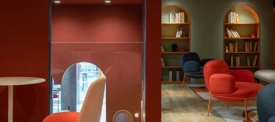
于是在空间质感的塑造上,Percent 以红色为基调,更能彰显女孩的审美和自信,红色代表热烈、激情、感性,是女性的代表色系之一。
我们在这个空间使用的红色,不过于明艳、不轻浮浅淡,而是反复调试之后最可以代表女性,尤其是成熟女性的朱红,在此基调上加入局部深浅的变化,展现女性丰富多样的魅力变化。
In the aspect of moulding space’s texture, percent is in red for fundamental key, highlighting the aesthetics and confidence of young ladies. As the representative color of women, red shows for fervency, passion and sensibility. The kind of red we used, is not excessively dazzling and frivolously pastel. Through many attempts, we decide on vermilion which is the best representative for female especially mature female. According to this keynote, we do some adjustments in part depth, appearing the various elegance of women.
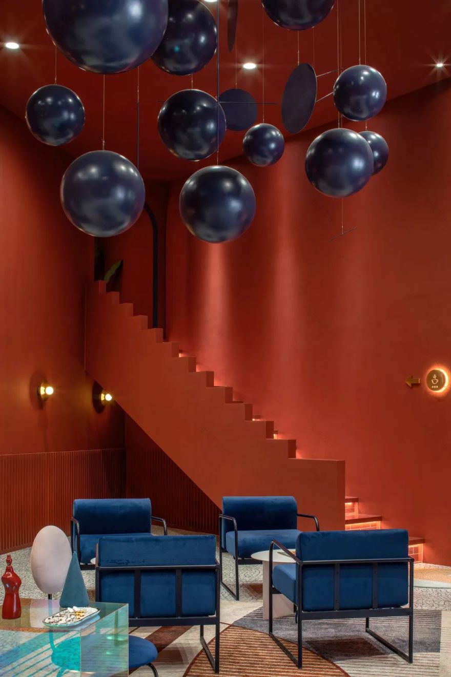
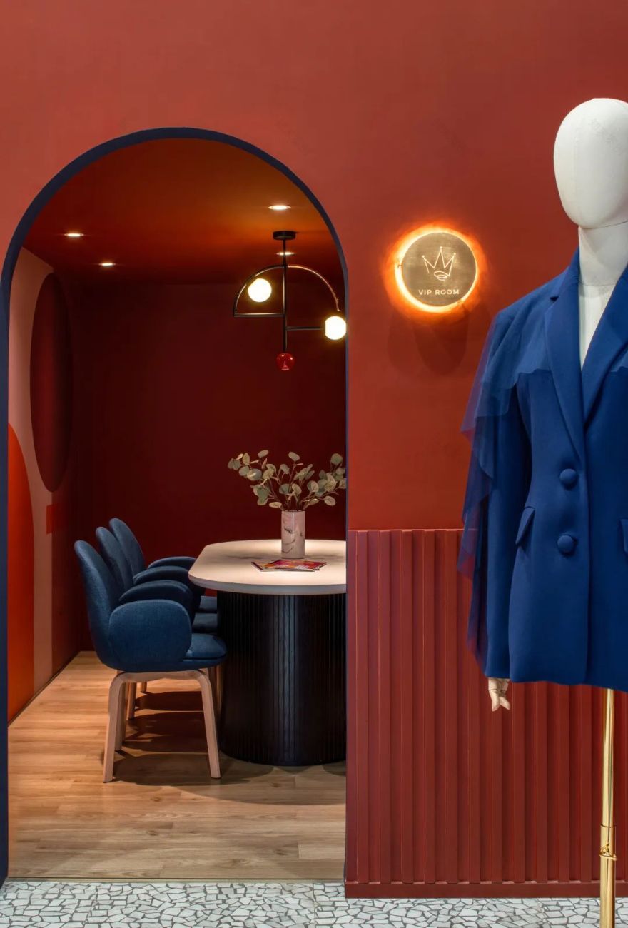
在空间发掘的趣味性上,Percent 被设计师赋予了很多精美巧妙的巧思细节:深蓝色的气球装置、门上的指示灯牌、楼梯的形状,软装的成列,还有亲子活动的空间,让女孩在其中发掘童趣、精致、生活品质,为他们离开这个空间的生活中带出一点一滴的灵感,自然而然的为他们带来自信,在空间赋予人潜移默化的影响和感知这一功能性上,做到设计师力所能及的传达。
In the aspect of excavating space’s entertainment, percent is endowed with many subtle and clever details, such as, the blue-black balloon equipment, the indicator light on the door, the shape of stairway, the line of soft-decoration and the area for parents-child campaign, from which young girls can explore the childlike happiness, delicacy and life quality. They also can absorb a few inspirations for lifestyle when they out of the space and enjoy the confidence spontaneously. In the functionality of unconsciously affecting and perceiving, achieving the designer’s controlling communication.
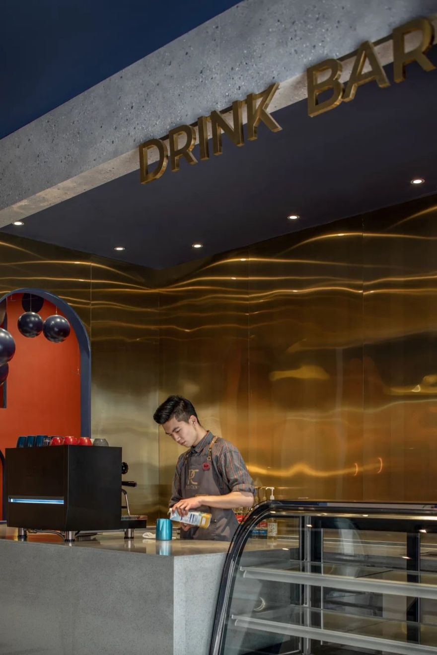
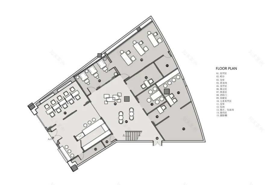
功能性上,percent 是一个复合空间、集合了美甲美睫、美容护肤、聚会空间、概念美学摄影、设计师女装、满足了女生的一切需求。
平淡的生活里也需要一点新鲜感,设计师以局部几何图形为主,莫兰迪色块的大胆撞色,利用空间的色彩感来彰显女生的本色,提升他们的体验感。
红与蓝,二楼客休区莫兰迪色块的撞色彩虹通道,让每个女孩进来都感觉心情是彩色的。
Functionally, as a comprehensive space, percent gathers manicure, eyelash beautifying, skin beauty, themed parties, conceptual photography and womenswear design, which provides all exquisite needs for ladies.
For adding to some freshness into the dull life, our designer adopts the philosophy of prominent local geometry and hyperbolic Morandi’s color chunks.
Color sense of space contributes to manifest the lady’s character and improve their experience feeling, such as the color of red and blue, the iridescent access featured by Morandi’s contrast color in the second floor’s lounge. Every beautiful girl will find a colored mood here.
设计师也在创作过程中不断与甲方反复碰撞各自的想法和思路,倾力打造出这个设计风格开放前卫和个性简约,具有法式复古气息与现代时尚碰撞的美学艺术空间。
In the process of creating, our designer also repeatedly exchanges his ideas with the first party, achieving the aesthetic art space of combining French retro feeling and modern fashion, characterized by open for trend and simple in style.
Project Name | 项目名称
Percent 美学集合空间
Location | 项目地址
云南省昆明市顺城购物中心 3F
Area | 项目面积
250㎡
Designer | 设计师
杨雪婉
Team members | 设计师团队
崔弘昊,方春红,吴鹏
Decoration designer | 软装设计师
刘静
Photography | 摄影师
贺川
DESIGNER
设计师介绍
方飞 & 杨雪婉
获得奖项
2019 年红棉中国设计室内设计奖
2018 英国 SBID 室内空间奖
2018 中国国际空间建筑装饰设计奖
2018IDS 国际设计先锋商业空间奖
2018IAI 国际设计优胜奖
2018 年金堂奖优秀餐饮空间设计
2018 年艾特奖
欢迎投稿作品
不忘点击
客服
消息
收藏
下载
最近


