查看完整案例


收藏

下载
▼建筑外观,exterior view
阿那亚发展商希望我把原来会所附近的门房改成一个游客中心。我希望在这个小建筑上继续尝试对建筑边界的设计实验。
Wutopia Lab was given the task by tourism company Aranya to revamp their concierge room near their offices to change it into a “striped” tourism information center.
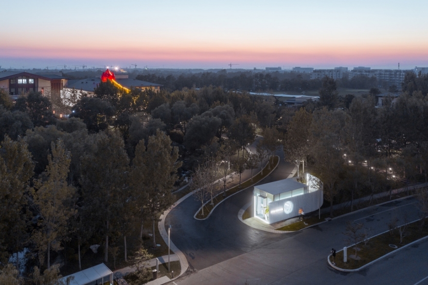
▼城市环境,context
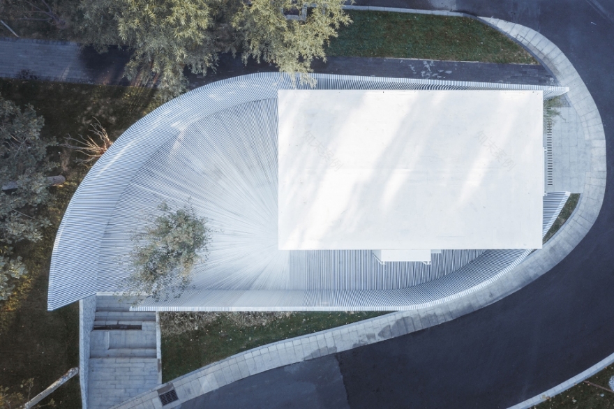
▼场地鸟瞰,aerial view of the site
▼像海魂衫一样的条纹包裹了整个立面,the building is entirely covered withthe pattern of sea-striped shirts that is immediately associated with sailors and the ocean
▼令人“眩晕”的立面,the facade brings a dizzy feeling
立面细部,facade detailed view
我倾向于在建筑立面上形成层层叠叠的空间来模糊建筑的气候边界。首先我把原来的门房剥成一个纯粹的半透明玻璃盒子,但和以往在气候边界前设定半透明的帷幕不同,这次我在玻璃盒子前设定了一道实体围墙作为建筑的领域间歇并围合玻璃盒子形成了一个半开放的院落。这道围墙不是所谓的附属设施,它和玻璃盒子以及院落一起成为游客中心的完整表达。但如果作为空间手段的尝试就到围墙此为止,倒也没太多可以谈的。那样,围墙就是明确的立面了,反而会掩盖我试图构建暧昧和多层次立面的企图。
▼改造前的访客中心,the original building
▼轴测图,axon
近景鸟瞰,a close aerial view
▼原有的建筑表皮被剥离,留下一个纯粹的半透明玻璃盒子,the skin of the original house was first replaced with semi-transparent glass to create a translucent box
玻璃盒子外部的围墙形成了一个半开放的院落,the box is surrounded by a solid wall, which creates a court yard that acts as the intermittent space between inside and outside
▼内部庭院,courtyard view
围墙和玻璃盒子以及院落一起成为游客中心的完整表达,the solid wall is not to be mistaken as a secondary element as it holistically unitizes the box and the courtyard
▼条纹削弱了围墙的实体感受,the effect of these stripes dissipates the dominating presence of the solid wall
这个结果不是我想看到的,但我又着迷于围墙围合成的完型,也不愿意在半透明的玻璃盒子前再竖立一道半透明的围墙,海边风很大,无论阳光板还是穿孔铝板都需要很笨重的钢结构加以支撑来抗侧覆。
我在出租车上无意听到“你问我要去向何方,我指着大海的方向”。在海边的上海人其实不太理解北京人对大海的渴望。所以在大学看到“我有一所房子,面朝大海,春暖花开”,是无法理解北京人的激动的。
但在阿那亚,我看到那么多北京人在夏季涌向这个沙滩,我想大海真是他们的远方和诗。
That is all we can talk about this exterior wall, but this wall has become an obvious building elevation and instead flattens the layering effect and architectural romance that I attempt to achieve. This is what I don’t want to see, yet, I am attached to the holistic nature of this wall and I also don’t want to replace this with just another semi-transparent wall. This building is located near the ocean and the structure to support light weight material such as polycarbonate and perforated steel will become much too bulky because of strong ocean winds.
▼接待处,reception
墙壁和圆窗细部,detailed view of the facade and the round opening
大海,这个突然触动我联系到海魂衫,这个典型的水手服装的典型图案。我决定用条纹去覆盖整个围墙和场地。没错,条纹会削弱围墙的实体感受,并创造出一种晕眩感,这晕眩感会在立面上创造一种新的不确定和暧昧,结合围墙的圆洞,和玻璃盒子内的功能发生联系。由此这个设计达成了我的实验目的。尽管手段并不是预先设定的。
What Aranya keeps on emphasizing and reminding me is the ocean. This made me think of the pattern of sea-striped shirts that is immediately associated with sailors and the ocean. I decided to use this pattern to cover completely this wall and grounds. The effect of these stripes dissipates the dominating presence of the solid wall, creating an optical illusion that distorts the elevation of this structure. Along with the deliberate punctures through the wall and the people occupying inside the semi-transparent box, this spatial arrangement creates an ambiguous and much more romantic setting. With this, the desired result was achieved even through the initial design plan was different.
立面细部,facade detail
这也是一种新的对偶,这所令人晕眩的房子却指明了大海的方向。
This has become a newly formed antithesis, that evokes a certain giddiness that leads you to the sea.
夜景,night view
▼总平面图,master plan
▼1层平面图,plan level 1
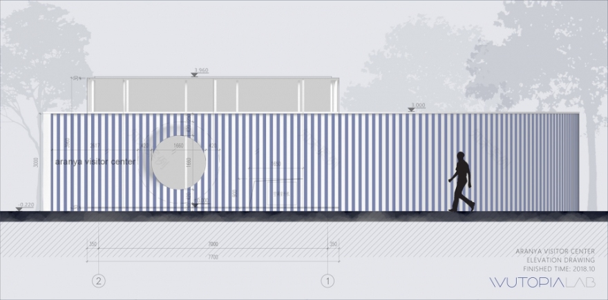
立面图,elevation
▼剖面图,section
项目名称:aranya访客中心
设计:Wutopia Lab
主持建筑师:俞挺
项目建筑师:穆芝霖
设计团队:潘大力 孙悟天
摄影:CreatAR Images 艾清
Location:秦皇岛
Area:35 m2
Material:玻璃幕墙、钢板、涂料、地坪漆
Project Year:2018.10
Project Name: Aranya visitor center
Firm: Wutopia Lab
Chief Architect: YU Ting
Project Architect: Zhilin MU
Design Team: Dali PAN, Wutian SUN
Photography: CreatAR Images
Location: Qinhuangdao
Area: 35 square meters
Material:Glass curtain wall,Steel plate,Coating,Floor paint
客服
消息
收藏
下载
最近


