查看完整案例


收藏

下载
© SHAO Feng
(邵风)
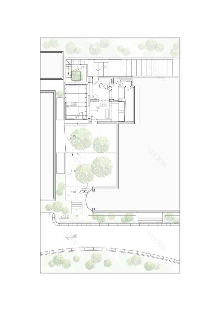
First Floor Plan
一层平面图
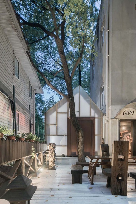
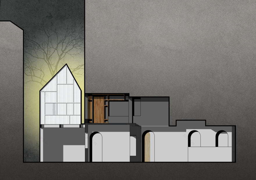
架构师提供的文本描述。两座建筑之间的一人画廊位于上海市中心的一个梯田庭院中。它由两个部分组成,一个是12平方米的画廊作为一个标志性空间,另一个是洞穴,它很容易被忽视,包括一个图书馆和一个合作空间。
Text description provided by the architects. One Person’s Gallery between two buildings is located in a terraced courtyard at the heart of Shanghai. It consists of two parts, one is 12 m2 gallery as an iconic space, and the other is the cave, which could be easily ignored, including a library and a co-work space.
© SHAO Feng
(邵风)
Archaeology
Archaeology
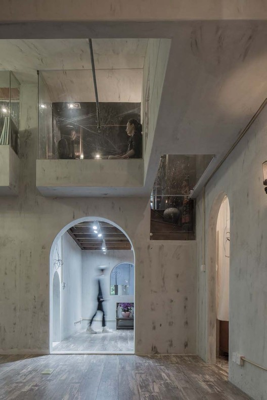
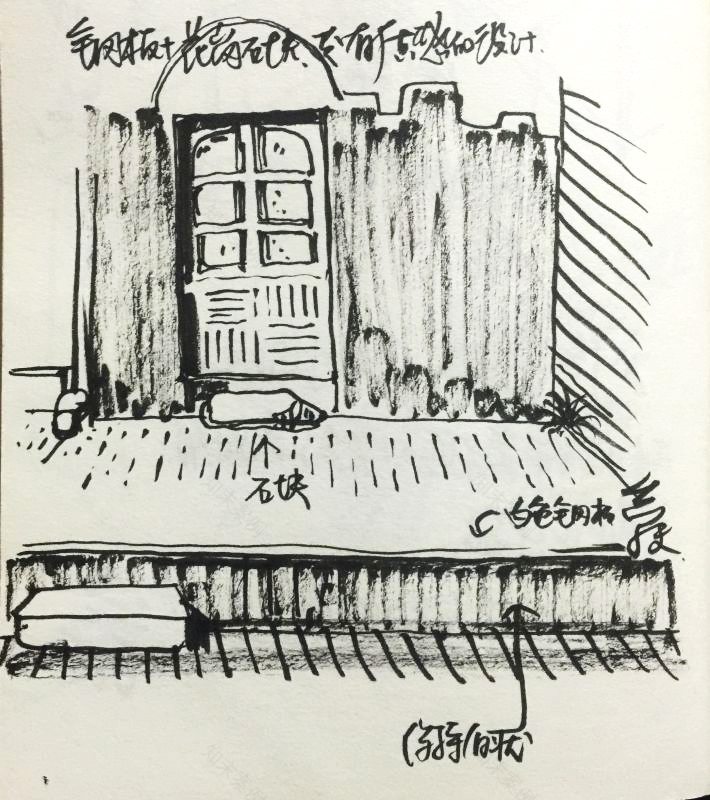
一个人的画廊曾经是一个存储结构,里面装满了一家破产公司的旧材料(我们称之为旧东西),看上去就像灾难现场。这个项目是在没有任何原始蓝图的情况下开始的。当建筑师看着工人们清理空间时,他得到了灵感。他决定用拱门作为室内设计的主题。建筑师没有清理垃圾,而是决定利用它,并试图把它作为一种优势。在图书馆和院子里,旧家具被替换为装饰品,一些旧门被重新使用,另一些被改造成天花板。一些不可预测的影响被发现,并由建筑师故意保存在探索现场。这就是为什么建筑师把这个项目当作考古学工作的原因。
One Person’s Gallery used to be a storage structure which filled with used materials (we called them old things) of a bankrupt company looked like disaster site. The project started without any original blueprints. The architect got an inspiration when him watching the workers cleaning the space. He decided to use the arch as the motif of interior design. Instead of cleaning up the trash, the architect decided to make use of it and tried to turn it as an advantage. The old furniture was replaced as decorations in the library and courtyard, some of the old doors were reused, and others were reconstructed as ceiling. Some unpredictable effects were found and kept deliberately by architect when exploring the site. This is the reason why the architect took the project as an archaeology work.
© SHAO Feng
(邵风)
Antithesis
Antithesis
对立词的命题可能来源于汉语修辞学,如阴阳。如果我们把一边当作旧的,大的,黑暗的,有一点脏的,隐藏的室内商业洞穴,装饰,另一边将是新的,小的,明亮的,整洁的,突出的户外艺术工作室。从这一对立的概念,一个人的画廊的想法是逐渐形成的差距。(鼓掌)
The proposition of antithesis could originate from Chinese rhetoric, like the Yin Yang. If we took one side as the old, big, dark, a bit dirty, hidden indoor commercial cave with ornaments the other side would be the new, small, bright, neat, highlighted outdoor art workshop. From this notion of antithesis, the idea of the one person’s gallery in the gap is gradually composed.
© SHAO Feng
(邵风)
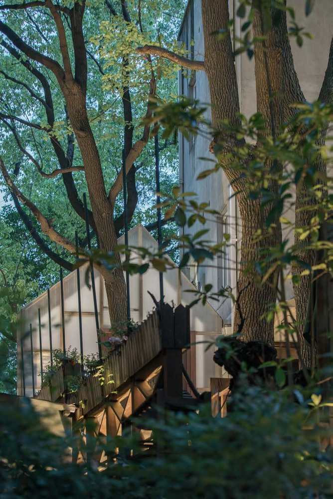
长三角被称为江南的空气总是充满水分,所以古代当地艺术家通过描绘剪影而不是强调光线和阴影,发展出了一种独特的审美技巧。建筑师选择了3层PMMA面板和木材结构来建造画廊。它看起来像一个实体从外面,但当你进入画廊,你会发现室外环境显示在墙上的剪影。剪影终于消化了实心墙的物质性。这是建筑师的目的。
The air in Yangtze River Delta called Jiangnan is always filled with moisture, so the ancient local artists developed a distinctive aesthetic technique by depicting Silhouettes rather than emphasizing light and shadow. Architect chose 3 layers of PMMA panel and timber structure to build gallery. It looks like an entity from outside, but when you get into gallery, you will find the outdoor surroundings display on the wall as silhouette. The silhouette digested materiality of solid wall at last. This is the architect’s purpose.
© SHAO Feng
(邵风)
© SHAO Feng
(邵风)
冰山一角
Tip of iceberg
这个画廊是冰山一角。更多的艺术家和建筑师将被邀请展示他们关于城市和建筑的重要作品。唯一的限制是画廊拒绝图形作品。业主邀请设计画廊的建筑师担任馆长,经营“一个人”的画廊。这是一个新故事的开始。
The gallery is the tip of an iceberg. More artists and architects will be invited to exhibit their critical work about urban and architecture. The only limit is that gallery rejects graphics work. The owner invited the architect who designed gallery as the curator to run the one person’s gallery. It’s the beginning of a new story.
© SHAO Feng
(邵风)
Architects Wutopia Lab
Location Shanghai, Shanghai, China
Category Gallery
Architects in Charge Ting Yu
Design Team Murong Xia
Area 120.0 sqm
Project Year 2016
Photographs SHAO Feng
客服
消息
收藏
下载
最近


