查看完整案例


收藏

下载

附件

翻译
The juxtaposition of art and shopping presented the practice with the challenge to create a design for an entirely new typology that would integrate two, often conflicting, worlds. The concept, therefore, has been to establish a lively architectural dialogue – via a celebration of views into the different spaces (both gallery and retail) as well as a homogenising tiled design that presents a continuous language throughout the building’s floor, façade and roof. The opportunity for flexibility has been a key consideration, so that entrances to the separate uses can be distinct, but there is also the opportunity to connect the entire programme. Doorways, screens and boundaries are therefore highly flexible, demountable, sliding and adaptable.
The Aishti Foundation building is located on a brownfield coastal site in central Beirut and replaces a number of previous warehouses, while also fronting onto an enhanced seaside promenade that has been created through land reclamation and the insertion of a playful, undulating landscaping strategy. This immediately defines the site as an amenity and a draw for visitors. In addition, the top level offers a sky bar with striking sea views as well as over the city of Beirut. The form is a simple block that has been rotated on one edge so that it appears tilted. The retail floors are to one side of the building, configured around a central atrium. The other side of the building accommodates the Aishti Foundation galleries.
The main entrance is punched into the façade and sits within the corner of the building, drawing visitors through the interior on a diagonal axis, which offers views to the sea. While the retail section of the building is wrapped in a solid façade and draws light from the atrium, the east façade is defined by a single large window, behind which a staircase ascends the galleries, offering a moment where the building connects back to the city. The façade has a number of layers, so that the building is like a glazed box that sits within a louvred frame. The outer layer creates an efficient passive shading system. Laterally supported, it floats around the building, with a void existing between the two layers. The geometric ‘thunderbolt’ pattern of the ceramic louvres – or ‘baguettes’ – reappears in the landscaping across the entire site, as well as on the interior tiling, and becomes a defining motif.
Principal: Christian Lahoude
Project Architect: Karolina Wierzbinska
Designers: Katharina Hoerath, Yao Xiao
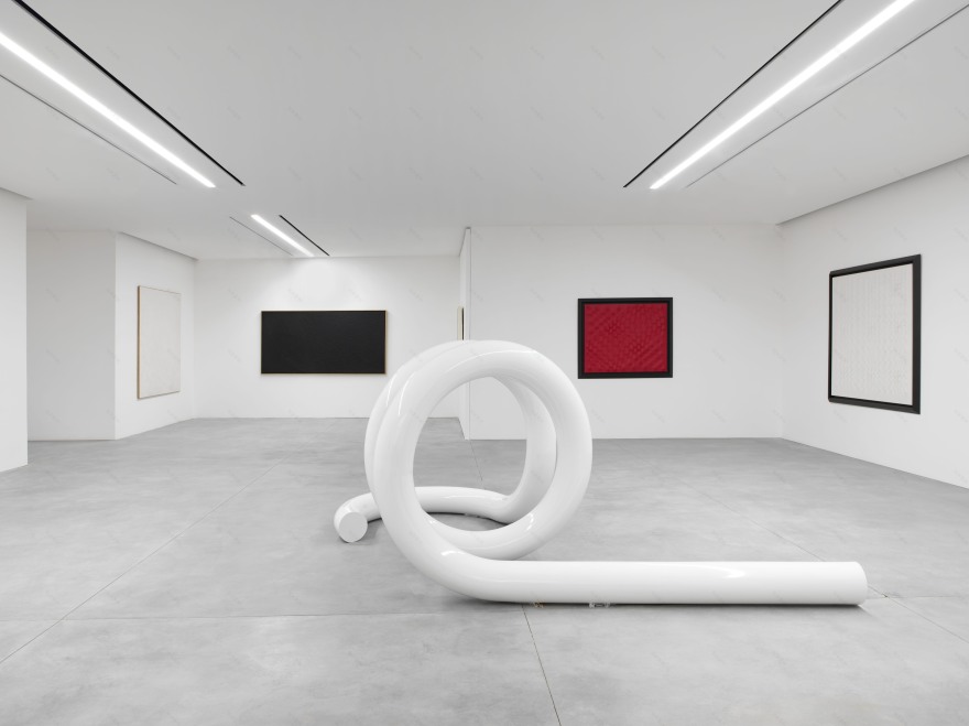
The new Aïshti Foundation & Mall, a contemporary art center and luxury shopping center on Beirut’s Mediterranean harbor, represents the perfect marriage of culture and retail.
In addition to the 60 in-store boutiques representing the most sought-after brands in fashion, Christian Lahoude Studio has designed the six-level retail space inside that includes five restaurants, a spa floor, and a rooftop pool.
The 172,000-square-foot retail space of the four-story building connects the stores with an avant garde art collection housed in a gallery designed by David Adjaye whose façade was interpreted into the interior signature motif by Christian Lahoude Studio. For the fixtures in the mall, The Studio established a single design element, which was then iterated into the product displays for various categories, including clothing, shoes, bags, jewelry and cosmetics. A unique retail experience tailors to the specific multibrand needs of the mall with an open plan that defines space without the use of solid barriers. Key elements such as cash area on each zone are used as wayfinding in the open space through the four floors.
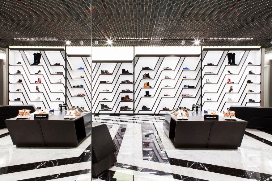
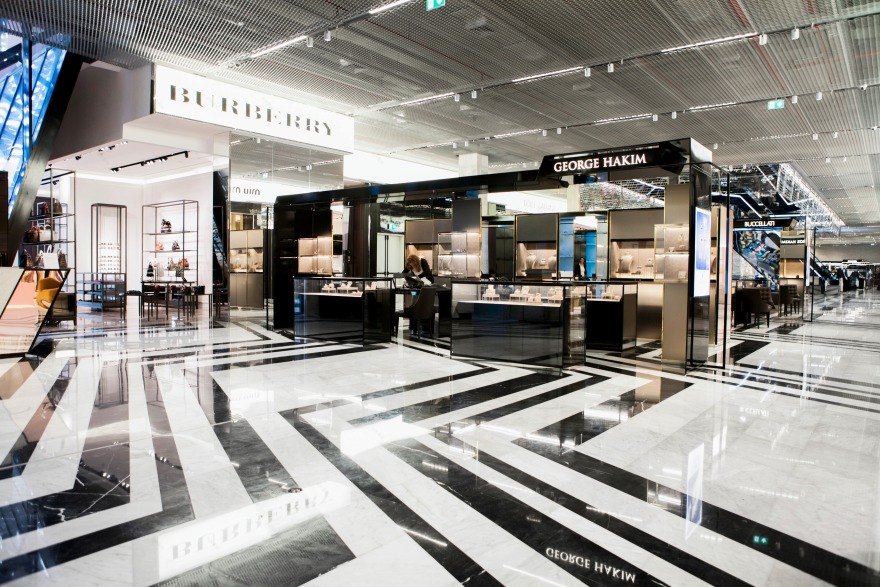
The studio’s main focus was to design all of the fixtures: More than 50, ranging from seating, displays, cash desk, shelving units, tables, vitrines) and custom finishes, matching the aesthetic and pattern existing of the building (black and white broken lines). That pattern is seen through the concept proposed by the studio, and served as inspiration for all the fixtures as well as floor layout and elevations- from the smallest to the largest scale, from fixture detail to overall layout. The central void between programs serves as a lightwell and contributes generously to the openness of the overall design with use of mesh and double-sided shelving.
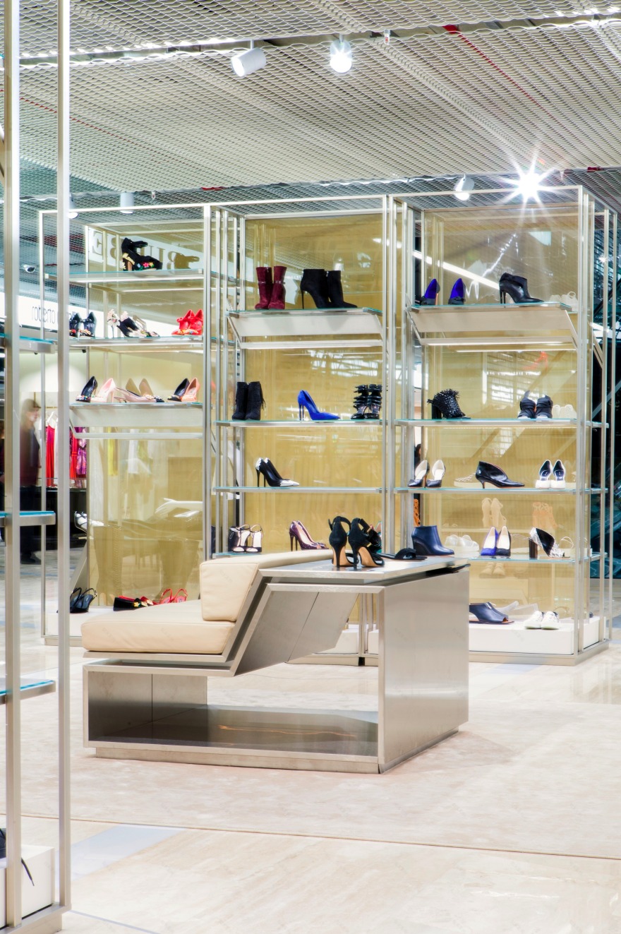
The design intent is consistent with Italian manufactured raw and noble materials such as metal, glass, mirror, and marble with varying finishes set the mood for each zone in shades of black and white with silver accents.
Basement (Kids, Teenagers):
Kids: White furniture with accents of red upholstery. The playful mood creates an open space so that shoppers are not reminded of being on the underground level.
Teenagers: Focal point of this floor is a backlit sneaker wall where the ‘broken line’ also appears as shelving.
Ground Floor (Jewelry, Small leather goods, Handbags, Perfume, Cosmetics):
It was necessary to create a flexible design and layout that could be appealing to different brands by bringing all zones together with the signature pattern through the multibrand space. In the handbag area, where the view of the sea is present, the units are suspended to emphasize the height of the ceiling through the polished marble floor to give the illusion of continuity.
A special feature of this floor is the perfume bar that takes the pattern to its maximum, fragmenting it in the design of the fixture and bottle displays, creating a strong color contrast to make the product stand out.
1st Floor (Mens)
The space tours around the central void, so the two areas confined are the circulations ends, on one end is the shoe section and SLG and on the other ready to wear and evening. Materials are darker featuring gunmetal, Nero Marquina marble, and smoked mirrors.
2nd Floor (Womans)
Changing the mood and materials towards a softer and luxurious atmosphere, materials are champagne metal, gold mesh, off white marble.
3rd Floor (Contemporary)
The layout was conceived dividing the space in Pop UP shop and Ready to wear, split by the void. Pattern on the floor was simplified, and materials follow a neutral palette in shades of grey with a fresher feel.
Christian Lahoude Studio is currently working on an expansion to the adjacent building which will include furniture, evening wear, and a new restaurant.
Program:
Jewelry
Small leather goods
Handbags
Cosmetics
Perfume bar
Eyewear
Bookshop
Kids clothes (MINI)
Teenagers ready to wear (aizone)
Men’s ready to wear
Men’s formal wear
Men’s shoes
Women’s ready to wear
Women’s evening wear
Women’s shoes
Contemporary
Fitting room
Cash desk
Office space
4 restaurants
Spa floor
Rooftop terrace
客服
消息
收藏
下载
最近


