查看完整案例


收藏

下载
半山腰凤凰汇店是 CPLUS 为 Under Clouds 餐饮品牌设计的第二间云南菜餐厅。餐厅占地 340 平方米,位于北京朝阳区一处下沉广场,坐落在凤凰汇购物中心·里巷(以下简称凤凰汇·里巷)的街区中部。从弃用街区统一玻璃窗立面到重建“门洞”打破内部单一空间的设计概念,始终都未远离业主与设计师达成一致的建造“与城市建立温暖联系”的空间情感诉求。
“Under Clouds, Galleria Branch” is the second Yunnan cuisine restaurant designed by CPLUS for the Under Clouds brand. It occupies 340 square meters and is located in Galleria – Instreet (hereinafter referred to as Instreet) in Chaoyang District in the northeast of Beijing. Due to the architectural strategy of breaking the monotonic internal space with “Doors” and wrapping the restaurant’s façade by the sealed wall with a central floor-to-ceiling window, all the concepts have focused on establishing a warm connection with the city.
▼项目概览,preview
自然质朴的亲近感
Natural intimacy
位于北京朝阳区的凤凰汇里巷,三面被高层建筑围合、没有车辆进入,是为当地居民设计的集休闲、商业为一体的下沉式城市公共空间。整个街区使用了灰色金属百叶窗及落地窗的统一立面设计,增加了视觉上的主题化联系,同时呈现出现代感十足的商业气息。
The Instreet is enclosed by high-rise buildings on three sides without vehicle access. It is a sunken plaza designed for local residents that integrates leisure and commerce. The entire block uses a unified facade design with gray metal shutters and floor-to-ceiling window walls, for increasing the visual thematic connection and presenting a modern commercial atmosphere.
▼临街外观,street view
半山腰餐厅用“红色墙面”替换掉原有的落地窗,让整个餐厅在灰色主调的街区里显得别具一格,富有生机。上午阳光照射,墙面被光影横向分割,呈现出不同层次的红色,时间和阳光让不同的树影呈现,在半山腰餐厅的立面上进行着光影创作。
Designers replace the original façade with “red walls”, making the entire restaurant unique and full of vitalities in the Instreet. The wall is divided horizontally by sunlight and shadow in the morning, showing different levels of red tone. Different tree shadows appear on the wall during different times.
▼墙面被光影横向分割,the wall is divided horizontally by sunlight and shadow
▼立面局部,facade
走近立面,似乎能嗅到泥土的味道,触摸墙面能感受到天然材料如肌肤般的颗粒感纹理。这种云南特有的红色土壤,一路北上带着浓烈的云南“风味”,为这条里巷带来了不一样的气息,后劲十足。
Approaching the facade, seemingly you can smell the soil, feel the skin-like grainy texture of natural materials when you touch the wall.
▼餐厅入口,entrance
一窗之隔
One window away
透过落地长窗视线向餐厅内部延伸,同样看到三重门带来的视觉递进与聚焦,但聚焦的场景是内部用餐区的展陈。窗内外定格场景一静一动,似乎对应着北京的翻云覆雨和云南的温暖稳定。而这两种地域气质的强烈反差在这间餐厅的距离只有一窗之隔。
Seeing inner space through the floor-to-ceiling window outside, the triple doors standstill in front of your sight. The same visual progression and focus are brought by the triple doors, but the focused scene of the exhibition is fixed. The frozen scene inside and the dynamic scene outside seem to correspond to the different regional temperaments between Yunnan and Beijing. Here and now, the distance is only one window away from each other.
▼室内外通过一窗相隔,one window away
内“幽”外“明”
“Gloomy” inside, “Bright” outside
外立面用红色墙面包裹的设计让内侧用餐空间的采光更加受限,设计师顺势而为,利用外明里暗的采光条件将用餐区划分为内外两个用餐区。从餐厅走廊到达用餐区中心,能直接感受到两侧用餐区“内幽外明”的不同氛围,客人会根据当下的情绪或社交需求作出选择:明亮开阔还是幽静私密。
Due to the inner space is much darker by the sealed facade, the design seizes the advantage of the existed physical conditions to create a different experience at the inner part. From the corridor to the center of the dining area, guests can directly feel the different atmospheres of the “inside and outside” and choose the preferable side according to their dining social demands.
▼玄关,porch
▼外侧用餐区,outer dining area
▼明亮开阔的氛围,bright and open atmosphere
“看见”韵律与节奏
“Seeing” Rhythm
走入里侧用餐区,背靠展陈柜居中就坐,空间似乎消失在眼前,“三重门”占据横向视野,纵向视线则自然聚焦在前方的落地长窗上,三面墙体及门洞呈现出多样化差异和丰富的表现力,原本单一的空间被厚实的墙体轮廓及门洞勾勒出有秩序的层次感,从而产生了视觉上的韵律与节奏。
Sitting in the inner central place of Under Clouds, the “triple door” occupies the horizontal field of vision, while the vertical line of sight is naturally focused on the front floor-to-ceiling window. The “triple door” allows space, which is monotonic in the first place, to write a rhythm, presenting an elegant, quiet temperament. The lines of the doorway and the wall together outline the sense of hierarchy and order of the space.
▼里侧用餐区,inner dining area
▼幽静私密的氛围,quiet and private atmosphere
视线聚焦到落地长窗,不由让人想起摄影家石元泰博于 1953 年至 1954 年间对日本皇室离宫——桂离宫拍摄的一系列黑白特写场景。日式障子门一层层打开,最终看到窗外的风景。这种内部极致的秩序感和看似并列的排布方式,却能让视线层层递进,最终聚焦在一窗的景观中。
Focusing on the floor-to-ceiling window, you spontaneously recalled series of black and white scenes of the Katsura Imperial Villa which was photographed by Ishimoto Yasuhiro between 1953 and 1954. The Japanese Tatami Doors are opened one by one, finally, you see the scenery outside the window. This extreme sense of internal order and juxtaposed arrangement allows the line of sight to progress layer by layer, and finally focus on the one-window landscape.
▼层层递进的视线聚焦于落地长窗,the progressive line of sight is focused on the floor-to-ceiling windows
平行空间的“内外关系”
The inside-out relationship of the parallel space
站在餐厅的任意角落,都能透过门洞看到全部或部分落地长窗,这种视线框景的设计意在让内外平行空间通过视觉交互形成微妙的“内外关系”,让处于室内的客人可以随时跟外界发生联系。
One can always have the view of the windows through the “doors” no matter which position he or she locates at. The central floor-to-ceiling window defines the sight focus between the inner and outer space. Therefore, a delicate, or to say subtle “inner and outer relationship” is formed by the scene and the line of sight.
▼透过门洞看到部分落地长窗,view of the windows through the “doors”
在质朴中洞察美感 The use of simple and natural materials
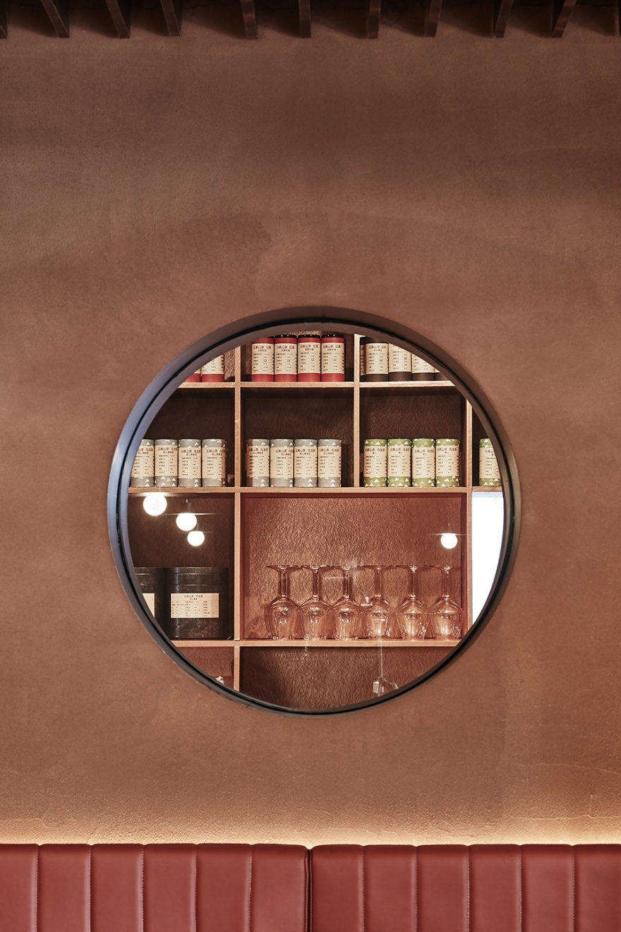
主体材料的选择上,CPLUS 最初便确定采用泥土、钢板等质朴的材料,同时考虑用现代工艺提高材料的表现力,最终呈现整个空间及外立面“质朴典雅”的气息。厚度 50cm 的墙体由砌块构成,再用从云南运来的泥土整体包裹,细腻的颗粒感让墙面呈现出皮肤般的自然质感。钢板的使用在室内占比不多,但使用部分的最终呈现都有些意外之喜。
At the beginning, CPLUS decided to use simple and natural materials, including soil and steel plate, and explore the modern technology related to the expressiveness of the material to present the “simple and elegant” quality of the entire space of Under Clouds restaurant eventually. The 50-centimeter-thick walls are made up of blocks at the first step. And then they are wrapped by soil transported from Yunnan. The delicate feeling of graininess makes the wall present a skin-like natural texture. The use of steel plates in the interior does not account for much, but the use of parts of the final presentation is somewhat unexpected.
▼餐厅一角,corner of the restaurant
内侧就餐区用整面穿孔钢板将开放餐区和包间隔开,一则让钢板两侧的人产生视觉联动,在满足包间客人私密性要求的同时,让餐厅工作人员通过镂空孔洞及时了解客人状态及需求;二则透过孔洞光线消除钢板密不透风的压抑感。后厨热轧钢板上的两个孔洞让就餐者与厨师之间有了联系,孔洞打破了原本完全封闭的后厨空间,厨师不经意看到窗外的客人正在吃着自己烹饪的食物,这种无意识交流也是种有意思的及时交流。
The inner dining area is separated by a perforated steel plate, helping people on both sides to get a visual linkage. While meeting the privacy requirements of the guests, the staff in restaurant can sense the status of the guests through the hollow holes. These tiny countless holes also eliminate the depressive feeling coming from the steel plate.
The two holes in the hot-rolled steel plate of the back kitchen form the possibility of connection between the diners and the chef. These holes broke the enclosed back kitchen space, providing the chance for the chef to view how the guests enjoy the food made by the chef. The unconsciousness communication makes the connection more interesting and subtle.
▼不同孔洞,different holes
阴翳之美
The light achieves the beauty of the shadow
“美,不存在于物体之中,而存在于物与物产生的阴翳的波纹和明暗之中。离开阴翳的作用,也就没有美。”出自日本作家谷崎润一郎的著作《阴翳礼赞》,这几句话也许最能恰当地表达半山腰餐厅中的“阴翳之美”。脚灯和射灯的布置及调试让原本浓烈的红色墙体显得温柔沉静,让扎实的黑色钢板有了灵动之感。半山腰的阴翳之美就存在于这些点缀之光与阴影之间的呼应与此起彼伏之间。
“Beauty does not exist in objects, but exists in the ripples and lightness of the shadows which produced by things and objects. Without shadows, there is no beauty.” From the book “The Praise of Shadows” by the Japanese writer Tanizaki Junichiro. These few words may be the most appropriate expression of the “gloomy beauty” in Under Clouds restaurant. The arrangement and debugging of footlights and spotlights make the red wall form a gentle and quiet appearance, a sense of agility reflected from the black steel plate. The beauty lies in the echoes between the lights and shadows.
▼夜景,night view
除此之外,照明团队基于天气、时段、时间的变化,调试出适用于不同用餐场景的“光环境”转换。无论是正餐、悠闲的下午茶,还是夜间漫不经心的酒局,食客都能在舒适的氛围中享受当下。
In addition, the lighting team experimented and created a “light environment” based on the weather, time period and the change of the time. Diners can enjoy the moment in a comfortable lighting atmosphere, whether it’s a dinner, a leisurely afternoon tea or a casual night of drinking.
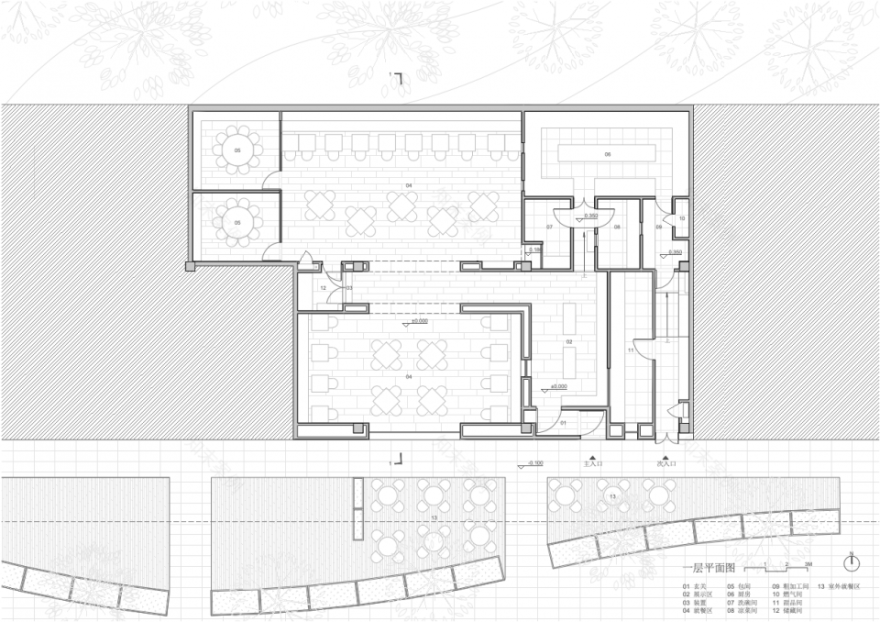
▼平面图,plan
▼剖面图,section
设计方:CPLUS
创始合伙人:程艳春、李楠
主持建筑师:程艳春
设计团队:曹鹏飞、陈亦奕、薄忱
照明顾问:清华大学建筑学院张昕工作室
项目类型:休闲建筑
时间:2019 年 12 月-2021 年 1 月
地点:中国,北京
建筑面积:340 平方米
摄影:陈冰、张东东
Project Details
Design Firm: CPLUS
Founding Partner: Cheng Yanchun, Li Nan
Principal Architect: Cheng Yanchun
Project Team: Cao Pengfei, Chen Yiyi, Bo Chen
Lighting Design: Zhang Xin Studio, Faculty of Architecture, Tsinghua University
Category: Leisure Architecture
Dates: December 2019-January 2021
Location: Beijing, China
Area: 340 square meters
Photograph: Chen Bing, Zhang Dongdong
客服
消息
收藏
下载
最近


