查看完整案例


收藏

下载
项目名称:华发华润置地万象天地展示中心
项目地址:江苏省南京市栖霞区经五路
建筑面积:1134㎡
景观面积:约7000㎡
建成时间:2018.10
项目位于江苏省南京市栖霞区,周边交通条件便利,紧邻长途客运站和火车东站,场地周边环境优美,有多个风景名胜区,山水人文资源丰富。
The project is located in Qixia district of Nanjing, the surrounding traffic conditions are very convenient, there are long-distance bus station and east railway station. This site is surrounded by magnificent environment, with a number of famous scenic spots and abundant natural resources.
宏观策略:寻找现代建筑的场地性格
设计之初,力求融合文化、品质、生活为一体,考虑建筑风格及项目核心需求,将项目整体景观营造出不仅是场地本身性格的体现,还是都市面貌的重要组成部分。场地的存在感将深深刻入人们的脑海,留下刻骨铭心的印象。当然还有十分重要的一点——找到景观场地本身的性格特征并顺应它。
At the beginning of the design, we tried to integrate the culture, quality and life altogether, and the architectural style and the key requirements of the project were taken into consideration to make the entire landscape of the project not only reflect the own character, but also an important part of the of the city appearance. It is also very important to find the own characteristic of the site and adapt to it.
挖掘建筑与景观的关系,把建筑的线条肌理感延伸到景观之中,根据建筑语言,划分整个场地空间。赋予划分后这些大小形状不同的空间以不同功能和体验。
Excavate the relationship between architecture and landscape, extend the line texture of architecture into the landscape, and divide the whole site space according to the architectural language.These different sizes and shapes are divided into different functions and experiences.
平面
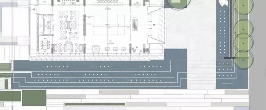
动线分析
和大部分展示区体验序列一样:入口到达空间、售楼处前场空间、售楼处后场的中庭空间及样板体验空间构成。然而值得一提的是,它的景观面积是建筑面积的7倍,售楼处与示范区之间有一个连廊围成中庭空间,建筑构成犹如一个容器,因此我们知道中庭空间将是场地承载其性格的部分。
Same as most sales office: entrance, front yard, back yard and model experience space. However, it is worth mentioning that its landscape area is 6 times to the building area. There is a corridor between the sales office and the demonstration area to form the atrium space that seems like a container. Therefore we know the atrium space will be the character part of the site.
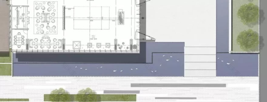
前场场地本身的景观面积非常大,入口区域过于平淡,因此设计上抬高了售楼处入口并设计台步,利用高差变化增加入口的提示感和仪式感。前场空灵纯净的空间之感洗涤了人们内心纷扰的城市杂念,为进入到后场“容器”有一个过渡、适应的过程。
The entrance has a huge landscape area which makes the entrance lack of highlights, so we raised the entrance area and add steps, take advantage of the elevation to make the entrance more vivid and stand out the demonstration area.The ethereal and pure sense of space in the front yard take away people's distracting thoughts, which is a transitional and adaptive process for them to enter the "container" to the back yard.
入口设计策略图
示范区入口
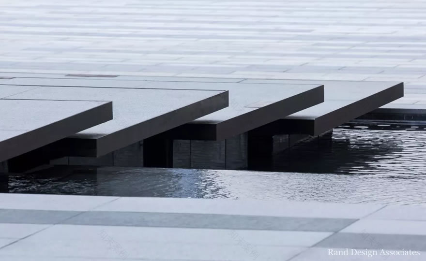
精致的景墙,有序的铺装设计,“悬浮”的入口汀步,结合水景、灵动的鱼群雕塑和植物共同营造现代而不失意境的空间感受。
Exquisite walls, orderly pavement design, "floating" entrance steps, combined with waterscape, life-like fish sculpture and plants to create a modern and artistic space experience.
售楼中心前场
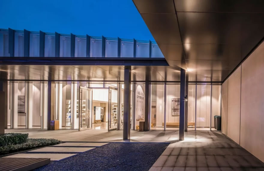
建筑立面本身具有非常明显的序列感,我们设计的两组景墙,一片简洁挺拔,一片是半透明的U形玻璃,围合出的广场化成为建筑的延续空间,而小鱼儿摆尾便成了入口空间十分灵动的点缀,在克制、理性的场地中,带入了纯净与空灵。
Building elevation has obvious sense of sequence, we designed two landscape wall: one with concise and straight geometrical line, the other one with translucent white glass, the fishtailing structures become the smart ornament of entrance space, which bring the purity, ethereality to this site.
售楼中心后场
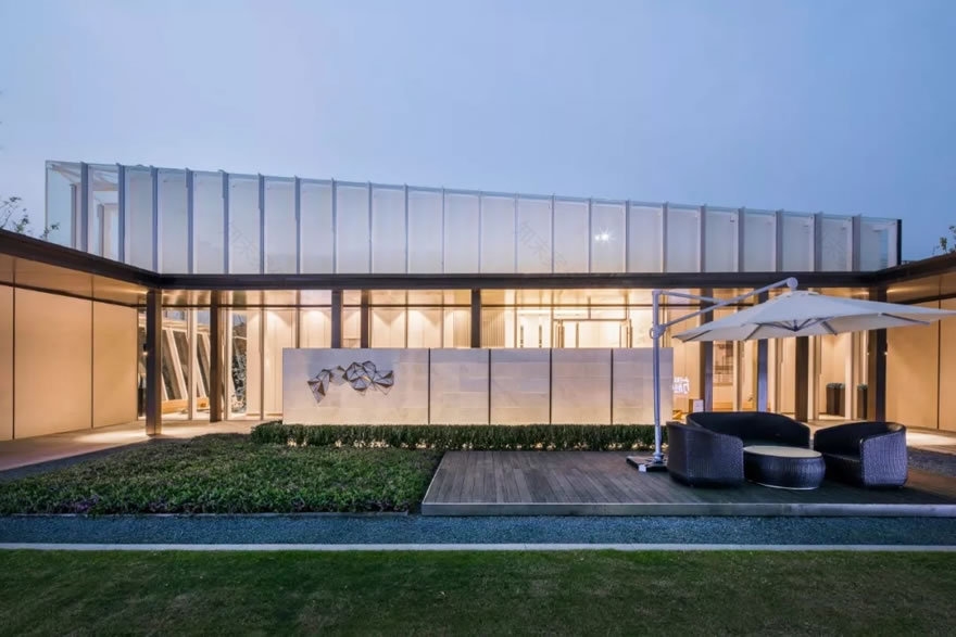
从售楼处出来,空间又重新变得开阔而自由。既来之,则安之,静心坐下,轻声洽谈。后场空间,可以容纳将近百人的派对活动,木平台结合阳光草坪,配以舒适的外摆家具,与人交流,与环境交流。
Going out from the sales office, the space becomes wide and free again. Take things as they come, let’s calm the mind to sit down and talk softly. The back yard space can hold party activity of nearly 100 people. The wooden platform, the sunshine, the green lawn, and furniture placed outside, all these make you comfortable to communicate with people and the environment.
比起传统的设计手法,几何形式更具张力,内敛、纯粹的设计语言,简洁的几何草坪和树池,点睛之笔的孤植树,至此空间上归于平静而又充满了秩序。行人漫步在连廊间,领略空灵悠扬之美,唤起归家的渴望。
Compared with the traditional design methods, geometry is more intense, introverted and pure, as we can see the geometric lawns and trees, the middle punchline solitary tree, so far the space is calm and full of order. If you ramble about the corridor, you will really appreciate the beauty of the space and arouse the desire to return home.
空间实验
方案深化期间,中庭经过多轮沟通,最终结合营销和成本的考量确定最适合的方向,在基础上推敲空间尺度及深化细节,确保最终的效果与品质。
During the period of deepening the program, the patio was designed with a lot of discussion, finally the most suitable project was determined based on the consideration of marketing and cost. Analyzing the spatial scale and details to ensure the final effect and quality.
首先利用屏风式的景墙将视线进行一定程度的遮挡,场地中间设置小块绿地,于此种树,树在屏风后显露梢头,行人行走于两侧廊下,渐行中可瞥见不同角度的景观。对空间的划分与材料对光的反射将“光”、“水”,“影”的特性融入到设计之中,把后场空间设计成一个体验空间与光影的舞台。
First the screen walls are used to block the view to a certain extent, a small green space with trees is set in the middle of the site, where trees can be seen in the back of the walls. Pedestrians can walk on both sides of the corridor and catch a glimpse of the landscape from different angles. We tried to integrate the characteristics of "light", "water" and "shadow" into the design by dividing the space and using the reflection of the material. The back yard space is designed as a stage of experiencing space, light and shadow.
我们又尝试将后场空间打造成人与自然共生的空间,通过流动的空间、绿意盎然的植物,将人与自然的边界模糊淡化。打造微自然邻里体验空间。
We also attempt to create a symbiotic space between human being and nature. To make the boundary blurred through flowing space and green plants and create a micro natural neighborhood experience.
在之前的基础上,我们继续尝试不同的设计方向,不对空间的性质做任何改变,与建筑一起去平衡整个场地空间的调性。通过风和玻璃的元素:风赋予了声音与律动,同时也唤醒了场地的活力;玻璃的纯净以及与光之间的梦幻关系,凸显整个场地的开阔而自由。
Here we turned to a completely different design direction on the basis of the first one and second one, without changing the nature of the space and balancing the tone of the whole site with architecture. Through the elements of wind and glass: wind gives sound and rhythm, and also awakens the vitality of the site; the purity of the glass and the dreamy relationship with the light stand out the openness and freedom of the site.
最终我们决定尽可能少的去干预自然,让大自然自己展现美。“树”“光”“影”都需要一个载体来体现,所以就用最自然的石材景墙当画板,让大自然在上面自由的创作。
Finally we decide to intervene the nature as little as possible in the design, so that nature can show her own beauty. "Tree", "light", "shadow", need a carrier to express the relationship which we use the most natural stone wall as a painting board and let nature create freely on it.
优化方案
在保障整体的景观效果的前提下,将主入口的水景面积减小,优化部分水景和铺装,更换立面材料,采用新型材料。
On the premise of guaranteeing the overall landscape effect, we reduce the waterscape area of the main entrance, optimize part of the waterscape and paving, replace the facade materials with new materials.
水景面积优化
入口台阶景墙优化
效果图
实景
实景
中庭廊架优化
效果图
实景
中庭景墙优化
效果图
实景
结语
一个空间会有众多个答案,我们愿意在空间中尝试不同的设计形式,再做理性的取舍。现实中面对场地未来的定位发展,用更简洁、现代的设计语言,去繁就简,打造一个动人的、有故事的未来居所,使得这个项目她能以最美的姿态呈现在众人面前。
There are many answers for just one space, we would like to try different designs and then make a rational choice. Facing of the orientation of the site in the future, we will use a more concise, modern design language to create a touching future residence, and make this project to present the most beautiful posture in front of all people.
建设单位:华润置地
景观设计单位:RDA景观设计事务所
设计团队:王哲赟、诸昌晶、Alessandro Zuccolo、
章任珅
摄影团队:方筑摄影
施工单位:杭州神工景观工程有限公司
客服
消息
收藏
下载
最近


