查看完整案例


收藏

下载

翻译
Yoshinoya, one of the best beef bowl shop from Japan which its recipe was originally created for more than 100 years. Nowadays we are craving for authentic, and original which Yoshinoya is renowned at this point. Designer team bring the point of heritage recipe into the design concept and twist the idea by questioning “how is the Yoshinoya will be if it was freshly opened in this time”. Then we combined the Japanese heritage of Yoshinoya together with new trend of urban café. This style is the mix and match under the concept of Mordern Original which is appeal to wide range of target customer, from young kids, teenagers to grandparents.
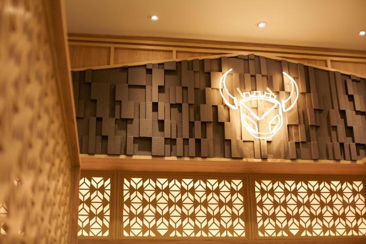
The strong identity of Yoshinoya is its logo which is very unique, simple and outstanding. The Logo is the orange bull horn which derived from the initial letter of “Y” from Yoshinoya , while the rope surrounding the horn represents the “Yokozuna”, the winner ranking in Japanese sumo-wrestling. This philosophy is the same at Yoshinoya that always competes for the best quality of beef bowls.
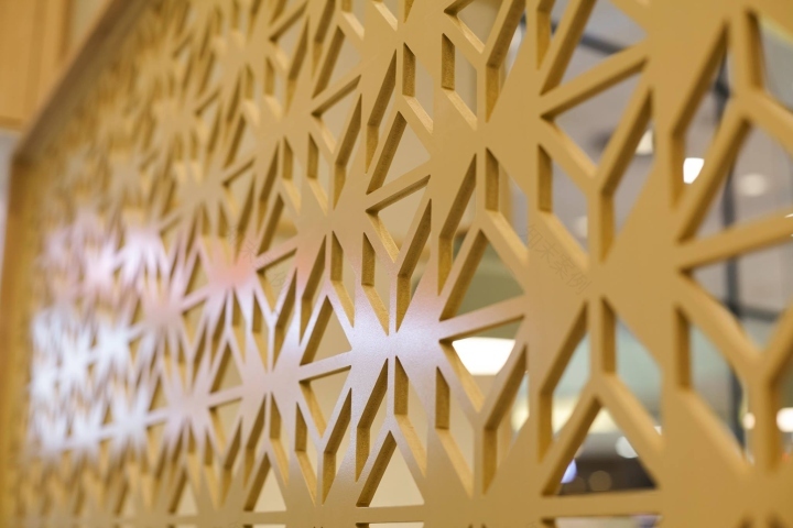
After designer team have studied the philosophy of Yoshinoya food, they bring every element into the design which we can clearly see in the restaurant. You can see Yoshinoya rope pattern on the wallpaper or at the rope of hanging lamp. Y shape of bull horn was used as an iconic and was embedded in many part of the interior design. Walk into the restaurant from the entrance way, there is the Yoshinoya logo flags along the walkway decorating in the Japanese style.
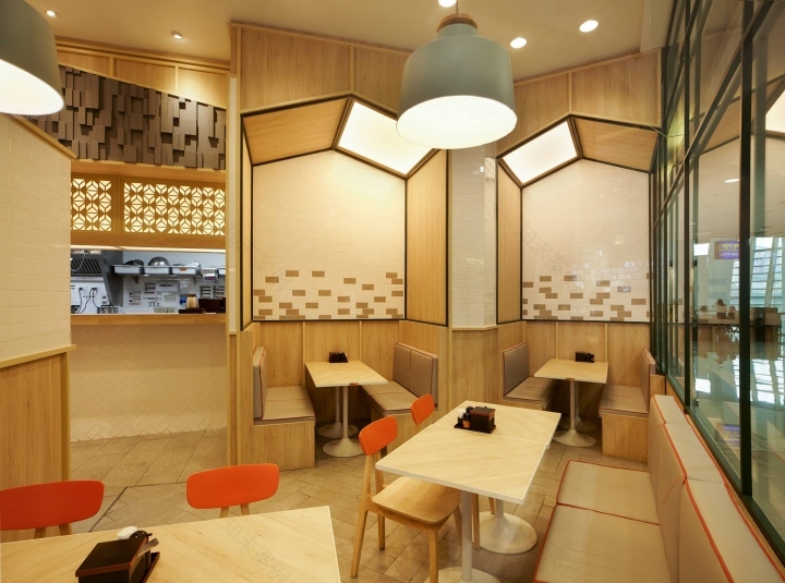
Then we will see the open kitchen at the middle section of the restaurant showing the delicacy and freshness of how chef made the special beef bowl for customer. At the right and left, it is the spacious area for dining in the “semi-outdoor” style. Customer will feel joyful choosing verity table styles when they come to Yoshinoya. There are long tables with the bench chairs, couple tables or even the triangle roof corner tables.
The overall tone of the area is designed in earth tone, composing of wood material in the colour of orange and green which is the iconic colour of Yohsinoya. All over these interior touch points are blended and become the first Yoshinoya that was rebranded and represented in new design concept of “Modern Original”. Then this branch, Yoshinoya at Charmchuri Square, became the pioneer branch and was used to developed the other branches in Thailand.
Designed by
party/space/design
Photography by
F section
客服
消息
收藏
下载
最近


