查看完整案例


收藏

下载

附件

翻译
Architect:GCA Architects
Location:Av. Diagonal, 191, Barcelona, Spain; | ;
Project Year:2017
Category:Offices
Stories By:GCA Architects;MERMET S.A.S.
From the outset, the concept of a continuous façade along the New Avenida Diagonal, stretching from plaça de les Glories to Forum, was always at the forefront of the urban planner’s vision. This façade was to be composed by buildings offering an iconic counterpoint, leading up as a gateway to the 21st century Poblenou neighborhood.
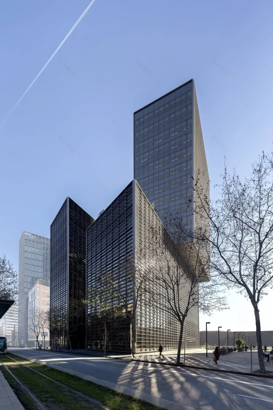
Located in Barcelona’s Campus Audiovisual 22@ business section and designed as a corporate headquarters, this building by GCA Architects rises as a pure and minimalist design, responding to the unique necessity of the place, as a building that interacts with the street. With a capacity for more than 1,000 people, the functional programme is divided into two towers of 11 and 18 floors respectively, reaching 72m high.
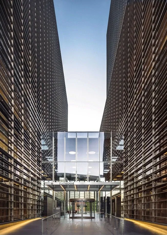
The towers are connected by the three-storey glass entrance, lit by natural light through extra clear glass and a direct view from either entrance. The main entrance also accommodates the reception desk and other common amenities in this space of about 11x26m. The glass perimeter of the roof allows for the natural flow of light and the central skylights also act as means of extraction in the case of emergency. The entrances consist of rounded doors with sliding entrances on either side marked with a glass awning.
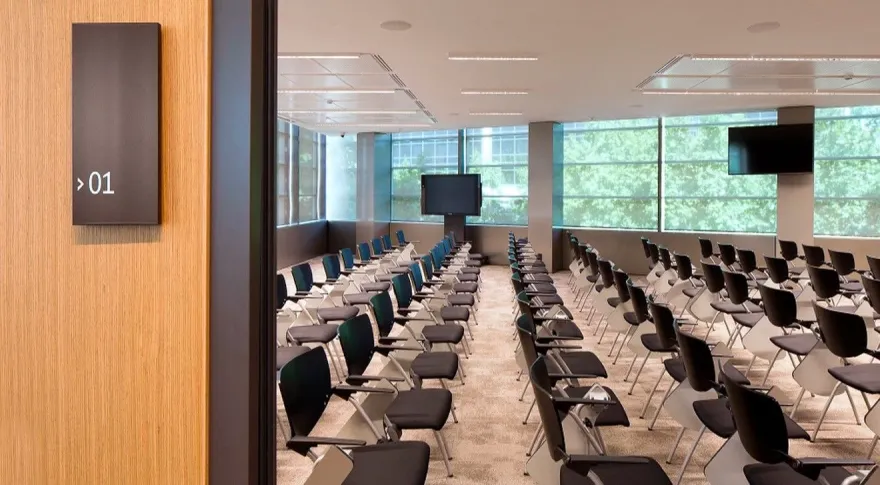
Indoors, the building houses restaurant with open kitchens, fitness center, a conference hall with a 200 person capacity, along with a car park with a 240 space capacity below ground, to name but a few of the features.
All in all the building reaches 28.000 m2. Each tower has a compact core zone with staircases, restrooms and a group of 4 elevators with innovative systems to manage the smooth flow of people.
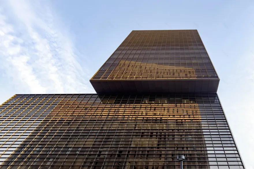
The shape of the Western tower creates a cantilever and allows the creation of a green terrace on the seventh floor at the same time.
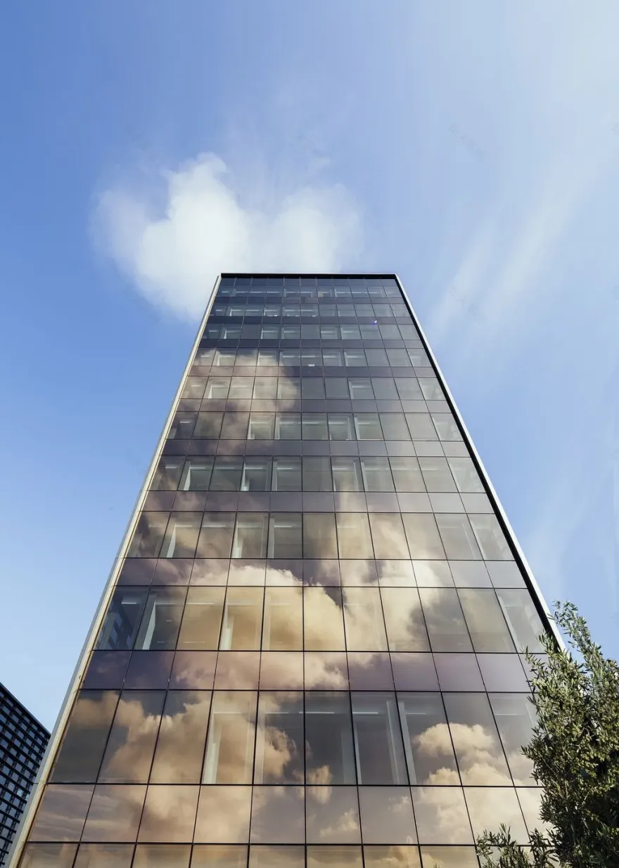
The façade is assembled by a modular construction system, which is finished with extruded aluminium slats and uprights providing both sunlight filtering and interior privacy, further reinforced by a highly reflective technological glass surface with the bottom third in opaque and visibility through the top two third. The effect is a homogenous second skin that envelopes the building like a protective layer. Beyond the seventh floor, once the interior privacy is ensured, this skin fades out, offering a clearer view of the city and the sea.
The building structure is made up of a heavy concrete core containing the restrooms, staircases and elevators; and a metallic framework for the cantilever, which balances the structural load and helps to reduce the height of the slab. For the structure construction it was used as an ascending-descending system, which allows building from the ground level down and upwards simultaneously, shortening the construction time. To achieve this, the steel columns were driven directly into the piles during the construction of the foundation, playing a part on the corresponding final structure steel frame once excavation and concrete works are finished.
High quality materials such as oak wood and modular furniture have been used in the interior design and a dividing system that allows for a more flexible spacing scheme. There are private rooms and offices as well as open office work areas.
In regards to functionalities, there is a waste room on the ground floor, which is connected to a pneumatic waste collection system.
The air conditioning system is connected to the heat and cold urban distribution net, significantly reducing CO2 emission levels. The lighting system is powered by energy-efficient led technology lamps, including presence and light sensors system to get an additional energy saving. In terms of water consumption, restrooms are fitted with double-flushed technology and low water flow taps as well as electronic sensor control in order to save a considerable amount of water.
GCA Architects building has been conceived according to the rigorous sustainability standards of the US Green Building Council, aiming to obtain a LEED GOLD certification, which would allow up to a 30% of energy savings compared to other traditional high-rise buildings.
The imposing architecture is what marks the line of action in interior design. The spaces, intended for the public part or common services of the headquarters, are visually connected in the large entrance atrium, which becomes the heart of the building. The rest of the floors are intended for work spaces, both collective and individual, except the plant located at the terrace level, which has a dining room for customers and a room for relations with the company's partners.
The building has spaces to work, rest, play sports, eat, train ... For example, it has an auditorium for presentations and events with a capacity of up to 220 people. Everything has been thought with the aim of promoting internal and external relations, as well as to make the stay in the building a comfortable and pleasant experience for all the employees of the company.
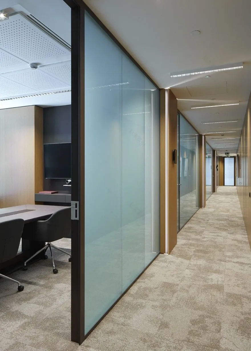
The aesthetic order of the exterior is transferred to the interior through the luminaires of all the floors, ordered so as to transmit unity to the whole. The glazed separations give the space a sense of transparency in all departments and allow natural light to flood every corner. In addition, its disposition has been thought so that all the collaborators, so much if their position of work is a shared area or an office, can have a space for the private, collective communication or to make conferences.
The floors connected to the great hall, destined to the ones visited with the clients and to the training of the employees, breathe a calm and sober atmosphere thanks to the use of noble and elegant materials, with a homogeneous line that avoids the excess of varieties. In the operating plants, however, it has sought to give more freshness and brightness through clear materials and sand tones.
Technology and art, two concepts deeply linked to the brand, constitute the common thread that runs throughout the building transmitting these values to the visitor.
Located in a strategic area close to multiple prestigious sites, the architects behind this project were faced with a major challenge. This building on the edge of the district of Poblenou, the
, was duty bound to obtain
(Leadership in Energy and Environmental Design). This certificate is the international benchmark similar to the French HQE for the construction of sustainable and high-performance buildings.
With the dual objective of
, the
fabric played a central role in both the technical and environmental domain.
With the objective of
, the firm GCA Architects designed a 28,000m² area accommodating some 1,000 people that stands out for its:
• Pure and minimalist glass facades that fully meet the architectural criteria of the district;
• Two 10-floor and 17-floor towers reaching a height of up to 72 metres;
• Three-floor glass atrium linking the towers and enabling natural light to penetrate into the building.
"
» Juan Velasco Garcia de Sierra –
.
the mineral composition of the Screen Nature fabric has minimal environmental impact. Incombustible and free of smoke emissions, it is rated M0 (NFP 92 503), Euroclass A2-s1-d0, F0, meeting all the health & safety requirements. This fabric with excellent transparency offers multiple benefits:
• Very high glare control: up to 95 % of sunlight is filtered out;
• Optimum thermal comfort with up to 82% of the solar energy reflected back
By meeting ever more demanding standards,
.
▼项目更多图片
客服
消息
收藏
下载
最近


