查看完整案例


收藏

下载

翻译
Firm: Space Matrix
Type: Commercial › Office
STATUS: Built
YEAR: 2019
SIZE: 10,000 sqft - 25,000 sqft
BUDGET: $1M - 5M
Thriving together: Integrating the different brands under Omnicom into one space
If there’s one thing that has become clear over the last few months, it is the importance of social connections in the modern workplace.
In the past few weeks, most people experienced feelings of isolation and loneliness, even as they enjoyed the flexibility of working remotely. In fact, in a global survey we recently conducted, over 85% of respondents said they missed face-to-face social interactions. Companies need to keep this in mind while rethinking their workplace strategies. While they design new policies to make remote working a bigger part of their operations, they also need to make sure that when employees interact, they do so safely and in the most meaningful way possible.
When we worked with the global marketing and communications giant Omnicom Media Group (OMG), our mandate was something very similar — to bring people together and to make sure interactions were more meaningful. There are several global agencies under OMG, and as the number of employees in Singapore increased, they sought to bring these agencies under one roof rather than having their diverse talent scattered across multiple spaces. We needed to conceptualise an office design that would integrate OMD and PHD Media, maximise workplace engagement and foster collaboration between diverse teams. Here’s how we went about it.
Removing physical barriers:
Earlier, the PHD and OMD offices were located on different floors, so they had limited interaction, and collaboration had to be more intentional. Our new design layout brought the brands to one unified office space. We designed a single main entrance for all Omnicom employees, and a common reception area where all visitors are greeted, irrespective of which agency they are visiting. There on, one can go left to find the space dedicated to PHD, while the OMD wing is to the right. Rather than physical dividers to separate the brands, we used visual differentiators like unique colours and themes for each space.
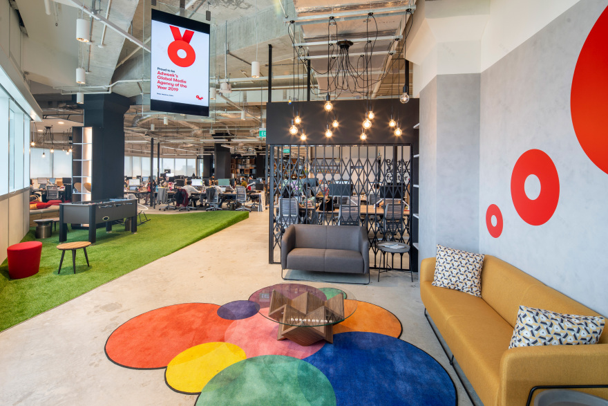
However, the pantry, meeting spaces and event area are all shared zones, so they are located in the middle. Employees from both sides of the office naturally run into each other here, so there are adequate opportunities for bonding, interaction and spontaneous collaboration. Moreover, these shared zones are all designed to be multi-functional, so that people automatically find more uses for these spaces and end up spending more time here. These areas feature lightweight furniture, operable walls and cluster seating options — all of which can be rearranged or opened out to create a larger space when needed.
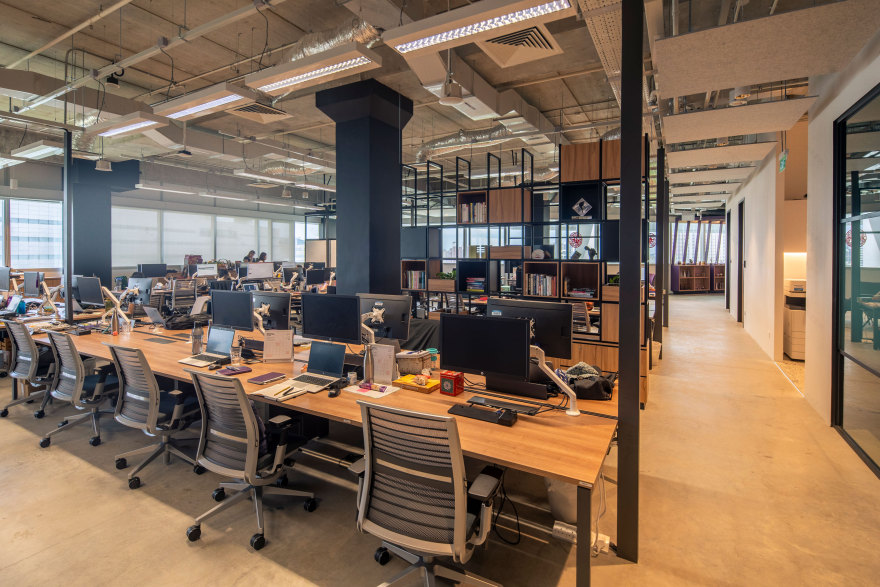
The other thing we did was to update the traditional hierarchical layouts the brands had before. Cubicles and closed cabins had formed physical barriers between junior employees and senior managers. Now, we adopted a completely open plan concept to make collaboration more seamless.
These updated office design concepts have a deeper significance in today’s world, as we navigate the impacts of COVID-19. Now, collaboration can’t just be seamless — it needs to be safe too. These design elements ensure safety in three important ways. Firstly, open areas with adequate ventilation and staggered occupancy have been found to be much safer than closed spaces where germs may stay suspended in the air for a longer time. Secondly, consider the advantages of neighbourhood work clusters. Self-sufficient, multi-purpose clusters allow smaller groups to work individually, bounce their ideas off one another and have more formal discussions together without having to leave their neighbourhood. They do not have to move around the entire office, looking for a new space, every time they perform a new task. Thirdly, non-assigned desks have a logistical advantage — they are empty at the end of the day and thus, are easier to swipe clean.
Thoughtfully integrated branding:
While we needed to bring the different agencies together and foster a stronger team culture, we also wanted to ensure that that does not happen at the cost of the individual brand styles and personalities. We started by putting together a central, unified theme that would work for both agencies housed within the office. We chose a neutral, earthy palette, with lots of greys, blues, beiges and wooden elements. We retained the exposed overhead ducts to give the entire office an industrial chic vibe. Additionally, the same timber laminate finish is seen across the office, as are the same metal cabinet accents, light fittings and shelves.
These neutral and unified elements formed the perfect canvas that allowed the distinct personalities of PHD and OMD to really pop. Their unique styles show through in the accent elements, wall graphics, tiles and murals. For instance, PHD places a lot of importance on their artistic strength and whimsical ideas. This shows through in the design of their meeting rooms, each of which is built around an unusual theme. While one meeting space features a giant chessboard on the floor, another surprises guests with a soothing cosmic theme.
Meanwhile OMD wanted to pay homage to the rich and diverse local culture. So their meeting rooms feature rich, jewel-toned walls set off by ornate Peranakan-inspired floor tiles, and retro wooden chairs reminiscent of kopitiams. As an added touch, their meeting rooms are all named after local places and delicacies.
Biophilia and a focus on hospitality:
Ideas thrive in a space where people feel happy, comfortable and mentally relaxed. So biophilic and hospitality-inspired elements feature prominently in the office design — be it the PHD and OMD wings or the central shared zones.
The common reception area has a green wall on one side and wooden elements on the other. This creates an impression of bringing the outdoors in, as one steps into the office. The corridor that leads into the PHD space also features a full-length green wall, a green ceiling and wooden trellises. Potted plants have been strategically used all through the office interiors — in the corners of the meeting rooms, on top of the shelves and in the open box partitions that separate the different zones. The entry and diffusion of natural sunlight has been optimised after thorough sun path and daylight analysis. We paid special attention to the glazing treatment to ensure that there are no uncomfortable glares. To put the focus back on collaboration and togetherness, we built the shared community spaces along the glazing, rather than having individual work desks lined against it. This ensures that sunlight and great views can be enjoyed by everyone as they collaborate, rather than a lucky handful who manage to nab the window-side seats.
Comfy, home-inspired elements and finishes have been used to make the office more cosy and welcoming. Cushy sofas, high-backed armchairs, beanbags and coffee tables are dotted around the office, so that one can curl up, share ideas and have impromptu discussions with colleagues. There are even rocking chairs and swings seats in some parts of the office, adding extra elements of whimsy and fun.
Again, these biophilic and hospitality elements have an added significance now. In the wake of COVID-19, employees’ mental health and well-being need to be taken care of as they return to the workplace. While it is good to remind people of the new norms as they interact with one another, stark, sterile spaces are more likely to cause paranoia and unnecessary alarm. Collaboration cannot thrive in such environments. A strong focus on wellness-driven design is thus going to prove important in the coming days. Moreover, biophilic elements also double up as an extra air filtration system — so green walls can prove exceptionally useful at a time when indoor air quality is going to be under scrutiny.
Hoping to foster collaboration while keeping the new safety standards in mind? We can help.
客服
消息
收藏
下载
最近


