查看完整案例


收藏

下载

翻译
Firm: Space Matrix
Type: Commercial › Office
STATUS: Built
YEAR: 2019
SIZE: 10,000 sqft - 25,000 sqft
Workplace design as a recruitment strategy: 3 takeaways from City Facilities Management
First impressions matter. This is one statement that people interviewing for a new job are used to hearing. Irrespective of how well qualified they are, they’re advised to dress professionally, be neat and tidy, and have their resume neatly organised so as to make a great first impression when they step in for that job interview.
But what a lot of employers don’t realise is that it works the other way round too — job interviews are where candidates form their first impression about the company. Millennials and Gen Z employees form a large part of the workforce today, and these employees look beyond just the salary when they make their decision about whether or not to accept a job offer. In fact, according to one study, 81% of job hunters say that the office design and workplace environment are important factors that help them decide whether they would work in that company.
When we first spoke to City Facilities Management, they put a unique challenge before us — to design their Hong Kong office to be an important part of their recruitment strategy. It wasn’t an ambiguous, long-term goal either. City Facilities Management was setting up their first headquarters in Asia, so they had a specific, time-bound hiring pipeline. They needed to establish a high-performing team of over 120 people in just 6 weeks. We knew we needed to create a gorgeous office space that would attract the best talent. It had to appeal to accomplished professionals who were in high demand and could pick and choose where they work.
Here are 3 strategies we chalked out in order to achieve this:
1. Making optimum use of natural and spatial assets
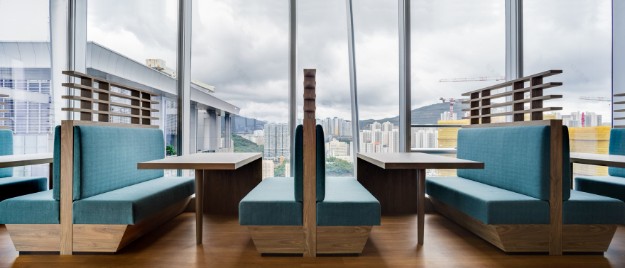
One of the first things you will notice upon entering the City Facilities office is the breath-taking 180-degree view of the harbour. This is no coincidence — since the office is in such a prime location, we made a conscious effort to make the most of this view.
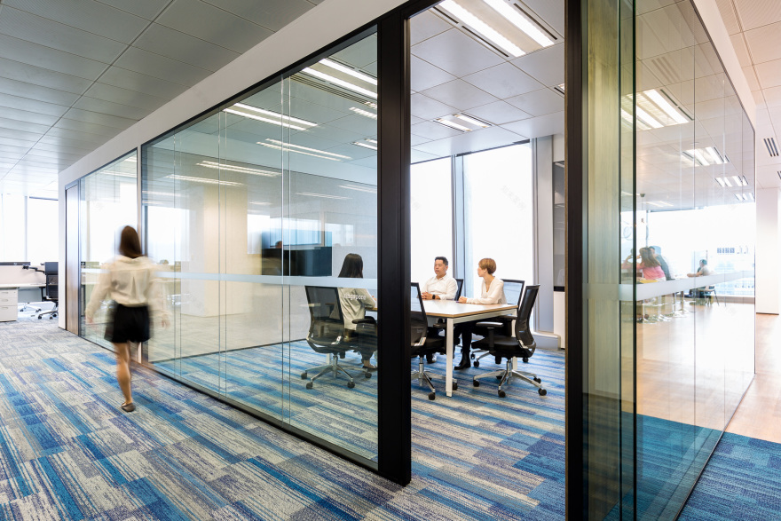
The office design is conceived in such a way that it frames this stunning harbour panorama, rather than distracting from it. We put in glass walls on this side of the office, and glass-walled partitions are used in the interiors as well, so as to create minimum visual interruptions through the space. This copious usage of transparent glass also serves another important purpose — it lets in natural sunlight deep within the office, rather than just at the peripheral areas.
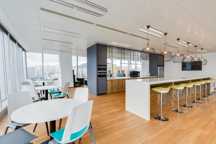
The layout within the office is designed to ensure that a maximum number of people can enjoy the stunning view at once. We included lots of seating options on the side that faces the harbour. The shared pantry and townhall space is on the harbour-side zone as well, so that those who do not have dedicated seats can come in and enjoy the view on their lunch hour or coffee breaks. One of the conference rooms is also built to face the harbour to offer some visual stimulation during meetings and discussions.
2. Putting a strong focus on comfort and hospitality
As for the office interiors, we went for sophisticated neutrals with a strong focus on comfort. We wanted to create a space where people will want to spend time every day — a space where they can sit back and work with their favourite playlist on, the gorgeous view in front, and a steaming beverage by their side.
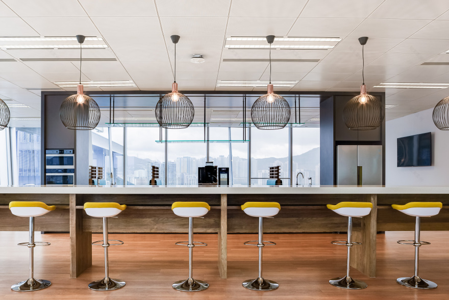
Soft whites and beiges make up the colour palette in this new office, with wood finishes on the floor and furnishings. Accent chairs and carpets dotted around the space add in pops of colour. We chose recessed lighting to create a soft, welcoming effect throughout the space, and added in trendy, hanging lights above the counters and pantry seats where brighter lights may be required.
Younger employees don’t want to be tied to a single desk all day — they look for variety and flexibility in their workdays. We made sure to offer that with a vast array of seating options so they can move around as they tackle different tasks throughout the day. There are work booths and café-like seating clusters for quick small-scale collaboration. Bar stools line the sides of the pantry, offering a casual setup for informal conversations. There are high-backed armchairs, height-adjustable seats and ergonomic chairs for when people want to get some focussed work done.
3. Highlighting the values that are important to employees today
Transparency and openness are important to employees today. In fact, lack of autonomy and trust is one of the top reasons why good employees quit, so that is one change they look for in their new workplace. The way an office is designed gives them important cues about the work culture and hierarchical structures within the company. For instance, in some organisations, the size of one’s cabin is indicative of their designation.
City Facilities Management has a flatter hierarchical structure, and the company culture is driven by transparency, approachability and collaboration. We ensured that this came across clearly through the workspace design. We conceptualised an open plan space where senior managers and junior employees all sit together. Even the CEO and Managing Director sit with the rest of the teams instead of being sequestered away in a stuffy office. Glass walls and chain link partitions further highlight the accessible, straightforward nature of their operations. Even the traditional ‘corner office view’ is not reserved for C-suite executives, but is opened up for everyone to enjoy. All these elements highlight the values that potential employees may be looking for, when they come in for a job interview.
These strategies ended up being really successful for City Facilities Management. In just 6 weeks, their brand new Asia headquarters were up and running. They successfully recruited and filled all the positions they had open — so now they have a stellar team to ensure the company’s success in the region. What’s more, the workplace design helped the organisation make a statement in the local market and brand themselves as a leader in the industry — a fact that was appreciated by their biggest clients in the region.
客服
消息
收藏
下载
最近


