

创作上传
VIP
收藏下载
登录 | 注册有礼
查看完整案例


收藏

下载

分享
翻译


Firm: wAtelier
Type: Commercial › Retail Shopping Mall
STATUS: Built
YEAR: 2018
SIZE: 0 sqft - 1000 sqft
Japanese design firm wAtelier led the rebranding of a Vietnamese chain Shooz with infinitely reconfigurable shoe display shelves in a tight, shoebox-shaped retail space of 34 square meters.
The design pulls the visitor’s vision through onto the far end of the store, anchored by the brand logo, designed in collaboration with Wulff Graphics.
Along the central axis drawn by this logo wall sit the main display counters, offset to make way for circulation paths. Carefully dimensioned to terrace incrementally towards the cashier, and wide enough to view the merchandise from outside the store and just reachable once inside, these movable counters forego the vertical shoe display systems that chop up spaces in favor of an open plan. As a result, interactions naturally take place over and around the counter.
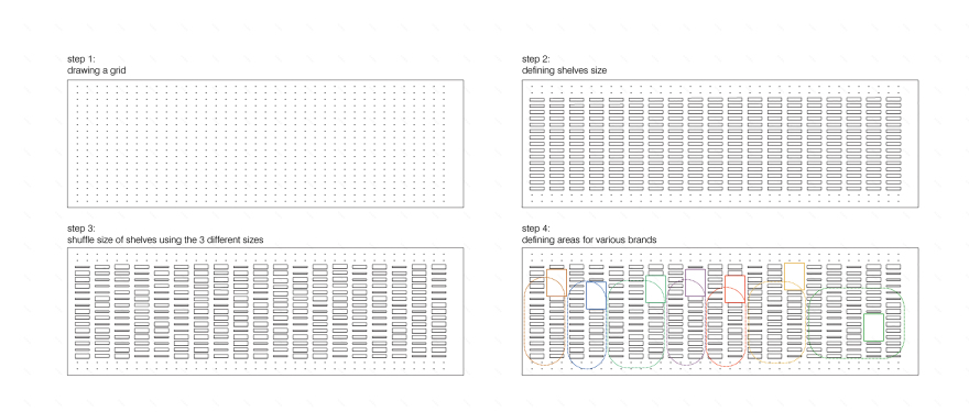
Seven wrapping surfaces surround these counters, initially configured as unfolding tapestries of distinct geometries, patterns and functions. 330 powder-coated steel L-shelves and 70 letter shelves can be attached and removed freely to the plywood wall, punctured evenly in a grid that accommodates eight shelf variations of different heights and widths.
As discrete elements, the modular L shelves, coming in three variations, echo the proportions of a typical shoebox.
As an aggregation, when shuffled, they emerge as a pattern with a life of their own in absence of products in display, and/or muted as thin, minimal and functional pieces when they give way to the merchandise.
At the time of photographing an idealized version of the site, on the left as you stand facing the store, the L shelves aimed toward the logo to accentuate the one-point perspective manifest in the design. On the right, they stopped at the corner and switched around to a surface of alphabet letter shelves, which also emerge and re-emerge as language, texture or function. At the corner facing the shopping mall audience, the letters aligned perfectly to signify the brand, only to disintegrate as the surface turns around further to the back, where it is followed by a full height mirror and a final surface of smaller logo hooks for bigger items.
These conditions are subject to change at any time within the constraints of the given grid.
Photographs: Giuseppe de Francesco


南京喵熊网络科技有限公司 苏ICP备18050492号-4知末 © 2018—2020 . All photos and trademark graphics are copyrighted by their owners.增值电信业务经营许可证(ICP)苏B2-20201444 苏公网安备 32011302321234号
苏公网安备 32011302321234号客服
消息
收藏
下载
最近