查看完整案例


收藏

下载
与JOY BOX盒里合作的第三家店铺在西安W Hotel的下沉广场开业了,这次我们希望在突出品牌记忆点的同时,能融合一些当地元素。
The third project that we cooperated with JOY BOX located in Xi’an W Hotel sunken square, and it just started its business recently. We aimed at blending in some local elements into this project while keep the brand’s own characteristic at the same time.
给盒子订制了新衣服
Tailor a new suit for the BOX
在此次合作中,我们仍旧延续盒里简洁明快的品牌风格,以及其标志性的黑白格立体灯箱,但在表现形式上结合西安风貌做出了一些改变。
We extended the concise and lively brand style of JOY BOX in this project. The symbolic black and white stereoscopic light boxes were used, but we decided to make some changes basing on the city scape of Xi’an.
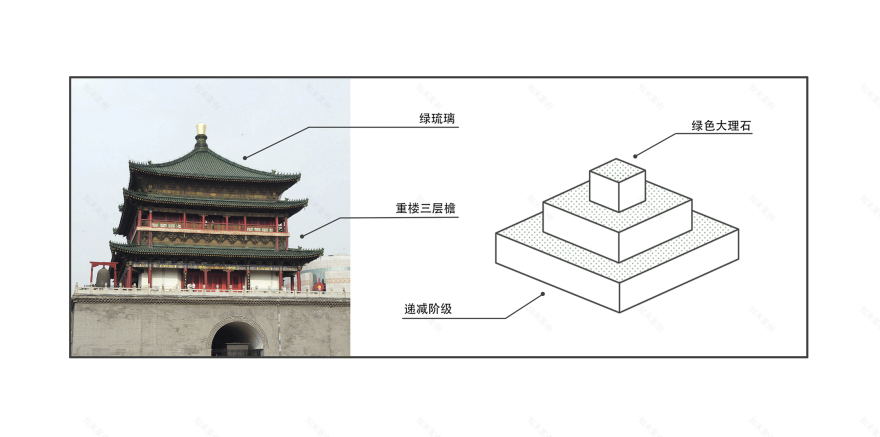
我们提取了一些初步的西安印象,解构为元素并重组在空间里。钟楼和鼓楼是西安标志性建筑,其庄严的重檐飞角以及熠熠闪光的绿琉璃瓦面予人深刻印象。我们将重檐转换为空间语言“叠级”,用绿色大理石象征绿琉璃,试图让空间与城市有所呼应。
The Bell Tower together with the Drum Tower is the landmark of Xi’an. The multiple eaves as well as the shining green glazed tiles left us a deep impression. We used the space concept of cascade as a substitute for multiple eaves, and the green marble we used acted as the symbol of green glaze. The space would echo with the Xi’an city.
▲从城市印象中提取元素
Seeking elements from city itself
一面不足,各方来补
Reinforce weaknesses
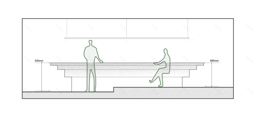
此项目原始空间整体狭窄细长,展示面有限,且入口处横亘一根地梁,使空间愈发局促。但空间体验是多维的,当一个方面存在短板限制发挥时,能够从其他方面弥补。
The original space of the project was narrow and slender thus the display part was limited and what’s worse, there is a grade beam lying at the entrance, which makes the space more cramped. But the spatial experience is multidimensional, we can use other part’s strong points to reinforce weaknesses.
▲高差问题通过不同的坐位形式来化解。
With the designing of varieties of seats forms, the problems could be solved.
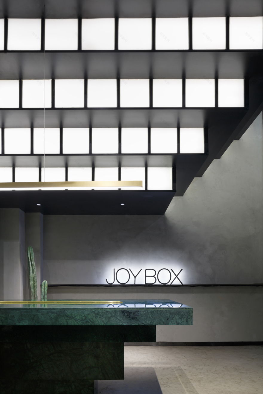
▲入口空间的递增叠级灯箱吸引并引导着客流。绿色大理石及黄铜吊灯的精致与混凝土墙面的粗粝形成对比,增强视觉张力。
The cascade light box placed at the entrance attracted and conducted the customers. The visual tension is strengthened according to the comparison between the exquisite green marble and bass chandelier and the rough concrete wall.
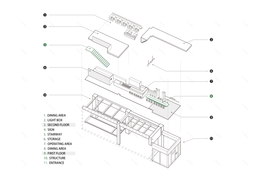
▲平面精炼,立面丰富
Simple in ichnography and rich in three-dimension
我们为盒里披上西安的外衣,想证明用几何体块构筑的空间,能够通过改变形式和材质来表露不同情感,也想传达秩序和逻辑是空间亘古不变的内核。
The JOY BOX is dressed in the style of Xi’an. We wanted to prove that different feelings can be expressed through the changing of different material used on geometry blocks which formed the space. The last but not the least, we believed that the order and logic are the core of space.
▲爆炸图
项目信息——
设计机构:武汉朴开十向设计事务所
空间设计师:熊天宇 张筱锴
设计执行:陆宏达
编辑:冯程程
项目地址:曲江池东路W酒店下沉广场
项目面积:90m²
完工时间:2019.1
摄影:张筱锴
材料:混凝土 不锈钢 大理石 黄铜
Project information——
Design agency: Pure’s Design
Space designer: Tianyu Xiong, Xiaokai Zhang
Design Implementation: Hongda Lu
Editor: Chengcheng Feng
Project location: W hotel sunken plaza, east qujiangchi road
Project area: 90 m²
Time of completion:2019.1
Photographer: Xiaokai Zhang
Material: concrete, stainless steel, marble, brass
客服
消息
收藏
下载
最近


