查看完整案例


收藏

下载
改造后的Wild Studio
Wild Studio after renovation
Wild Studio位于江苏省南通市大生众创园区,是一个为生活而生的独立服装设计品牌,旨在坚持自由舒适,追求内在自我好奇。
Wild Studio is located at Nantong Dasheng Creative Park, Jiangsu. It is an independent design brand born for life, aim to persist in freedom and comfort, and pursue inner self-curiosity.
坐落于大生众创园区
Situated at Dasheng Creative Park
场地是一栋园区内的沿街联排建筑,上下两层,南北朝向。建筑一层的南侧独立出来作为服装展示空间,其余则为业主的工作室。
The site is a two-storey terrace house, facing the north and the south. Wild Studio gallery occupies a small portion on the first floor, keeping the rest of the spaces being used as studio.
改造前的Wild Studio
Wild Studio before renovation
初到现场,4米乘8米的方正空间一目了然,没有太多限制但也相对少了些特色。这种看似’自由’的空间实则更难入手。如我们经常提及的:设计的出发点皆由场地的各种局限或特点所生发。那这个场地作为商业空间的局限是什么呢?是不是太枯燥无聊又缺乏动线呢?由此,设计的挑战便浮现出来,即如何在仅有32平米的方正空间内创造出有趣的动线,让人在进入空间后停留较久,同时也能兼顾商业需求。
When we first visited the site, this 4-meter by 8-meter space was sample and straightforward at a glance, without too many restrictions, and has relatively few characteristics. In such a ‘free’ space, it is actually tougher to start with the design. So, what are the restriction of this space? It is way too straight forward and is lack of vibrant circulation, isn’t it? The challenges have then been exploited: to create a vibrant circulation within this 32 square-meter space, to allow customers to stay for a longer time, and to accomplish commercial needs concurrently.
原始平面图
Existing plan
1
服装展厅
gallery
2 人行走道
corridor
3 原始楼梯
existing stairs
4 原始卫生间
existing toilet
5 工作室
studio
平面图
Plan
1 玄关 5 收银台
foyer cashier
2 隧道 6 陈列架
tunnel shelves
3 服装展示区 7 展示台
display stone stool
4 试衣间
fitting room
空间内原有的卫生间和楼梯位于整栋建筑的中心位置,自然而然地留出一条连接展厅与工作室的人行通道。我们便顺势利用这条现有的人行通道,将它延伸至服装展厅的入口,在平面上形成一条轴。同时将此处天花的高度处理成从入口处逐渐变矮,宽度也逐渐变窄,让这条轴在视觉上被无限延伸,形成一条隧道。
The existing toilet and staircase is located at the central area of the building, naturally created a corridor that connects the gallery and the studio, which formed an axis on the plan. Along this axis, we deliberately reduced the ceiling height and narrowed down the width of the corridor, transforming it into an endless tunnel.
设计草图
Design Sketches
隧道末端与工作室相连接的地方,光透过一扇磨砂的玻璃门渗入隧道内,让沿街的行人从外往内看时会被这道光吸引进店。隧道内选用深褐色的艺术涂料作为主色调来强调它的深邃感。
At the end of the tunnel, where it connects to the studio, a beam of light diffusing through a matte finished glass door. When pedestrians look through the glass into the tunnel, their sight will be drawn into the space. A dark textured paint is applied throughout the tunnel to add on to its depth and the sophisticated atmosphere.
隧道剖面图
Tunnel section
隧道旁的空间则需囊括橱窗、陈列、收银、试衣间这四大功能。为了将这些功能合理又有趣的纳入剩余的20平米中,我们想到使用单一回环曲线的动线布局。
The 32 square-meter space is divided into two by the axis, leaving the space next to the tunnel to the four major functions – window display, cloth display, cashier, and the fitting room. How to incorporate all four functions into the remaining 20 square-meter space reasonably?In this case, we thought of using a single loop curvilinear configuration for the path for the gallery.
动线分析图
Circulation diagram
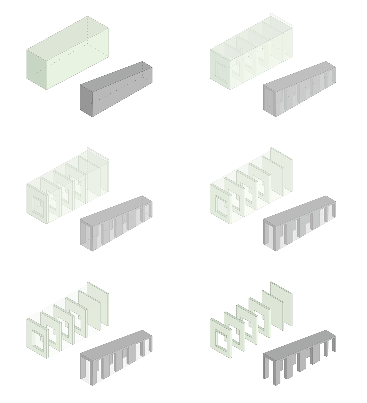
依照这四个功能,我们采用等形分割的方式将空间一分为五。从动线上让人在步入空间后以多次折返的方式进入每个小空间。通过回环往复的方式让客人在无意间参观完室内的每个角落并与各个小空间内陈列的商品产生互动。
The remaining 20 square-meter space is further divided into five according to the functional needs. The circulation is branched out from the tunnel to each display area, once the customer enters the gallery, he/she will be led by the designed circulation to walk through the tunnel wherever he/she wants to get to the next display area. This circulation potentially encourages and guides the customer to walk around every corner connected by the loop and interact with all the merchandise.
展示空间 1
Display area 1
展示空间 2
Display area 2
展示空间 3
Display area 3
收银台
Cashier counter
展示区剖面图
Section
每个服装展示空间以一道墙分隔开来,并以方框的形式开了同等大小的窗洞。当行人从外向里看时,会因为这三个连续叠加的框而产生的“递归”视觉感受,这种感受引导着人将视线聚焦在展示空间的末端,由此,我们便大胆的将橱窗安置在视线的焦点处。这时,橱窗更像是一个艺术装置,其陈列效果更大程度的被突显。
Walls with openings are erected in-between each display area in a form of repeating frames. When pedestrians walk pass the street and look into the gallery through these openings, the optical illusion stimulated by these layers of frame converges at the end of the gallery. Here, we intentionally placed the display windows at the end of the space as art installations, to further highlight and magnify its display effect.
呈现出递归效果的橱窗
Dorse effect
服装展厅内墙体的两侧安装了Fine Lumens的长条形壁灯,让客人不论正对或者背对窗口,都能感受到这种递归的视觉感。
Linear light features are installed on both sides of the wall. When customers look from either the front or the back, he/she will be able to visualise the Dorse effect from both directions.
隧道右侧的墙体嵌入了用以陈列服装配饰的层板,这些层板嵌在与展示空间通往隧道出入口一一对应的框架单元内。同时在每个框架单元内壁上方我们挖出了“天光”,进一步强调了隧道的纵深感。
Layers of shelves are embedded into the sidewall of the tunnel, each shelf unit is aligned with the opening of the display area. A row of skylights in each shelf unit is designed to enhance the depth of the tunnel.
展示区与隧道的衔接处
Display and tunnel intersection
Wild Studio可以说是一个和业主一起探索与实验的项目,隧道内隔板的裹材是业主亲自剪裁与制作的成果。除此之外,外立面的肌理我们也一起做了很多尝试:用业主从工厂中捡回来的废弃零配件创造出一些特别的肌理效果,虽然最后还是选用了成品涂料,但过程中依然收获了很多新的体验与感知。
Wild Studio is a joint work with our client. The shelves that wrapped in green fabric are DIY by our client. As for the façade texture, we try to experiment different texture by using props which can be easily sourced from daily life, although the final texture is made from textured paint, we all enjoy the process of experimenting.
空间内的石材展示台,也是与业主和工厂师傅一同探讨摸索的成果,甚至连切割下来的边角料都被我们悉心带回用在了其他项目上。
For the stone stools, we worked closely with our client and the factory workers to explore the possibilities of making an interesting texture. Even the cut-out pieces were brought back and used for other projects.
OFFHAND PRACTICE会保持好奇的态度在专业领域中不断探索,继续演绎属于我们的“即席发挥”。
Wild Studio is the project with the most experimentalism that OFFHAND PRACTICE has ever done. In this project, “Wild” and “Practice” is the centre of gravity for all the inspiration. Our intensive exploration lies with all stages throughout the project, acts as a driver for us to constantly examine available possibilities, until the best possible outcome is successfully materialised.
OFFHAND PRACTICE will let the motive of curiosity and innovation thrives in our vein, continue to execute our expertise with that motivation, and always “improvise” in our unique style.
石材与外立面肌理的实验 (请往👈划)
Texture experiment (slide to the left)
主入口门把手
Main entrance handle
o f f h a n d p r a c t i c e . c o m
客户:Wild Studio
地点:南通市大生众创街区2期311
室内面积:32m²
项目设计时间:2019.06 - 2019.09
项目施工时间:2019.09 - 2019.11
设计内容:建筑外立面,室内,灯光
室内设计:OFFHAND PRACTICE
室内设计师:袁愿,聂璇,李月
空间摄影:胡彦昀 Hu Yanyun
设计施工团队:南通清风装饰工程有限公司
WEIBO/INSTAGRAM:offhandpractice
撰文:胡彦昀
特别鸣谢:林宸西,Josephine Chai
谢谢!


