查看完整案例


收藏

下载
《脑力智魔星》全脑开发中心中建广场店
设计公司:无非设计(深圳)
主创设计师:曹博文
设计团队:薛茵琦、王嘉良、杨艳蓉、黄彬彬
项目地址:佛山,中国
项目面积:72.0 平方米
项目施工负责:黄彬彬
完工时间:2020年12月
主材:雪弗板、木饰面、烤漆、地胶
摄影:DAVEN
《脑力智魔星》全脑潜能开发中心,是专注于2-16岁儿童脑力潜能开发的专业培训机构。拥有全脑开发、百变魔尺、烧脑魔方、超级注意力、超级记忆力及快速阅读等创新脑力开发课程,为儿童各个成长阶段中所需的脑部发育提供针对性的引导性课程,根据课程的设置,由经验丰富老师进行一对一或一对多授课,注重从兴趣培养儿童的脑部开发。
Brain wisdom magic star whole brain potential development center is a professional training institution focusing on the development of brain potential of children aged 2-16. It has innovative brain development courses such as whole brain development, magic ruler, magic cube, super attention, super memory and fast reading. It provides targeted guidance courses for children's brain development in various stages of growth. According to the curriculum, experienced teachers teach one-to-one or one to many, focusing on cultivating children's brain development from interest.
此次,我们既《天才魔星》全脑旗舰店后的一次全新升级2.0迭代版本,用出奇的创意来点亮这72平方的微小空间。
This time, we are a brand-new upgrade 2.0 iteration version after the "magic star of genius" flagship store, lighting up the 72 square meters of tiny space with extraordinary creativity.
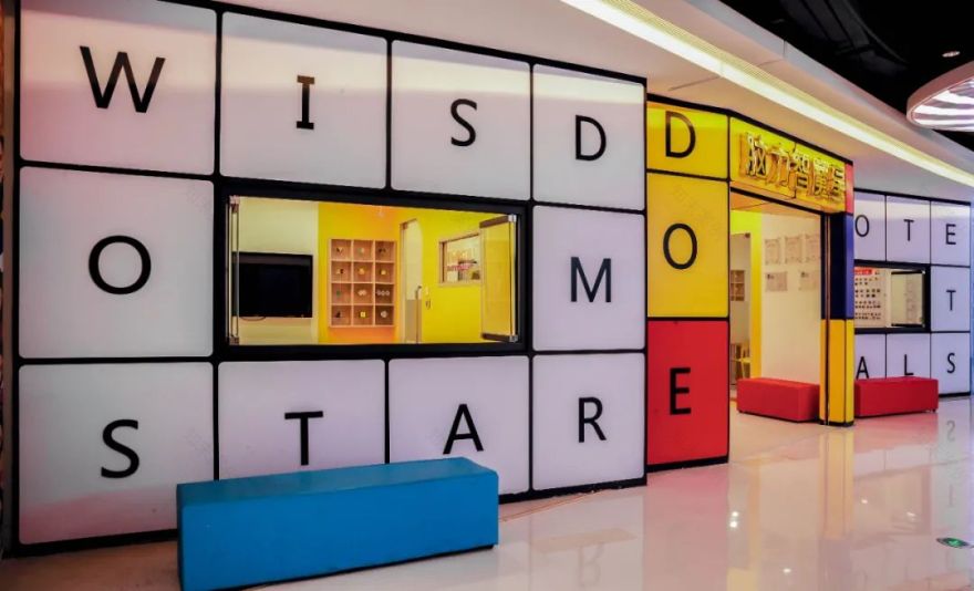
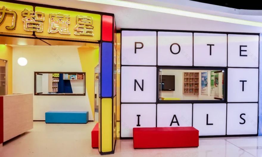
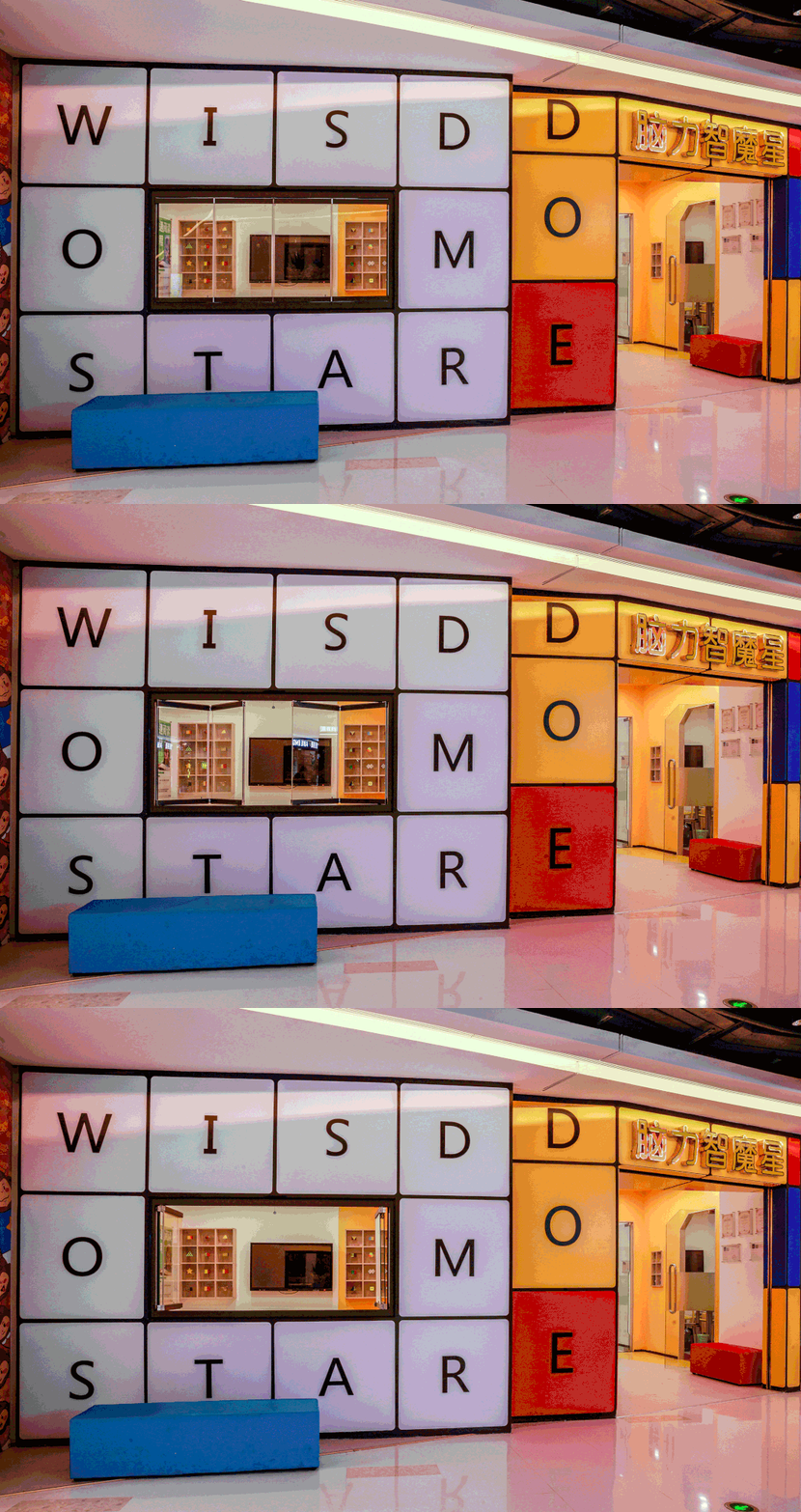
该项目的设计灵感来自“魔方”,整体上像是由三个立体魔方错开组合而成,力求打造一个立体感极强的空间,从外部到内部,功能形态都体现魔方的趣味性,仿佛走入了一个魔方世界。将全脑三组英文“WISDOMSTART”、“ DISCOVER ”、“POTENTIAL”置入三个立体盒子外围表面,形成一个概念极强的键盘+魔方组合,塑造超级IP门头视觉效果。
The design inspiration of this project comes from "Rubik's Cube". On the whole, it seems to be composed of three three-dimensional Rubik's cubes, striving to create a space with strong three-dimensional sense. From the outside to the inside, the functional form reflects the interest of Rubik's cube, as if walking into a Rubik's cube world. Put three groups of English words "wisdomstart", "discover" and "potential" into the peripheral surface of three three-dimensional boxes to form a combination of keyboard and magic cube with strong concept and create the visual effect of super IP door.
项目现场施工
▼
门头施工现场
▼
分析图
▼
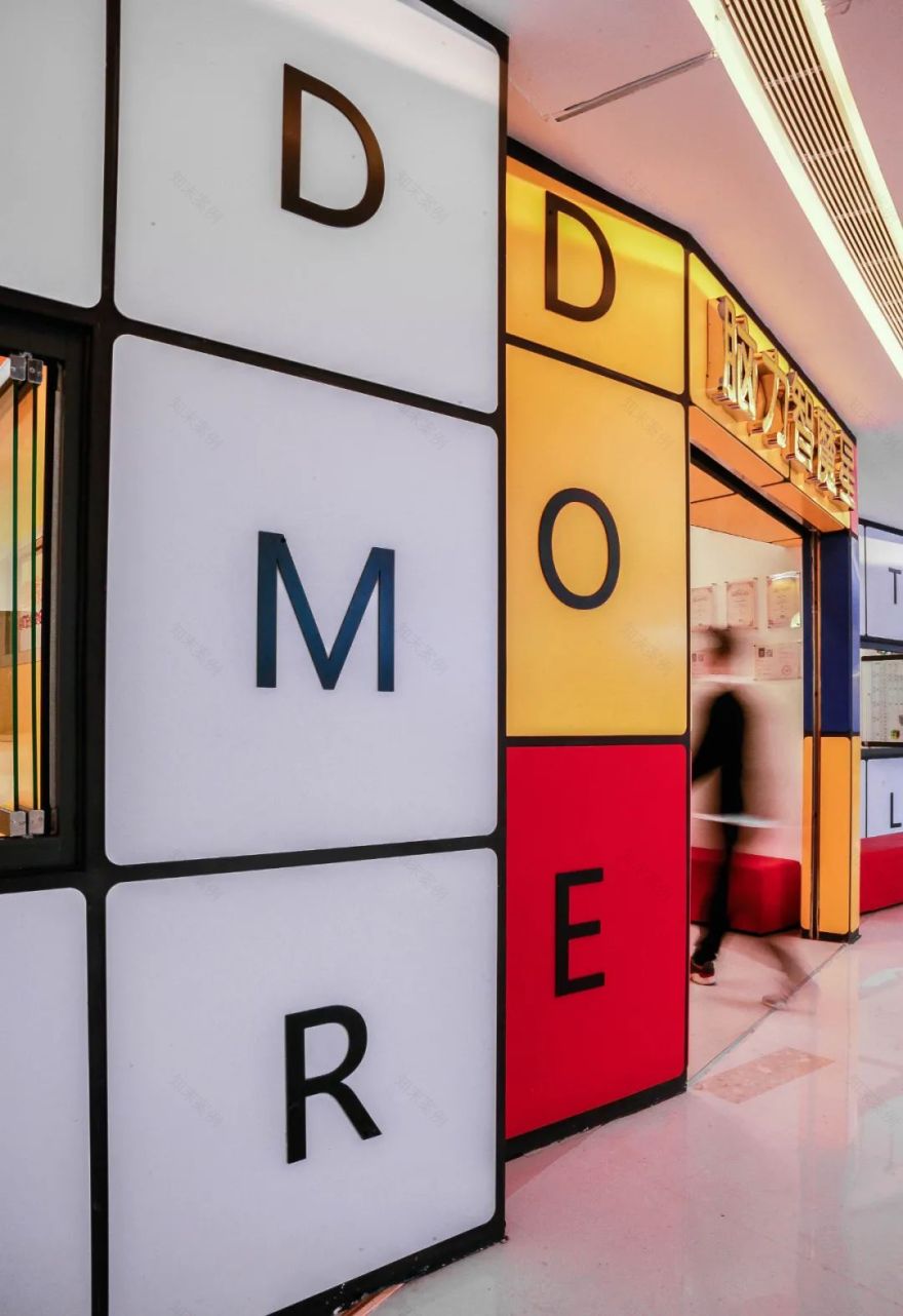
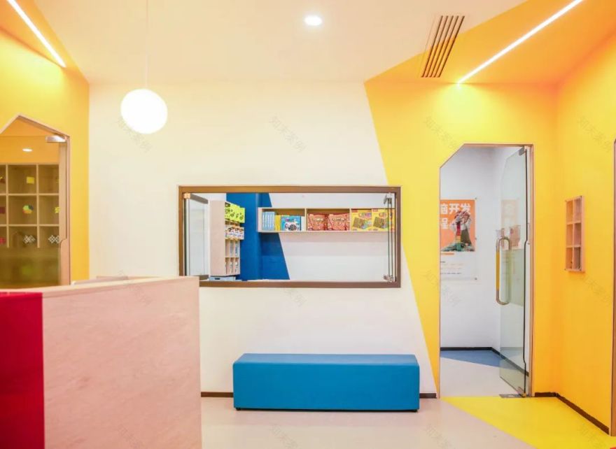
通过对魔方的颜色和形体结合,以红、黄、蓝为主题色,把脑力智魔星的LOGO及倡导理念植入门头的方块之上,同时也强化了品牌。
Through the combination of the color and shape of Rubik's cube, with red, yellow and blue as the theme color, the logo and advocacy concept of brain wisdom Rubik's star are implanted into the box of the door, and the brand is strengthened at the same time.
折叠窗
▼
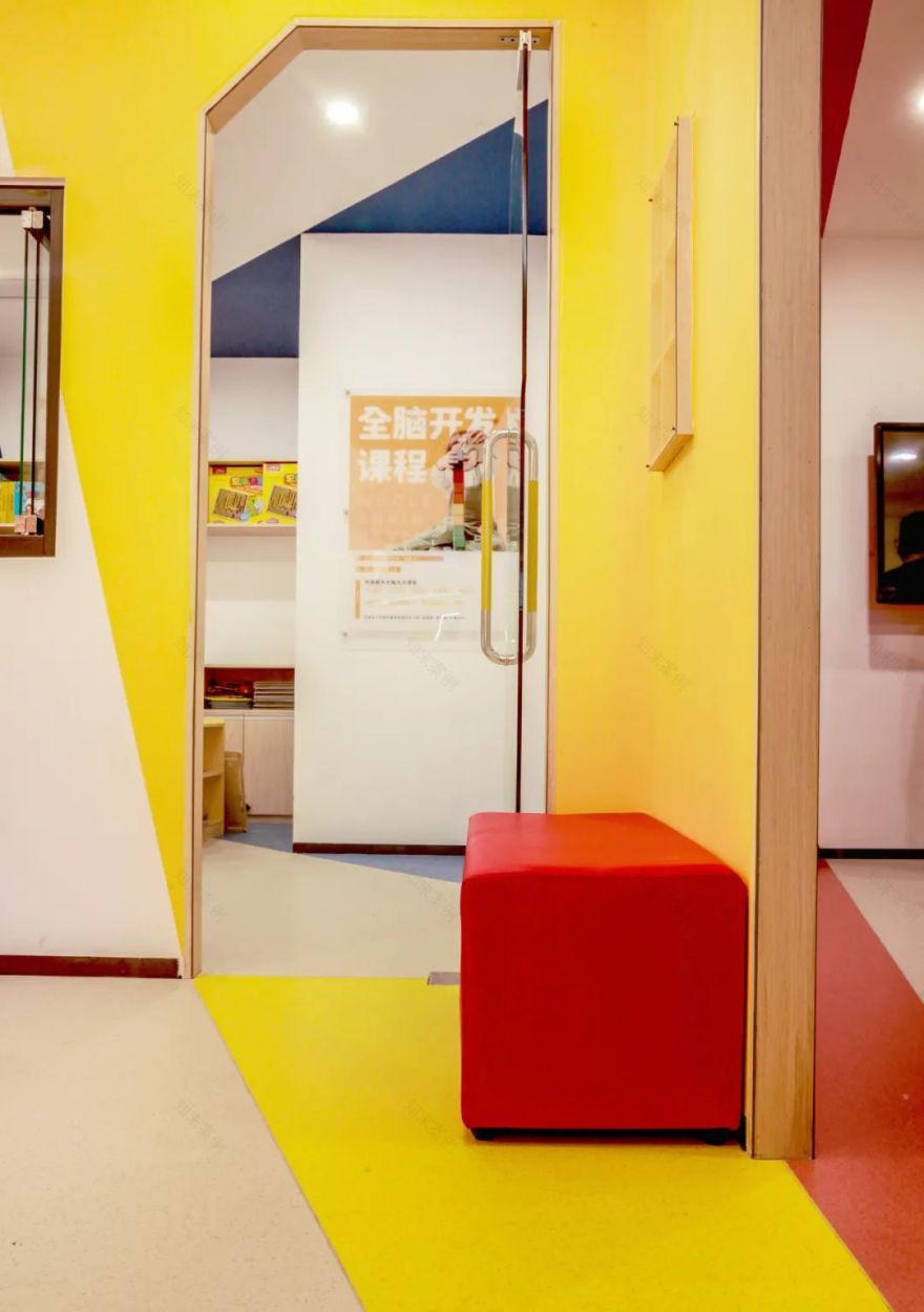
进入接待厅,我们希望构建一个视觉体验,运用跳跃性的颜色切割,使视觉上像是一个倾斜的盒子。前台在色彩上选用红色木色结合碰撞较为明快的色调,放置一个较大的魔方装置凸显品牌特点,靠墙设置了条形沙发提供家长等候休息,墙上的魔方展示柜直接嵌入墙体,链接着接待厅和课室。
Entering the reception hall, we hope to build a visual experience, using jumping color cutting to make it visually like an inclined box. On the front desk, red wood color is used in combination with relatively bright colors. A large Rubik's cube device is placed to highlight the brand characteristics. A bar sofa is set up against the wall to provide parents with waiting and rest. The Rubik's cube display cabinet on the wall is directly embedded into the wall, linking the reception hall and classroom.
安全拉手
▼
在色彩和材质运用上,整体空间设计简约但专注细节感,均采用圆弧形倒角最大程度避免了各类尖角所产生的安全隐患。空间内软装充分考虑儿童尺寸与日常课程需求。
In the use of color and material, the overall space design is simple but focused on the sense of detail, and arc chamfering is adopted to avoid the potential safety hazards caused by various sharp corners to the greatest extent. The soft decoration in the space fully considers children's size and daily curriculum needs.
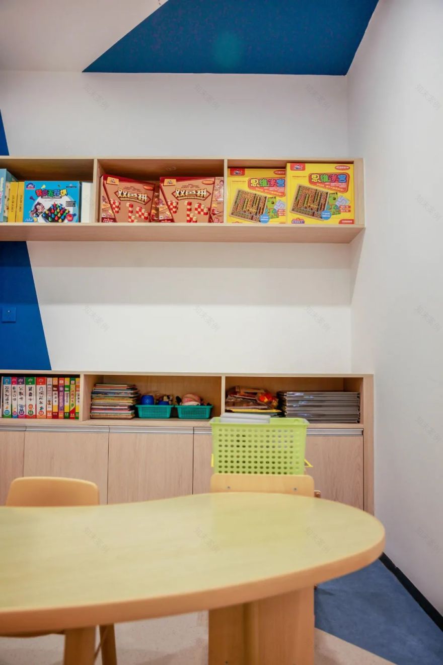
三个课室分别局部跳跃性的使用了红黄蓝三种颜色,灰色窗洞点缀,将各空间有机串联、紧密结合,保证室内统一性的同时,绚丽而不杂乱,丰富而有序。沿用简约手法,窗户采用折叠玻璃窗,墙体上设置了两排魔方展示柜以及教具储藏柜,桌椅则用和谐人性的尺度,且灵活多变,满足不同教学模式。
The three classrooms use red, yellow and blue colors respectively, and the gray window holes are embellished, which organically connect and closely combine the various spaces, ensuring the unity of the interior at the same time, gorgeous but not messy, rich and orderly. Using the simple method, the windows use the folding glass windows, the wall set up two rows of Rubik's cube display cabinet and teaching aid storage cabinet, the tables and chairs use the scale of harmonious human nature, and flexible, to meet the different teaching mode.
关于无非设计(深圳)
用广告思维重塑空间美学新高度
成立于2017年,设计师团队均毕业于中国著名八大美院。无非设计专注于高端商业空间设计及室内软装陈设,立足于本土设计的再创造,将现代创意思维融合东方文化,以独特的审美视觉和跨界颠覆的思维表达商业空间的独特性,帮助更多品牌获得全新的空间体验。其作品已获得国内外知名大奖,并成为中国顶尖设计机构之一。
Founded in 2017, the designer team has graduated from the famous eight National Academy of Fine Arts in China. W DESIGN focuses on high-end commercial space design and interior soft furnishings. Based on this The re creation of soil design integrates modern creative thinking with oriental culture. Expressing commercial space with unique aesthetic vision and transversive subversion thinking. Uniqueness helps more brands gain a new space experience. Its work has already been made It has won famous awards both at home and abroad and has become one of the top design institutes in China.
主创设计师
▼
曹博文
软装大师联主创设计师,
跨界设计师,
无非设计(深圳)主持设计师,
中国美术学院学士,
中国美术学院客座讲师,
中国建筑装饰学会CIID专委,
中国梦想改造家理事,
深圳新锐青年100佳设计师,
2020 红棉中国设计奖,
2020 WYD2020大中华区年度100青年设计师奖,
2020 中国芒果奖商业空间最佳创意奖,
2020 IDS国际设计先锋奖,
2020 IDG金创意国际大奖赛银奖,
2020 40UNDER40广东设计杰出青年奖,
2019 40UNDER40广东设计杰出青年奖,
2018 艾特国际设计传媒奖,
2018 APSDA亚太设计银奖,
2017 国际空间设计艾特奖,
客服
消息
收藏
下载
最近


