查看完整案例


收藏

下载
咖啡厅位于The Paul Sukhumvit 64号办公楼,设计师需要注意当地法规。由于规定,地板,墙体,玻璃门和窗户不能被替换和改动,只可以在原有基础上增添新的饰面板。
▼建筑概览,Overview of the building ©Chalermwat Wongchompoo (Sofography)
A café within a rental unit in an office building, The Paul Sukhumvit 64, has its rules and regulations from the building juristic. Due to the rules, floor, walls, glass door and window cannot be replaced or modified, yet it is only allowed for covering another finished material without demolishing an existing one.
▼建筑立面,Facade of the building ©Chalermwat Wongchompoo (Sofography)
▼由立面望向室内,Viewing the interior from the facade ©Chalermwat Wongchompoo (Sofography)
Double S Specialty咖啡厅专为生活在附近街区的居民所设计,这里有很多住宅与办公建筑。因此,它需要在不改动现有立面的基础上做出引人注目的设计。‘Double S’的命名来源于‘from SEED to SIP’,使人想起传统烘培坊,它们通常使用本材料彰显粗犷的特性。因此使用简约的材料塑造新的形象就成为了咖啡厅的设计概念,它能够吸引人气,改变顾客的感受并激发对咖啡的兴趣。
▼分析图,Diagram ©TOUCH Architect
Double S Specialty Coffee is offered for surrounded people who lives in neighborhood, which has a lot of residence and office building nearby. Therefore, it needs to catch the eyes from people without changing an existing façade. ‘Double S’ which name is initiated from ‘from SEED to SIP’, reminds to an old roasting house, which is mainly use local materials together with revealing its rustic character. This becomes a design concept of the café, that attracts people, changes customer’s feeling and arouses coffee appetite, by using simple materials to create a new pattern.
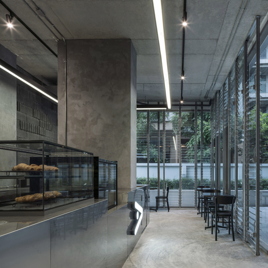
▼柜台空间概览,Overview the counter spaces ©Chalermwat Wongchompoo (Sofography)
▼座位区概览,Overview of the seating area ©Chalermwat Wongchompoo (Sofography)
裸露的无抹灰“混凝土砌块”整齐排开,另一种肌理的砌块随机嵌入其中,形成一大面有趣图案的背景墙。地板与天花保留原有“抛光混凝土”和“钢筋混凝土”不加修饰的质感。柜台则覆盖了“不锈钢”饰面板从而强调咖啡厅的属性。“可调节的玻璃百叶窗”是在前玻璃墙的复层上形成的,从而改变立面特征。它由旧烘培坊采用的横向木百叶窗转化而来,通过其透明特性,人群能够观赏到室内活动。
▼优美的用餐环境,Beautiful environment ©Chalermwat Wongchompoo (Sofography)
▼精妙的建筑元素,Subtle architectural elements ©Chalermwat Wongchompoo (Sofography)
Bare ‘concrete blocks’, without any plastered, are arrayed in simple arrangement, together with randomly inserting another edge of concrete block to generate an interesting pattern to a large back wall. Floor and ceiling are left over as it looks like before, which is ‘polished cement’ and ‘reinforced concrete’ without any finished material. Counter bar is cladded by ‘stainless steel’ plate which emphasizing coffee elements on the counter. An ‘adjustable glass louver’ is formed to duplicate layer of a front glass wall in order to change the façade feature. It has been transformed from a horizontal wooden louver wall in an old roasting house, while allows people seeing activities inside from its transparency.
▼砌块肌理,Block materials ©Chalermwat Wongchompoo (Sofography)
▼平面图,Plans ©TOUCH Architect
客服
消息
收藏
下载
最近


