查看完整案例


收藏

下载

翻译
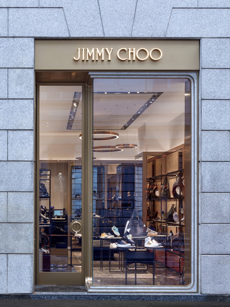
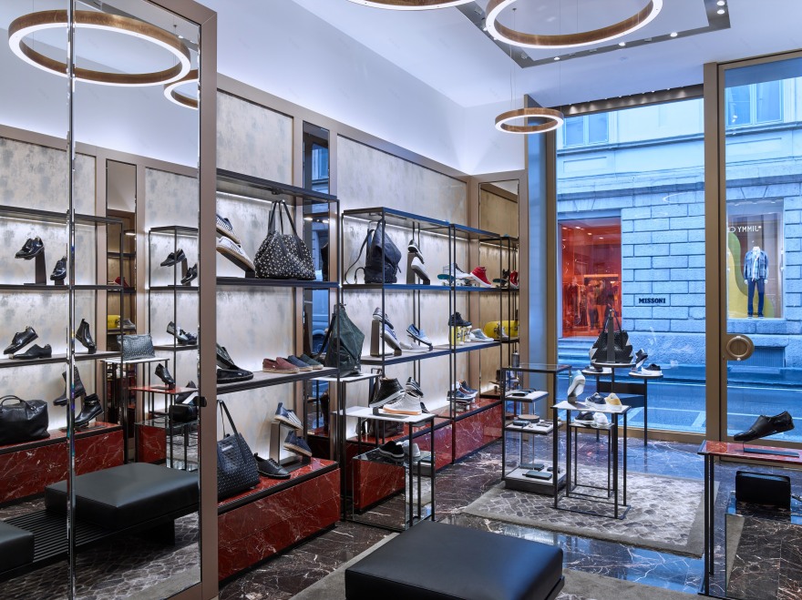
Located on Via Sant'Andrea, the Milan store is Jimmy Choo’s first in Europe to have a fully dedicated men’s boutique adjacent to the womens store. While in New York men and women’s lines are displayed within a single open floor plan, the Milan store maintains two discrete but connected spaces. To create a sense of openness, Christian Lahoude Studio expanded the windows on the entrance facade and created a shelving system that enabled the store to be fully transparent on one side. Taking inspiration from classic Italian designs from the 1940s, the studio used highly polished brass and contrasting materials to create two unique but complementary environments.
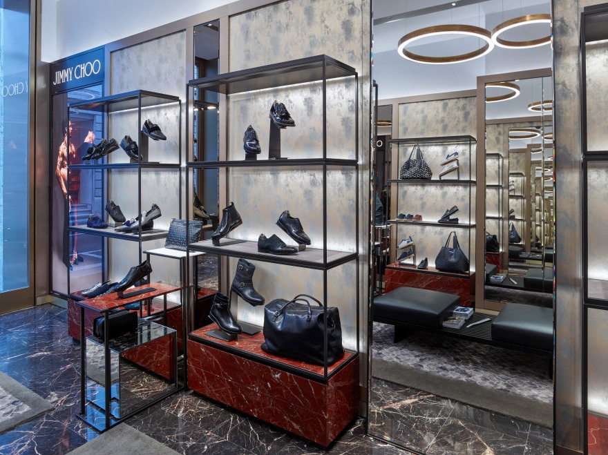
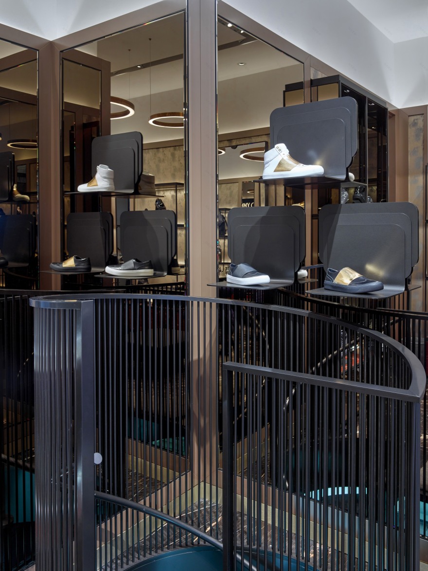
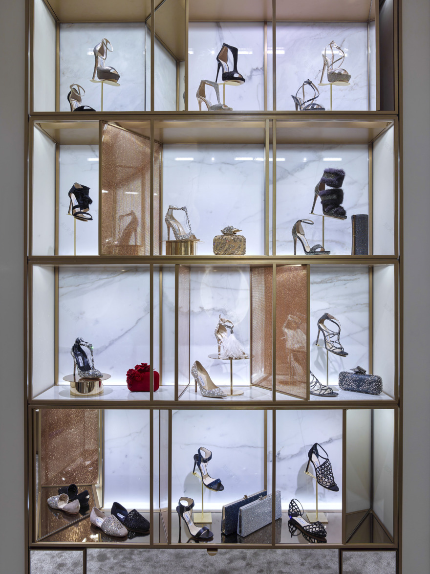
On the men’s side, red and black marble is combined with lacquer panels and uplit coves to take advantage of the ceiling heights and to create a slightly darker and more traditionally masculine presentation. The women’s side has an airier and lighter ambience, and features a new lighting concept, developed by the Studio especially for Milan. The chandeliers and sconces throughout are composed of golden-speckled, tulip-drop glass with brass backing to reflect the light. The creation of new geometric pedestals for product displays presents a playful sensibility, keeping products lower and readily available to visitors. Rather than feature objects set out of reach, Lahoude has designed displays and niches that encourage interaction with the product, recognizing that touch and feel of the product are as important as the feel of the space itself.
客服
消息
收藏
下载
最近


