查看完整案例


收藏

下载
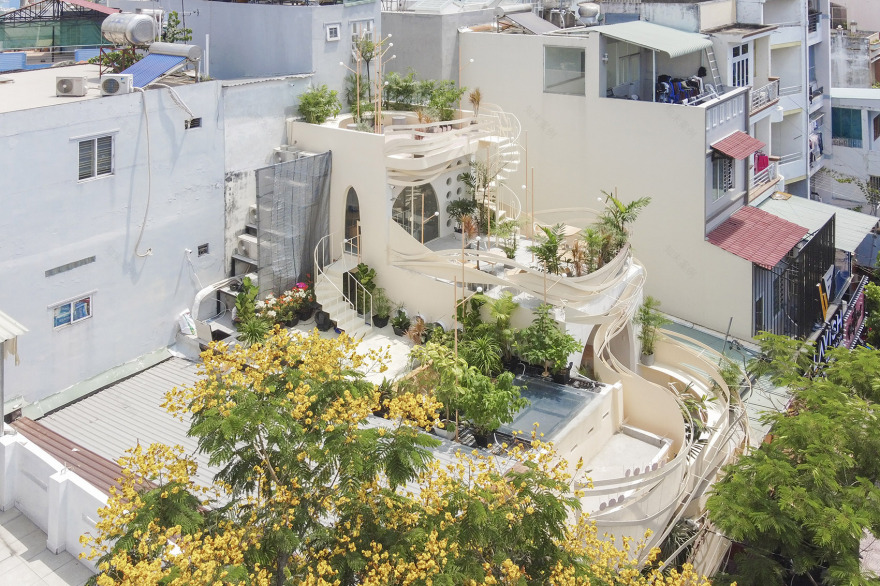
September是一个咖啡厅品牌,Red5在其开设第一家店铺的时候便参与了设计。在第二家店铺中,设计师讲述了“风与巢”的故事,延续了之前“秋天与落叶”的主题。
September is the cafe brand that Red5 has accompanied from the first coffee shop. At the next coffee shop, we bring the story of “The Wind and the Nest” to continue the story “Autumn and Fall Leaves” from the previous store.
▼项目鸟瞰,aerial view of the project ©Phú Đào
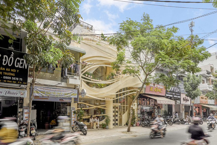
▼沿街外观,external view along the street ©Phú Đào
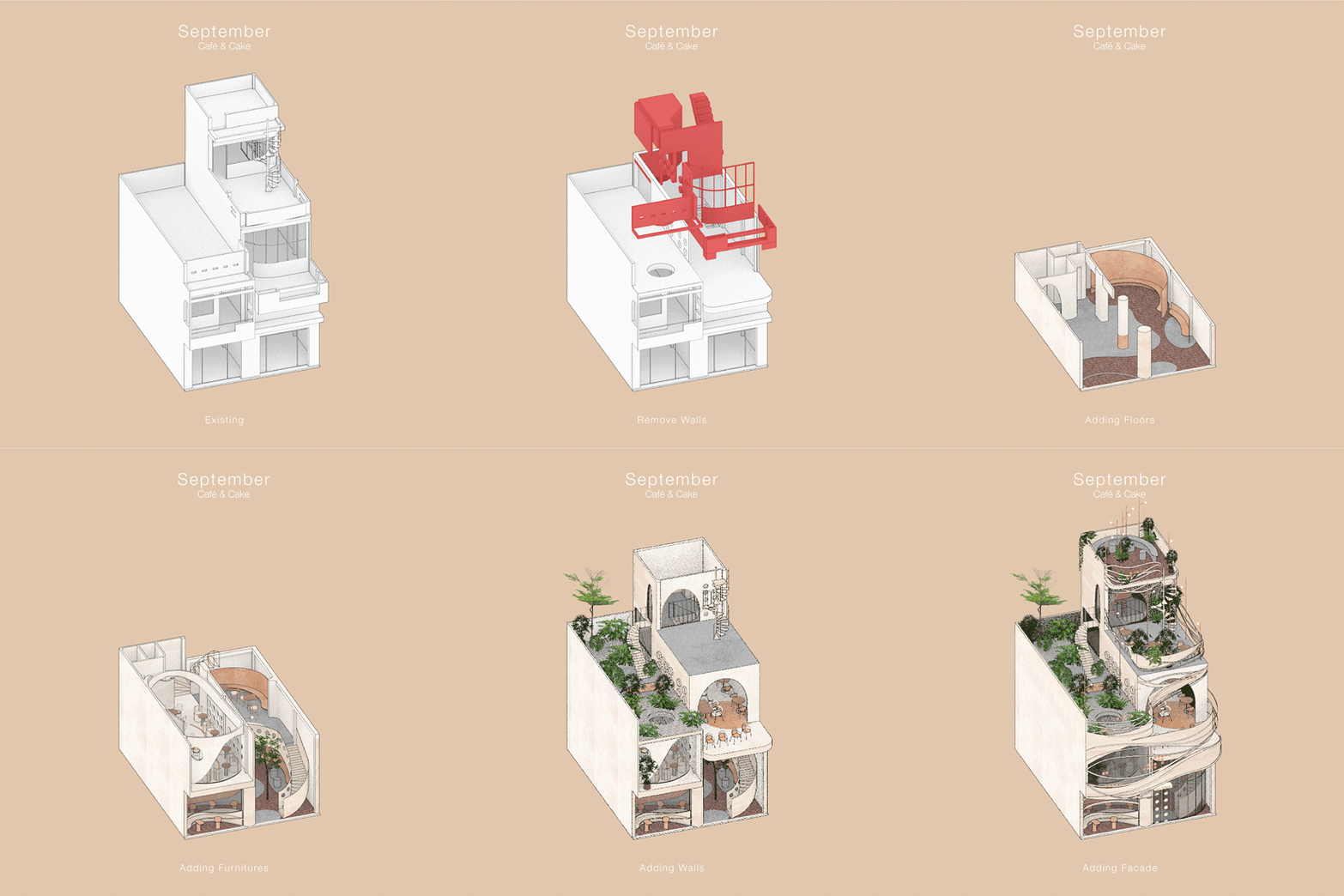
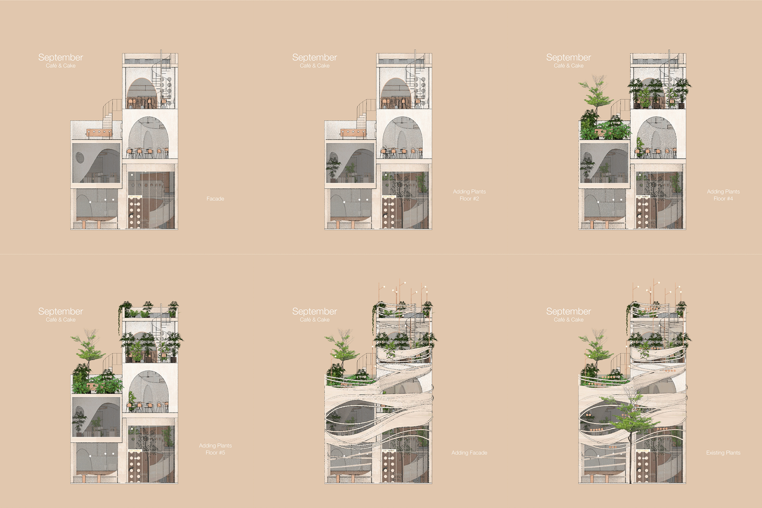
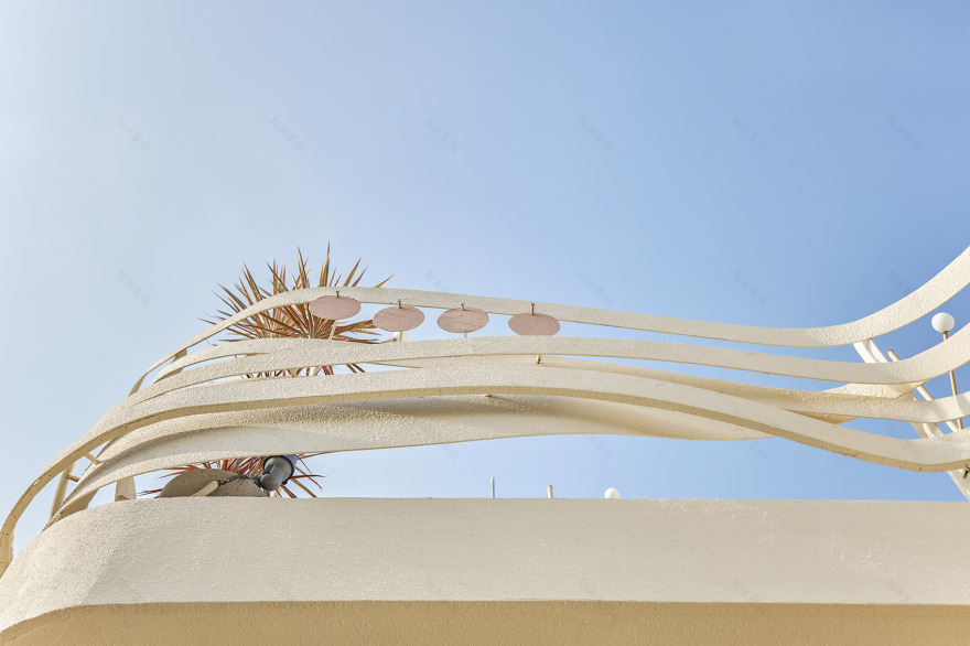
项目原本是两栋相邻的房屋,通过与楼板脱开的墙面连接。设计创造一个布满两栋房屋的、有许多凹陷和缝隙的鸟巢。利用建筑的高和宽,立面使用了许多环绕的钢制元素,在不同角度上重复了鸟巢的意境。悬挂在立面上的圆片会随风抖动,如同鸟儿落在枝头。
With the current status of two adjacent houses, off-floor dams connected, we want to create a nest with many nooks and crannies throughout the two houses. With the advantage of width and height, the facade repeats the bird’s nest’s image with a different perspective and uses many surrounding steel systems. The circles hanging in the facade will move as the wind blows like a symbolic image of birds on a branch.
▼设计过程,design process ©Red5studio
▼立面设计,facade design ©Red5studio
▼立面近景,closer view to the facade ©Phú Đào
▼与鸟巢相关的元素,elements with the concept of nest ©Phú Đào
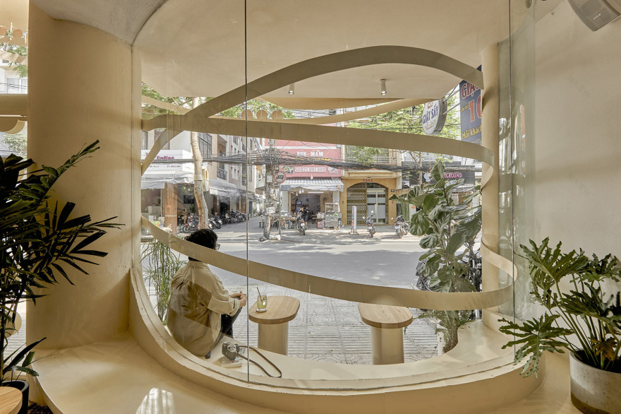
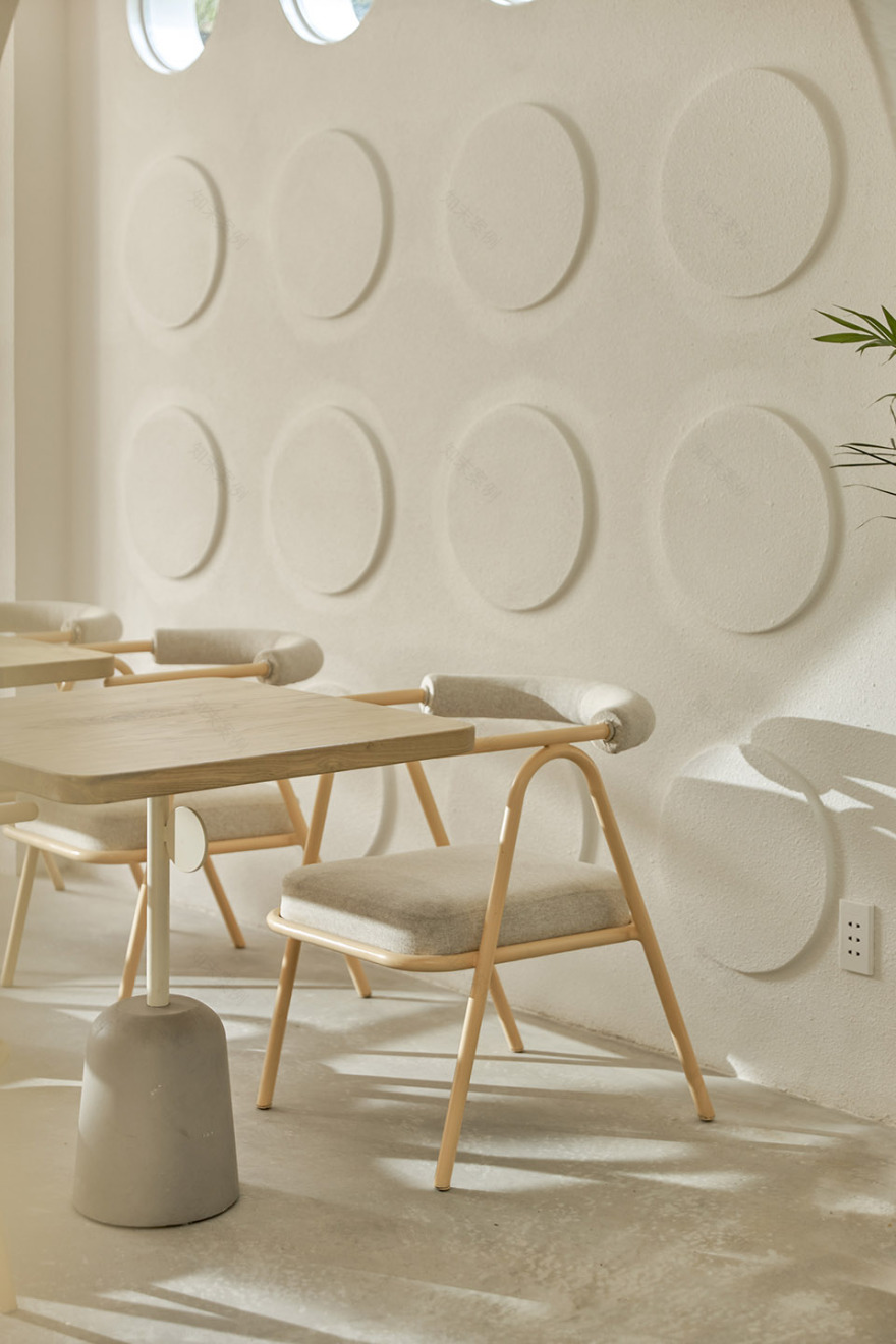
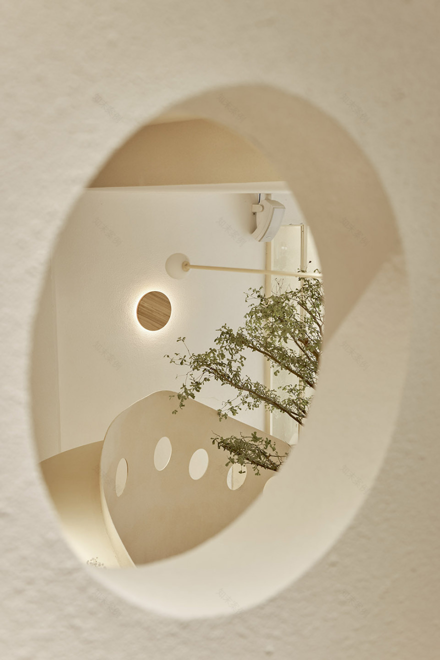
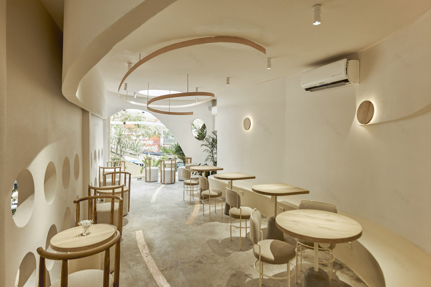
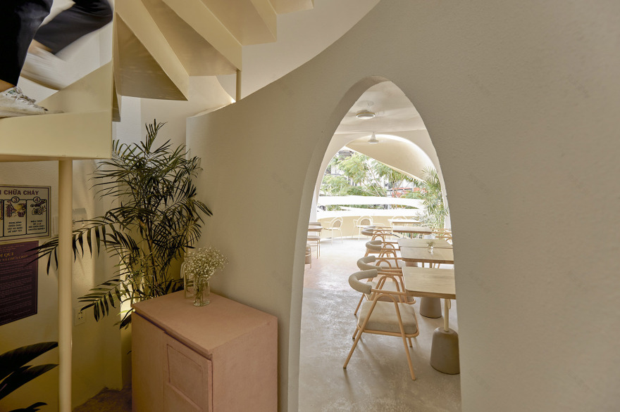
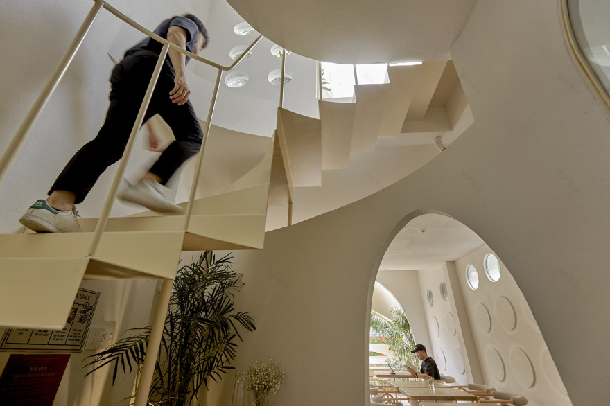
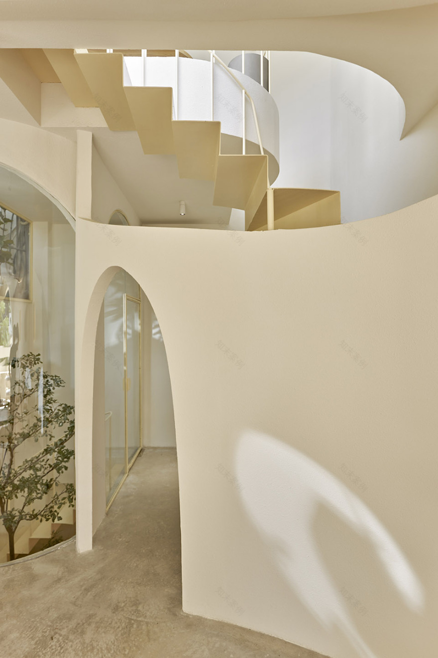
为了创造September那令人熟悉的特有感觉,设计师使用柔和中性的颜色,如白色、米黄色、玫瑰橙和天然木色等。此外,圆形和弧线元素被反复运用在入口的玻璃门洞、楼梯、墙面甚至家具细节中。风的意象主要由空间中的弧线表现,贯穿天花、墙面和地面,如同微风拂过各个角落,创造出了一种轻盈的感觉。
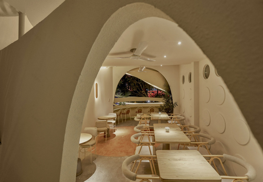
To create the familiar and characteristic feeling of September, we use gentle neutral tones such as white, beige, rose-orange, natural wood colors. Besides, the circular image and the curve reminded through the glass holes of the entrance, stairs, on the wall or even just the tiny details on the furniture. The wind’s image is led by curves in space, through the ceiling, walls, and floor, creating a light feeling like a breeze spreading into each corner.
▼入口,entrance ©Phú Đào
▼室外座位,outdoor seatings ©Phú Đào
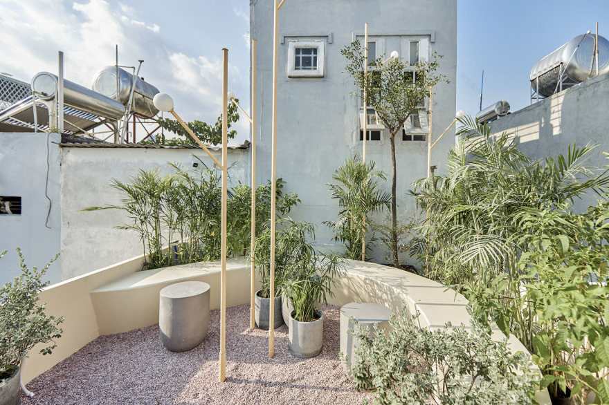
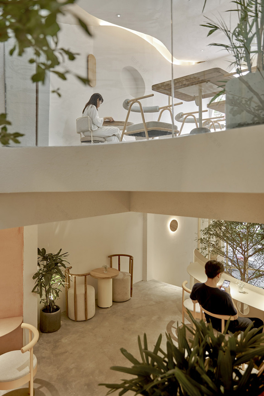
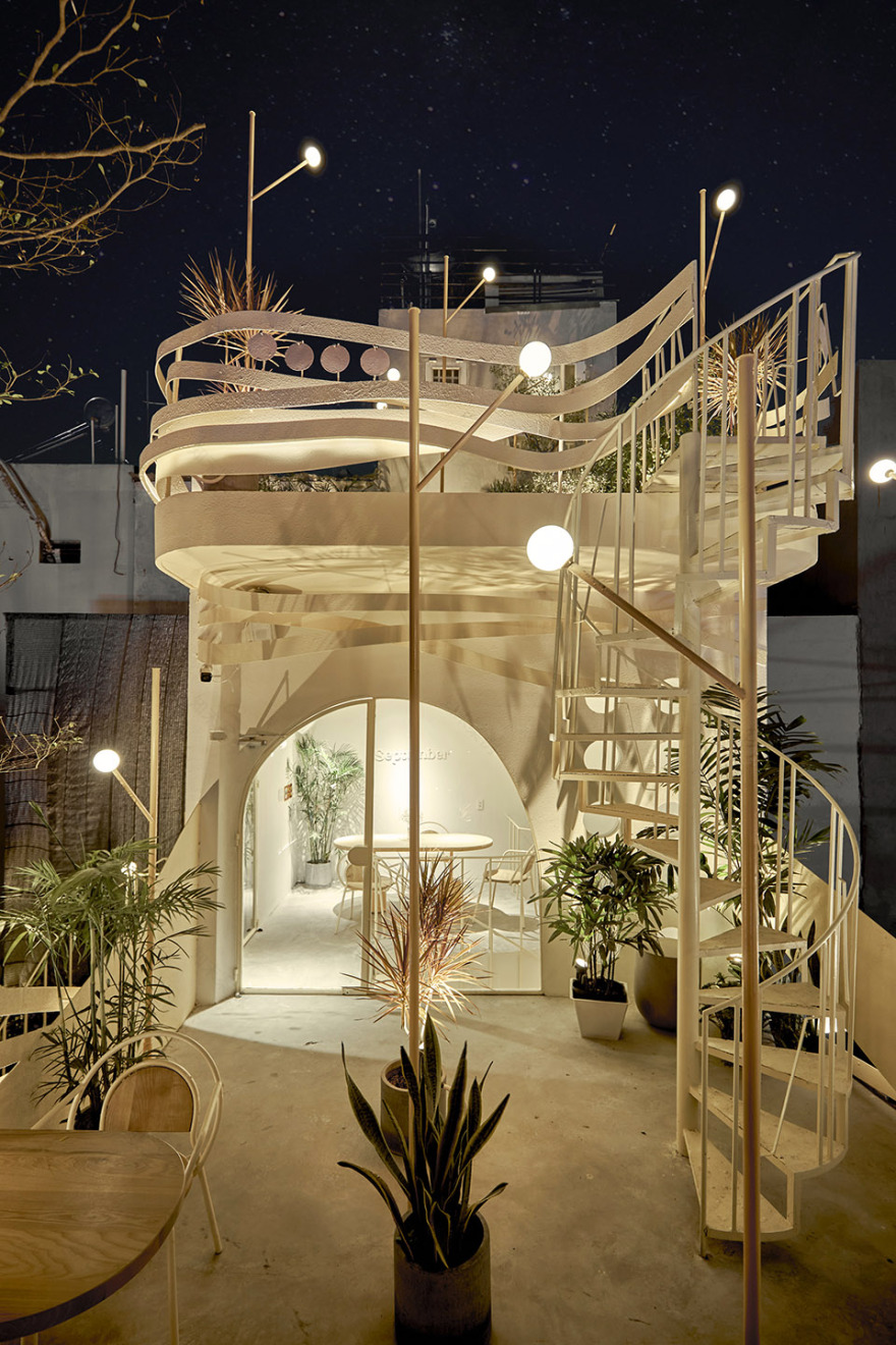
在空间的平面布局上,一层遵照将花园带入房屋的精神,创造了一种“虽在室内,犹如室外”的感觉,游客可以在这里稍作歇息,或围绕吧台观看咖啡制作。二层和三层空间主要接待会长时间停留的顾客或多人团体。屋顶好似一座空中花园,灯具如同支撑鸟巢的树枝。这里是空间的亮点,感兴趣的游客必然会来此打卡。吸烟区也设置于此。
Regarding the layout of the space, the ground floor with the spirit of bringing the garden into the house creates an “indoor but outdoor” feeling suitable for guests to sit fast or sit around the bar looking at mixing. The 2nd and 3rd-floor areas are for those who sit longer or go in groups. If the rooftop is an aerial garden, the lamp section is like a branch supporting the nest, and this is also the highlight of the space for those who love to check in and is the smoking area.
▼一层空间概览,overall view of the first floor space ©Phú Đào
▼一层座位区,seating space on the first floor ©Phú Đào
▼室内座椅延续到室外,interior seatings extending to the outside ©Phú Đào
▼楼层交错的室内空间,interior space with staggered floors ©Phú Đào
▼二层座椅区,seating space on the second floor ©Phú Đào
▼可以看向楼下的吧台,bar counter with view to the lower level ©Phú Đào
▼弧形的空间和家具,curved space and furniture ©Phú Đào
▼空间尽头设有弧形窗口,curved window at the end of the space ©Phú Đào
▼通向三层的楼梯,stair case connecting to the third floor ©Phú Đào
▼从楼上俯视一层空间,look down at the first floor space from the upper levels ©Phú Đào
▼三层就餐区,连接室外露台,seating space on the third floor connecting to the outdoor terrace ©Phú Đào
▼弧形墙面与开洞,curved wall and openings ©Phú Đào
▼三层室外露台,outdoor terrace on the third floor ©Phú Đào
▼通向屋顶露台的拱门,arched door connecting to the roof terrace ©Phú Đào
▼屋顶露台,roof terrace ©Phú Đào
▼从上层露台俯视下层露台,view to the lower terrace from the upper one ©Phú Đào
▼围绕空间的钢制构件细部,closer view to the steel system around the space ©Phú Đào
所有家具和空间均以鸟巢为灵感,充满弧线、树枝、停落枝头的鸟儿、或简单的圆点等元素,共同创造了一座城市中心的“鸟巢”。
The entire furniture and space had inspired by bird’s nests, curves, branches, birds on branches or simply a tiny dot circle, all creating a bird’s nest in the heart of the city.
▼空间和家具细部,details of the space and furniture ©Phú Đào
▼透过圆形开口的视线连接,visual connections through the circular openings ©Phú Đào
▼夜景,night view ©Phú Đào
Design & Build: Red5studio + Ben Decor Client: September Saigon Partner: Ben Decor, A Thông, Zero Furniture, Jati Tile, Nhật Phương Concept: Lại Chính Trực Design Team: Lại Chính Trực, Nguyễn Vịnh Nhi, Trần Thị Kim Duyên, Phạm Hoàng Duy Nhân Area: 260 m2 Location: 47-49 Vĩnh Hội, Quận 4, Tp. Hồ Chí Minh Photo: Phú Đào
客服
消息
收藏
下载
最近


