查看完整案例


收藏

下载

翻译
On the increasingly rare occasion one finds themselves shopping at an actual in-store location these days, rather than online, there’s no doubt that a beautiful space adds to the experience – maybe even subconsciously affecting your decision to purchase.
The below brands have nailed their retail offerings, with stores that are worth visiting purely to appreciate their design merit before even considering the product on sale. Bricks are heroed in a myriad of materials, shapes and sizes, forming everything from concrete counters to rammed earth walls and glass floors.
Our round-up includes a fair few Aesop stores, no surprise considering the brand makes a conscious effort to work with local architects that add a distinct flair to each individual outpost. The Gough Street store in Hong Kong by March Studios, for example, makes excellent use of Venetian glass Austral bricks by Brickworks, comprising the aforementioned floor.
More local awesomeness includes the Tigerlily flagship inside Westfield Sydney, a boho dream come true by Room On Fire featuring a material palette inspired by Aussie beach culture. Cream-coloured Bowral Bricks by Brickworks clad the façade, a bright and summery point of difference amongst the shopping centre surrounds.
Below are a total of 14 projects that elevate the humble brick to noteworthy heights, brought to you in partnership with our friends over at Brickworks.
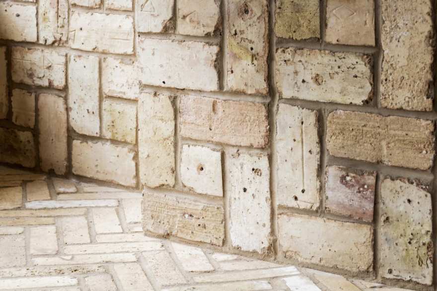
Aesop Brussels Store by Bernard Dubois // Brussels local Bernard Dubois took charge of the Belgian capital’s Aesop skincare store, cladding most of the interior with 2cm hand cut yellow briquettes. Brick is a cornerstone of Belgian architecture though Dubois sought after a less traditional take on the aesthetic, beginning by stacking the briquettes vertically rather than the conventional horizontal.
The same briquettes are laid in herringbone formation across the floor, a visually satisfying pattern clash against the vertically laid walls and counter. Dubois sees Brussels as a city without borders, with a global cultural influence. He demonstrates this outlook in the Aesop store, sourcing the briquettes locally from the region of Flanders, but assembling them with cement-less joints in the same vein as East Asian construction.
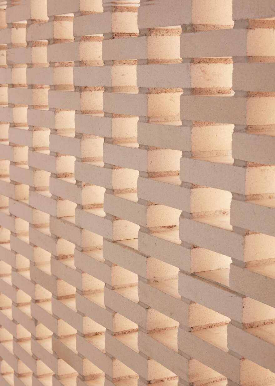
Aesop Park Slope by Frida Escobedo // Set amongst the mid-century brownstones synonymous with the charm of Brooklyn’s Park Slope is an Aesop store by Mexican architect Frida Escobedo. Hundreds of rosy rammed-earth bricks sourced from Oaxaca are stacked in opposing diagonal rows, creating gridded walls that jut out into the store and divide the space into open sections, determining the public-facing store layout.
The bricks were developed by Escobedo’s former student, Patricia Medivil, made by hand in a workshop in Mexico City. Natural pigment from Mexican earth gives the bricks their unique blushed hue, while their tessellating pattern reinterprets the local masonry of the brownstone homes that surround Aesop’s corner site. The original brick walls inside have been painted white, while the original stamped tin ceiling remains.
Read the full article about this project & see more images here.
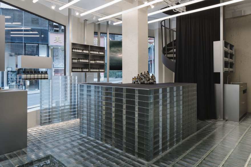
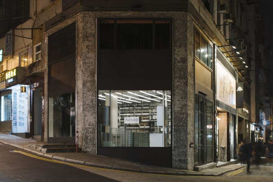
Aesop Gough Street Hong Kong Store by March Studios // In the weathered concrete shell of a former Bangkok printing press, Melbourne-based March Studios inserted a translucent glass and steel structure, embracing the site’s rough textures rather than concealing them. Venetian Glass Austral bricks propped on steel legs and machine feet form an illusive ground-scape hovering above a topography of bulky concrete artefacts, making customers feel as through they have stepped into a museum and elevating the regular retail experience. Seeing as this is March Studio’s 17th Aesop store, they seem to have it down to a fine art.
Glass brick steps, terraces and an untethered central counter rise from the floor, emulating the stacked density of Hong Kong’s skyscrapers. The bricks also clad an entire display wall, providing a non-invasive yet compelling backdrop for product placed on floating steel shelves. The reflective quality of the glass brick aids in brightening the formerly dark space, enhanced by the addition of large steel-framed windows. Shimmering in the light by day, the glass bricks draw passersby into the store, a subtle yet effective visual draw card.
A thick curtain shields an original spiral staircase leading to an upstairs treatment room, an additional element of intrigue and slow reveal. A tea corner provides a place for calm respite, much needed within the often over-stimulating city surrounds. The Gough Street Aesop store is Hong Kong’s first dedicated sole-use building whereby retail and events are allowed in the same space. The store also has a facility for customers to drop off used glass and plastic product bottles for recycling.
Aesop Bucktown in Chicago Store by Norman Kelly // Chicago’s grid plan inspired the duo behind Norman Kelly for Chicago’s first Aesop store, set in a 93sqm site on an upmarket street corner. Ubiquitous across the city’s alleyways, Norman Kelly chose to elevate the humble Chicago Common brick, reclaiming approximately 10,000 of them to clad the walls in a pinwheel formation, and the floors in a herringbone pattern.
Choosing to arrange the bricks in purely aesthetic, non-load-bearing bonds accentuates bespoke qualities of the common brick that were historically overlooked, celebrating their irregular colouration and dimensions. Embedded black steel alcoves and counters allow the product displayed to shine, without distracting from the materiality of the brick.
Tigerlily Sydney Flagship Store by Room On Fire // For Aussie swimwear and clothing brand Tigerlily, Room On Fire looked no further than Sydney’s coastal landscape and beaches for inspiration. A focus on local materials, texture and forms includes the use of Bowral bricks, their pale sandstone colour adding texture without detracting from the fresh, bright palette.
Located in Westfield Sydney, the bricks allow the store to standout amongst the artificially lit shopping centre surrounds. The bricks clad the outer façade, interspersed by full height glass panels framed with Australian Blackbutt timber. Sections of the outer brick facade are perforated; dappling the inner surface of the bricks with light and making them appear to glow, emulating sunlight. This perforated motif is repeated on internal walls, while another brick tone is introduced by way of a central counter clad with rosy-hued bricks.
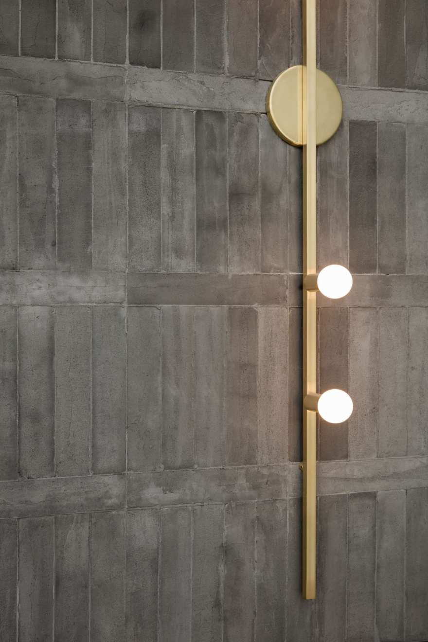
Room On Fire collaborated with local suppliers and artisans on unique elements throughout the store, including custom wall lights by ceramicist Natalie Rosin. Vintage Moroccan rugs and tiles, weathered brass and palm plants round out a bohemian aesthetic synonymous with Australia’s climate and beach culture.
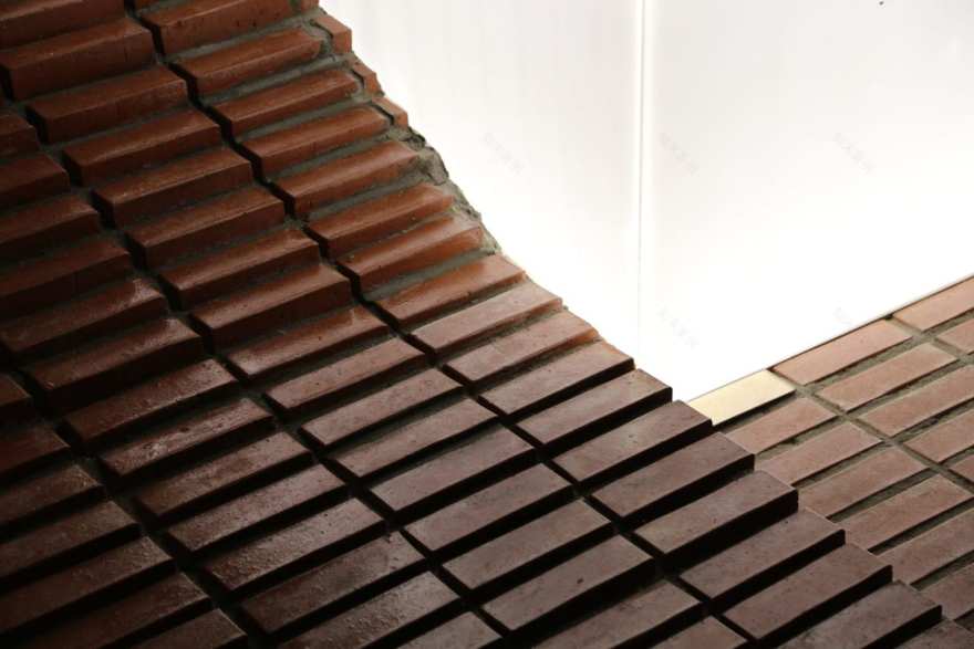
Coffee Nap Roasters 2nd in Seoul by Design Studio Maoom // A sloping brick hill replaces seating at Seoul’s Coffee Nap Roasters 2nd by Design Studio Maoom, in doing so transforming an otherwise functional feature into a scenic element. The hill is 1.5m tall, occupying 42sqm of the 50sqm space, with a real bamboo tree planted at its base enhancing connotations of being outdoors – the tree is even positioned by the door so that the leaves sway in the ‘breeze’ created by its opening and closing.
In total around 7000 red bricks move continuously from the floor upwards, stacked with 10 – 15mm gaps to create the most seamless ascending shape possible. Beside the slope, brick stairs lead to the top of the hill for those not inclined to climb. The sun shines through floor to ceiling windows, with a round mirror reflecting changes in light aligned with the time of day. When it gets dark, the coffee bar is illuminated as a glowing beacon within the space.
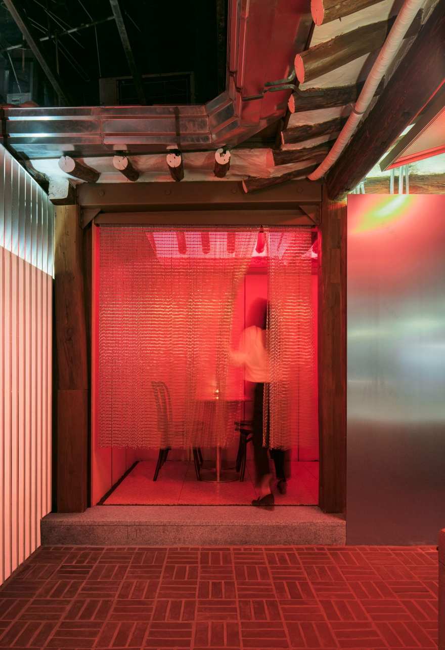
Caligari Brewing in Seoul by Labotory // Caligari Brewing is a boutique beer brand popular across South Korea, which takes its name from the 1920 German silent horror film ‘The Cabinet of Dr. Caligari’. In keeping, the brand image is a little dark and moody, in contrast to the traditional Korean architecture of Ikseon-dong where the 92sqm site is located, an alley popular with tourists.
Labotory married the two, combining motifs that speak to the brand’s identity with local sensibility. The designers kept oriental formations intact and added contrasting contemporary finishes and materials. The sloped roof features exposed beams of traditional lauan timber, below which stainless steel panels and concrete walls create lively contrast. Red LED strips and neon signs create a sensuous atmosphere come nightfall, when Caligari Brewing transforms from a lunch spot to a bar. A brick floor paved in a square grid formation underpins the eclectic design, making diners feel as though the bar is a part of the alleyway and serving as a consistent reminder of the local vernacular.
Read the full article about this project & see more images here.
Hermes Takes Over MVRDV Crystal Houses in Amsterdam // Originally home to Amsterdam’s Chanel flagship, Hermes has now moved into the Crystal House designed by MVRDV. The entirely transparent façade comprises specially engineered glass bricks bound with high-strength transparent glue, glass window frames and glass architraves.
In charge of all Hermes retail design across the globe, Paris-based design studio RDAI tweaked MVRDV’s design. Removing a blank interior wall on the upper half of the façade more clearly enhances the glass elements, allowing light to reflect through. At the upper level, glass bricks give the illusion of dissolving into the terracotta bricks that clad the rest of the building.
Forty Five Ten in New York by Snarkitecture // A Snarkitecture-designed boutique in New York’s Hudson Yards shopping precinct, Forty Five Ten merges fashion and art. Founded 19 years ago in Dallas, the 1486sqm space is the brand’s first New York outpost. Snarkitecture chose glass bricks for the exterior façade spanning across four store fronts, interspersed with jagged stretches of clear glass that allows views of the window displays. As well as being an ironic play on New York’s intrinsic ‘exposed brick’ aesthetic, the glass bricks blur the store interior beyond, adding a level of intrigue and mystique.
In-store, a grid layout breaks the boutique into various sections with distinct materiality, including arched nooks, bold black terrazzo tiles and full height pastel blue curtains. Art and sculpture from artists including Jose Dávila, Lars Fisk and Al Freeman are dotted amongst the fashion collections.
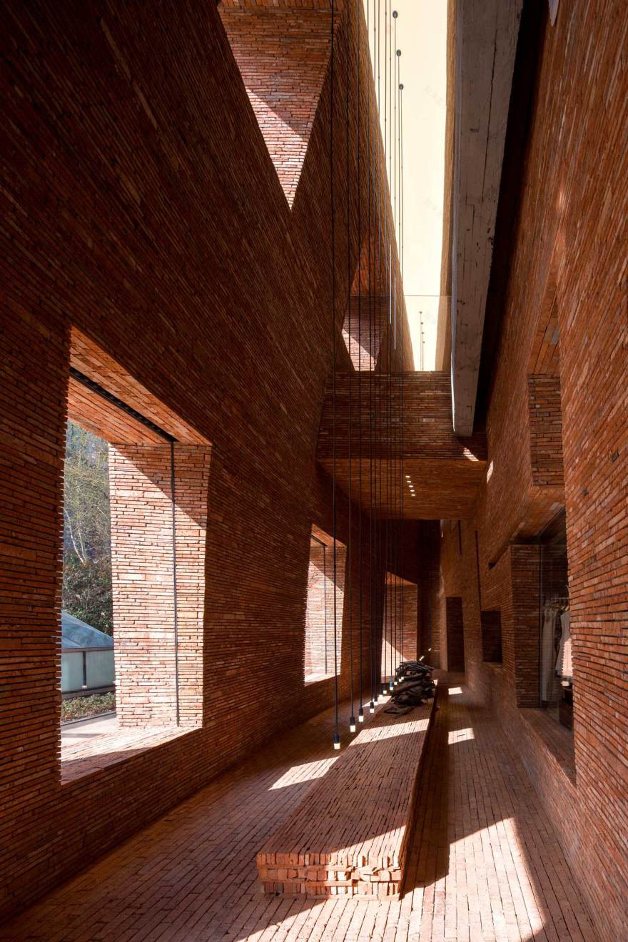
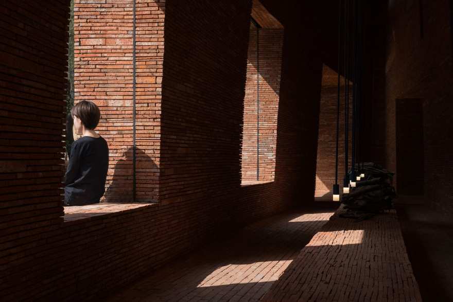
Urban Revivo Flagship Store in Shanghai, China by Domani // This flagship store for Chinese fashion brand Urban Revivo by Guangzhou-based design studio DOMANI is set within an existing 1980s building, which the city didn’t allow to have any external modifications. In order to create a commercially successful, captivating retail experience, DOMANI decided to insert a space between the building’s façade and the store’s new entrance. They pushed back the entry point by 3 metres from the original façade, creating a two-storey brick “Canyon”.
The canyon creates a new landmark from an ordinary site while making a comment on the possibilities that lie in the refurbishments of previously unremarkable buildings. DOMANI searched for discarded material to use within the canyon, settling for a red clay brick that’s between 60-80-years old, and extensively used in Chinese construction. They modernised the material by building a distinctive three-dimensional experience bathed in natural light – from 11:00 am in the morning to 4:00-6:00 pm in the afternoon sunlight passes through the space, creating a dynamic experience.
Read the full article about this project & see more images here.
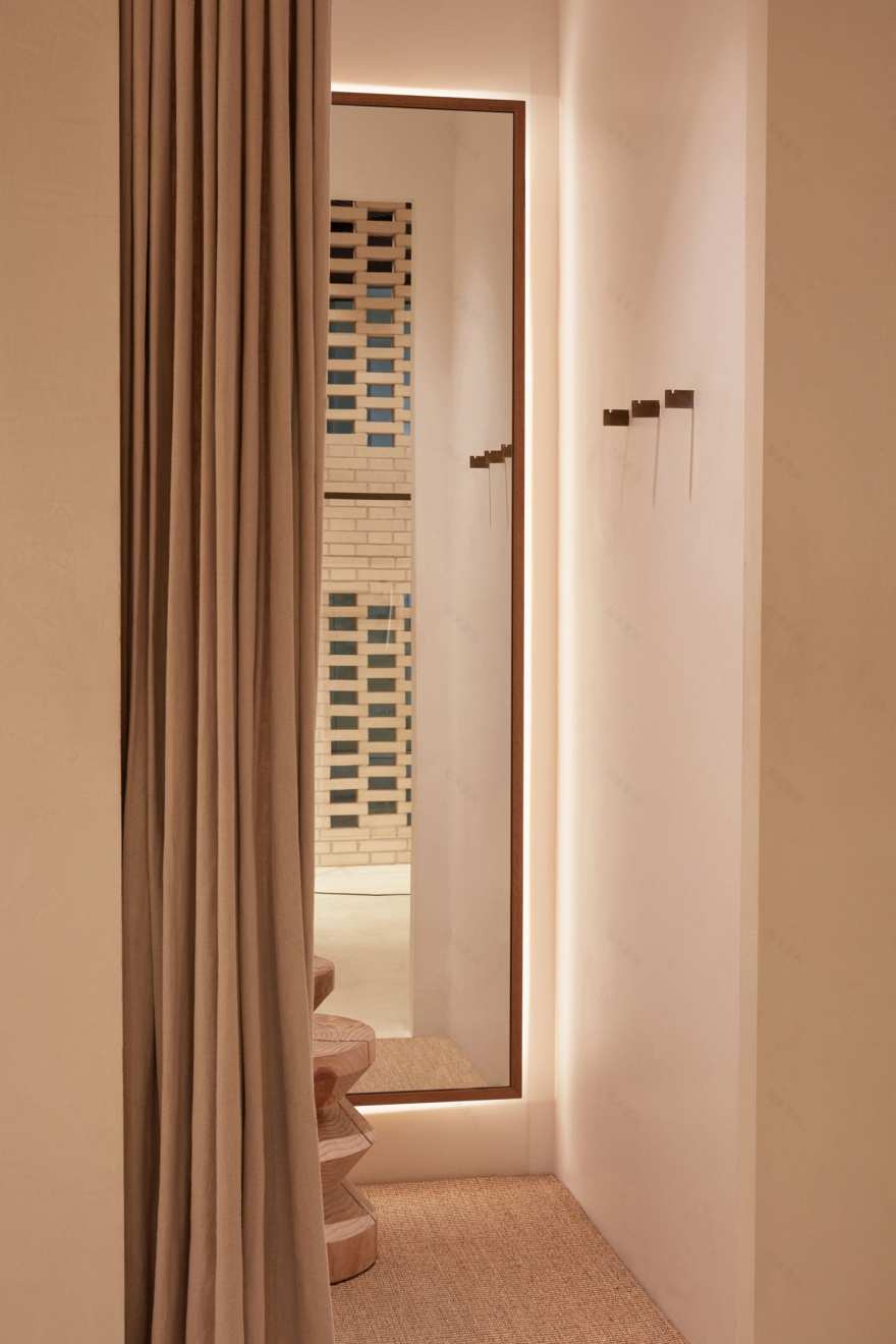
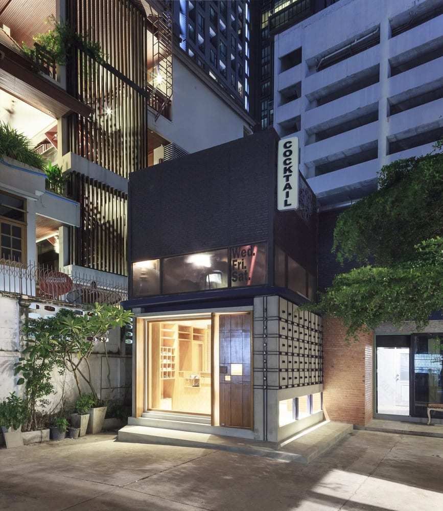
Keaton Tailor in Bangkok, Thailand by PHTAA Living Design // Set in a bustling area of downtown Bangkok, Keaton Tailor by PHTAA Living Design is a modern interpretation of a vintage tailor shop. Using G.H Oelsner’s ‘A Handbook of Weaves’ for creative reference, PHTAA designed facades around the concept of fabric weaving, using two distinct patterns on the interior and exterior of a concrete facade to represent how weaved fabric appears differently on opposing sides. The outer wall features a metal grid of straight, uninterrupted lines, with small squares that puncture through to the interior wall forming a pattern.
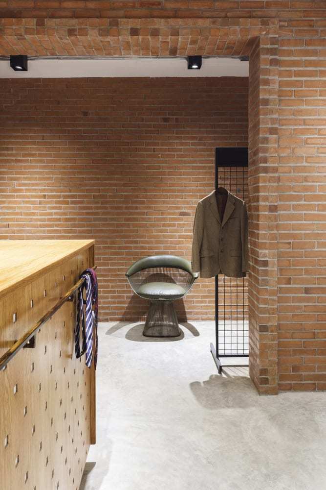
Continuing this concept, PHTAA chose two iterations of brick for the interior and exterior facades. A sheer expanse of black brick clads the outer upper level, making the store stand out amongst the white buildings surrounding it. Inside, natural red brick clads the back wall and architrave, forming a partition between the store and changing rooms.
RYU Japanese Restaurant in Montreal, Canada by Ménard Dworkind // MRDK employed a contemporary design approach underpinned with a Japanese sensibility for Ryu Japanese restaurant in Montreal. The duo prioritised hand-worked natural materials that would patina with age, their beauty only enhancing through their imperfections.
The hero of the interior is the heavy and robust sushi bar made from concrete brick supports, surrounded by cantilevered timber swivel chairs. Hanging gardens suspended above the bar outline two large skylights, and add an element of soft plant life that filters the light inside the space.
Read the full article about this project & see more images here.
Warehouse Gym D3 Dubai by VSHD Design // VSHD Design was challenged with creating a gym that is at once inviting, functional, and creatively inspiring within the context of its surrounds. Inspired by Brutalist architecture and underground fight clubs, the studio was determined to stay away from materials predictably found in health clubs. They combined contemporary mediums such as gold-copper alloy with locally cured concrete bricks to evoke elegance and warmth with a muscular edge.
Read the full article about this project & see more images here.
Pottery & Coloured Glaze Workshop in Boshan, China by Co-Direction Design // Boshan is one of China‘s porcelain capitals, with ceramic craftsmanship in the district dating back over a thousand years. The idyllic surrounds of Yuwang Mountain are home to an ‘elder care town’, which is the site of Co-Direction Design’s Pottery and Coloured Glaze Workshop. Co-Direction relied heavily on natural materials to create a calming, restrained atmosphere. Timber, stone, copper and brick were widely utilised, in harmony with age-old cultural symbols of ceramics incorporated into the interior.
The vast, double-height ceiling is covered in curved timber veneer slats, from which strategically placed light bulbs illuminate glazed brick walls below. Both earth-toned and luminous, grey bricks contrast to form a pattern that traces the perimeter of the foyer.
Read the full article about this project & see more images here.
This Yellowtrace Promotion is proudly created in partnership with Brickworks. All related thoughts and ideas reflect our genuine opinion. Like everything we do at Yellowtrace, our sponsored content is carefully curated to maintain utmost relevance to our readers.
客服
消息
收藏
下载
最近


