查看完整案例


收藏

下载

附件

翻译
After winning the competition in 2013, Ico Migliore, Mara Servetto and Italo Lupi have designed the permanent exhibition of the historic Compasso d’Oro Award Collection at the ADI DESIGN MUSEUM, in addition to the logo design and brand identity. The Compasso d’oro Award, established in 1954 on the basis of an idea by Gio Ponti, aims to enhance the quality of products made in Italy and recognize the fundamental contribution of design to the production industry and society as a whole.
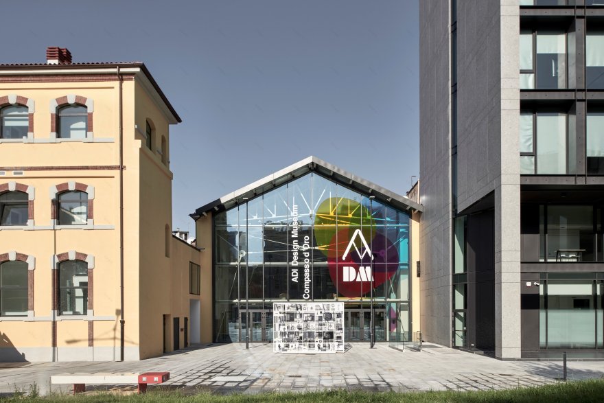
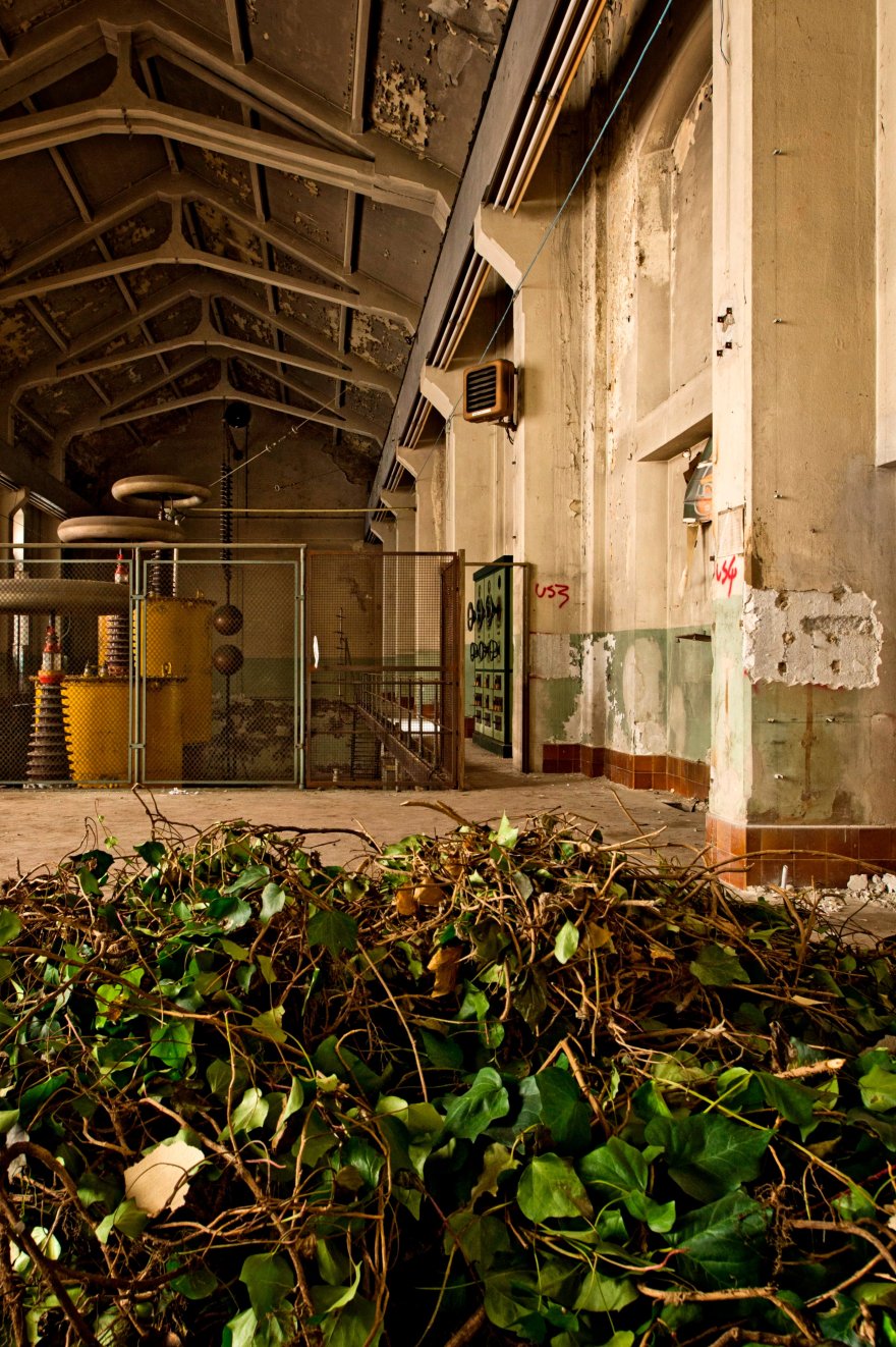
The new Adi Design Museum occupies the large space once site of the Enel Electrical Plant in Porta Volta. Located halfway between the cultural urban space of the Fabbrica del Vapore and the Gian Giacomo Feltrinelli Foundation designed by Herzog and De Meuron, the museum covers an area home to great urban quality and the development of the city’s new true cultural hubs.
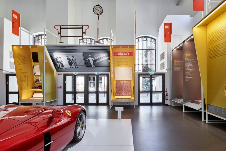
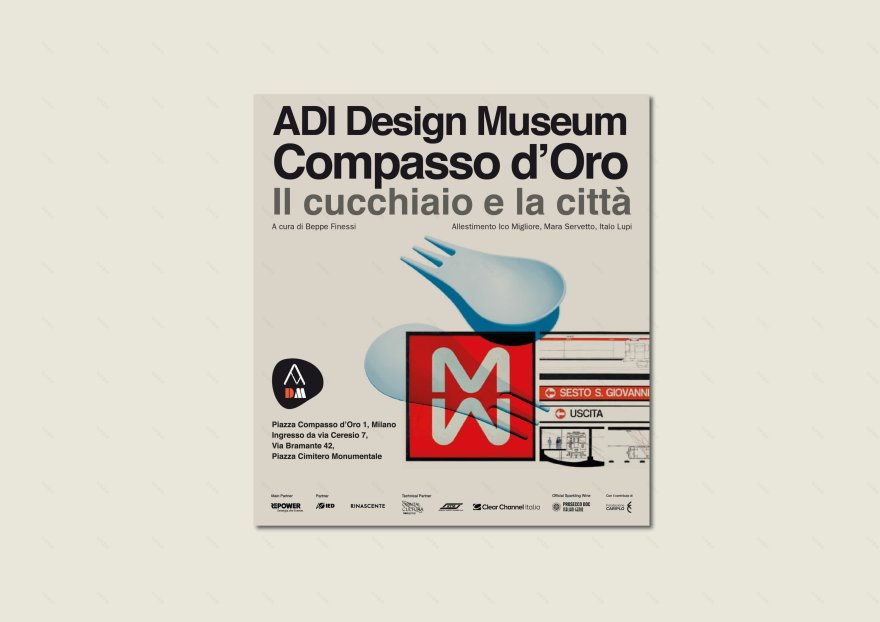
Within the ex-industrial area between via Ceresio and via Bramante, the permanent exhibition of the Compasso d’Oro Award Historic Collection, curated by Beppe Finessi and titled “The spoon and the city”, presents more than 2500 objects and apparatus. These are arranged across three different rooms and follow the chronological order of the awards, starting from 1954. It not only offers visitors a narration based on the design itself, but also on the historical and industrial insights expressed by the award-winning objects. The projects featured are accompanied by documents and historical contents arising from the philological reseach by the group led by Matteo Pirola.
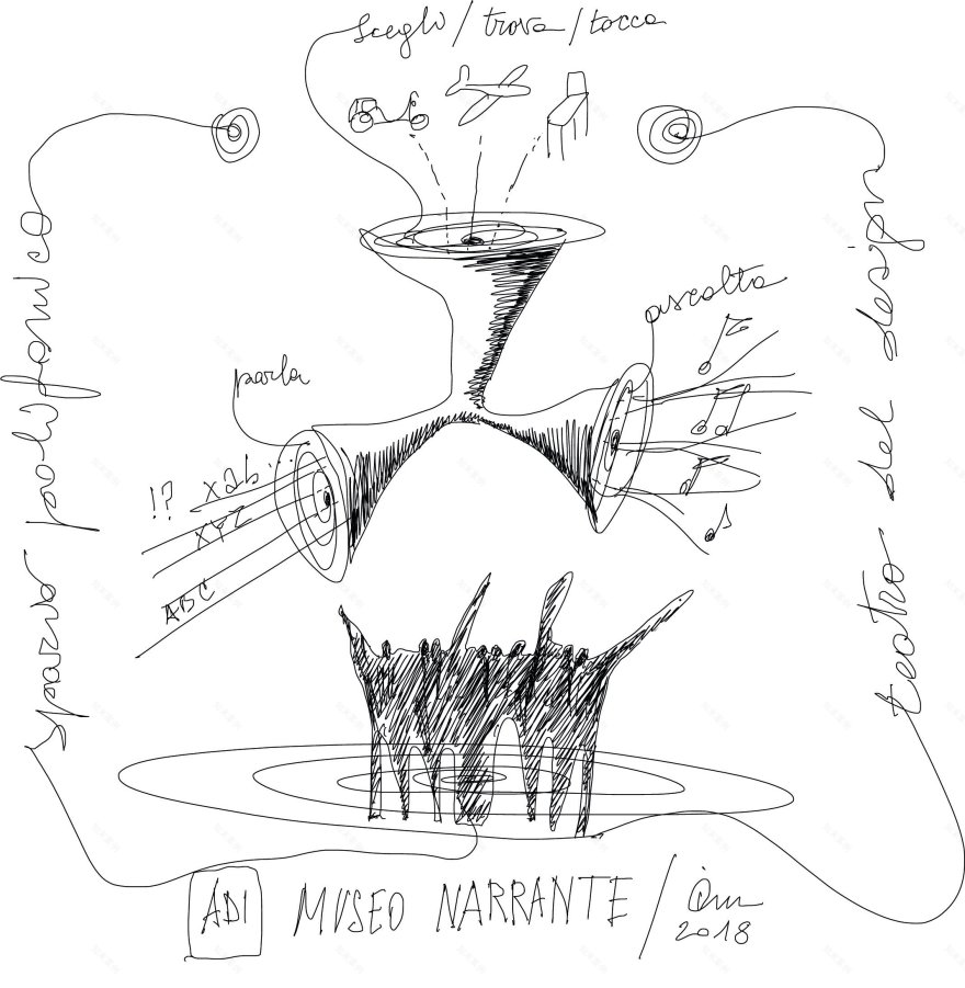
The exhibition design creates an open and permeable museum, which the visitor can enter freely, constructing a route at thair own pace. It is a flexible machine à montrer conceived so that it can grow and change according to the evolution of the permanent collection.
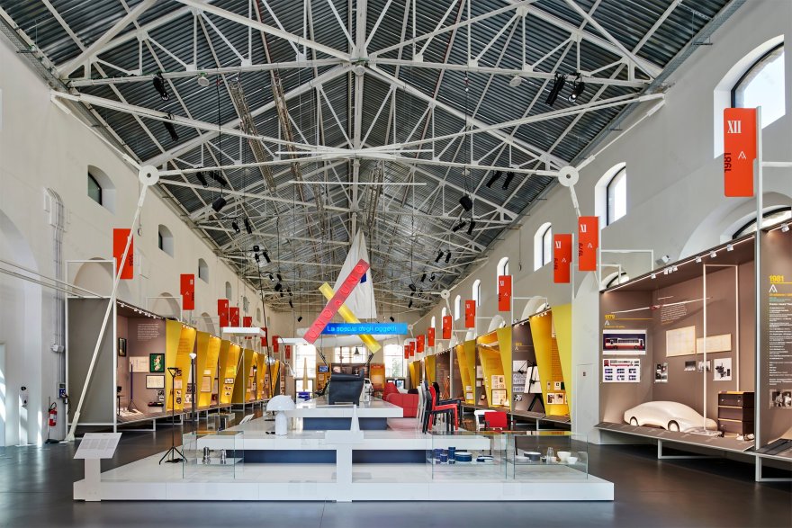
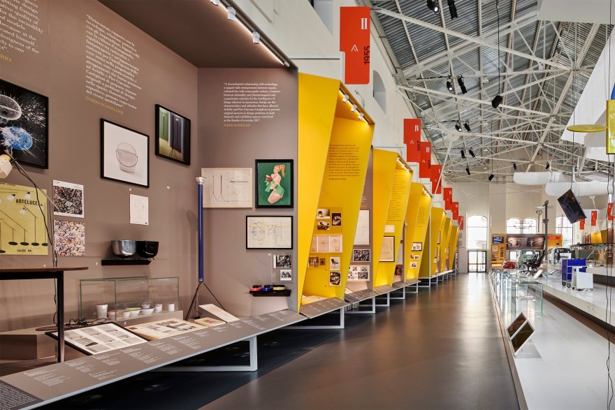
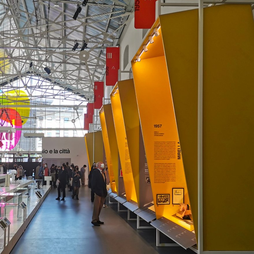
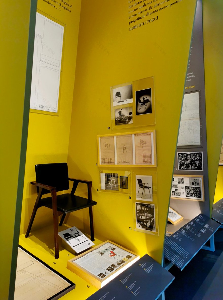
By fitting lightly within the existing structure, the set up “defines” a rhythmic, complex sequence of narrative scenarios that go beyond ordinary exhibition structures” state the designers Ico Migliore, Mara Servetto and Italo Lupi. This is “to make the museum a ‘narrative museum’, which is capable of being an inclusive place of personal and social enrichment in new ways”. Furthermore: “the exhibition was designed as an unbroken succession of large exhibition sets and distinguishes two levels of interpretation by means of colour: the scenarios marked in grey list all the awards historically, while the scenarios in sulphurous yellow feature in- depth information on an individual object from that year. In addition to the colours, the tilted misalignment of the yellow boxes emphasises the distinction between the additional information”.
Commissioned by the ADI Fundation, the new museum is characterised by multiple intended uses, making it a unicum in the history of similar museums in Europe and beyond. Alongside the very expansive space of the permanent museum are smaller but significant spaces dedicated to temporary exhibitions that will maintain the visitors’ interest over time thanks to the variety of the proposals on offer, including food and bevarage services and cultural offer.
Within the ADI’s plan to become a new pulsating agorà in the design world, the exhibition system encompasses the perimeter walls of the three wide aisles, creating free central spaces destined for temporary exhibitions or special events. Like suspended rooms, 64 4-meter high story-based scenarios open up and reveal the prize-winning objects enriched by many historical accounts.
Marking the succession of 34 scenarios dedicated to the award-winning objects and characterized by a graphite grey colour, specific focus points in each room highlight different objects from each year of the award that are selected by the curators for in-depth analysis. These scenarios act like light accents that stand out and punctuate the chronological narration by means of a chromatic leap towards the dark shades of grey. As such, in the first room, the scenarios dedicated to the years of the award rhythmically alternate with 15 in-
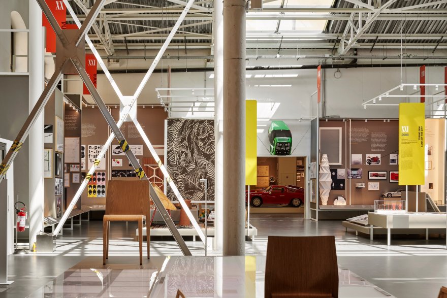
depth scenarios that jut out, tilting 10° towards the visitors, almost as if attempting to absorb them to capture their attention. Within the second and the third room, the exhibition system dedicated to in-depth explorations moves away from the walls to occupy the central areas with a system of 13 detailed islands that provide a 360° view. These platforms are of various dimensions and heights, and the objects emerge on different levels.
Paying particular attention to sustainability, the exhibition structure combines the lightness of the white painted tubular metal with the choice of recycled wood panels with a grey laminate finish. These panels express a strong material sense, despite their minimal thickness.
The lighting design develops pinpoint accents and scattered light planes. It is fully integrated within the narrative scenography and defines a landscape with natural light that pays particular attention to consumption and sustainability. The determination to keep the display system light led to the selection of Targetti OZ spotlights, which – thanks to their small size and their location along a very thin rail using a magnetic system- move with great flexibility both inside the display set and over the in-depth platforms, together with long LED bars that are fully integrated within the exhibition plane to offer clear planes of light.
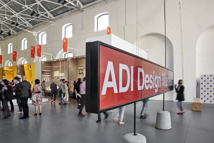
Within a museum conceived as a fluid pathway, with interconnected and linear spaces, the primary role of the graphic design is to serve as a visual landmark that is useful for orientation and to support the narration of the contents. Like oversized bookmarks, 50 two-sided banners measuring up to 6m high punctuate the exhibition route by marking the exhibition perimeter sets with a vivid red.
Graphic planes fully integrated within the display stand out within the exhibition set, offering further critical or descriptive insights about the products. The left side of the set hosts the award winners – which includes the list of all the prize-winning products, the juries and the special awards – while long sloping planes emerge at the foot of each scenario. These planes feature further in-depth information on the contents in a precise manner.
DATA Project: ADI DESIGN MUSEUM Location: Milan Clients: Fondazione ADI Commencement of works: gennaio 2019 Completion of first part of works: 25 maggio 2021 Total Exhibition Area: 3.000 sqm Compasso d'Oro exhibition: 1000 sqm Designers: Ico Migliore, Mara Servetto, Italo Lupi
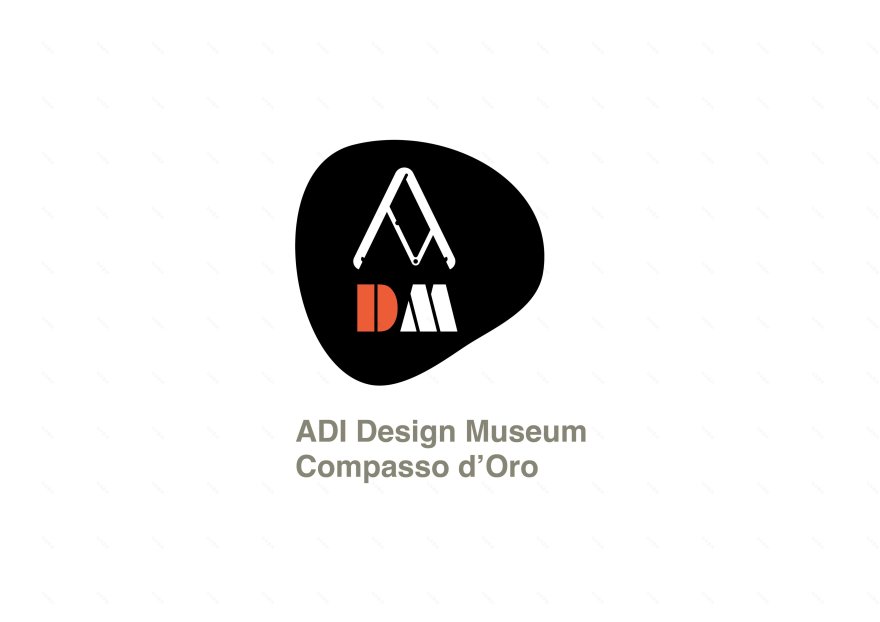
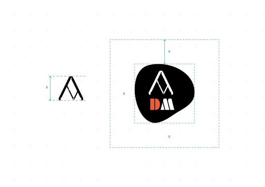
Logo for the new ADI Design Museum – Compasso d’Oro
Design: Ico Migliore Mara Servetto Italo Lupi
Since 1956 ADI (Associazione per il Disegno Industriale) has operated as an intelligent observatory of what at the outset was the nascent discipline of design; an outpost that has become an institution with the mission and responsibility of organizing and assigning the Compasso d’Oro awards.
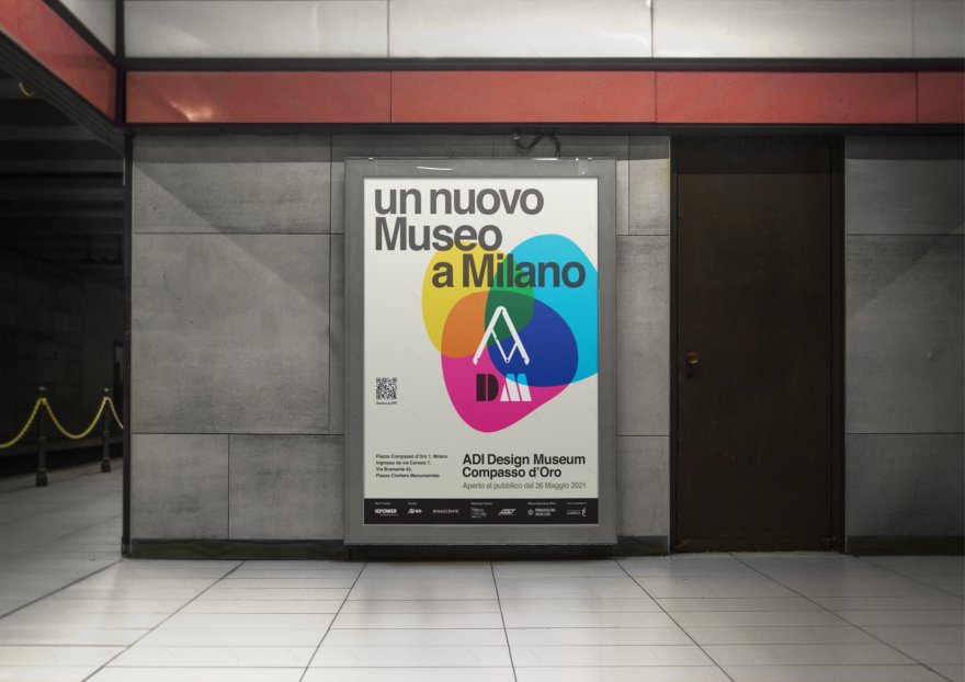
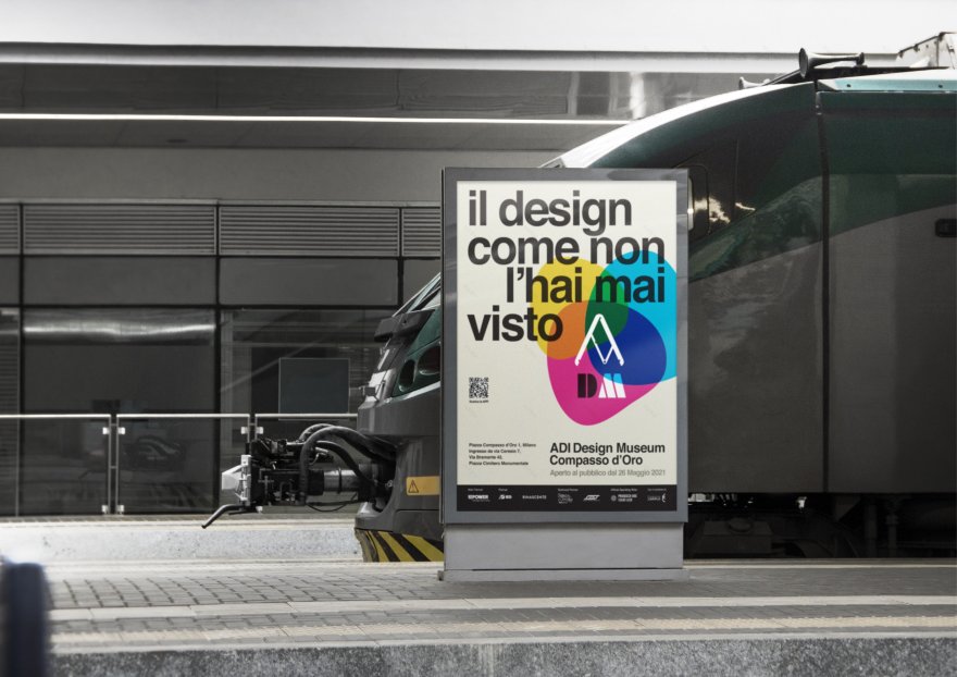
A path of over sixty years that has garnered international acclaim, with a history that like all human affairs has had its moments of splendor and its critical episodes, always in pursuit of freedom and independence of judgment. An outpost for the defense of good design, which on the fertile territory of Milan has stationed two sentinels of worldwide prestige: ADI and the Triennale di Milano. Keeping faith with the disciplinary tenets of European and specifically Italian Rationalism, ADI entrusted the image of its communications to the great master Bob Noorda, whose conceptual rigor suggested the use of the Helvetica Medium typeface in the logo, for greater legibility, and the Helvetica Bold character for the name of the association. Across the many years, these characters have stood for the expressive specificity of ADI. Today, on the eve of a fundamental development – the opening of a major new museum, a polyphonic space built around the visitor, as indicated in the project that won the competition in 2014 for the set-up and architecture of the spaces on Via Ceresio – a novel logo has been designed to forcefully identify the new spaces and this innovative initiative. The logo takes its cue from an affectionate tribute to the founding fathers of what was a pioneering discipline in the early days of design, officially sanctioned by the “Industrial Design” section included in the 10th Milan Triennale in 1954. It is a tribute, in particular, to Michele Provinciali, for the black form that represents the Compass, and the other contributors of the section, A. and P.G. Castiglioni, Roberto Menghi, Augusto Morello, who immediately became true Presidents of the Italian Republic of Design. The logo of the Compasso d'Oro Museum relies on this forceful symbol of identity to interpret the Compass itself as a letter A, the first initial of ADI, thus simplifying the official name of ADI DESIGN MUSEUM in DESIGN MUSEUM for easy, immediate recognition on digital devices.
For the titles, the font choice has gone to the forceful design of DECO BLACK, utilized in two colors, black and warm red. The full name of the association remains in HELVETICA BOLD, in a warm shade of dark gray. There are two possible versions, one with the drawing of the Compass and the initials DM, compressed into the irregular black form, and the other with the two characters shifted outside, allowing the Compass to stand out in the black “seal.” A logo capable of conveying a strong identity, with great freedom and flexibility of use, also on the different scales to which we have become accustomed thanks to today’s communication media.
客服
消息
收藏
下载
最近


