查看完整案例


收藏

下载

翻译
Marking 30 years of McDonald’s in Russia, Landini Associates designed the newly opened flagship store on the iconic site of the country’s first ever location.
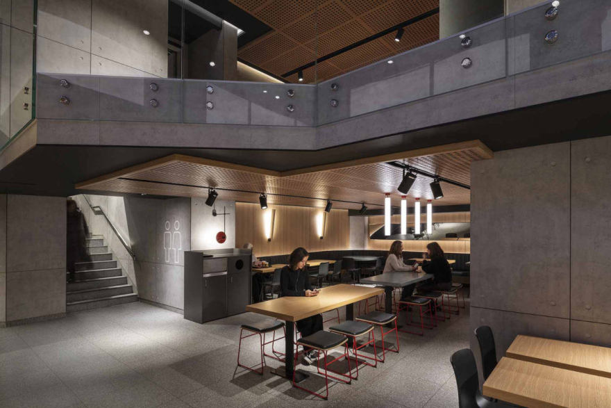
Built over three floors with multiple mezzanines, the new design is an experiment in “Non Design”; the intention is to hero the food, the service and the people who come to enjoy it. To create a “recognizable neutrality” that allows this to happen.
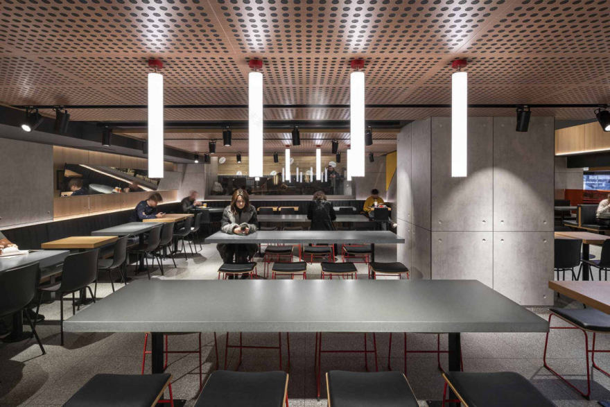
Concrete, glass, stainless steel and oak form a palette of modern simplicity. The colourful graphic environments that long ago became the signature for McDonald’s internationally have been replaced with a different approach. The walls of the store intermittently celebrate the menu items, with stylized laser cut line drawings of McDonald’s iconic products as well as archery, fries and coffee beans that nod to both the heritage and evolution of the brand.
On entering customers are able to customize their meal and pay for their orders at the modern interactive self-ordering kiosks in the entrance hall beneath an illuminated ceiling. Traditional service and pick up points for take away orders are adjacent to these.
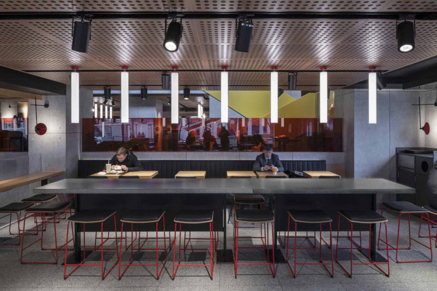
Pushkin Square has one of the highest guest counts globally of any McDonald’s restaurant and so the layout of seating throughout has been designed in response to maximize privacy, utilizing mesh screens to achieve this. New seating types and areas have been designed to accommodate families, groups and individuals. Zinc, concrete and oak tables and benches help define these zones, challenging customer’s historical perceptions of quick service restaurants by elevating the environment. A key addition unique to Pushkin Square is the introduction of a new FreeStyle Step Seating.
The look and feel of McCafe has evolved to be entirely timber as a way to make it warmer and more inviting to customers and to differentiate the independently serviced café from the rest of the restaurant.
Throughout the store, mirrored ceilings are used to increase perceptions of height, open views and reflect the iconic Pushkin Square, creating energy in the space whilst still allowing it to be a place of calm and respite, ‘a bubble of happy’, from the outside world. A new lighting scheme has been conceived to deliver a calmer, more intimate experience that encourages customers to slow down and relax.
Pushkin Square is an evolution of Landini’s global format for McDonald’s, Project Ray, named after the brand’s founder Ray Kroc. Iterations of the Ray Concept have been rolled out across Australia, Asia, Europe and America, most recently at the McDonald’s Headquarters Global Menu Restaurant in Chicago and the famous Rock n’ Roll Restaurant (Chicago), New York’s Times Square, San Francisco, Moscow, Madrid and Buenos Aries, Milan, Beijing, Tokyo and Dubai.
Design: Landini Associates
Photography: Andrew Meredith
14 Images | expand images for additional detail
客服
消息
收藏
下载
最近


