查看完整案例


收藏

下载
朴室新生
正德厚生,抱朴含真。
这个项目是我们自有的办公室,我们希望在这里能够放松地生活、工作、交流。
Zhengde and welfare, embrace the true Park.
This project is our own office, We want to be here to be able to relax Live, work, communicate.
朴室位于福建龙岩,这是我们第二个“家”。作为一家在四线城市打拼的设计公司,我们有属于自己的情怀,不同情境的设想,成就了我们现有的空间表达。
Pushi is located in Longyan, Fujian province, which is our second "home". As a design company struggling in a fourth-tier city, we have some of our own feelings, different scenarios, achievements of our existing space expression.
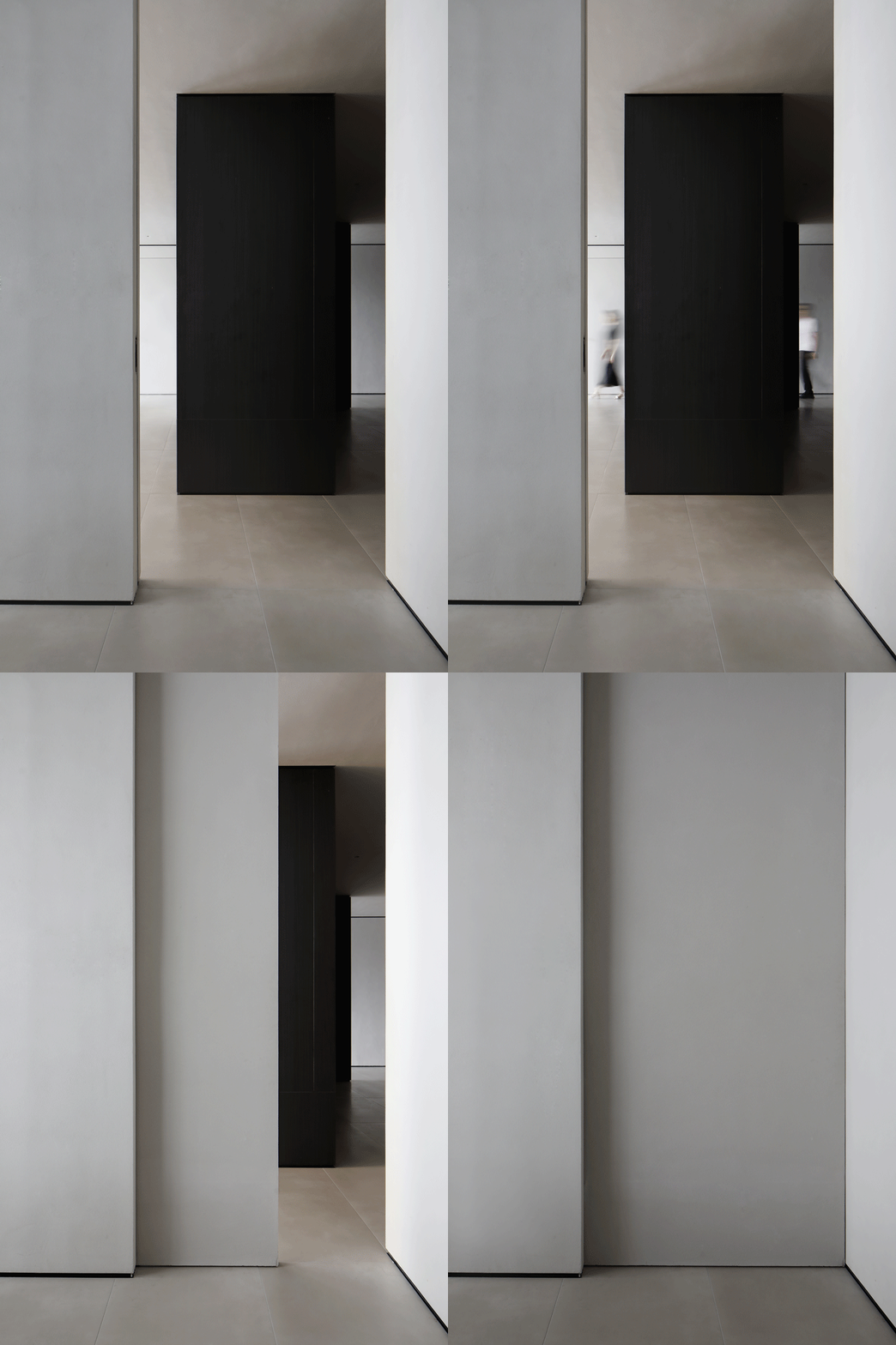
空间上,我们希望能够更自由,且更具私密性,让参观者有探索的欲望。平面布局我们运用了洄游的设计手法,让空间与空间之间能够高效连接。考虑到多种工作情境的变化,我们在洄游的基础上,应用口袋门作为空间私密与开放的切换方式。同时,在整个空间盒子中置入黑色的体块,让它与相邻的空间都产生对比的关系。
In terms of space, we want to be more free and more private, so that visitors have the desire to explore. In the plane layout, we use the design technique of migration, so that the space and space can be connected efficiently. Considering the changes of various working situations, on the basis of migration, we apply pocket door as the switching mode between private and open space. Meanwhile, black volume is placed in the whole space box, so as to create a comparative relationship between it and adjacent space.
好看并不是设计的目的,设计应该是解决问题的。考虑到建筑结构是玻璃幕墙结构,空间主体又是朝西的方向,我们特意预留了一块暗部区域,让我们拥有一个不受外界打扰的安静空间。同时,我们可以在这边做灯光演示,让大家对灯光有更好的认知。
Looking good is not the purpose of design, design is supposed to solve problems. Considering that the building structure is a glass curtain wall structure and the main part of the space is facing west, we deliberately reserved a dark area to allow us to have a quiet space without being disturbed by the outside world. At the same time, we can do a lighting demonstration here, so that people have a better understanding of the light.
1 (91).JPG
1 (87).JPG
1 (90).JPG
由于这块区域缺少自然采光,容易让人产生压迫感。设计师在空间中置入了一块“天井”,在有效的改变空间感的同时,当水珠散落土壤的时候,空气中弥漫着雨后土壤清新的气息,不禁让我们想起小时候。
SDue to the lack of natural lighting in this area, it is easy to create a sense of pressure. The designer placed a "patio" in the space, effectively changing the sense of space at the same time, when the water drops scattered on the soil, the air was filled with the fresh breath of the soil after the rain, can not help but remind us of childhood.
1 (99).JPG
在空间引导上,我们希望达到游园的设计效果,前期我们希望有一些压迫感,转角处的尺度放大后,又有一种柳暗花明的心理感受,同时也能够起到有效的空间引导。黑色木纹的玄关墙板,既有装饰效果,又具有极强的收纳能力。
In the space guidance, we hope to achieve the design effect of the garden. Early on, we hope to have some sense of pressure. After the scale of the corner is enlarged, it also has a kind of psychological feeling, and can also play an effective space guidance. The porch wallboard of black wood grain not only has an adornment effect, but also has a very strong receiving ability.
茶室作为接待空间,除了在动线引导上特意避开了容易凌乱的办公区,让我们的空间形象在尽可能整洁的同时,不会影响同事的正常办公。
Tea room as a reception space, in addition to the moving line guide deliberately to avoid easy messy office area, so that our space image as neat as possible at the same time, will not affect the normal work of colleagues.
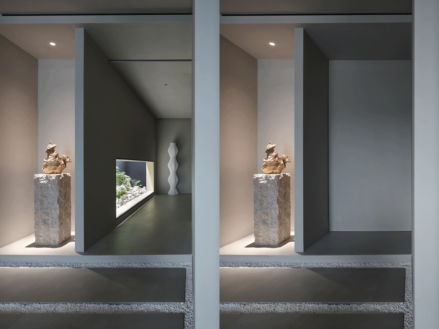
1 (86).JPG 茶室与休闲区之间相互串联,同时可以应用口袋门的形式让空间切换成不同模式。在茶室区域,我们以朽木与山石为端景,除了能够很好地与茶室融为一体外,还有一个有趣的设计考量,朽木与造景区的植物形成鲜明反差。腐朽与新生的对应关系,让空间更具人文气息。
The teahouse and the leisure area are connected in series, and the space can be switched into different modes by using the form of pocket door. In the teahouse area, we used the decayed wood and rocks as the end views. Apart from the fact that they blend well with the teahouse, there is an interesting design consideration. The decayed wood contrasts with the plants in the landscaped area. The correspondence between decay and rebirth. Let the space more humanistic atmosphere.
黑色木纹与素色漆形成强烈的反差,使空间更有张力,同时连贯的空间关系让我们可以更自由地行走。
The contrast between the black wood grain and the plain paint makes the space more tense, while the coherent spatial relationship allows us to walk more freely.
整个空间,办公区、会议室、两个独立办公室是光线最好的区域,我们都留给了自己,我们希望团队都能够在放松舒适的环境中工作。
The whole space, the office area, the conference room, and the two separate offices are the best lit areas. We kept them to ourselves and wanted the team to be able to work in a relaxed and comfortable environment.
会议室紧邻玄关与办公区,我们可以在第一时间进入会议状态。同时,在方案汇报时,团队可以很好的互相配合。
The meeting room is adjacent to the porch and office area, so we can enter the meeting state at the first time. At the same time, the team can cooperate well with each other when the plan is reported.
会议室的吊灯,采用可以上下出光的方式,不同情境的使用,可产生不同的氛围。水纹大理石的应用,让空间更显灵动。
For the chandelier in the conference room, we have made the lighting design that can be lit up and down, so that we can switch between business and leisure. Marble desktop makes the space more flexible.
1 (55).JPG
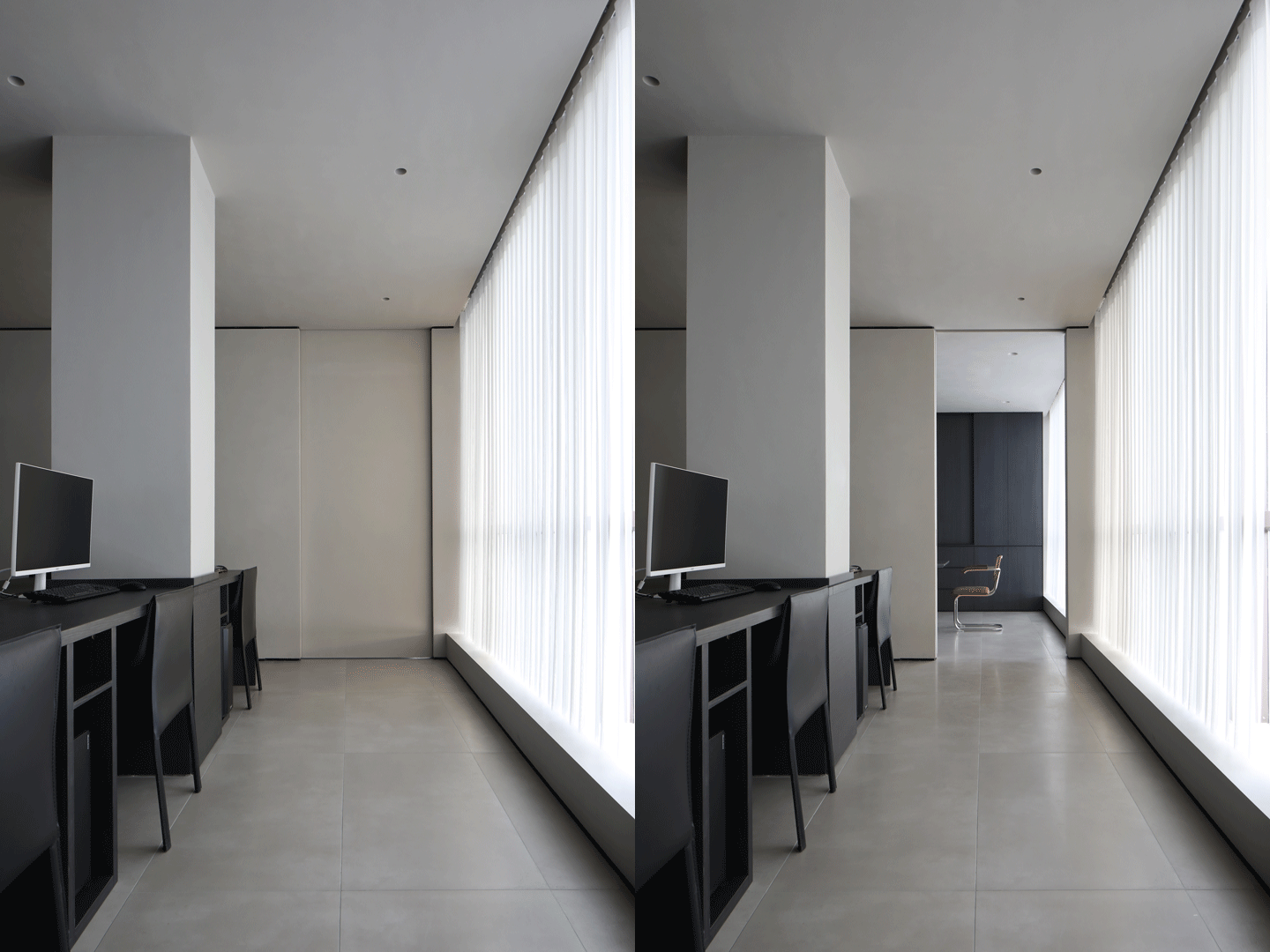
口袋门的应用,让我们产生了不同的空间体验。
The application of pocket door makes us have a different space experience.
办公区,我们希望它更简洁,同时嵌入米色体块,在呼应整个空间用色的同时,空间变得更加温馨。
For the office area, we wanted it to be more concise and at the same time embed the beige volume, which echoes the color of the whole space and becomes more warm.
1 (118).JPG
项目信息
Information
项目名称:朴室 | 新生
Project Name:Park Shi, new student
项目地点:福建省龙岩市
Project Location:Longyan City, Fujian Province
竣工时间:2021
Completed:2021
项目类型:商业办公
Type:Commercial office
项目面积:280㎡
Area:280㎡
设计单位:厚朴设计
Design Company:Hope design
主创设计:陈曾斌 陈隐开 王俏文
Design director:Chen zengbin Chen Yinkai Wang qiaowen
设计团队:曾静莹、强雯晶、罗益淳
Design Team:Zeng jingying, Qiang wenjing, Luo yichun
施工单位:厚朴装饰
Construction unit: Hopu decoration
项目经理:李宏伟
Project Manager: Li Hongwei
软装设计:厚朴设计
Decoration Design:Hope design
灯光设计:段晓磊 汤道微
Lighting Design:Duan xiaolei Tang daowei
摄影:阿奇 龙辉
Photographer:Archie portal Lung fai
视频:1988 摄影
Video:1988 photography
客服
消息
收藏
下载
最近


