查看完整案例


收藏

下载
HOPU ASSOCIATES
厚朴空间设计
Apartment & villa Exhibition Office Restaurant
White留白March 19th, 2019
Copyright© 2019 HOPU Associates
EDIT/ © Burdian
DESIGN/ ©HOPU Associates
PHOTO/ © Rongkun Chen
▼序言 PREFACE
曾几何时,默然喜欢上室内设计这个行当,或许是当年的年少轻狂,又或许是对生活的无畏,十年一晃而过。
Once upon a time, silently like the interior design business, may be the youth of the year, or perhaps the life of the fearless, ten years have passed.
屋主【涛哥】是一个很好相处的人,我们的第一次见面是从一根烟开始的。涛哥很好客,同时又是美食达人,自然而然的,朋友们经常到家里聚会。依稀还记得,当时的对话,我说你家一年365天,朋友有来最多也就65天吧!涛哥说那不一定,365天当中,280天还是有的。T
he owner of the house is a good person to get along with. Our first meeting started with a cigarette. Tao is very hospitable and is also a food expert. Naturally, friends often go to home parties. I can barely remember the conversation, I said ...
Your family 365 days a year, friends come up at most 65 days it!
Brother Tao said
Not necessarily. Of the 365 days, 280 days are still there.
涛哥说:既然选择了你们,就要对你们无条件信任!
是的,信任是我们做好一个作品的关键!好的作品都是业主与设计师、施工方共同合作的产物,并不是单方面任何人可以独立完成的!
至今仍然记得,那段时间因为出差的关系,由同事陪涛哥去看入户门,看的差不多了,价格也满意,涛哥突然冒了句“不行,大门还是要曾斌看过,不然万一买回去,他不喜欢就不好了”这些都是事后,同事告诉我的,从心底莫名的感动,感恩涛哥对厚朴的信任与支持!
Tao said: since you have been chosen, we must trust you unconditionally!
客厅 LIVING ROOM
客厅因为梁位的原因,墙面大面积选用白色乳胶漆。这样可以跟吊顶连成一片,这样让整个空间显得更高,电视背景采用装饰柜的手法去做,局部嵌入一些铁板盒子装饰,在保证客厅收纳的同时,不失美观。家居美观的关键在于收纳,没有合理的收纳空间,即使做再漂亮,最终也会因为收纳,而让整个空间失色不少。
Living room because of the beam position, large area of the wall selected white latex paint. This can be connected with the ceiling, so that the entire space looks higher, the television background is used to decorate the cabinet to do, partially embedded with some iron box decoration, while ensuring the living room storage, without losing beauty. The key to the beauty of the home is storage, there is no reasonable storage space, even if it is beautiful, it will eventually be because of storage, and the entire space is overshadowed.
▼餐厅 DINING ROOM
这套房子,餐厅原结构会比较局促,设计师改变传统手法,把客厅与餐厅中间那堵墙拆除后,让聚餐成为可能,客厅与餐厅的光线、空气是互通的,循环的,整个空间相对原结构,更大,更亮。
公卫与小孩房,采用隐形门设计,同时与客厅背景砖600*1200白色砖竖贴的线条呼应,简洁、干练,而小孩房与原通道多余的空间让给餐厅,一切都刚刚好的样子。
The original structure of this house and restaurant will be relatively cramped. The designer will change the traditional approach and remove the wall between the living room and the dining room to make it possible to have a dinner. The light and air between the living room and the dining room are interchangeable, circular, and the entire space. Relative to the original structure, Bigger, brighter. The public guard and children’s room uses an invisible door design, and at the same time echoes the lines of 600 * 1200 white bricks in the background of the living room. It is simple and capable, and the children’s room and the original channel are given to the restaurant. Everything is just right.
留白本身并不代表素雅,留白也需要喧嚣的诠释,整个客餐厅,设计师运用了三个大"L",让整个空间无论在哪个角度都能有很鲜明的色彩对比、融合。
Retention itself does not represent elegance. Retention also requires interpretation. In this restaurant, the designer uses three large "L" to allow the entire space to have a very bright color contrast and integration from any angle.
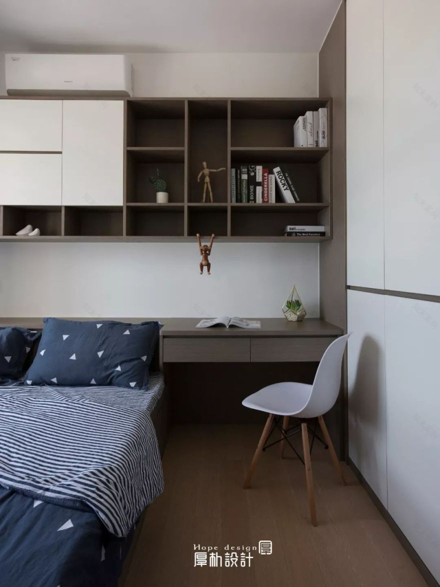
▼小孩房STUDY
小孩房空间虽小,却有2.6米长的大衣柜,2.8米长的大书柜。开放的书柜,足够小朋友展示自己的爱好,收纳书籍。
Although the children’s room space is small, there is a 2.6-meter-long wardrobe and a 2.8-meter-long bookcase. Open bookcase, enough children to show their own hobbies, accept books.
▼厨房 KITCHEN
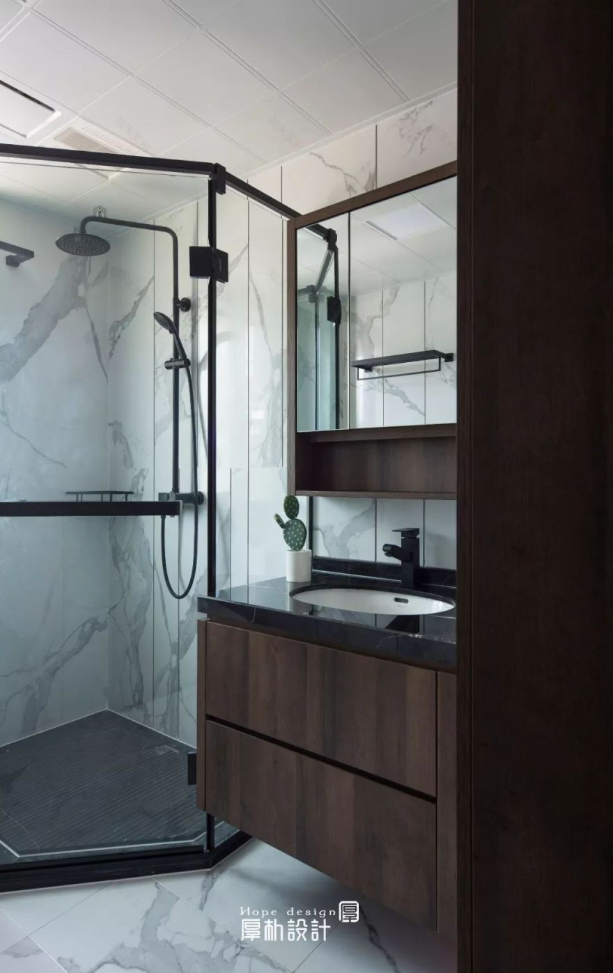
▼卫生间 BATHROOM
▼卧室 BEDROOM
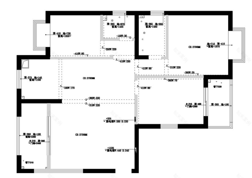
▼原始结构图 BUILDING SERVEY PLAN
▼平面布置图 FLOOR PLAN
项目名称 | 留白
项目地址 | 东岳花园 龙岩·新罗
设计团队 | 厚朴空间设计
项目周期 |
|2018.04-2019.01
建筑面积
|116
项目类型 | 平层
摄影版权 | 陈荣坤
主要材料 | 实木地板、里拉橡木、乳胶漆
HOPU ASSOCIATES
Copyright © 2019HOPU Associates
A
ll rights reserved.
/More Information
厚朴空间设计
HOPU ASSOCIATES
关于我们「设计师说好的设计应该让人目以投之、足以赶之、情以注之、心以神之。纵然设计是灵活多变的,但有一种更能抚慰人们繁忙的心,便是独特的自在与悠然。无论是闲看庭前花开花落,还是偶望天上云卷云舒,都能让人心生豁达,这似乎才是生活应该有的样子。
陈曾斌
创始人/设计师
138 5953 4910
陈隐开
创始人/设计师
158 8066 7667
我们向住自由,热爱设计并追求完美。我们相信设计源于生活,设计即是对生活的深层感悟,是为了生活品质的提升而存在,我们不仅关注生活的品质内涵,更在于创造一种极致的生活文化。
厚朴空間設計
地址:福建省龙岩市新罗区万宝SOHO A1 幢 1819室
客服
消息
收藏
下载
最近


