查看完整案例


收藏

下载
BED是一家仅接待预约顾客的美睫沙龙。BED的名称反映了店主希望让顾客在做睫毛的同时能够像睡觉一样充分放松的意愿。门店的logo同样传达了这样的概念,它由店主合作过的插画家Yu Nagaba设计。
BED is a reservations-only eyelash salon. The name reflects the owner’s wish to allow clients to feel relaxed, like they could fall asleep, while their eyelashes are being done. The logo that expresses the concept was designed by Yu Nagaba, an illustrator who we also partnered with for LAND, another salon owned by BED’s owner.
▼项目概览,general view © Takumi Ota
▼入口的标识,sign at the entrance © Takumi Ota
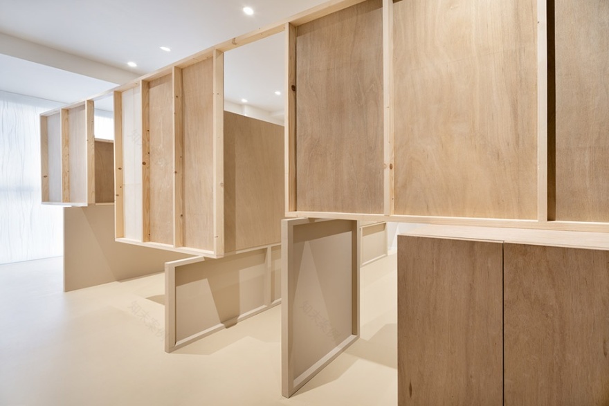
为了在有限的空间中设置多个座位,同时还要兼顾私密性和开放感,设计团队特别为空间打造了独特的隔墙系统。
这些隔墙的一侧覆盖着薄板,因此正面和背面是完全不同的。隔墙相互交错的方式构成了路径与层级,在保证客人私密性的同时,又不至于完全阻断实现,同时又在不经意间让相邻的两个空间获得了共享的区域。
▼平面图,plan © Takumi Ota
We created original partitions in order to house multiple seats in limited square footage and maintain privacy while still feeling open enough for guests to relax and even sleep.
The partitions have a thin board attached to only one side, so the front and back are different. The partitions intersect in a way that creates passages and levels. This maintains privacy for each client without completely stopping the line of sight, in effect unconsciously sharing the space of the adjacent booth.
▼隔墙相互交错的方式构成了路径与层级 © Takumi Ota
The partitions intersect in a way that creates passages and levels
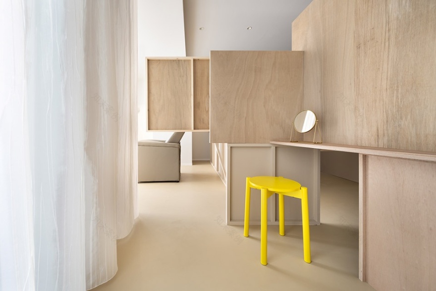
▼化妆区,make-up area © Takumi Ota
为了进一步缓解被边界束缚的感觉,地板被涂上与隔墙底部相同的颜色。墙板摆放的方式给人以轻盈的感觉,隔墙的正面和背面在上方与下方交替展现,当人们在空间中移动时能够感知到连续和变化的体验——设计的目的就是要给人留下不一样的印象。
To further reduce any sensation of being boxed in, we painted the floor the same color as the bottom panels (which are attached to the floor). Panels are placed so that they feel light. Top and bottom panels alternately show the front and back so that when moving through the space it feels connected but also changed – it’s designed to leave an impression.
▼隔墙系统,the partitions © Takumi Ota
▼隔墙的正反面和色彩均发生变化,The panels alternately show the front and back and are painted in different colors © Takumi Ota
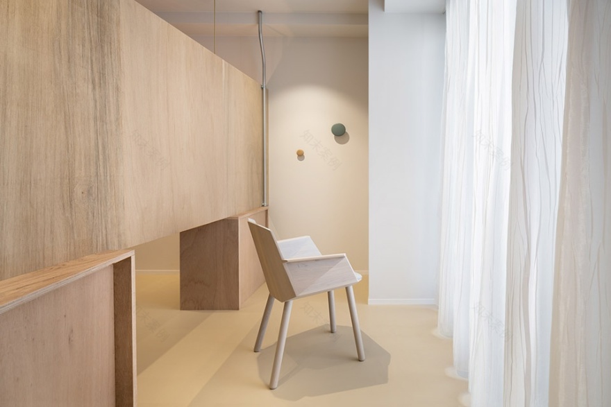
北侧的窗户较为宽阔,但为了阻挡外部的视线,采用了定制的窗帘进行遮挡。从南面的入口望向北面时,客人将看到一个满溢着柔和光线的空间。隔墙之间的走道经由光线凸显出来,在空间内建立起完整的流线。
The north side window is quite large, but in order to block the view from outside, we fully covered the north side in custom curtains. When you look at the north side from the entrance (south), you see a space filled with soft light. The passageways between the partitions are accentuated by this light, and it seems to circulate throughout the space.
▼北侧窗边座位,seating area at the north side © Takumi Ota
▼空间满溢着柔和的光线,a space filled with soft light © Takumi Ota
私人空间的分隔恰到好处,为客人们带来了足以入眠的舒适空间。
Booths are separated just enough, and we believe we have achieved a space that is comfortable enough to sleep in.
▼私人床位,the private booth © Takumi Ota
▼室内细节,interior details © Takumi Ota
Project: BED
Business type: eyelash salon
Floor area: 32㎡
Designer: Sohei Arao
Photographer: Takumi Ota
Construction: THE
Lighting design: DAIKO Yoriaki Kokubu
VI: Yu Nagaba
Address: Breeze Minamisenba 501, Minamisenba 4-8-4, Chuo-ku, Osaka-shi, Osaka 542-0081, Japan
Designed: September 1 – October 20, 2020
Built: November 4 – 16, 2020
客服
消息
收藏
下载
最近


