查看完整案例


收藏

下载
介入小型餐饮商业项目时,在满足合理的用餐位,翻台率,私人业主的个人喜好,投资成本控制这些问题之外,如何去寻找另外的设计出发点,如何从一个商业命题的本质去呈现一种简单的状态,是这次项目设计的初衷。
When talking about small-scale catering projects, in addition to dining space, turnover rate, private owners’ personal preferences and cost control, this project aims to find new design points and present a simple state from a commercial proposition.
▼项目概览,preview ©Kevin
原建筑场地是一个60平方米的商铺,入户的层高只有2.3米,而且是单面的采光,室内光线很弱,感官上比较压抑。这样的建筑结构显然是缺乏张力的。
The original site is a 60-square-meter shop with 2.3 meters as the entering height. Moreover, it is day-lighted on one side. The indoor area is very dark, presenting a depressing sense. Obviously, the building structure is in lack attraction.
▼前台,仓库,用餐功能的组合,形成的外立面 ©Kevin the façade formed by combining the functions of reception, warehousing and catering
▼入口顶面使用镜面增加空间的纵向层次 ©Kevin mirrors are employed on the top surface of the entrance to increase longitudinal layers of the space
从理性角度分析:对于餐饮商业项目,主题性,商业性,功能性,体验性,依赖于建筑结构内部空间的划分或者是重新解构重组。随之而来也会有很多更加实际的问题,建筑结构的整改,灯光的运用,功能的分配等等。
When it comes to the analysis from a rational perspective, the thematic, commercial, functional, and experiential nature depends on the division or re-deconstruction of the internal structure. Hence, many practical problems emerge, such as the rectification of the building structure, the use of light, the distribution of functions, etc.
▼轴测图,axon ©象蝶设计
从主观感性的设计维度出发:直觉的反应是米粉的晶莹剔透的干净的状态,思考项目的商业性和主题性能否就可以从这种状态里去延伸,带着这些问题去思考,首先想到的是材质,别的项目上我们是在材料加一层一层的工艺,就好像给材料穿上一层一层的衣服,然而如果我们反过来想,如果不需要这种“coating”,就是用一种直接的,简单的状态呢,最后选用不锈钢钢丝网作为吊顶的材料,材料的反射会在白天引入光线到室内,随着光线的变化,材料本身渗透着一种变化,呈现出一个透亮的顶面;其次空间的进门的层高不高,我们将前台和储物系统布置在了空间的最前端,在横向上两种功能形式的组合自然而然形成了有“体积感”的门面;移窗和玻璃隔断拓展了视线的纵深感;进门区域的镜面反射的顶面,削弱层高不足带来的压迫感。
Starting from the subjective design dimension, rice noodles’ crystal-clear impression is the intuitive response. The commercial and thematic nature of the project can be extended from this impression. When thinking about these issues, the first thing that comes to mind is the material. For other projects, we add layers of craftsmanship to the material, just like putting layers of clothes on the material. However, turning the other way around, it can be a straightforward and simple state without this kind of “coating”. Finally, we choose the stainless steel wire as the ceiling material. The reflection of the material brings light into the room during the day. As the light changes, the material presents a difference, showing a translucent top surface. Additionally, the height of the entrance is not high. So, we have arranged the front desk and storage system at the forefront of the space. The combination of the two functional areas in the horizontal direction naturally forms a facade with a sense of volume. What’s more, movable windows and glass partition expands the depth of sight. The mirror-reflected top surface at the entrance area weakens the sense of oppression caused by insufficient layer height.
▼悬浮的桌面增加空间感, The suspended table tops adds a spatial effect ©Kevin
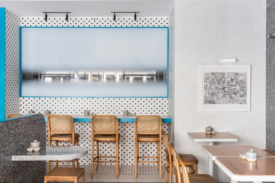
▼点状墙面增加视觉层次,the dotted walls add a layered visual effect ©Kevin
▼自然光线引入室内,使不锈钢网顶面呈现光感 ©Kevin natural light is let in, to make the stainless-steel mesh top look shiny
▼色块区分高桌用餐区和主要用餐区 ©Kevin color blocks are used to distinguish the high table dining zone and the main dining zone
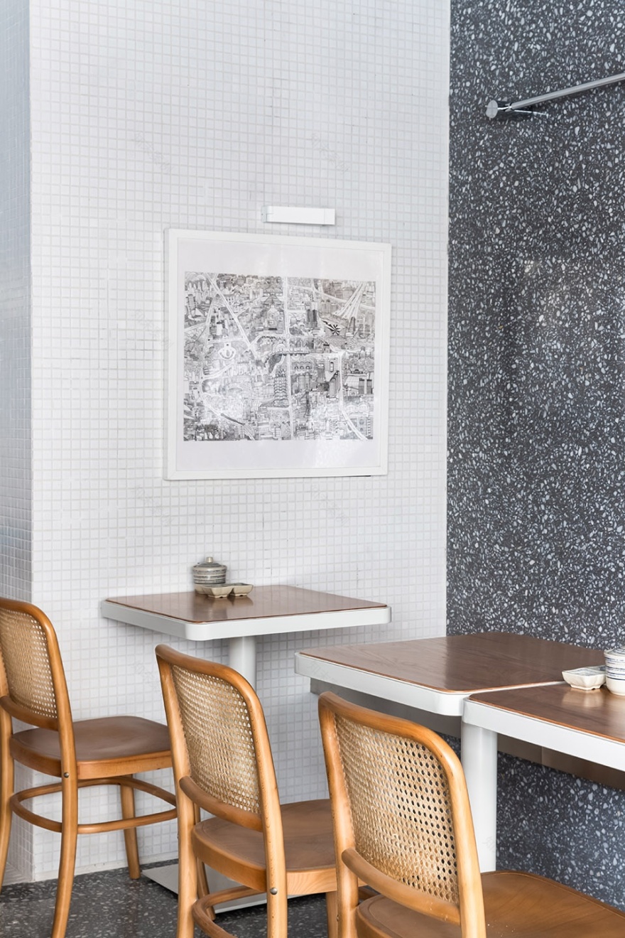
▼插画师绘制的地图寓意迎接各地而来的顾客 ©Kevin the map drawn by an illustrator implies a welcome awaiting guests from different places
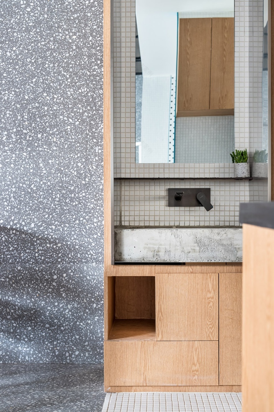
▼洗手区域,hand washing area ©Kevin
▼现场制作的台盆,A sink made on site ©Kevin
▼前台花灯,灵感来自米粉的外形 ©Kevin the flower lantern at the front desk is inspired by the shape of rice noodles
▼户外空间,outdoor space ©Kevin
▼平面图,plan ©象蝶设计
项目名称:一筴米粉 餐厅设计
设计方:象蝶设计
项目设计 & 完成年份:2020.10
主创及设计团队:杨韬,蒋蒋
项目地址:上海 嘉定
建筑面积:60㎡
摄影版权:Kevin
品牌:水磨石,不锈钢网,马赛克
客服
消息
收藏
下载
最近


