查看完整案例


收藏

下载
项目位于浙江桐乡,原建筑餐厅包厢位置有很好的视野和景观,业主希望尽量保持原先包厢位置、后勤办公位置和户外绿化的前提下,进行室内改造升级。
The project is located in Tongxiang of Zhejiang. Considering good vision and views from private rooms in the original restaurant, the owner hoped to transform and upgrade the interior on the premise of keeping private rooms and the logistics office in their original positions and retaining outdoor greenbelts.
▼项目概览,Preview
捏土造器,器的本质不在是土,而在它中产生了“无”的空间。空间的围是这次设计的出发点。从单体空间特征着手,空间可以是规则或者不规则,空间表情是硬朗或是柔软,单体和单体之间形成共存。
▼手绘概念,sketch
Though made from earth, earthenware is not earth in essence, but the “empty” space generated inside. Spatial dimensions are where the design started. Starting from characteristics of separate spaces, a space can be regular or irregular, show a tough or soft expression, and coexist with other spaces.
▼餐厅外观,external view
在满足业主的需求下,通过纤薄的黑色钢板结构制造出多一层的交通空间,提供餐厅独立的行政动线。钢板上开出的洞口,增加韵律感。行政通道和规则的长方形用餐大厅之间,置入两个类似圆形的空间区域,表皮均为灰色的水磨石,弧形墙面阳角在不规则角度的情况下显得纤细,和本身石材的厚重感形成对比。
▼纤细的墙体阳角,拉开空间层次,spatial corridor
▼黑色通道,black hallway
To meet the demands of the owner, another traffic space is created with a structure made of thin black steel plates, to provide an independent administrative circulation. The holes opened in steel plates add a rhythmic feel. Between the administrative passage and the regular rectangular dining hall, two nearly circular zones are arranged, of which surfaces are both grey terrazzo and external corners of arc walls appear slender at irregular angles, forming a contrast with the thick and heavy feel of stone.
▼圆形用餐区,circular dining area
▼圆形和方形空间连接,circular and square Spaces are connected
▼半开放式用餐区,interior of the semi-private room
▼室内一角,a corner of the interior space
▼弧形墙细部,closer view to the walls
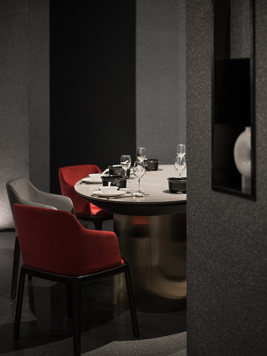
▼配合空间设计的椭圆桌,oval round table with space design
▼家具与墙的体块感,the sense of bulk of furniture and walls
通过用餐大厅,包厢过道由一面不规则弧形墙和备餐台面的体块所组成,包厢入口故意内退一些,留出缓冲的空间,空间的节奏也由此产生。
Through the dining hall, the passage to private rooms is composed of an irregular arc wall and the mass of table tops for meal preparations, and the entrance to each private room is deliberately moved slightly inside, to leave a buffer space and thus generate spatial rhythms.
▼红色的空间构成,red space composition
▼用餐区,interior dining space
▼现场制作的调料台及餐桌,the table made on site
▼黑色体块下的卡座,the black block
▼边几细部,closer view to the table
空间的感受,除了围合,设计上对光线和视线进行控制。空间中加入的黑钢的行政通道,故意遮蔽掉了一些自然光线,希望通过暗色的调性来烘托空间的氛围;而包厢外原本幽暗的走道,则选用了玻璃砖,让户外的景观和光线穿过包厢,隐约的穿透进来。
▼走廊,corridor
▼包厢入口,entry
▼红色展台在室内点缀,red booths dot the interior
As for feelings in the space, it is not only enclosed but also designed to control light and view. The black steel administrative passage added to the space is intentionally shielded from some natural light, in the hope of setting off the spatial atmosphere in a dark tone; the original dim passage is built with glass bricks, to make outdoor views and light faintly discernible through private rooms.
▼走廊看向包厢,view from the corridor to the private room
▼私宴包厢 1,compartments for private dining
▼私宴包厢 2,compartments for private dining
▼私宴包厢 3,compartments for private dining
▼竖向肌理增加空间层次,metope texture
▼备餐柜细部,details of cabinet preparation
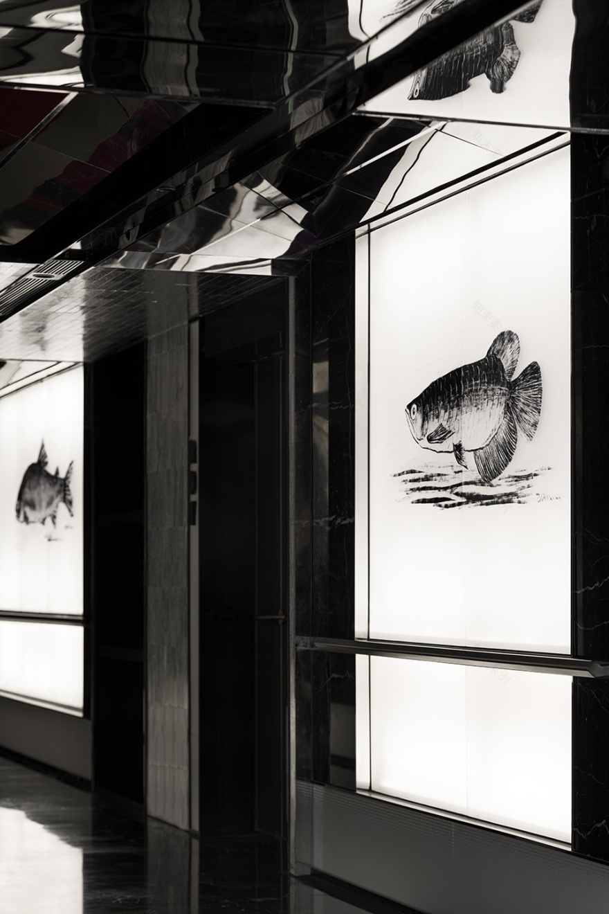
趣味和空间的结合,来自于二维的平面插画设计,类似于在白纸上画画,但是介质有所不同。入口处屏幕上的黑色海洋,过道发光幕上的鱼,呈现视觉上的不同感官,同时点明餐厅的主题。
▼带有等候的点单区,order area
▼走道上的鱼,fish in the corridor
▼边几上的石材,details
▼包厢装饰,decoration
The combination of interest and the space comes from two-dimensional graphic illustration design, which is similar to painting on white paper but different in media. The black ocean on the screen at the entrance and fishes on the light curtain in the passage present different visual experiences, while highlighting the theme of the restaurant.
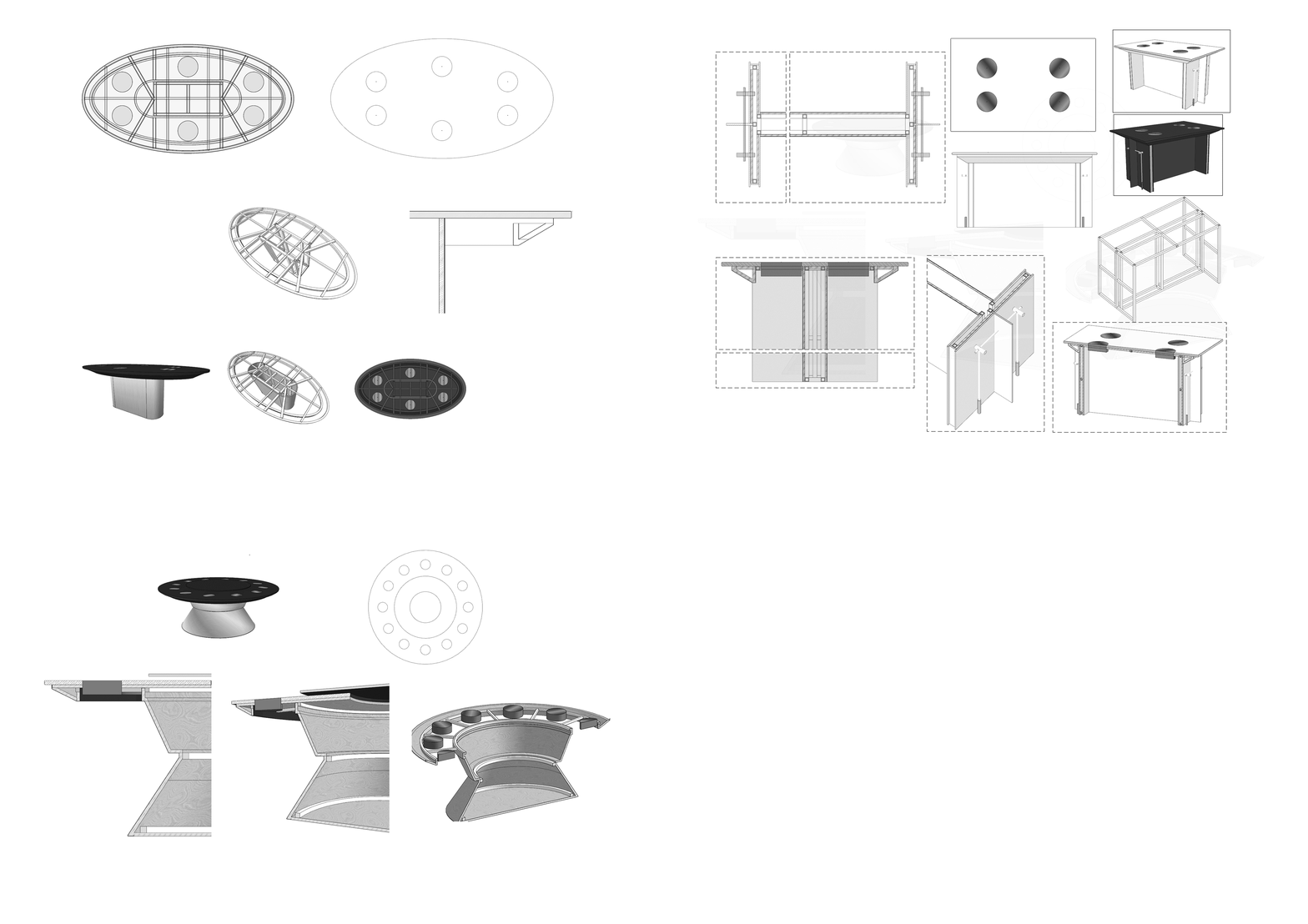
▼轴测图,axonometric diagram
▼模型平面图,plan
▼剖面透视图,perspective section
▼餐桌细部图纸,table detail drawing
项目名称:酩悦海鲜餐厅设计
设计方:象蝶设计
项目设计 & 完成年份:2021.11
主创及设计团队:杨韬,蒋蒋
项目地址:浙江 桐乡
建筑面积:600㎡
摄影版权:谭啸 康超凡
合作方-插画师:ZAMI
品牌:水磨石,不锈钢,钢板,大理石,玻璃砖,岩板,微水泥
Project name:Mingyue Seafood restaurant Design
Design:Xiangdie Design
Design year & Completion Year:2021.11
Leader designer & Team:Yang tao,Jiang jiang
Project location:Tongxiang Zhejiang
Gross Built Area:600㎡
Photo credits:Tan Xiao Kang Chao Fan
Partners-Illustrator:ZAMI
Brands / Products used in the project:Terrazzo, Stainless steel, Steel plate, Marble, Rock plate, Colour cement
客服
消息
收藏
下载
最近


