查看完整案例


收藏

下载
◆项目地址:北京市顺义区
◆项目面积:120㎡
◆设计公司:HAS设计机构
◆设计主创:刘 鑫
◆项目时间:2021.6.3
每年我们都会做一两个小型家装项目,这个项目不同于以往的别墅豪宅项目,他更加真实的反映了当代客户对住宅空间的要求,并且也考验着设计师对用户需求敏锐并且客观的设计输出和设计语言的表达。
Every year, we will do one or two small home decoration projects. This project is different from the previous villa and luxury house projects. It more truly reflects the requirements of contemporary customers for residential space, and it also tests the designers' sensitive and objective design output and expression of design language for users' needs.
客厅焦糖色牛皮色的沙发让空间更加轻松饱满,无主灯设计搭配多样性的壁灯让空间照明更有层次。
The caramel-colored cow leather sofa in the living room makes the space more relaxed and full. The design of non-main lights and the diversified wall lights make the space more hierarchical.
坦率的讲对于我们设计团队,什么样的客户是优质客户,我们一致的认为,能够让设计真正落地,定稿之后不乱改方案的客户才是优质客户,跟设计费的高低无关。那么显然这套设计能够落地,这就是我们的优质客户。
Frankly speaking, for our design team, what kind of customers are high quality customers? We all believe that the customers who can make the design truly be implemented and do not change the scheme arbitrarily after the final draft are the high quality customers, which has nothing to do with the design cost. So obviously this design can be implemented, this is our quality customers.
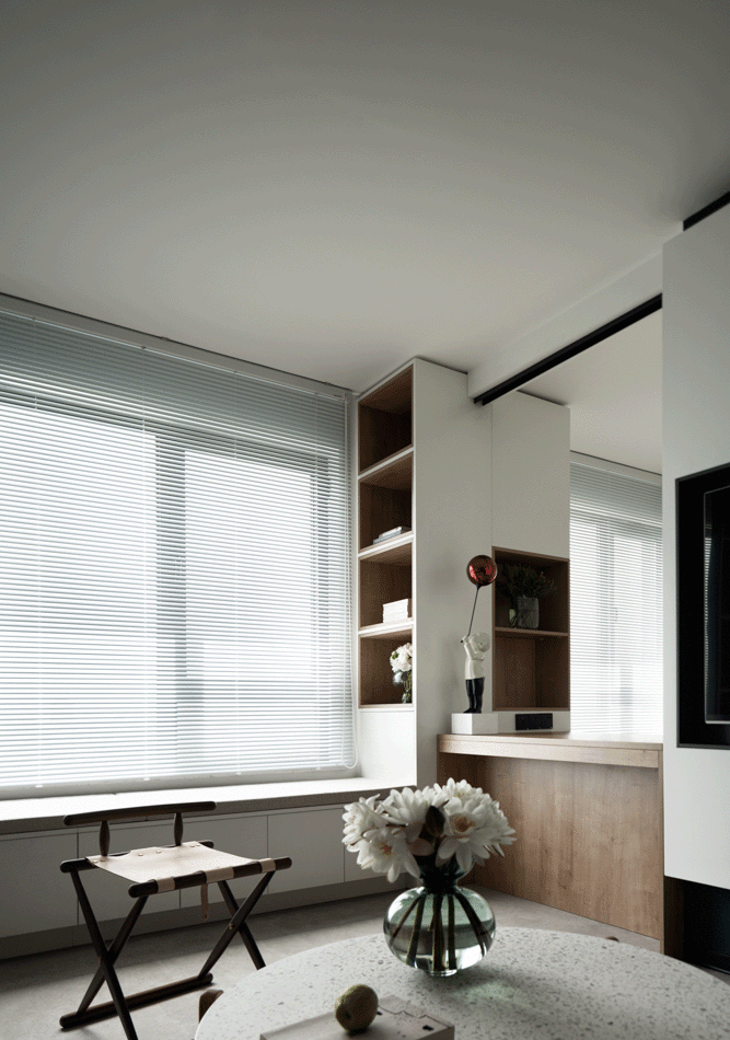
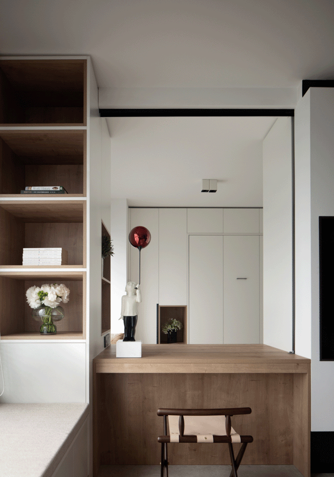
客厅重新做了一个分割,让客厅的面积减小增加了一个多功能书房,并且配备折叠床,桌子上的推拉门可以根据需求,让空间可以变成一个封闭式的卧室。
The sitting room did a break up afre, the area that lets a sitting room decreases increased a multifunctional study, and provide folding bed, the sliding door on the table can be according to demand, let the space can become a closed bedroom.
这套方案我们去除了现在当下流行的样板间风格和所谓的轻奢风格,我们更想传达出这个设计没有风格,属于客户自己的风格,我们可以设计装饰空间,但是我们不设计客户的生活。
In the scheme, we remove the currently popular model room style and the so-called light luxury style. We want to convey that this design has no style and belongs to the client's own style. We can design the decorative space, but we cannot design the client's life.
这个项目没有过多的装饰设计手法,更多的是让空间动线能够合理的利用,增加了很多的收纳和储物空间,空间的色调简洁明快并且干练。
This project does not have too much decoration design technique, more is to let the space move line to be able to reasonable use, increased a lot of storage and storage space, the tone of the space is simple and lively and capable.
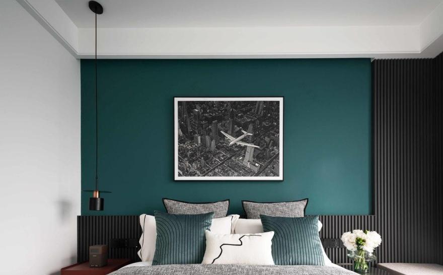
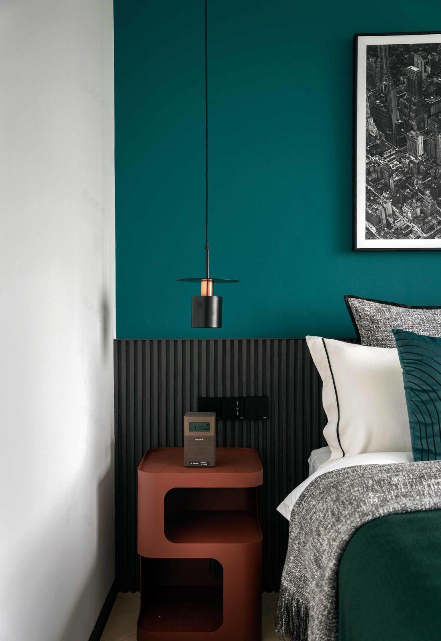
卧室空间的绿色墙面增加空间视觉的穿透力,简单的绿色墙漆配上航拍的摄影作品,让空间更加的三维立体化。靠窗的位置设计了一组地台,增加了实用性的同时,也具备靠窗沐浴阳光的空间。
The green wall of the bedroom space increases the visual penetration of the space. The simple green wall paint with aerial photography works makes the space more three-dimensional. The position that relies on a window designed a group of platform, increased practical while, also have the space that relies on a window to bathe sunshine.
进入门厅的空间做了一个黑色空间,目的是让空间有个视觉压缩,踏入客厅的空间才会感到瞬间豁然开朗和空间视觉的放大。空间的亮与暗需要色彩的对比才能更能凸显。
The space that enters vestibular made a black space, the purpose is to let a space have a vision to compress, the space that steps into the sitting room just can feel instant all of a sudden be bright and bright and the amplification of spatial vision. The contrast ability that the space is bright with dark need colorific can highlight more.
愿他们能在这个温馨家中恩爱彼此,喜乐平安!
May they enjoy love and peace in this warm home!
----------2021.6.2 北京
客服
消息
收藏
下载
最近


