查看完整案例


收藏

下载
木叶轻语,阳光温柔,心静若止水,
澄净,通透,闲坐一隅,
Konoha whispers softly, the sun is gentle, and the heart is still like water,Clear, transparent, sitting in a corner,When the breeze comes, take it easy.
本案是个上叠设计,两层空间结构,由闲情娱乐,到日常活动,再到休息空间,串联起节奏分明的生活动线。自然质感的选材蕴含着深层次的生命力,越住越品得其内在感觉。整个设计作品是感受、精神和冷静的表达,跳脱出复杂的配色,更多的是用比较纯粹的方式转化到空间表达、平衡功能与美感......
This case is a superimposed design with a two-story space structure, from leisure and entertainment, to daily activities, and then to the rest space, connecting the lines of life and activities with a clear rhythm. The selection of natural texture contains deep vitality, and the more you live, the better you get the inner feeling. The whole design work is an expression of feeling, spirit and calmness, getting out of complex color matching, and more of it is transformed into spatial expression in a relatively pure way, balancing function and beauty...
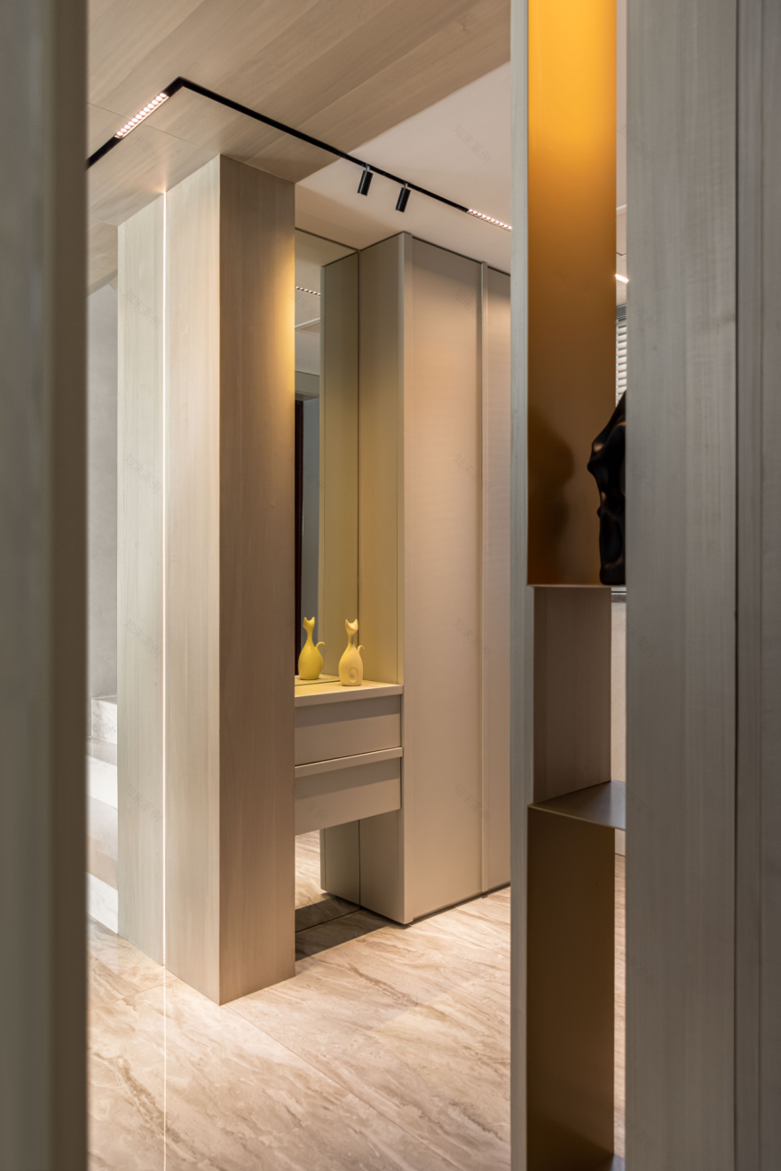
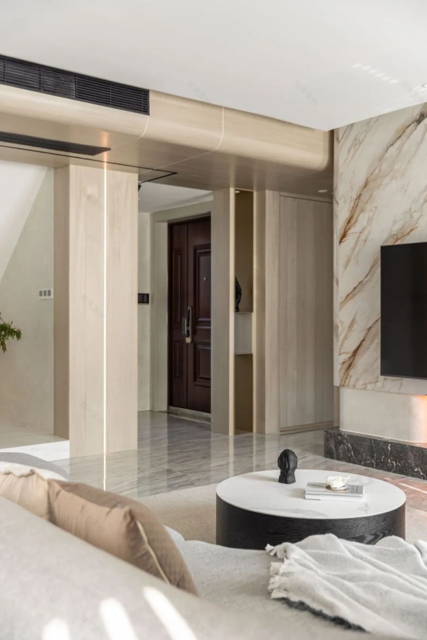
入户玄关柜到顶,满足了鞋子收纳需求,左侧挑空玄关柜消减了整体柜体的厚重感,镜面使空间开阔的同时,也方便出门前做好着装整理。
The entry porch cabinet reaches the top to meet the needs of shoe storage. The empty porch cabinet on the left reduces the heavy feeling of the overall cabinet. The mirror surface makes the space open, and it is also convenient to dress and organize before going out.
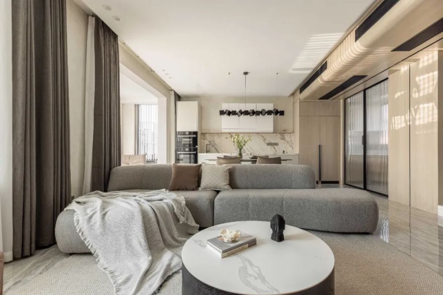
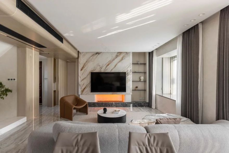
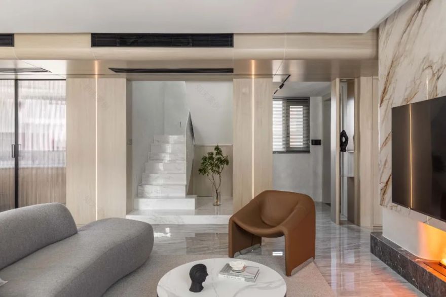
整体空间调性以浅灰色为基调,搭配大面积原木色,营造出一种简洁、利落的空间氛围。
The overall space tone is based on light gray, with a large area of log color, creating a simple and neat space atmosphere.
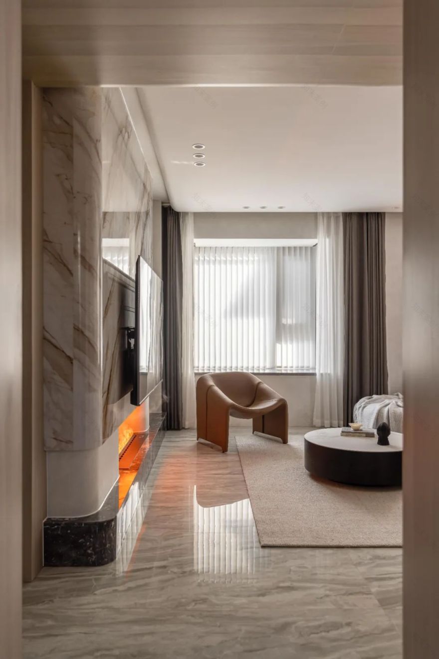
电视墙采用岩板热弯工艺,沉静温润的石材与下方壁炉跃动的火苗相映成辉,既动且静,自成一景。
The TV wall adopts the hot-bending process of slate. The quiet and warm stone and the throbbing flames of the fireplace below complement each other. It is both dynamic and still, forming a scene of its own.
墙面木色延伸至顶,增加空间纵深感,墙面内嵌线性灯,功能性与装饰性相结合。
The wood color of the wall extends to the top to increase the depth of the space. Linear lights are embedded in the wall, which combines functionality and decoration.
定制的铁艺镂空扶手,让楼梯区域更加轻盈通透,感应踢脚灯令上下楼更为便捷。
Customized wrought iron hollow handrails make the stair area lighter and more transparent, and induction skirting lights make it easier to go up and downstairs.
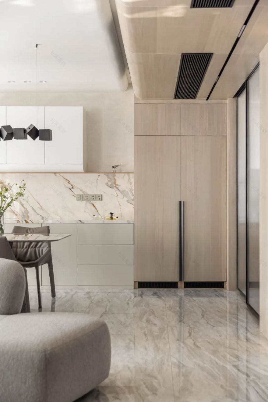
台面岩板延伸上墙,丰富空间层次感。内嵌冰箱与墙面木纹同色,在空间上保持了一致性。
The countertop slate extends to the wall, enriching the sense of spatial hierarchy. The built-in refrigerator is of the same color as the wood grain of the wall, maintaining consistency in space.
竖百叶引光入室,细碎光影随时间流逝在地面流淌,赋予了空间更多生机。
The vertical louvers guide light into the room, and the fine light and shadow flow on the ground with the passage of time, giving the space more vitality.
铁艺长虹玻璃推拉门,既能消减厨房台面的杂乱感,又保证了餐厅采光不受阻挡。艺术涂料与石材结合的墙面与柜门造型处处彰显设计巧思。
The wrought iron Changhong glass sliding door can not only reduce the clutter of the kitchen countertop, but also ensure that the restaurants lighting is not blocked. The combination of art paint and stone walls and cabinet doors show design ingenuity everywhere.
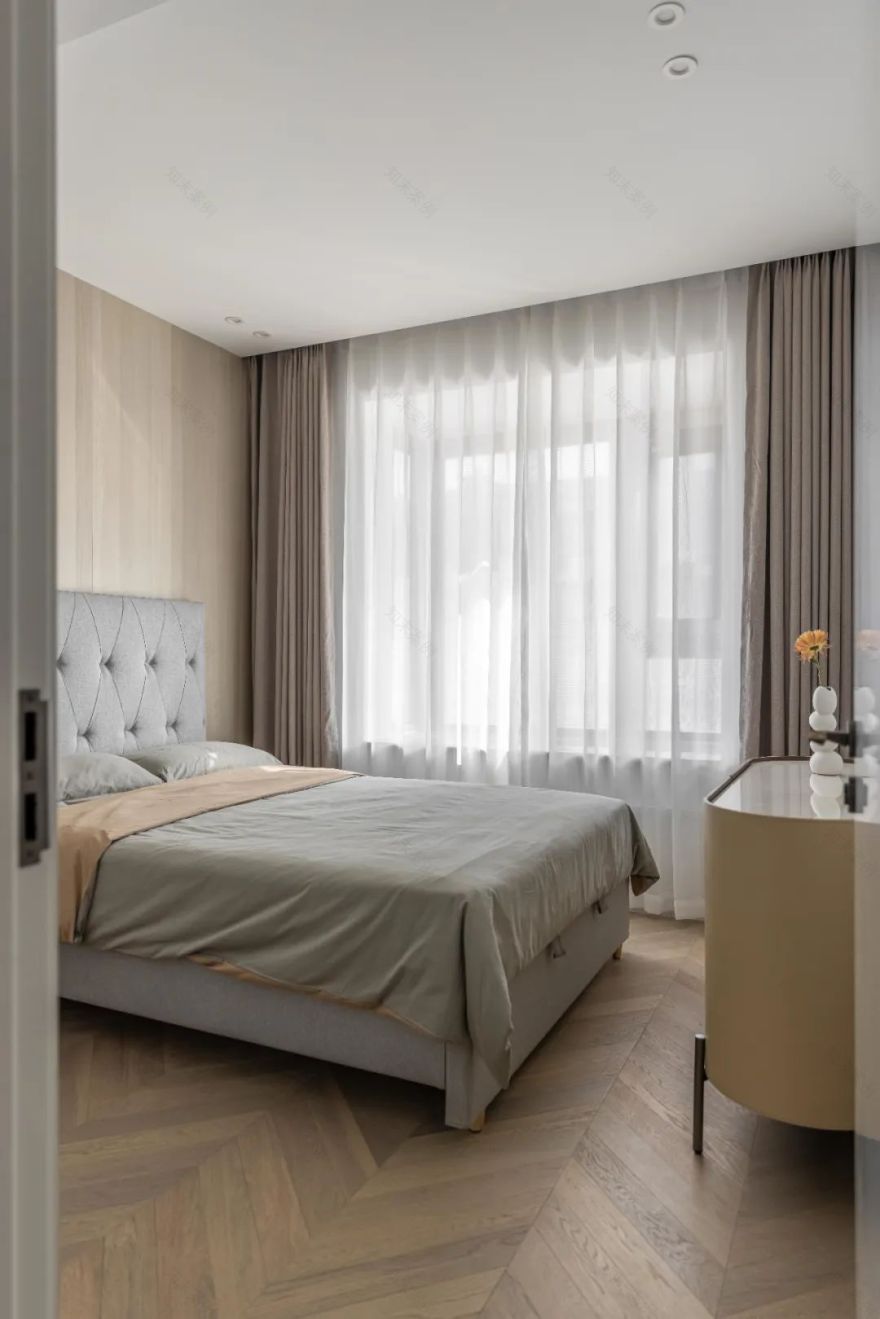
客房延续公共空间的色调,床头背景木饰面板装饰,结合烤漆波浪板,增加墙面层次感。
The guest room continues the tone of the public space, and the bedside background is decorated with wood veneer panels, combined with varnished wave boards to increase the layering of the walls.
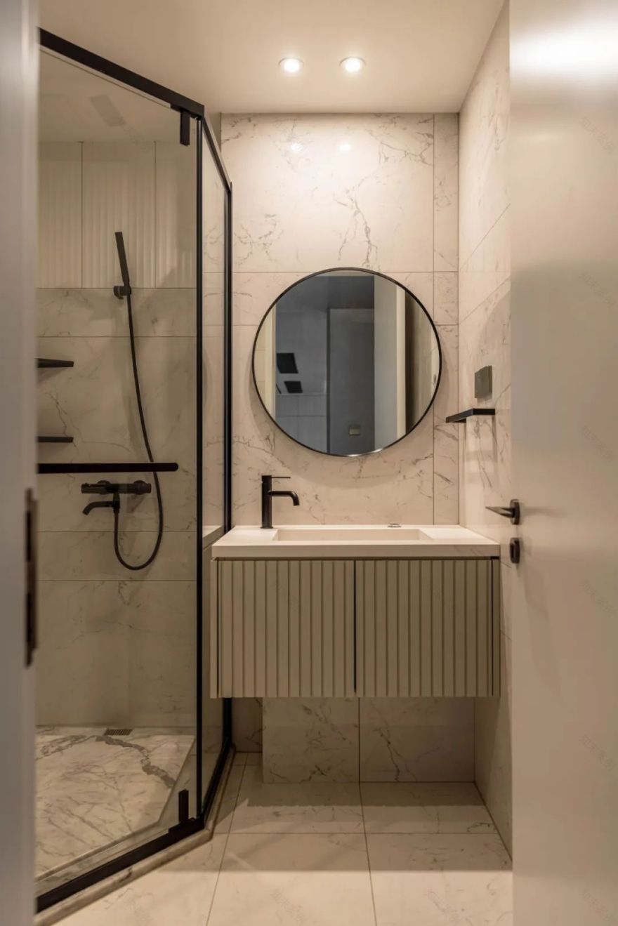
客卫以白色为主的色调减少了狭小空间的局促感,每一处细节的规划和设计都至关重要。
The guest bathroom is dominated by white to reduce the cramped feeling of the small space, and the planning and design of every detail is crucial.
二楼中厅是孩子学习和亲子互动的主要区域。大面积留白与浅木色使空间更具温柔的调性,充裕的空间、利落的软装搭配,可以让空间容纳多种生活情景。
The atrium on the second floor is the main area for children to study and interact with parents. The large area of white space and light wood color make the space more gentle tones, and the ample space and neat soft decoration can allow the space to accommodate a variety of life scenarios.
通往顶楼花园的楼梯,自然光也从玻璃天井透进室内。
Stairs leading to the garden on the top floor allow natural light to filter into the interior from the glass patio.
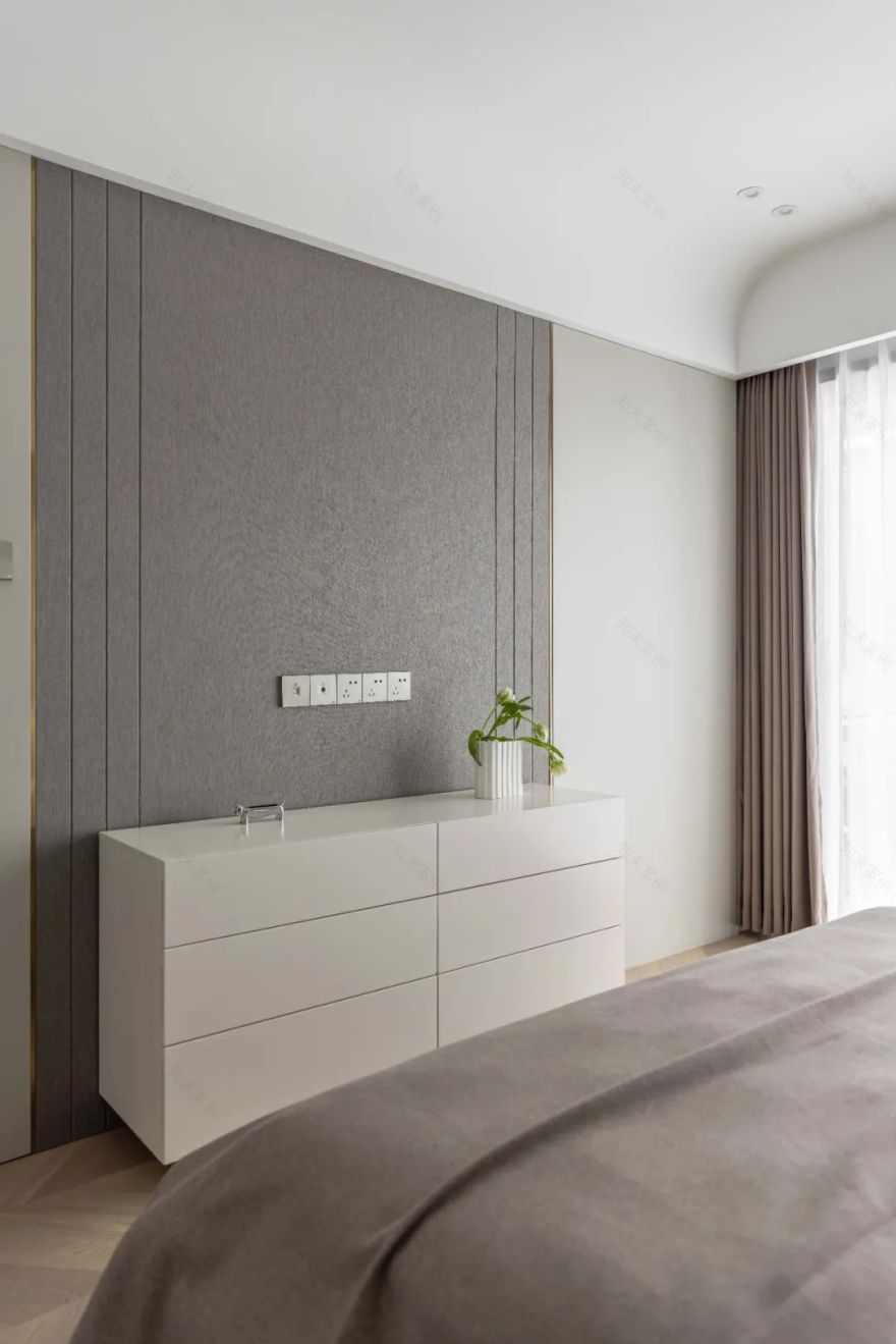
以灰咖色为主色调的主卧,相较公共空间少了些热情,但更为温和包容,为放松和睡眠提供更加舒适的氛围环境。
The master bedroom with gray and coffee as the main color is less enthusiastic than the public space, but more gentle and tolerant, providing a more comfortable atmosphere for relaxation and sleep.
与墙面同色的主卫门消减了存在感,使得整体墙面保持了更好的一致性。
The main guard gate of the same color as the wall reduces the sense of existence, making the overall wall maintain a better consistency.
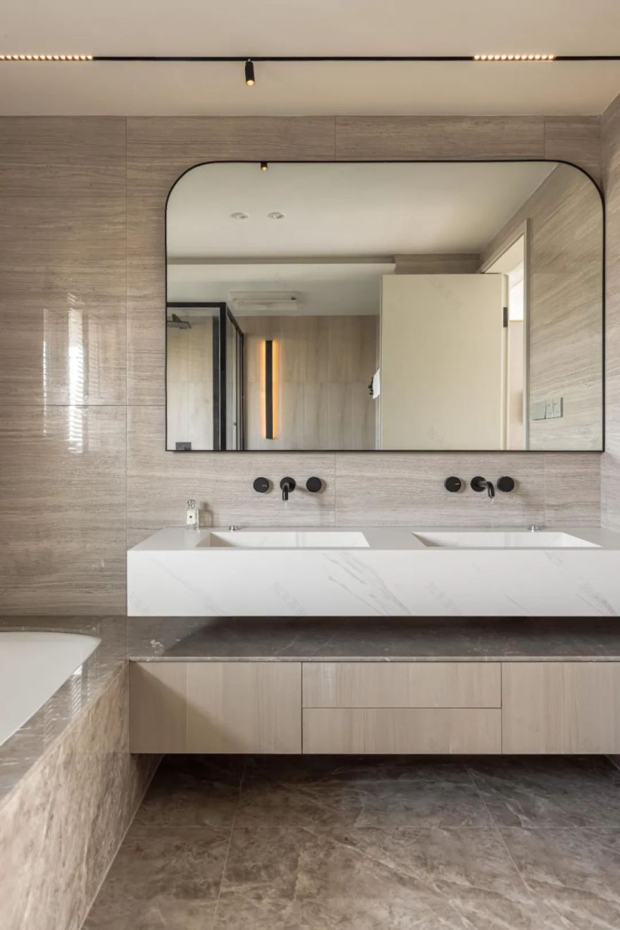
双台盆设计,洗漱空间宽敞,同时使用时候也不会受到影响,嵌入式龙头和一体式的石材台盆,减少卫生死角。
Double basin design, spacious washing space, and will not be affected when using, embedded faucet and integrated stone basin, reduce sanitary dead corners.
以宇航员为主题的儿童房,大面积运用撞色,为孩子打造了属于自己的梦想航空站。
The astronaut-themed childrens room uses a large area of contrasting colors to create their own dream air station for children.
回风口巧妙地隐藏在柜门后,与柜子融为一体;两个柜体之间是一个通往卫生间的隐形门。
The air return vent is cleverly hidden behind the cabinet door and integrated with the cabinet; between the two cabinets is an invisible door leading to the bathroom.
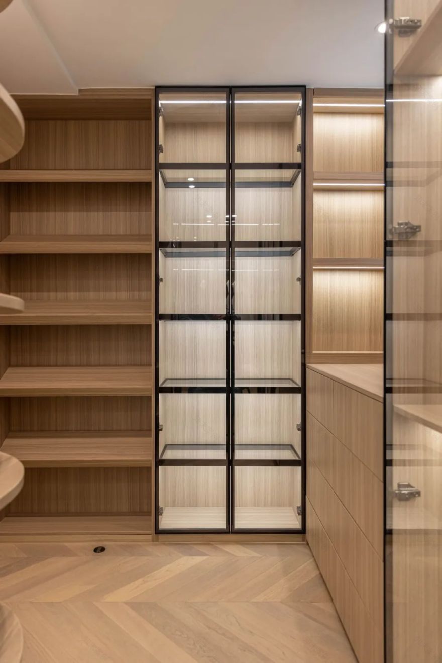
独立衣帽间设计大面积挂衣区,同时兼顾包包与鞋子,内置灯带物品一目了然,收纳更省心。
The independent cloakroom is designed with a large area for hanging clothes, taking into account bags and shoes at the same time.
居住需求 Living demand
4、二层挑空区域浇筑使用
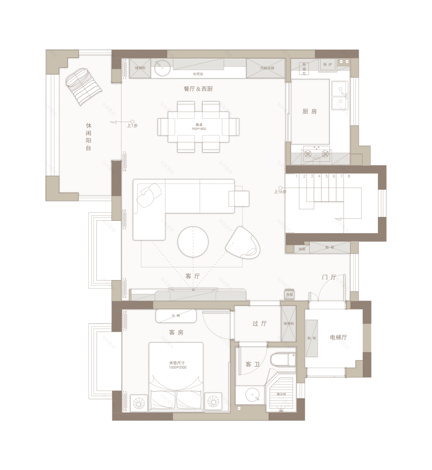
空间优化 Space optimization
1、二层挑空区域浇筑,设置开放书房
2、原主卫空间减小,扩大主卧空间
3、次卫与衣帽间位置重新规划,合理布局
平面方案 / DESIGN FLAT PLAN
客服
消息
收藏
下载
最近


