查看完整案例


收藏

下载
这是一个与美有关的空间,整个空间没有多余的造型,只为深处其间的人,成为整个空间的主角,让每一个人保有最纯真的精致、细腻与纯粹。为了打破常规的美发沙龙,更加注重体验与服务,设计师不断突破传统的美发空间,将简单、纯粹、责任、求真、务实融入到设计理念当中,以一种极简炫酷的潮流形式,创造出独特的结构时刻。
This is a space related to beauty. There is no redundant shape in the whole space. It is only for the people in the middle of the space to become the protagonist of the whole space, so that everyone can keep the most pure delicacy, delicacy and purity. In order to break away from the conventional hairdressing salon and pay more attention to experience and service, designers constantly break through the traditional hairdressing space, integrating simplicity, purity, responsibility, truth-seeking and pragmatism into the design concept, creating a unique structural moment in a minimalist and cool fashion form.
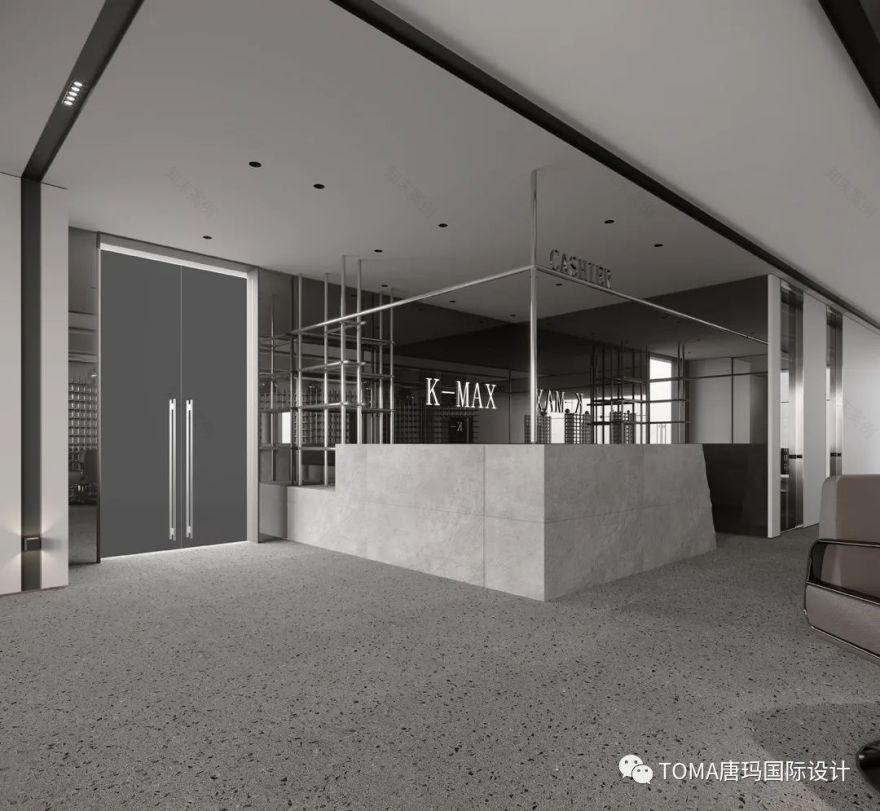
整个美发沙龙主要由石材和钢材组成,内部是由灯带交替区划天花板的格局,创造了不同空间的微妙分离。入口处的设计方法旨在提高客户的预期,现有的钢制窗框是装饰性的造型,与水磨石的地面与灰色的水泥墙体搭配在一起,给人以明媚通透的感觉。
The whole hair salon is mainly composed of stone and steel, and the interior is divided into ceiling pattern alternately by light belts, creating a subtle separation of different spaces. The design method of the entrance is to improve the expectation of customers. The existing steel window frame is a decorative model, which is matched with terrazzo floor and gray cement wall, giving a bright and transparent feeling.
整个空间的设计重心,设计师考虑的本质是最舒服的环境,最干净简洁的空间体验。大面积使用不锈钢的构造,是因其易清洁的特性使然。同时,设计师利用钢构造型的穿透性,巧妙设置灯光照明,营造别样氛围,解构出几个功能各异的区域。流体空间和自由物体的过渡和继承,表明一种律动的构图,通过行走于空间的动线运动,从而激活整个空间。
The design focus of the whole space, designers consider the essence is the most comfortable environment, the most clean and concise space experience. Large area use of stainless steel structure, because of its easy to clean characteristics. At the same time, the designer uses the penetrability of steel structure modeling to skillfully set up lighting, create a different atmosphere and deconstruct several functional areas. The transition and inheritance of fluid space and free objects indicate a rhythmic composition, which activates the whole space by moving the moving line in space.
美发沙发被分隔出会客区、造型区与休闲区,舒适之余给予人精致的美好体验。其中最为特色的是运用了3000多米不锈钢创造出的“波浪”造型。此大型装置的灵感来源于“人有三千烦恼丝,一丝胜一丝”的佛家术语,用简单的方式,专注做好一件事,用卓越的技术为客人打造满意的发型,专为客人提供高品质的价值服务。
The hairdressing sofa is divided into the reception area, the modeling area and the leisure area, providing a beautiful experience with exquisite comfort. One of the most distinctive is the use of 3000 meters of stainless steel to create a "wave" shape. The inspiration of this large-scale installation is derived from the Buddhist term of "people have 3000 worries, one silk is better than one silk". It focuses on doing one thing in a simple way, creates a satisfactory hairstyle for customers with excellent technology, and provides high-quality value service for customers.
“大减法”与小细节的完美融合,主要体现在材质的混搭成就了空间宁静温暖的感觉。其中不同质地的金属银色,如球体、不锈钢架构、亮面吊顶,反映出了干净利落的环境,又形成耐人寻味的层次感。统一的银色不锈钢隔架,作为统一的装饰符号灵活贯穿于整个空间,帮助衬托出美发产品的专业质感,细节之处大量保持极简设计,经典即是永恒。
The perfect combination of "subtraction" and small details is mainly reflected in the material mix and match, which makes the space quiet and warm. Among them, the metallic silver of different textures, such as sphere, stainless steel structure and bright ceiling, reflects the clean and tidy environment and forms an intriguing sense of hierarchy. The uniform silver stainless steel spacer frame, as a unified decorative symbol, runs through the whole space flexibly, helping to set off the professional texture of hair products. The details are kept in minimalist design, and the classic is eternal.
洗头区采用太空舱式的设计语言,为这个半封闭式空间提供了相对独立尊贵的美发体验。方与圆,白与灰的几何设计线索,糅合规整与圆整,凝练出灵动而独特的空间气质。
The shampoo area adopts the space capsule design language, which provides a relatively independent and noble hair experience for this semi enclosed space. The geometric design clues of square and circle, white and grey combine regular and round, and condense the flexible and unique space temperament.
项目名称丨K-MAX SALON
Project Name丨
K-MAX Salon
项目位置福建福州
Project Location丨Fuzhou, Fujian
项目面积 | 310平方米
Project Area丨310 square meters
设计时间
2020/07Design Time丨July 2020
设计团队
丨
刘妍丽 林杰熙
Design Team丨
Liu Yanli and Lin JieXi
效果表现
张罕星
Performance丨Zhang HanxingFloor Plan
平面图
设计师/Designer
客服
消息
收藏
下载
最近


