查看完整案例


收藏

下载

翻译
Firm: Space Matrix
Type: Commercial › Office
STATUS: Built
YEAR: 2019
3 things that happen when designers design their own office space
As a part of our global expansion plans, we branched out into China through the successful acquisition of Muraya last year. Our initial conversations with Muraya told us that this interior design and construction company shared a lot of our core values and cultural beliefs. Together with their talented team, we looked forward to better servicing our clients in Australia, India and Southeast Asia.
But first, we needed a gorgeous office for our newly expanded team in Shanghai. We wanted to rebrand the existing space to reflect its affiliation to the larger Space Matrix family. Moreover, the way we work has changed a lot over the last few years, and we wanted our office design to be more functional and collaborative.
Fortunately, we had our best designers on the job! And when you ask designers to design their own office space, here are 3 things that happen:
1. They know exactly how they work - and they design for it
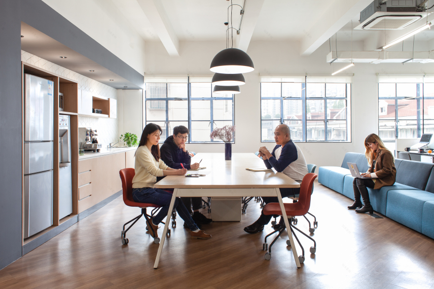
Work culture here at Space Matrix has become extremely collaborative and dynamic over the years. Our designers wanted the office to reflect and encourage that culture, so they did away with all individual offices. Now, from the General Manager to the newest hire, everyone sits side by side in our brand new open office. They put in large communal work tables, increased the number of power and data points throughout the space and included lockers adjacent to the work area so that people can store their belongings and feel free to move around the office unencumbered.
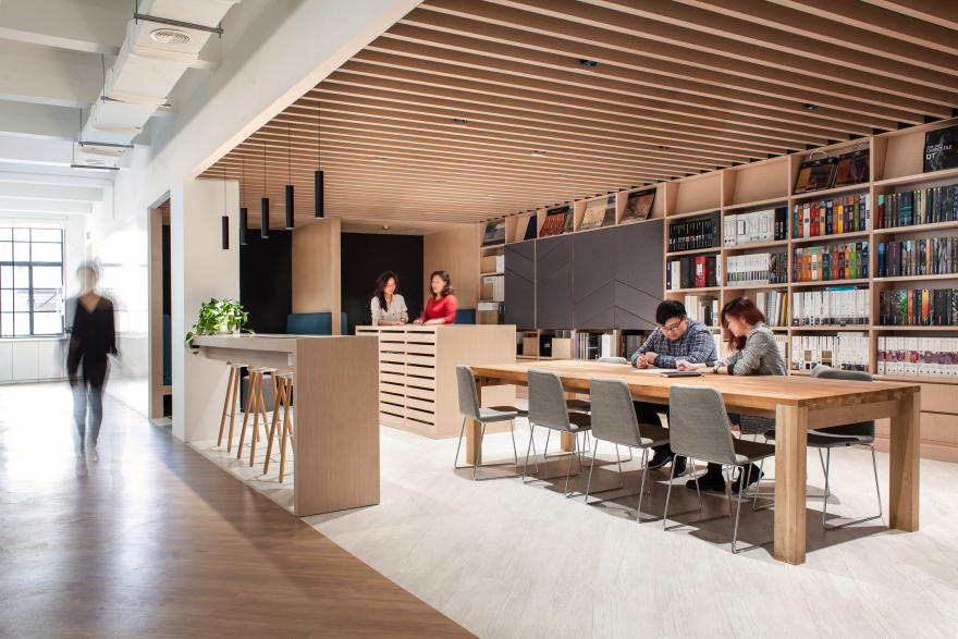
Removing individual offices left them with enough space to triple the existing design library. This is a communal space with colourful shelves and a variety of seating options where people usually gather to work and bond. Now, it can also be used to relax and enjoy a bit of quiet time when needed. The addition of work booths here, makes this a great place to retreat to for some focussed work.
The other thing our designers did with all that extra space was to create a gorgeous new design lab. This is where all our materials and finishes are kept. With all our resources at an arm’s reach, this is the perfect spot to come to, when a designer wants to discuss a particular project with a colleague, or even demonstrate a certain idea to a client. It also has a large projection wall on one side, which makes this design lab ideal for townhalls, trainings, events and vendor showcases.
2. They manage change early on
Sustainability is a core part of the Space Matrix ethos, and we pride ourselves on offering highly efficient green solutions to our clients. Our designers wanted to put this to practice in our Shanghai workspace as well. Sustainable workplace design is more than just adding some greenery in the office — it requires quite a bit of planning and sometimes, even complete overhaul of certain existing systems and practices.
This workspace is LEED Gold certified — on an average, buildings with this certification have been found to use 20% less source energy than non-certified buildings. Our Shanghai office is designed with wide windows in the work areas, which give us lots of natural sunlight, and cut down our electricity consumption. We have luxurious green walls in a number of areas in the office, which improves indoor air quality and reduce dependency on air conditioning systems. These green walls have their own irrigation channels, making them extremely low maintenance too. Our designers also put a greater focus on workplace technology — we now store more information digitally, using various Google platforms and cloud-based servers. This cuts down our need for physical storage spaces, and it lets us uphold our culture of flexibility and mobility by enabling people to access data from anywhere. Moreover, it comes with a fantastic green advantage too — it has helped us reduce the amount of paper we use by 70%.
3. They prioritise their well-being
As every designer knows, creativity gets stifled in bland, uninspiring offices, and thrives in salutogenic spaces. Salutogenic design prioritises wellness and creates an atmosphere where people can design, collaborate and grow.
The soothing spaces here at the Space Matrix Shanghai office is testament to this. Our designers did up the space in white, giving the office a clean, airy vibe. Rather than an accent colour, they chose to add visual interest with plants instead. Take a stroll through the office and you’ll see potted greens on the all-white work desks, tumbling vines strategically placed on cupboards and tables, eye-catching ferns in the meeting rooms, and lush green walls in the work areas. These biophilic elements soothe the eye, add an appealing natural texture to the space, and put the focus strongly on wellness. Sitting for long durations can also impact physical health and cause mental fatigue, so our designers incorporated clusters of sit-stand work desks to ensure that people are not cooped up at their desk all day. Moreover, the sprawling design lab is spacious enough to be utilised as a multi-functional area — and our colleagues at Space Matrix Shanghai put it to good use, with frequent yoga and workout sessions there.
客服
消息
收藏
下载
最近


