查看完整案例


收藏

下载
▲重新设计后的七分甜门店 The redesign of the SWEET 7 storefront
2015 年,7 分甜的第一家门店在落地苏州。同年,品牌入驻购物中心的首家门店也在苏州同步开出。经过 6 年在长三角地区的深耕,7 分甜已跻身国内茶饮行业的头部品牌。随着品牌力的提升,7 分甜尝试回归初心,委托 MOC 对这家充满纪念意义的门店进行设计。
In 2015, the first shop of SWEET 7 was launched in Suzhou. In the same year, it is also its first time to open a shop in a mall of Suzhou. After 6 years of development in the Yangtze River Delta, SWEET 7 has become one of the top brands in the RTD tea industry. With the improvement of brand power, SWEET 7 would like to go back to its origin and commission MOC to redesign this monumental storefront.
7 分甜启源于苏州,与这座城市的感情不言而喻,因此品牌方希望能在这个纪念性的门店结合苏州元素,表达出品牌与城市的连结。然而,过度追求城市文化的表达,往往会让一个商业空间变得空洞乏味,如何运用在地文化元素为品牌赋能,正是在该命题之下急需解决的问题。
SWEET 7 来自苏州,因此它希望在这家具有纪念意义的店铺中结合苏州元素,以表达它与这座城市的联系。如何在店铺中呈现苏州元素和苏州印象成为当务之急。然而,城市文化的过度呈现往往会使商业空间变得空洞和乏味。因此,如何利用当地文化元素为品牌赋能是亟待解决的问题。
01 造园:回应江南人文历史
01 Creating a Garden: Responding to the Humanistic History of Jiangnan
提起苏州,第一印象必定属于“园林”。
When it comes to Suzhou, the first impression must be “Gardens”.
▲园林印象 Garden impression
作为一项重要的世界文化遗产,江南园林宅园合一,可赏、可游、可居,这种建筑形态的形成,是在人口密集和缺乏自然风光的城市中,人类追求自然、向往自然和完善自身居住环境的一种创造。此外,江南园林所蕴涵的中华哲学、历史、人文是江南人文历史传统、地方习俗的一种象征和浓缩,在世界造园史上具有独特的历史地位和重大的艺术价值。
As an important world cultural heritage, Jiangnan gardens are a combination of houses and gardens for the purposes of appreciation, amusement, and habitation. This architectural form was developed in a densely populated city that lacks natural beauty. Its creation was for people to pursue nature, aspire to nature, and improve their living environment. In addition, the Chinese philosophy, history, and humanity in the gardens of Jiangnan are the symbol and quintessence of humanistic and historical traditions and local customs in this area. This landscape garden style has a unique historical status and significant artistic value in the history of gardens in the world.
在深入的理解园林的精神后,MOC 对江南园林的元素进行提取、拆分和重组,通过空间向顾客讲述 7 分甜的眼中的苏州印象,以小窥大,希望顾客通过一家小小的门店,更深入地领略到园林之美。
After an in-depth understanding of the spirit of gardens, MOC extracts, dissembles and reconstructs the elements of the gardens in Jiangnan. In this space, customers are introduced to the Suzhou impressions in the eyes of SWEET 7. The brand hopes its customers can appreciate the beauty of the garden through a small store.
▲冲孔板制作的现代屋檐掩映下的传统屋檐 Traditional eaves under the cover of modern eaves made of perforated panels.
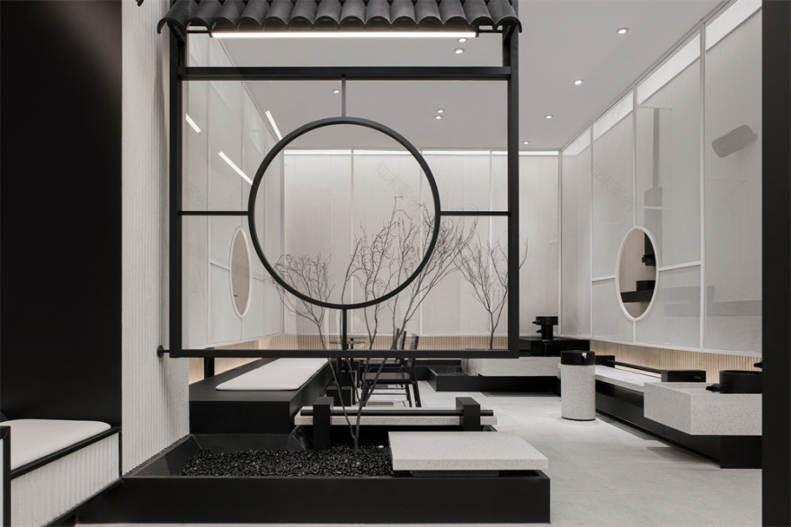
MOC 融入了苏州建筑和江南园林风格,通过现代的手法进行重新演绎——色调采用传统的白墙黛瓦,但表达方式却是现代的,极简的黑白结合暖色灯光,将休闲氛围置于院落之间。
MOC incorporates Suzhou architecture and Jiangnan garden style, and reinterprets it with a modern approach – the color palette combines the traditional white walls and black tiles. But its presentation is very modern. The minimal black and white are set against the warm lighting, which creates a casual atmosphere in the courtyard.
▲轴测说明 Axonometric projection
▲现代手法演绎的白墙黛瓦 Modern interpretation of white walls and black tiles
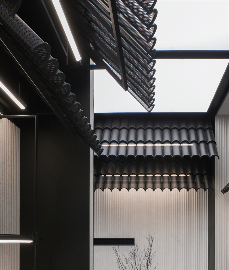
细密的金属冲孔板形成半通透的效果,几层叠加构成江南水乡的屋檐形态,结合空间布局勾勒出建筑与院落的关系。立面则使用白色的水泥软陶墙板,以其朴质的肌理质感回应传统建筑立面的屋檐和雕花木窗。
A semi-transparent effect is formed by fine metal perforated panels. The stacking layers of panels come into the shape of the eaves in the Jiangnan water village, outlining the connection between the building and the courtyard within the space layout. The façade is made of white polymer clay wall panels, and its unadorned texture echoes the eaves and carved wooden windows of the traditional building façade.
▲细密的冲孔板弯曲并叠加形成屋檐,隐约透出暖色灯光 Fine perforated panels are bent and overlapped to form the eaves, with warm light faintly coming through.
▲现代的屋檐和墙体与传统屋檐和木窗相对而立,勾勒出院落形态。The modern eaves and walls stand opposite to the traditional eaves and wooden windows, which outlines a courtyard.
天花上的整片发光软膜,为空间带来户外感。黑白交融的整体色调,使顾客对空间主题的第一印象由此形成。
The illuminated ceiling made from soft film creates the outdoor atmosphere. The overall color palette of black and white gives customers the first impression of the shop theme.
▲从通道看向室内庭院 Looking into the indoor courtyard from the passage
▲定制家具细节 Details of customized furniture
02 静与动:无水不成园
02 Stillness vs. Dynamics: No Water, No Garden
无水不成园。水是江南园林之魂。
There’s no garden without water. Water is the soul of Jiangnan gardens.
MOC 在空间后部设计了一个内庭院,布局精巧。沿墙设置流水装置,座位依水而设:品茗间,高低错落的流水潺潺可闻其声,动静相宜。
MOC has designed an indoor courtyard at the back of the space with an elaborate layout. A flowing water installation is along the wall and the seats are by the water. While sipping tea, customers hear the gurgling water at different heights, which is a balance of stillness and dynamics.
▲流水装置和座位细节 Flowing water installation and details of seating.
苏州气候温和,蚕桑发达,自古便盛产丝绸布匹。庭院中,MOC 以编制金属网回应丝绸的织造纹路,形成半通透的白纱效果,又以顶部透光灯膜洗亮空间,在庭院的流水声中透过白纱可见朦胧景致,更添园林气韵。
Suzhou has a mild climate and a rich silk and mulberry industry. It has produced silk and cloth since ancient times. In the courtyard, woven metal nets are adopted by MOC as to imitate the weaving pattern of silk and create the effect of the semi-transparent white veil. The space is illuminated with a lighting film box in the ceiling, and the garden atmosphere is accented with the hazy view through the white veil amidst the sound of flowing water.
▲金属网的编织肌理回应了布料的织造纹理 The woven texture of metal net responds to the weaving fabric.
▲沿墙设置的流水装置,为坐饮增添几许意趣 The flowing water installation along the wall enhances the mood for tea drinking.
空间整体调性、错落的物搭配,使空间慢且静。而流水的动,则缓缓地为空间带来更为纯净清新的感受。
The overall tone of the space and the delicate decorations makes it slow and quiet, while the movement of the water inadvertently brings a pure and fresh experience.
▲结合传统家具结构定制的空间家具 Customized furniture in traditional style.
03 形与色:整体性的品牌形象
03 Form vs. Color: A Holistic Brand Image
结合空间主题,MOC 对出现在空间中的品牌元素提出了统一的要求。配合空间的整体文化内涵,品牌标准视觉的让步提升了品牌与在地文化的融合度。
入口处,品牌视觉锤的“7”字以矗立于水景之中,犹如假山融入到空间景观之中,与空间整体风格融合中又不失品牌性。
Combining with the theme of the space, MOC unifies the brand elements that appear within the shop space. In line with the overall cultural connotation of the space, the visual standard of the brand enhances the integration of the brand and local culture. At the entrance, the brand signature “7” stands in the waterscape, like a rockery blending into the landscape. It fits into the overall spatial style, without losing its branding.
▲从入口处看向室内 Looking from the entrance into the interior
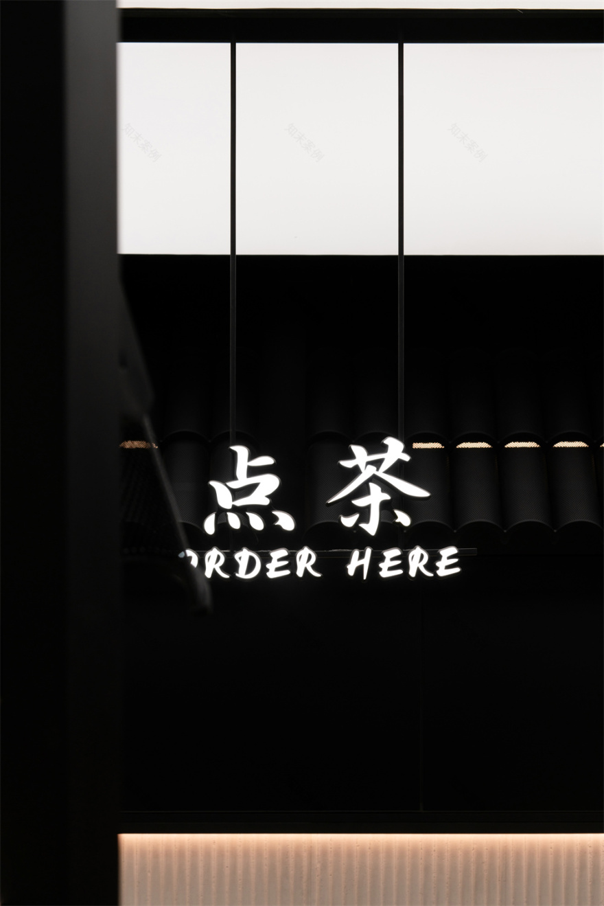
原来的品牌标准字体被替代为定制的行楷书法字体,融合了书法手写英文字体与整体空间雅致的调性互相匹配。
The original font for the brand is replaced with a custom calligraphic font. With the handwritten English font, it matches the elegant tone of the whole space.
▲针对该门店定制的行楷字体 Customized font for the storefront
▲植物掩映下的自助柜台 The self-service counter through the plants
洞见苏州慢,邂逅 7 分甜。当年轻人坐在空间中的传统窗花前啜饮,在场景连接的时空中体会到园林之美,正是 MOC 对传统文化在时代语境下的又一次探索。
Enjoying the slow Suzhou and tasting SWEET 7. When young people are sipping tea and sitting in front of the traditional window, they experience the beauty of the garden back in time and space, which is another exploration of traditional culture by MOC in the context of the times.
▲平面图 Floorplan
项目信息——
项目名称:七分甜-园林主题店
主创设计师:梁宁森,吴岫微
项目总监:杨振钰
空间设计:庄亦乘,胡侨,吴心鸿
平面设计:小铁,皮酱,谢昕妤
业主团队:孙长远,敖娇,冯家俊
设计周期:2021.4-2021.6
竣工:2021.7
项目地址:苏州园区永旺梦乐城一层
面积:120㎡
主材:金属冲孔板,水泥软陶板,灰麻石,金属网
业主:七分甜
文案:杨振钰,吴岫微
翻译:柯清雅
摄影:小云
客服
消息
收藏
下载
最近


