查看完整案例

收藏

下载
福邸国际是一家融合整体设计及进口软装的整体家居服务公司,同时也是目前全球拥有众多奢侈品品牌的进口软装家居产品提供商。在福邸自身的家居存储仓库中,业主希望拥有与自己品牌形象相契的建筑场地,因此福邸仓库改造项目应运而生。
ForD International is a comprehensive home service company that integrates overall design and imported soft furnishings. It is also currently a provider of imported soft furnishings and home products for many luxury brands worldwide. In ForD’s own home storage warehouse, the owner hopes to have a building site that matches their brand image, thus the ForD warehouse renovation project was born.
厂区位于杭州萧山工业区,周边几乎都是中小型工厂,工业氛围浓厚。建筑的前身是由4座老旧的办公楼与电子车间组成,此次改造作为福邸的家具仓库及展厅使用。say希望将这个厂区更新为该区域充满活力的一个城市节点,消除以往单调的工业建筑形象。
▼区位图,site analysis
▼厂区原状,original state of the factory
ForD International is a comprehensive home service company that integrates overall design and imported soft furnishings. It is also currently a provider of imported soft furnishings and home products for many luxury brands worldwide. In ForD’s own home storage warehouse, the owner hopes to have a building site that matches their brand image, thus the ForD warehouse renovation project was born.
▼沿街立面,facade along the street
01
规则中的不规则
Irregularity within regularity
厂区总建筑面积约1.7万㎡,原本的四幢建筑因功能划分为了展厅、办公室和仓库。改造过程中,say保留了原建筑的主体结构,将重心放在了新立面系统的构建,在原有尺度上进行的材质的覆盖也暗示着建筑在时间维度上的延续。
The total construction area of the factory is approximately 17,000 square meters, and the four original buildings were divided into exhibition halls, offices, and warehouses according to their functions. During the renovation process, Say preserved the main structure of the original building and focused on constructing a new facade system. The use of materials to cover the original dimensions implies the continuation of the building in the time dimension.
▼翻新后的四幢建筑,the four original buildings after renovation
▼设计的重点在于新立面系统的构建,the focus of the design is on the construction of the new facade system
▼平面化的外立面语言,planar language of the facade
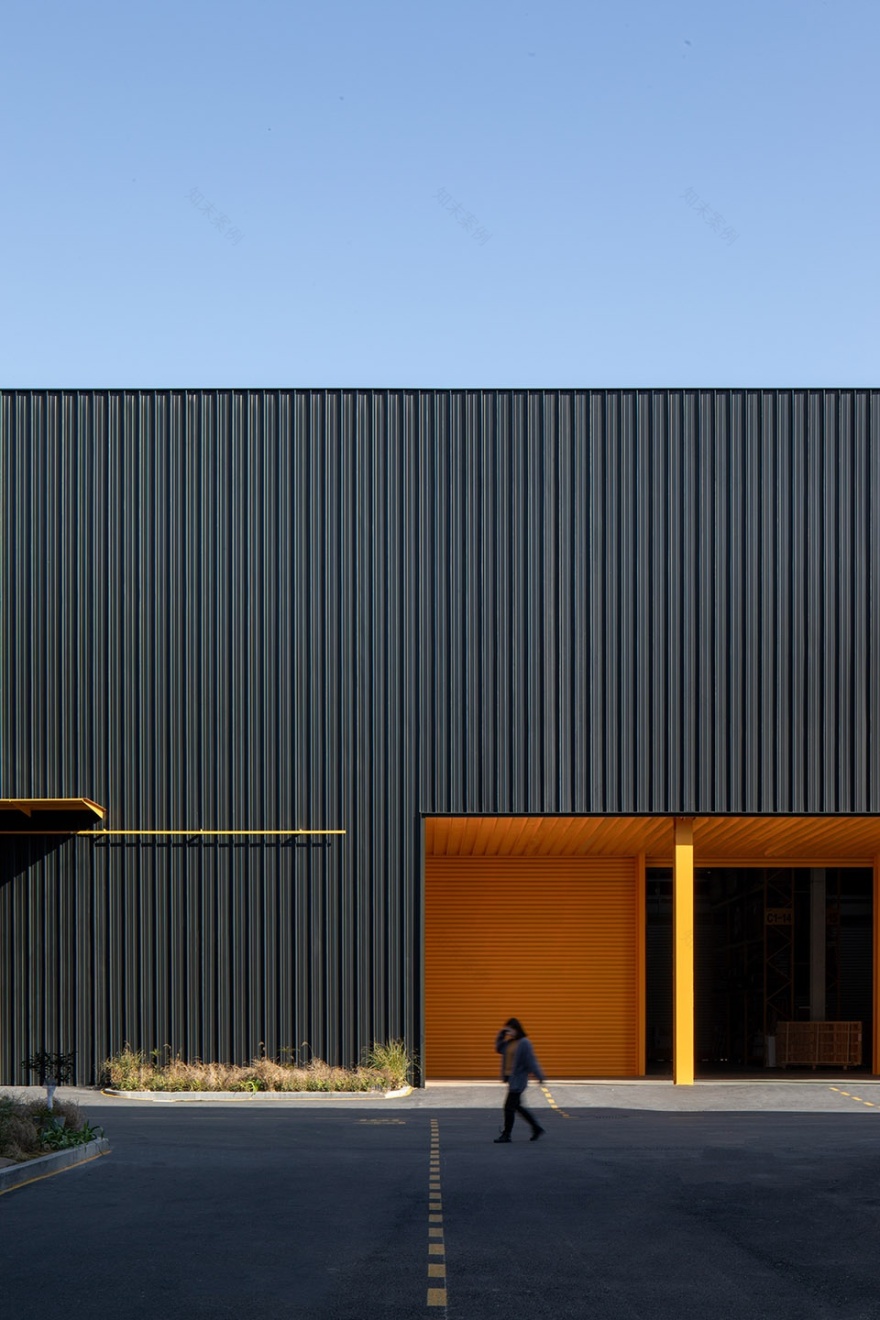
设计师通过更具平面的语言去做了外立面的“包裹”,简洁与清晰的视觉效果传递出了设计上的高效与快捷。考虑到立面美观性、材料持久性,铝镁锰金属面板成为了此次建筑外立面改造的关键。
The designer used a more planar language to create a “wrapper” for the facade, and the simple and clear visual effect conveys the efficiency and speed of the design. Considering both the aesthetic and material durability of the facade, aluminum-magnesium-manganese metal panels became the key material for the external facade renovation of the building.
▼参数化的构成,parametric composition
▼铝镁锰板构成建筑外立面改造的关键,aluminum-magnesium-manganese metal panels of the facade
通过对铝镁锰板的使用,可以恰如其分的遮挡住原有窗洞进来的直射光线,合理的保护了展厅中的家具。
Through the use of aluminum-magnesium-manganese panels, the direct sunlight coming in through the original windows can be appropriately blocked, which provides reasonable protection for the furniture in the showroom.
▼立面细部,details of the facade
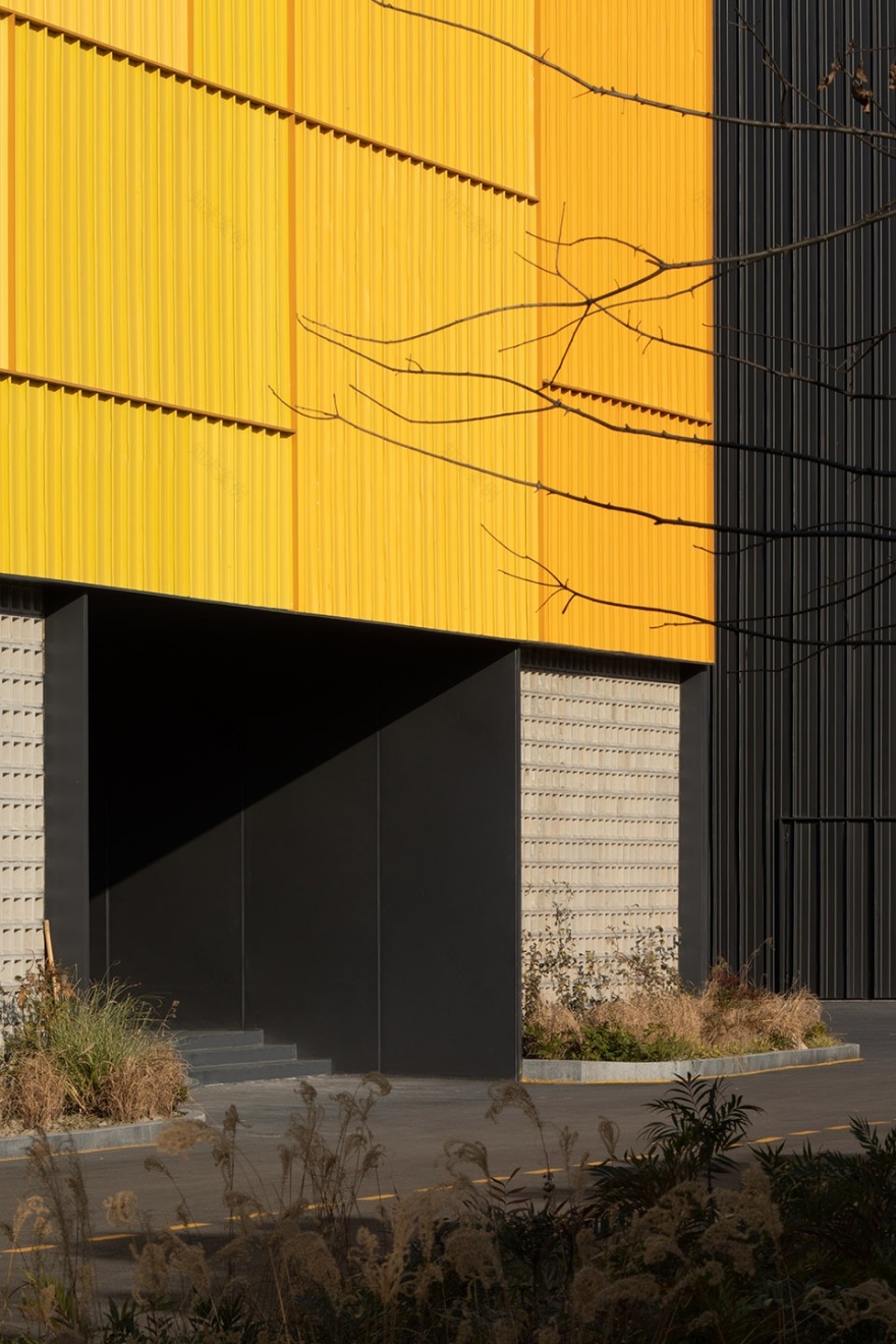
展厅建筑南立面,say尝试了参数化的构成方式丰富新立面网格体系,一抹福邸标志性的黄色从一端逐渐消隐至另一端,在规则中以不规则的网格排列前进,16个颜色在同一个立面上演绎着各自特有的色彩。
On the south facade of the exhibition building, Say tried a parametric approach to enrich the new facade grid system. A touch of the iconic yellow of Fudi gradually fades from one end to the other in an irregular grid arrangement within the rules, and 16 colors are interpreted on the same facade with their own unique hues.
▼黄色为建筑立面的标志色彩,yellow is the signature color of the building facade
▼体量节奏,rhythm of the volume
▼立面细部,details of the facade
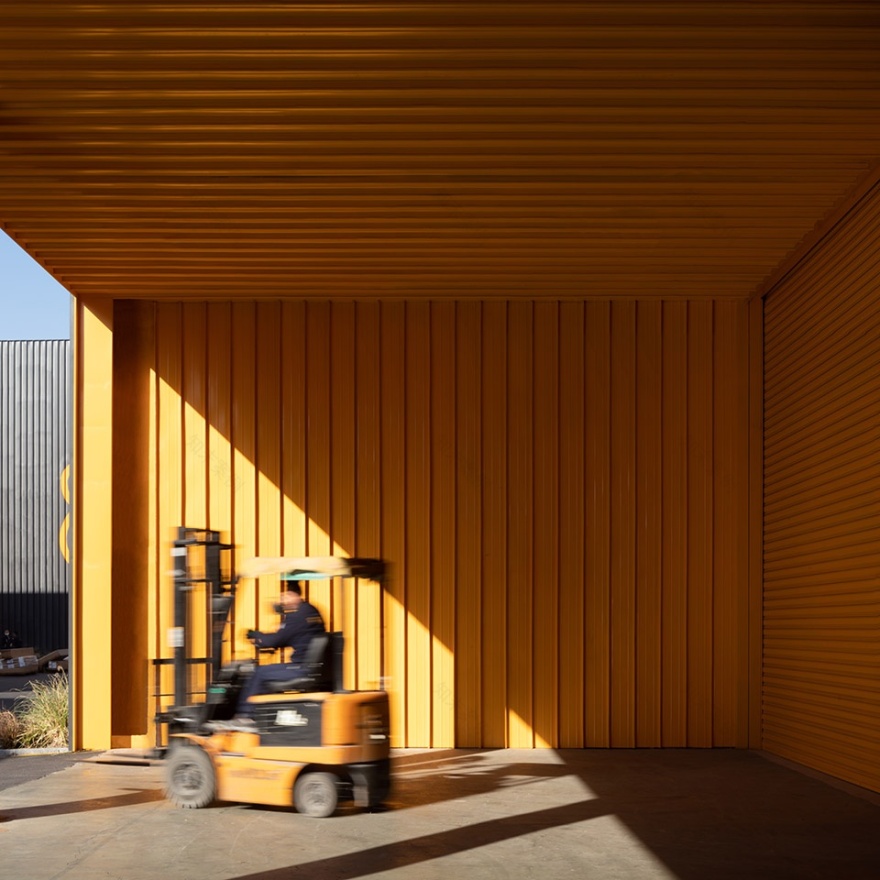
▼阳光与仓库入口,sunlight and warehouse entrance
▼仓库入口区域,entrance area of the warehouse
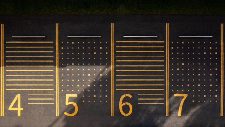
园区的平面色彩也采用了建筑立面标志黄色与之呼应,厂区地面根据货物运输的车行流线和功能分区做了相应的指引,停车位区域的图案也结合到建筑立面的像素化概念。
The color scheme of the park also echoes the iconic yellow color of the building facade. The ground of the factory area has been designed with corresponding guidance based on the vehicle flow lines for goods transportation and functional zoning. The pattern of the parking area is also integrated with the pixelated concept of the building facade.
▼园区的平面色彩与建筑立面标志黄色呼应
the color scheme of the park also echoes the iconic yellow color of the building facade
▼像素化的停车场图案,pixelated parking lot pattern
02
从建筑生长出的绿意
Greenery grown from the building
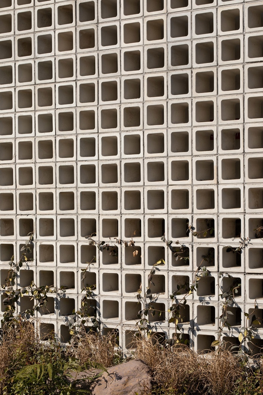
配合建筑立面,周围做了低矮花灌木景观,绿意从地面延伸却又不抢夺立面的视线,同时保留了原有场地的树木,让植物与建筑立面的配合相得益彰。
To complement the building facade, low and bushy floral landscapes were added around the building. The greenery extends from the ground without obstructing the view of the facade, while the existing trees on the site were preserved, making the plants and the building facade complement each other perfectly.
▼园区景观分析图,analysis of the landscape design
▼展厅景观分析图,analysis of the landscape design
展厅建筑的南面有用于给前来展厅的顾客的外摆休息区,同时也作为了主要的停留点,在工业气息浓重的环境下也能感受到绿意的生机。
On the south side of the showroom building, there is an outdoor seating area for customers visiting the showroom, which also serves as the main stopping point. Despite the strong industrial atmosphere, one can also feel the vitality of the greenery.
▼在自然中生长的乌桕移植到与人产生交流的户外空间
The Chinese hackberry grown in nature is transplanted to an outdoor space for interaction with people
▼植物与建筑立面的配合相得益彰,the plants and the building facade complement each other
▼在砖墙中蔓延出的绿意,green creeping through the brick walls
03
极简的仓库空间
Minimalist warehouse space
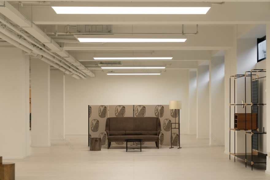
展厅建筑共3层,1层主要为展区、摄影区以及水吧区,2层为灯展示区和大件家具展示区,而3层则是座椅类家具的展示,整体空间以白色为基调,以家具陈列为重点,北面高窗挥洒下的自然光配合家具的展示有着微妙的效果。
The exhibition building consists of three floors. The first floor mainly includes exhibition areas, photography areas, and a water bar. The second floor is dedicated to lighting and large furniture displays, while the third floor is for showcasing seating furniture. The overall space is predominantly white, with a focus on furniture displays. Natural light from the high windows on the north side creates a subtle effect when combined with the furniture displays.
▼展厅内部空间概览,overall of the exhibition building interior
▼展厅,showroom
仓库遵循了原有建筑结构,根据立柱的位置考虑到搬运货物的尺度,把每一跨柱作为一个货架的区域,并以号码标注,黄色与黑色的对比使人能快速的识别到货架编号,便于分区管理。
The warehouse follows the original building structure and considers the scale of handling goods based on the position of columns. Each span of columns is used as a shelf area, labeled with numbers for easy identification, and the contrast between yellow and black helps people quickly recognize the shelf numbers, facilitating zoning management.
▼模型,model
▼平面图,floor plan
▼立面图,elevation
福邸仓库改造
状况:完成
年份:2022
项目类型:工业建筑
设计公司:say architects
主持设计:张岩、单嘉男
团队:宋丹丽、范雅雯、兰丹娜、何思韵、周瑶、叶金
空间摄影:RAWVISION studio、DONG建筑影像
景观设计:去野 · 二旦植物工作室
Renovation of the ForD Warehouse
Status: Completed
Year: 2022
Project type: Industrial architecture
Design firm: say architects
Lead designers: Zhang Yan, Shan Jianan
Team: Song Danli, Fan Yawen, Lan Dana, He Siyun, Zhou Yao, Ye Jin
Photography: RAWVISION studio, DONG Architecture Photography
Landscape design: Quye·Erdan Plant Workshop
客服
消息
收藏
下载
最近


