查看完整案例


收藏

下载
室内设计里,
色彩是影响风格的最重要因素之一,
或许你喜欢静谧的氛围,
或许你喜欢明亮的空间,
或许你热爱大自然的感觉......
这些无不需要依靠色彩的叠加与搭配。
来看看最新的室内设计色彩趋势吧,
希望能为你装点空间带来启发。
之前,色彩的主要目的是为室内设计带来更加前卫的调色板,比如充满活力的红色,现代金属色和黑色调装墙的变化,而今年采用更加注重生活方式的方式来开发新的色调。
Last year was all about bringing an edgier palette into the home–with vibrant reds, modern metallics, and variations of the statement black accent wall. Unlike 2018's color trends, 2019 is taking a more mindful, lifestyle-based approach to the development of new shades.
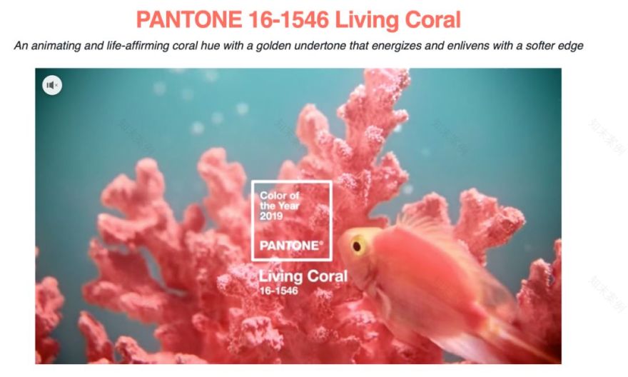
大多数涂料品牌已经发布了今年的颜色,包括Benjamin Moore,PPG Paints,Sherwin Williams,当然还有Pantone的2019年度颜色:珊瑚红。
Most paint brands have released their colors of the year, including Benjamin Moore, PPG Paints, Sherwin Williams, and of course, Pantone's 2019 Color of the Year: Living Coral.
从功能强大的水性涂料到柔软的陶土,公司正在将消费者家庭生活,心理需求和数字参与之间的关系联系起来,这激发了今年的许多色彩选择。
From powerful aquas to soft terracottas, companies are connecting the dots between consumers' home lives, mental demands, and digital engagement, which inspired many of the color picks this year.
如果您希望通过新的色调来启动您的家居装修,请查看2019年的顶级色彩趋势,以及如何在您自己的家中使用它们。
If you're looking to kick-start your home refresh by indulging in new hues, check out 2019's top color trends, along with how to use them in your own home now.
1.
WOODLAND SHADES
森林之影
“虽然大自然是家居装饰的共同灵感,但在2019年,我们将看到从超大植物到林地的转变,蘑菇灰和蕨类植物的色彩。蘑菇也将继续成为家庭中的关键形状,“Sherwin Williams色彩营销总监Sue Wadden说道,”他们朴实的灰色与温暖的棕色混合在一起,散发出旧世界,自然主义的感觉。“
“While nature is a common inspiration for home décor, in 2019 we will see a shift from oversized botanicals to the woodlands, with mushroom grays and fern-inspired colors. Mushrooms will also continue to be a key shape in the home," says Sue Wadden, director of color marketing at
Sherwin Williams
. "Their earthy color–gray blended with warm brown–gives off an old world, naturalist feel."
2.
ENERGIZING CORAL
活力珊瑚
当你开始进行家庭改造时,Pantone的2019年活珊瑚色才有意义。根据室内设计师Carolyn Pressly的说法,“我们将在家中看到更多充满希望和乐观的色彩,最近选择的活珊瑚-Pantone的年份颜色就证明了这一点。而不是直接使用珊瑚,你可以把它分成它的橙色和粉红色的同行。在这样一个没有窗户的办公室里或是一个小女孩的房间里,心情瞬间变得充满活力和振奋。
It only makes sense for Pantone's 2019 color of the year–Living Coral–to be on your radar when you begin your home revamp. According to interior designer
Carolyn Pressly
, "We’ll be seeing more hopeful and optimistic colors in the home, as evidenced by the recent selection of living coral, Pantone’s color of the year. Instead of using coral literally, you can separate it into its orange and pink counterparts. In this windowless office converted into a little girl’s room, the mood instantly becomes energizing and uplifting."
3.
HUNTER GREENS
猎人绿
根据室内设计师Becky Shea的说法,猎人绿是2019年的绝佳选择。“猎人绿拥有闷沉和世故的价值,它在自然界和生命中都是内在的。它在各方面都是永恒的,并且在自然元素和中性色调。我们对这种颜色的喜爱是它在木制品,墙壁,家具和配饰之间的无缝过渡。它的性别中立性在我的心中也占有特殊的位置,没有让家庭感觉更具男性化或女性化,它是每个人的完美平衡。“她说。
According to interior designer Becky Shea, hunter greens are a great choice for 2019. "Hunter green
holds a sultry and worldly value to it, it's intrinsic in nature and all of life. It's timeless in every respect, and works beautifully with natural elements and neutral tones. What we also love about this color is how seamlessly it transitions between millwork, walls, furniture and accessories. Its gender neutrality also holds a special place in my heart, there's no definition of a home feeling more masculine or feminine; it's the perfect balance of each," she says.
4.
SATURATED MOODY HUES
饱含情绪的色调
“目前,我爱上了深沉的饱和色彩,”室内设计师Keita Turner说道。“这些深色的喜怒无常的颜色非常适合定制的内置插件和厨房橱柜。我理想的是在一个拥有充足自然光线的房间里使用它们。”
"Currently, I’m in love with the deep saturated colors," says interior designer
Keita Turner
. "Beau Green, Kendall Charcoal, Hale Navy and Hunter Green. These darker moody colors are perfect for custom built-ins and kitchen cabinetry. I would ideally use them in a room with an abundance of natural light."
5.
PALE PINK COLORWAYS
浅粉色
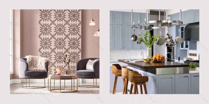
由于其中性特性和与其他色调的兼容性,淡粉色在2019年盛行。室内设计师Barbara Schmidtexplains认为,“单色配色- 就像这个粉红色的沙漠沙色- 将在2019年流行。它可以与丰富的白色或柠檬黄混合,以获得理想的外观。”
Pale pinks are prevailing in 2019 due to their neutral properties and compatibility with other shades. Interior designer
Barbara Schmidt
explains that "Monochromatic colorways–like this pink desert sand shade–will be popular in 2019. It can be mixed with an abundance of white or a lemon yellow for the ideal look."
6.
DIGITALLY INSPIRED
智能灵感
根据Valspar的高级色彩设计师Sue Kim的说法,“家居中的智能技术正在以不同的方式推动色彩体验。”因此,我们将看到更高强度的色调,以“奇怪的熟悉”(显然是华丽的)方式模仿人造光的边缘。
According to the Senior Color Designer Sue Kim of
Valspar
, "Smart technology in the home is driving the color experience differently." Because of this, we will see higher intensity shades that mimic the edge of artificial light in a way that is "strangely familiar" (and obviously gorgeous).
7.
A CONTEMPORARY TWIST ON FOREST GREENS
森林绿的当代化
深受大自然启发(但不直接反映)自然的深绿色将带来户外的治疗功能,而不会感到过于树栖。在这里,PPG的年度“守夜人”的颜色填补了一个充满欢迎丰富的房间。
Deep greens that are inspired by (but not directly reflective of) nature will bring the healing properties of the outdoors into the home, without feeling overly arboreal. Here, PPG's color of the year "Night Watch" fills a room with a welcoming richness.
8.
MISTY BLUES
影青
在2019年,我们将看到柔和的雾状和阴霾的蓝调。这种喜怒无常的蓝色有一种平静的灰色底色,可以促进家中更加宁静的能量。根据Kim的说法,蓝调可以被赋予“淡淡的紫色,以释放我们的思想,带着一丝灰色,以沉淀我们的心灵。”他们选择西雅图阴霾作为他们今年的颜色之一。
In 2019, we're going to see blues with a softened mistiness and haze. This moody blue has a calming grey undertone that promotes a more serene energy in the home. According to Kim, blues can be given "a touch of purple to free our thinking, with hints of gray to ground us." They selected Seattle Haze as one of their colors of the year.
9.
OPTIMISTIC YELLOWS
黄色
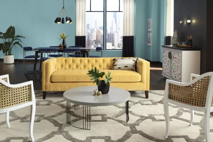
在2019年,我们会看到与乐观相关的颜色上升,如大胆的黄色和橙色。宣威威廉姆斯的下午,一个丰富而诱人的黄色,搭配凉爽的蓝色,贝壳色和粉红色。
In 2019 we'll see a rise in colors that are associated with optimism, like bold yellows and oranges. Sherwin Williams'
Afternoon
, a rich and inviting yellow, pairs beautifully with cool blues, beiges, and pinks.
10.
OFF-CREAM
奶油色
极简主义运动鼓励了许多现代家庭过着更加整洁,自由,有思想的生活。有了这个,与极简主义- 奶油,米色和白色相关的色调- 被纳入许多家庭调色板。由于其固有的简洁性可以用不同类型的照明进行点睛,因此需要具有更大胆,更多彩色底色的奶油色调。
The minimalist movement has encouraged many modern homemakers to live a more clutter free, thoughtful life. With this, shades associated with minimalism–creams, beiges, and whites–are being incorporated into many home palettes. Cream shades with bolder, more colorful undertones are desired for their inherent simplicity that can be manipulated with different types of lighting.
11.
SOFT TERRACOTTAS
淡赤土色
Sherwin Williams的2019年颜色是Cavern Clay,这代表着一种西南部风格。对于那些想要更具元素,自然风格的色调以及家居现代风格的人来说,这款细腻的铁锈色将真正焕发光彩。
Sherwin Williams' 2019 color of the year is
Cavern Clay
, which is a Southwest inspired tone. For those who want a more elemental, nature-inspired hue with a contemporary twist in their home, this creamy rust will truly shine.
12.
ELECTRIC CITRUS
电子柑橘色
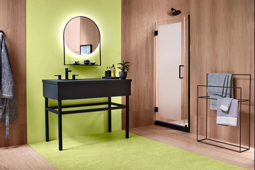
根据Valspar专家的说法,2019年有趣的的,更加极端的颜色将会流行。“我能做到这一点,让我们改变”的态度体现在电子色调上,如柠檬绿,柑橘橙和亮黄色。
According to Valspar experts, playful, more extreme colors will be popular in 2019. The “I can do this, let’s make a change” attitude is reflected in electric tones like lime green, citrus orange, and bright yellow.
13.
DUSTY BLUSH
灰粉色
千禧年粉红色是刚过时的颜色。现在,柔和的色调,如玫瑰色的中性色调和柔和的腮红色,反映出一种灵性,正在受到青睐。与千禧年粉红色不同,这些色调不那么肤浅,而且更加永恒。
Millennial pink is a color of the (very recent) past. Now, softer shades like rosy neutrals and muted blushes, which reflect a spirituality, are being favored. Unlike millennial pink, these hues are less trendy and more timeless.
14.
JEWEL TONED ACCENTS
珠宝色
2019年,您可以将珠宝色彩带入您喜爱的空间,并配有宝石色调的家具和装饰。2018年是中性色调的一年,而2019年是在多种颜色混搭中找到平衡。厨柜,墙壁和家具都是采用祖母绿,蓝宝石和海蓝宝石等颜色的不错选择。
In 2019, bring pops of color into your favorite spaces with jewel-toned furniture and accents. 2018 was the year of the neutral palette, and 2019 is all about finding balance with appropriate doses of color. Kitchen cabinets, accent walls, and furniture are all smart ways to incorporate colors like emeralds, sapphires, and aquamarines.
15.
RAW WOOD
原木
浅色木质色调是取代传统米色或棕褐色的绝佳选择。采用灰色,枫木色或松木色调的中性色调非常适合极简主义者和色彩恐惧症。
Light, wood-inspired shades are a great alternative to traditional beiges or tans. Neutrals that take on ash, maple, or pine tones are perfect for the minimalists and color-phobics alike.
16.
ALMOST WHITE
近乎于白
没有什么比全白色的调色板更经典了。虽然纯白色是许多家庭的首选,但2019年将成为“类白色”的一年。这些色调提供了微妙的细微差别,适应不同的灯光,家具和周围的色彩。对于那些渴望极简又想增添动感人来说,类白色的色调是万无一失的选择。
There’s nothing more classic than an all white palette. And while pure white is a go-to for many homemakers, 2019 will be the year of “almost-whites.” These shades offer subtle nuances that adapt to different lighting, furniture, and surrounding colors. For those who crave a minimalist palette that still feels dynamic, an almost-white shade is the fool-proof choice.
17.
POWER-INDUCING AQUAS
浅绿色的活力
Sherwin Williams的HGTV HOME选择了生动但平静的反射池作为他们2019年的颜色。充满活力的浅绿色本身就是大胆的,但是当与不同的颜色搭配时,多变的色调会变化(想想柔和的粉红色,粉彩)。虽然色调很容易低沉,但Sherwin Williams油漆专家认为2014年将浅绿色用作动力色:“它具有幽默感和力量,非常适合背景墙,前门或书架,”该品牌说。
HGTV HOME by Sherwin Williams picked the vivid-but-calm
Reflecting Pool
as their 2019 color of the year. The vibrant aqua is bold on its own, but the versatile hue changes when paired with different colors (think soft pinks, pastels). While the color is easily toned down, Sherwin Williams paint experts see aqua being used as a power color in 2019: “It takes on a sense of humor and power, and is perfect for a fun accent wall, front door, or bookshelf,” the brand said.
18.
RICH MUTED PURPLE
哑紫色
Pantone将亮紫罗兰色评为2018年度最佳颜色,紫色也将在2019年盛行。然而,我们应该期待哑光,低调的颜色同时具有丰富的能量,但具有柔和的强度,使阴影更加多样化。
Pantone named Ultra Violet as their
2018 Color of the Year
, and purple is expected to prevail in 2019 as well. Next year, however, we should expected muted, understated versions of the color that still have that rich energy, but with a mellowed intensity that makes the shade more versatile.
19.
DEEP BERRY REDS
深莓红
在2019年,期待看到大胆,饱和的红色,将个性沉浸在空间里而不会淹没它。深莓红色具有舒适和温暖的品质,同时为空间丰富的色彩增添活力。
In 2019, expect to see bold, saturated reds that infuse life into a space without overwhelming it. Deep berries have comforting and cozy qualities, while simultaneously energizing a space with their rich color.
20.
MINDFUL GRAY UNDERTONES
灰色底色
“人们将开始融入平静的灰色底色,这与内心的生活和明智的选择有关,”Kim说。这些创造性的“内省色调”将颜色的底色视为与阴影一样。带有灰色底色的深蓝色,紫色和棕色在家中营造出柔和的宁静感。
"People will begin to incorporate calm grey undertones, which are associated with mindful living and smart choices," says Kim. These coined "introspective shades" regard a color's undertone as equally important to the shade itself. Navys, purples, and browns with grey undertones create a subdued sense of tranquility in the home.
Part from Elle
客服
消息
收藏
下载
最近


