查看完整案例


收藏

下载
▲
在平面布置上,设计师采用了洄游动线设计,墙体的分割形成了一个参观流线,使得展区与展区间有了节奏变化,也增强了消费者的参观体验感。
In the layout, the designer adopts the migration moving line design, and the partition of the wall forms a visiting flow line, which makes the rhythm change between the exhibition area and the exhibition area, and also enhances the feeling of consumers' visiting experience.
▲[ 前台 ]
reception
顶面我们采用了重复的正列元素,把一个正方体重复组合排列,形成一张大“网”,使得空间更加“活泼“。
On the top surface, we used repeated elements to combine and arrange a cube repeatedly to form a big "net", making the space more "lively".
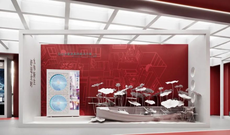
▲[ 产品展示区 ]
Product display area
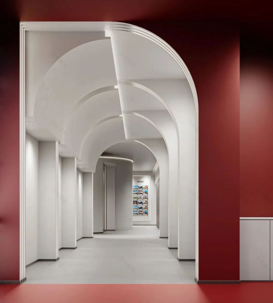
在墙体上开出了一个椭圆形的洞,框住了里面的景色,框的出现可以让参观者产生好奇心从而吸引他(她)们视线。
An oval hole is cut out in the wall to frame the scenery inside, and the appearance of the frame can arouse the curiosity of the visitor and attract his (her) eyes.
▲[ 过道 ]
aisle
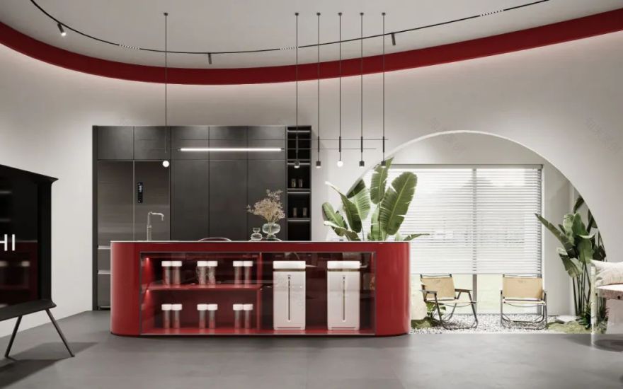
设计师采用了弧形的吊顶设计,既拉高了空间的层高又弱化了空间的方正感,让空间更加的柔和。
The designer adopts the curved ceiling design, which not only raises the height of the space but also weakens the square sense of the space, making the space more sot.
▲[ 茶室 ]
tearoom
承重柱没有进行过多的装饰处理,突出柱子的结构美感,增加了视觉效果。
The load-bearing column is not too much decorative treatment, highlighting the structural beauty of the column and increasing the visual effect.
▲[活动洽谈区
适当的镂空能打破墙面的索然无味,墙上的简单洞洞造型瞬间提升高级感。绿植的摆放,增加了空间的美感。
Appropriate hollowing can break the dull tastelessness of the wall, and the simple hole shape on the wall instantly improves the sense of advanced. The placement of green plants increases the beauty of the space.
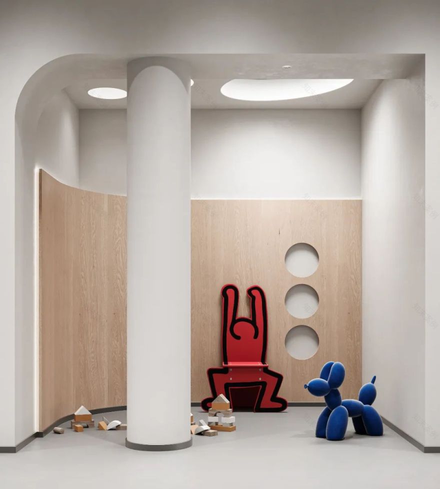
▲[ 儿童娱乐区 ]
Children's play area
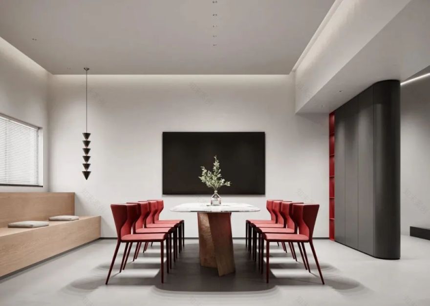
空间中素色与亮色搭配毫无违和感,红,蓝色的出现使得空间更加活跃。
The combination of plain colors and bright colors in the space is no violation, and the appearance of red and blue makes the space more active
.
▲[洽谈区]
Negotiation area
侧边采用了大面积的玻璃,使得空间更加开阔,也保证了该空间的私密性。
A large area of glass is used on the side, making the space more open and ensuring the privacy of the space.
▲[门头展示 ]
Door display
门头设计体现了设计的美感,色彩的搭配给消费者留下了深刻的记忆。
The design of the door reflects the beauty of the design, and the collocation of colors has left a deep memory for consumers.
项目地址:安徽-芜湖
建筑面积:460
设计风格:现代极简
硬装设计:周笙笙全案设计工作室
软装设计:周笙笙全案设计工作室
主要材料:艺术涂料、全屋成品定制、岩板、木饰面、玻璃、软膜灯箱等
客服
消息
收藏
下载
最近


