查看完整案例


收藏

下载
“糖份在吃下去后,会使胰岛素快速增加,色氨酸在血中浓度升高,进入细胞后转换成血清素。所以,糖是甜蜜的。”
“Sugar, when eaten, increases insulin rapidly and tryptophan levels in the blood increase, which is converted into serotonin when it enters cells. So sugar is sweet.”
WAGASHI的这家店的初定义是做“带来幸福感的甜品”。对于商业空间的概念描述,是“礼物”,它可以是打开包装盒的惊喜,也可以是层层蛋糕下的奶油,更是空间内发生的有趣的瞬间。
The first definition of WAGASHI’s shop is to make “sweet things that bring happiness”. Conceptual description of commercial space is “gift”. It can be a surprise to open the box, or a layer of cream under the cake. It is also an interesting moment happening in the space.
▼门店外观,exterior view of the store ©上海或者设计
以空间内的设计语言,抽象的代表食物感官上的界定:通过材料上的差异作为整个空间内“惊喜”的感知。我们由此大胆的经行了一次有趣的实验,不锈钢与水泥肌理漆的质感不同,色感却类似;明黄涂料与肌理漆质感类似却色感不同。这种材料上戏剧性的碰撞造成了空间内奇妙的衔接与搭配,也改变了传统餐饮空间的刻板印象。
▼空间爆炸轴测图,exploded axon ©上海或者设计
With the design language in the space, it represents the definition of food sense in an abstract way: the perception of “pleasant surprise” in the whole space through the difference in material. So we boldly carried out an interesting experiment, stainless steel and cement texture paint have different texture, but similar color; bright yellow paint and texture paint have similar texture but different color. The dramatic collision of this material created the wonderful connection and collocation in the space, and changed the stereotype of traditional dining space.
▼二层空间概览,通过材料上的差异来表现整个空间内“惊喜”的感知,overview of space on the 2nd floor, the perception of “pleasant surprise” in the whole space is achieved through the difference in material ©上海或者设计
▼二层空间,不锈钢与水泥肌理漆的质感不同,色感却类似,second floor, stainless steel and cement texture paint have different textures, but similar color ©上海或者设计
整个空间内的基调与品牌本身的走向相同,我们通过灰黄的对比描述了一个诙谐轻松的故事,线条体块的穿插,对几何造型的探索与表达,包括墙面上正在掉落的logo,也是我们在其中埋下的一个“小彩蛋”,不仅增加了空间的层次感,更使得人们的视角随其走向变化而丰富视觉体验。我们采用了大量拱形元素,使得流动的空间内充满了不确定性,与不同材质的联系构成了整个空间的逻辑。
▼墙面上正在掉落的logo,the logo falling on the wall ©上海或者设计
The tone of the whole space is the same as the trend of the brand itself. We describe a funny and relaxed story through gray-yellow comparison, the intersection of lines and blocks, the exploration and expression of geometric shapes, including the logo falling on the wall, which is ” in-jokes” we buried in it. It not only increases the space, but also the sense of hierarchy enriches the visual experience with the change of people’s perspective. We adopt a large number of arch elements, which make the flowing space full of uncertainty, and the connection with different materials constitutes the logic of the whole space.
▼二层空间,天花板采用拱形元素,墙面上正在掉落的logo增加了空间的层次感,second floor, the ceiling adopts a large number of arch elements, and the logo falling on the wall increases the space ©上海或者设计
▼用餐空间细节,details of the dining space ©上海或者设计
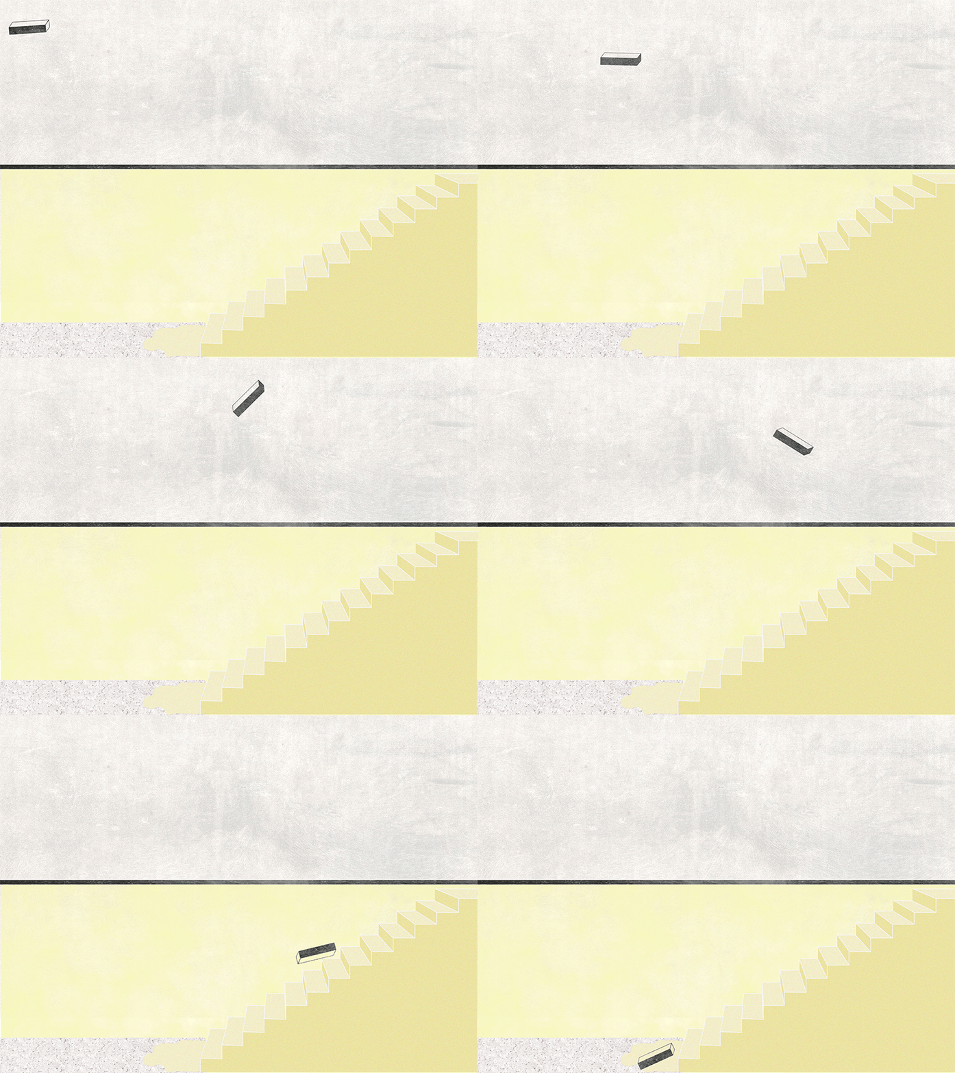
▼“流淌的楼梯”像是涂抹在蛋糕上的黄油芝士,一层一层地蔓延下来,”flowing stairs” are like butter cheese on a cake, spreading down layer by layer ©上海或者设计
▼空间细节,space details ©上海或者设计
▼材料细节,material details ©上海或者设计
▼平面图,plans ©上海或者设计
▼场景剖面图,section with scenes ©上海或者设计
客服
消息
收藏
下载
最近


