查看完整案例


收藏

下载

附件

翻译
London – April 23th 2018 – Last week, Hedonism Wines and Michelin-starred super-chef Ollie Dabbous launched their new joint venture – the 3-storey HIDE restaurant at #85 Piccadilly, widely regarded as the most anticipated London restaurant opening of the year.
SUMMARY
Atmos were commissioned to design and deliver the exuberant centrepiece staircase that weaves between the 3 levels of experience at HIDE (bar BELOW; informal a-la-carte dining at GROUND; elegant tasting menu ABOVE).
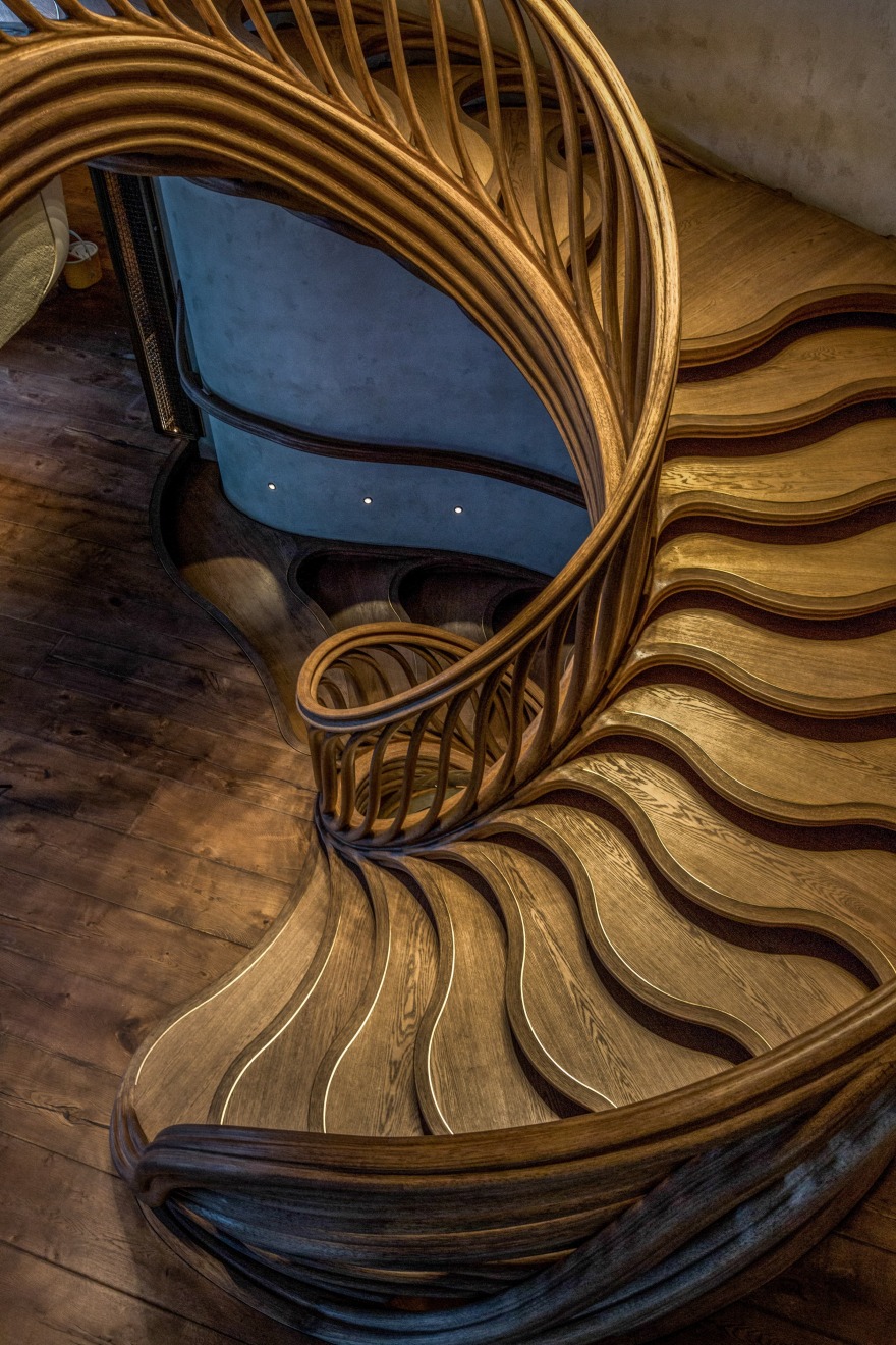
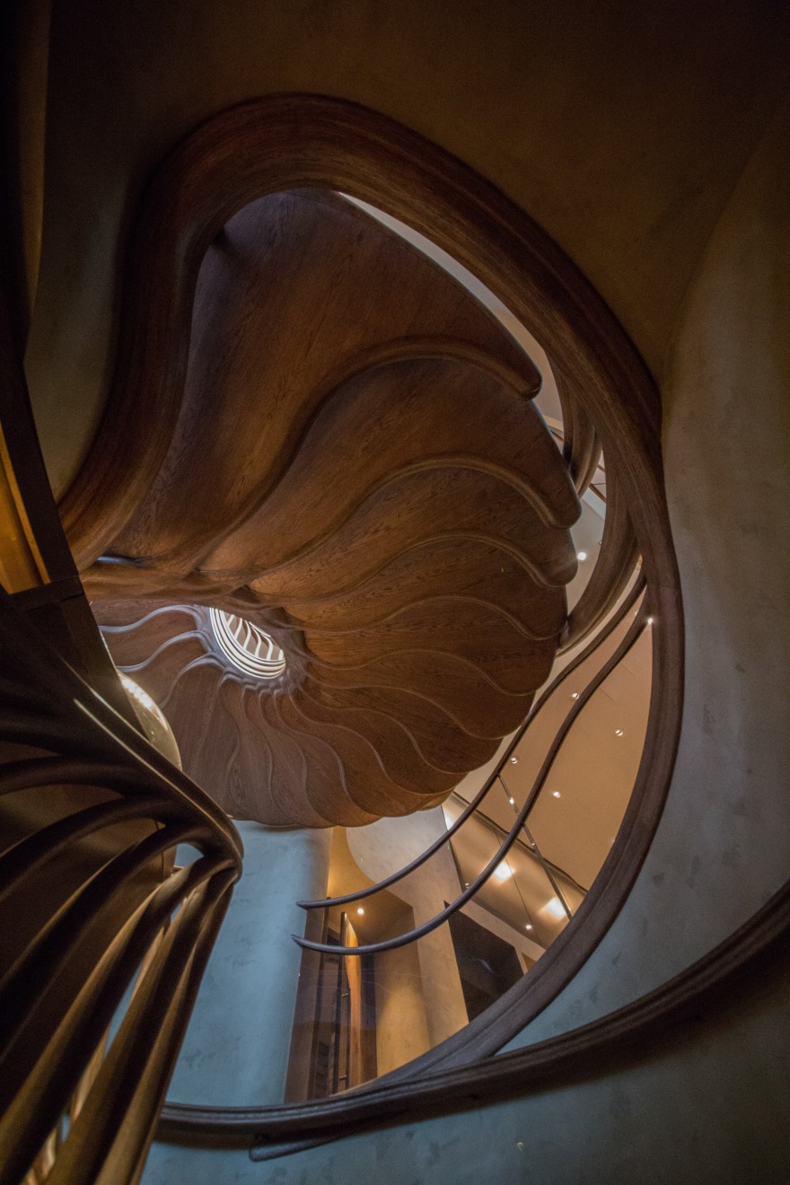
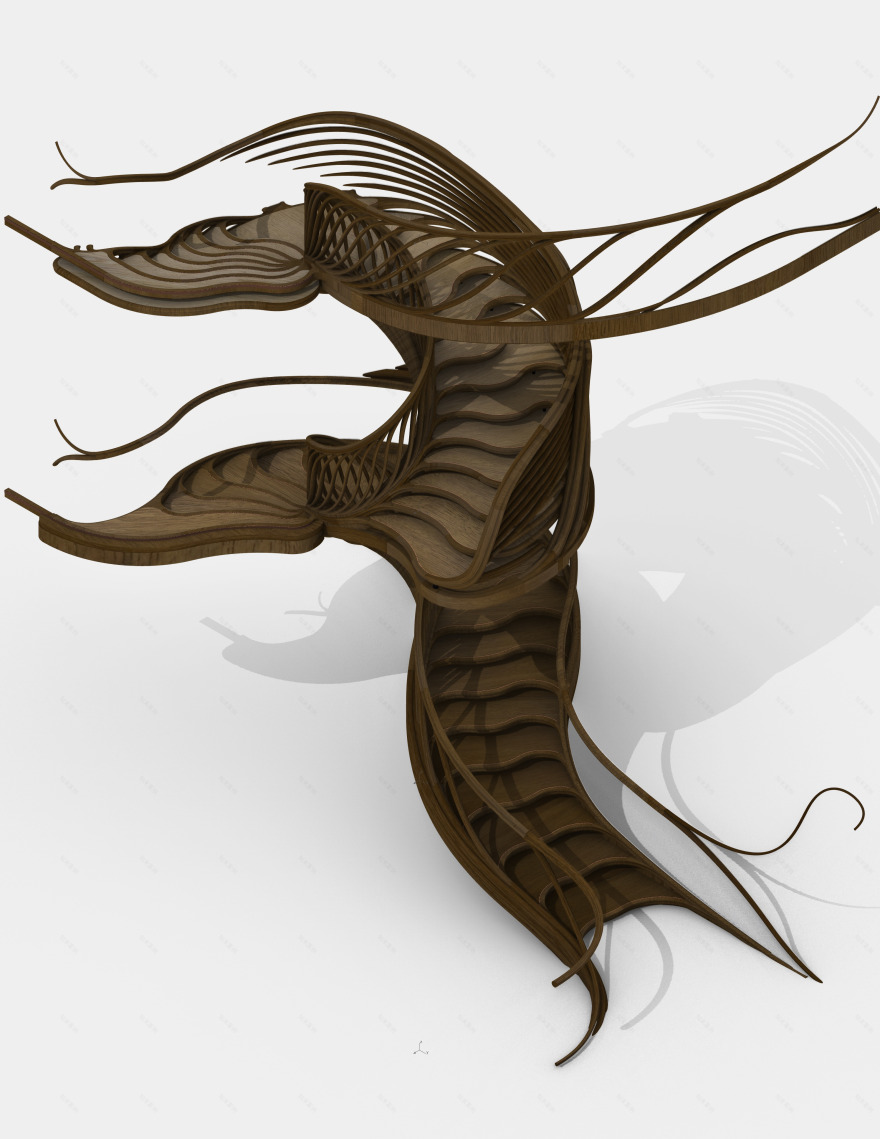
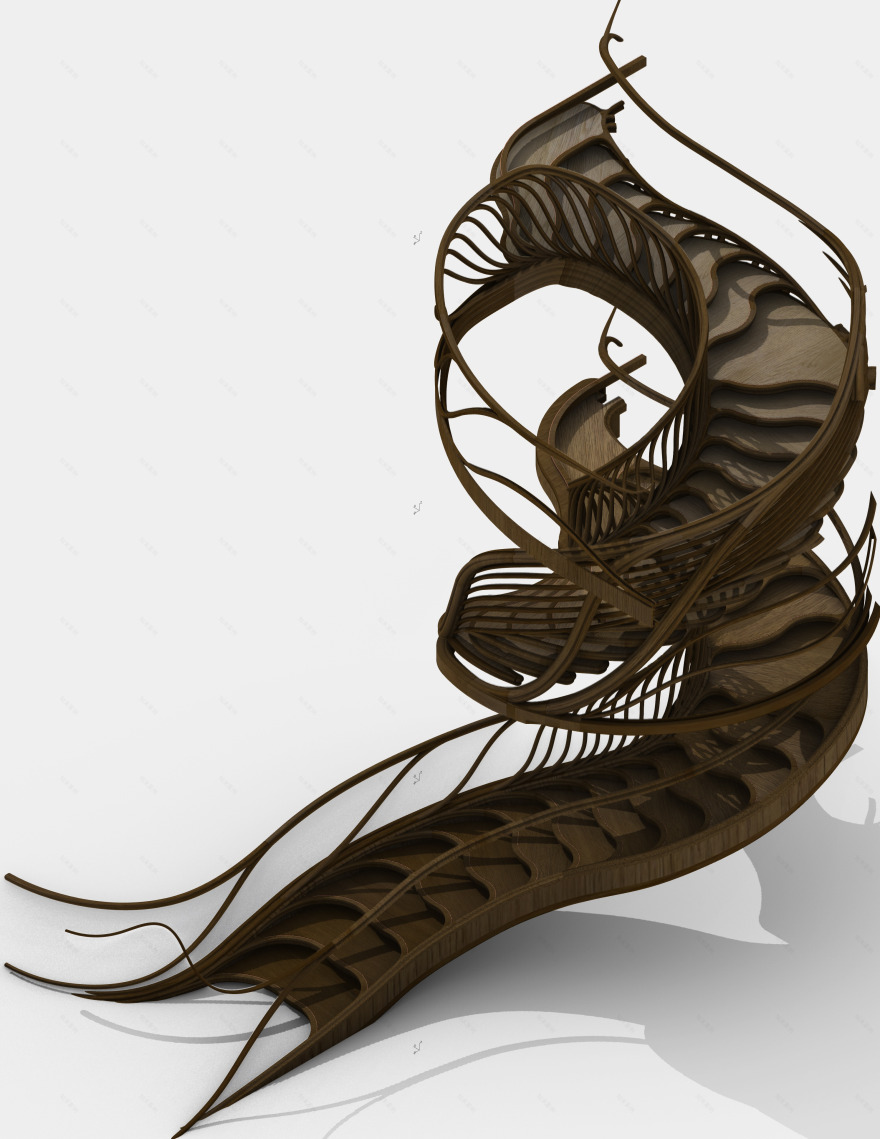
The stair’s design creates a plant-like structure that grows like an irrepressible life-force from beneath, bursting from the shadows of the basement towards the daylight above.
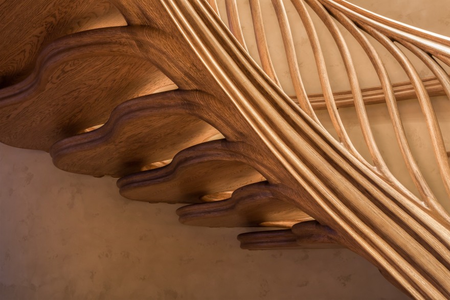
It twists upwards, spiralling energetically like a corkscrew, steps unfurling seamlessly from the structural stem like leaves, while further branches similarly delaminate to form a delicate wavy balustrade guiding the guests carefully upwards.
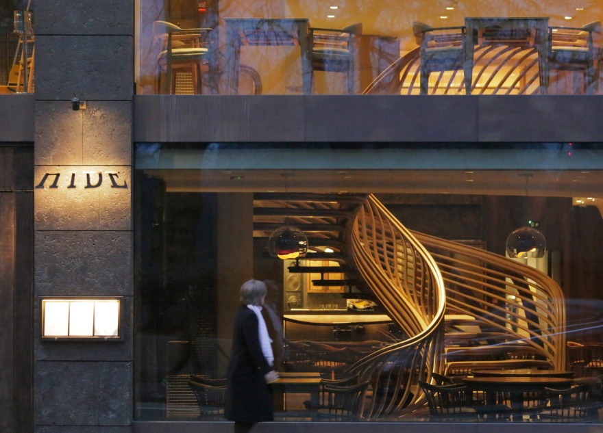
“StairStalk” finally unfurls at the 1st floor level, as if reuniting with its vast family of arboreal brethren in Green Park opposite - nestling just beyond the full-height panoramic glazing fronting Piccadilly.[1]
Like a wild plant pulsing insistently upwards and outwards between the comparatively restrained geometry of its surrounding architecture, it at last comes to rest once its conveyancing role is accomplished, merging gently into the walls that contain it.
NATURE
Its entire surface is made of European Oak, like a green plant grown woody with age, thus naturalising amidst the restaurant’s family of wider oak furniture.
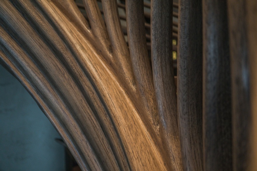
The main structure was layered from glued slices of thin oak veneer, laid and laminated together against curved moulds and then hand-sanded into shape to form an elaborately-curving timber structure whose visible grain magically follows its path.
This structure then encapsulates the thicker slabs of more familiar wide- oak floorboards forming the upper and lower surface of each tread, thus echoing the fields of parallel oak floorboards at the uppermost treads of each flight.
The evolving design took its cue from the natural palette, playful imagination, and powerful aesthetic developed by both the interior designer and the project client.[2]
This love of nature is further echoed in Ollie Dabbous’s showcasing of natural ingredients; his reinvention of familiar vegetables; even the stunning culinary presentation of delicately curling leaves and petals and other botanicals.
Another crucial influence was more mystical and whimsical and relates to the perceived magic that underpins all nature - especially the world of childhood fairy-tales, in whose fertile soils the stair first took root.
GEOMETRY
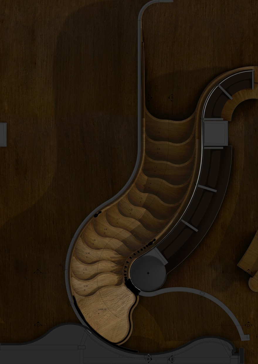
The stair begins in the basement as a simple concave step, indented to invite the user into its folds, which then curl back to mould into the surrounding fibres of the stringers trammelling it either side as they travel along the enclosing walls either side.
From there the central indent flips to become an increasingly protruding curve whose sequence aggregates to imply a central speedier ridge that the speedier guests can quickly ascend, while the remaining indented valleys either side offer calmer, slower journeys.
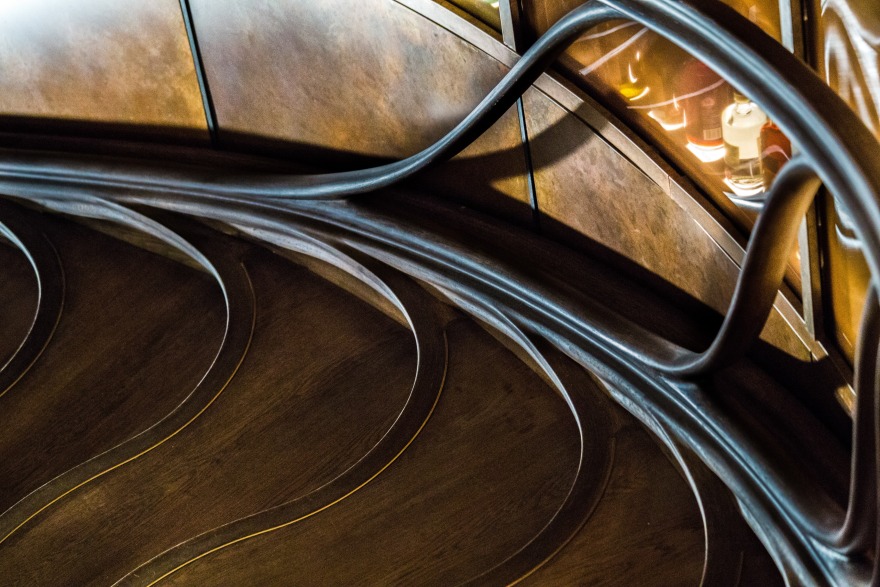
The stair glides along a glazed bar wall to its left, glowing with the amber glow of sophisticate alcohols, until this cedes at the spiral’s centre to a circular glass-domed beer-hop rummager, specially commissioned as a hand-turned cast-iron set of cogs that reference the distilling process - and enable the barman to rotate and access the bottles within.
On its other side, the wall flanking the hidden lift undulated and protruded to magnetically inflect the stair geometry, just as both ceiling edges meeting the stair also undulated to respectfully meet it.
[1] A casual mobile photo snapped by Atmos director Alex Haw at dusk, outside looking in, gives the unmistakeable impression of HIDE’s stair swooping upwards – and seamlessly transiting into the reflection of a branching treetop reflected from the Park beyond. [2] Striking natural forms include landscapes of British wildflowers cast by London artist Rachel Dein into gleaming plaster panelling the 1st floor “Hide & Seek” dining room (a space Rose Murray calls “a Hide without walls”) - their leaves surreptitiously scattered with other small, witty objects contributed by the owners; cork creeping up columns; fairy-tale paper mushrooms by Su Blackwell growing across vault walls of the “Reading-Room”’; desiccated mushrooms commissioned from Jeanette Morillo, blooming gracefully from bathroom walls; bleached moss unfurling from the ceiling; timber designated as the predominant material for furniture throughout.
StairStalk then lifts free of the bar wall below and its inner stringer ascends as a free-floating structural element, bearing the full weight of the entire stair structure until it docks with the mezzanine floor above.
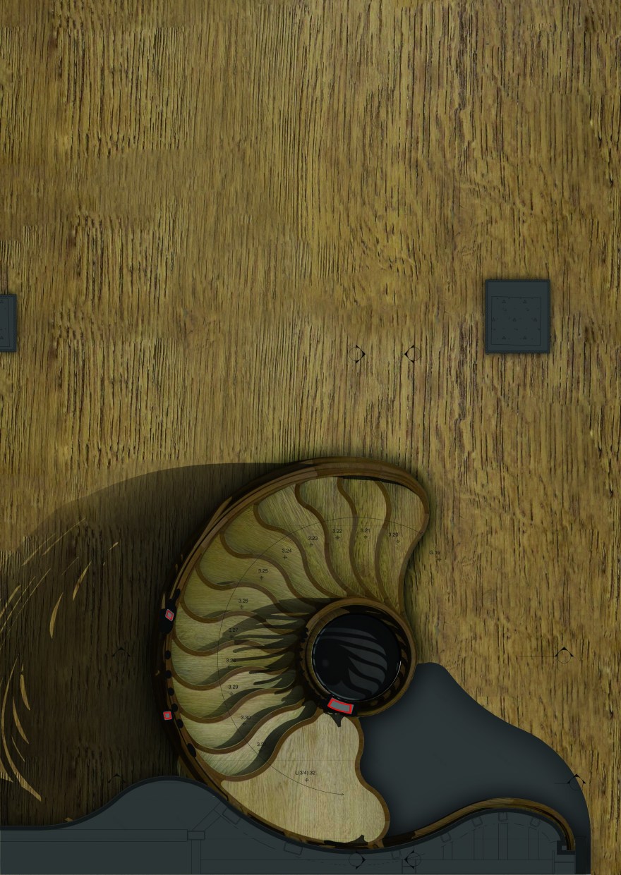
The structure is larger and grander than it might first appear – 5 full metres in diameter, with a metre-wide void free of structure.
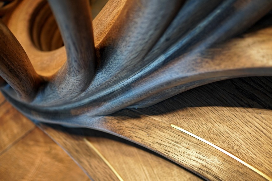
The inner balustrade split where it hits the ground level to form a fibrous offshoot that encircles the stair void, bifurcating to continue upwards as the main stair stem, but also unwrapping to form the front nosing of the tread just one step up, which in turn further bifurcates to not only wrap around the edge of this 1st floating tread (eventually blending back into the stringer from which it sprung, its fibres morphing perfectly with the ridges of its underside), but also then rising as a robust thick strand which eventually forms the outer handrail, gliding upwards before wrapping around the wall towards the lift.
The tread geometries were assembled from pure arcs, conjoined tangentially and seamlessly at their tips, for simplicity of transcribing drawings into fabricated elements.
Simple composite arcs facilitated quicker transliteration of geometry into built matter. No two lines repeat; no treads are the same; each step contributes its unique part to an ever-evolving algorithmic sequence.
ERGONOMICS
The lines and shapes build on Atmos’s fascination for ergonomics, and the constraints and habits of the human body - pinching or stretching the sizes of treads to reflect the range of possible human movements across them.
The undulating plan pattern of the tread nosings merge multiple implicit pathways, with the intrepid and rushed able to fast-track their progress by tracking more quickly across steeper, shorter distances between more pinched contours, while the leisurely can traverse longer, shallower valley routes at a much slower pace.
The balustrade stems bifurcate from their lower structural stringer to spread and give transparency to this restraining veil, before they re-converge to form a thick multi-fibred upper stem, which is then richly sculpted to follow the path of the human hand that grips it, as if softly gouged by thumb and fingers either side.
COLOUR & TEXTURE
As it journeys from basement to mezzanine, each tread lightens slightly in tone to perfectly match and align with the 3 main tonal values of each floor it joins (dark BELOW, mid-tone at mid-level GROUND, light ABOVE).
The increasingly ‘smoked’ darkness of the lower steps references the bar’s activity and essence beyond; what the interior designer Rose Murray calls “a nod to the distillation process [where] activated oak infuses alcohol, slowly transforming clear liquor into a rich amber fluid.”
The oak was slightly darkened using natural stains and oils to help reveal its grain, brushed on thicker and more richly at areas of desired contrast, which also helps facilitate optical navigation of the staircase’s heady forms.
The concealed metal core, structurally required to enable the stair to float upwards free from constraint at the walls, is implicitly allowed to shimmer through briefly at the front nosings, as if like sap between a tree’s bark, flashing a golden strip of thin brass plate that wraps along the grain and provides a slightly raised texture to assure greater foothold.
STRUCTURE
The lower stair was supported by a combination of plywood and steel substructures, depending on the adjacent wall composition. The structural engineers Heyne Tillett Steel (HTS) created a bespoke steel deck edge at the edge of the composite concrete-and-steel slab to offer a springing point to the floating stair above.
As the inner stringer wound its way upwards from the ground floor to the mezzanine, acting as the main structural support for a stair that appeared to fly free of its enclosing walls, intricate 3D analysis (OASYS GSA) showed the stringer was subject to enormous bending and torsional shear stresses, and the design evolved into a structural model of reinforced timber – sheathing a series of hefty RHS steels that delicately interconnected to provide the necessary structural stability – as well as dampen perceptible vibration as people ran up the stairs.
All floating cantilevering treads above ground level were also reinforced with 10-15mm layers of stainless steel plate, which were further sheathed in structural plywood and interconnected with short, thin steel stubs (sequentially welded into place as construction progressed up the stairs) – reinvigorating the structural principle under which cantilevered stone treads were traditionally supported.
Analysis showed further support was required to brace the stairs in the event of extreme loading, so smaller RHS sections were meticulously twisted and concealed into three sinuous “fibrous” posts that wrapped around the outer edges of the stair and then merged into further steel secretly laced within handrail, and geometrically morphed into the outer tails of the treads.
The steel core, fabricated to much lower tolerances, proved immensely challenging for the timber team to integrate, but in deploying exceptional painstaking accuracy and care, they prevailed against the odds, and its meticulous integration, junctioning and encapsulation is completely undetectable.
FABRICATION
After an exhaustive global search for fabricators, the team appointed Trabczynski / GD Staircases - based in West Poland - as main contractor for the stair. This project would have been absolutely impossible without them.
Trabczynski / GD Staircases specialise in designing and building ambitious luxury staircases using a unique method of bentwood construction that enables them to achieve extraordinary curvature in a wide range of designs and types – whether traditional or avant-garde. They have pioneered a specific form of laminated veneer lumber, layering hundreds of precisely-cut shapes into contoured curved solids which have the illusion of solid wood, with the most extraordinary curving grain.
With almost thirty years’ experience, they have successfully delivered hundreds of high-end projects around the globe. The project team was concerned to ensure that the fabricators would attain the very high level of craftsmanship required; Trabczynski / GD Staircases won the bid when they turned up to a meeting with a stunning, immaculately-carved full-scale timber mock-up of one of the treads stashed in their checked-in luggage!
The unprecedented 3-dimensional complexities of the project forced them to pioneer completely new team workflows, fabrication methodologies and design-data communication strategies.
Mikolaj Trabczynski, their CEO, spent over 4,000 hours over the duration of the project managing the translation of data from the designers as well as overseeing - and sometimes fully participating in - the fabrication; his brother and a colleague collectively spent 10,000 hours, working late into the night on both management and fabrication aspects; up to 9 other men worked on the stair at any other given time. Their level of craftsmanship was exquisite and painstaking. The communications between the design and fabrication teams were rapid and intensive; Mikolaj notes with some shock that the project amassed more than 2,000 email threads.
After extensive surveying of the site and cross-checking of dimensions, it was built as a single prefabricated element, split into 2 lifts because of the limitations of their warehouse's roof height. It took 8 journeys to ship it by land across Europe to the restaurant, where 6 men worked day and night to splice and connect its components, mask and sand the junctions between elements, and stain and finish the entire piece.
Altogether the project laminated 4,500 m2 of thin oak veneers for the main structure, and 150m2 of thick 5mm+ oak veneers for sheathing the tops of the treads (as well as any undersides of the exposed series).
The treads were reinforced with 3.5m3 of plywood - the only items to be digitally cut by CNC machine, while everything else was traced and cut by hand.
All this timber was glued together with over half a tonne of bespoke polyurethane glue using a pioneering new chemical that took weeks to harden. This unique new glue then actually stiffens the timber alongside the steel; the strength of the composite timber and glue substructure contributed to the stability of the whole, augmenting the traditional steel structure.
客服
消息
收藏
下载
最近


