查看完整案例


收藏

下载
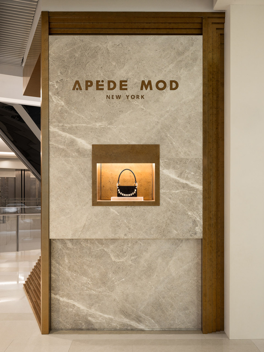
APEDE MOD是一个来自纽约的设计师包袋品牌, say受其委托设计位于上海IAPM的第一家线下门店。say从多元化且包含装饰美学的产品中提取灵感,将原本并不规整的空间策划成一个别具一格的画廊空间,带给消费者极具游览式的购物体验。 APEDE MOD, a bag design brand from New York, Say was consigned to design the first offline store in IAPM, Shanghai. Got inspired from diversified decorative and embellishing products, say transformed the initially irregular space into a unique gallery space, bringing consumers a very sightseeing shopping experience.
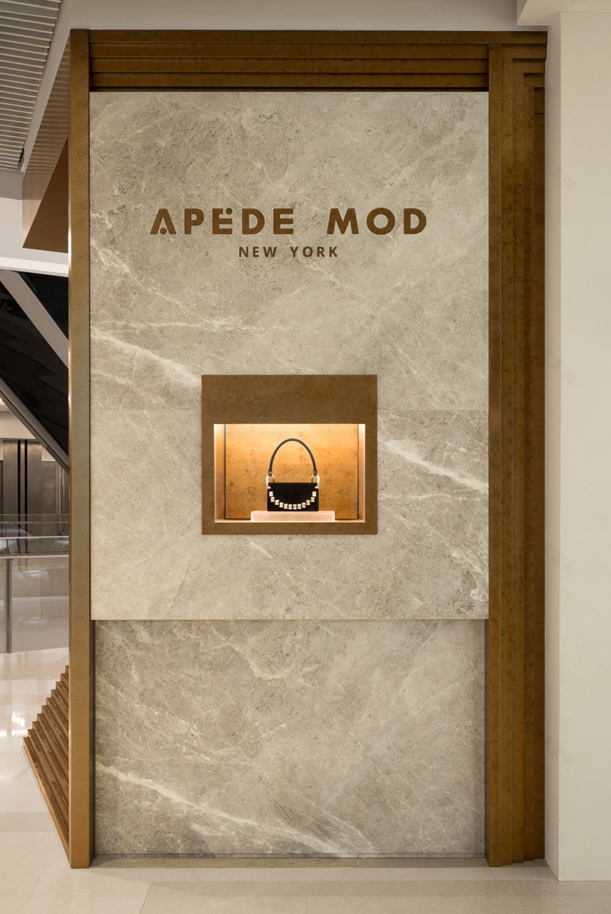
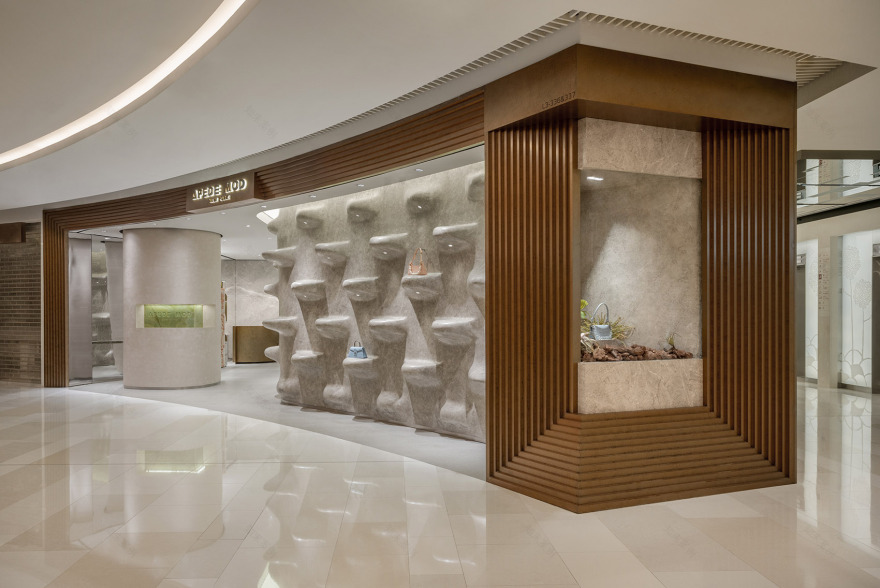
▼店铺入口,entrance of the store ©汪敏杰
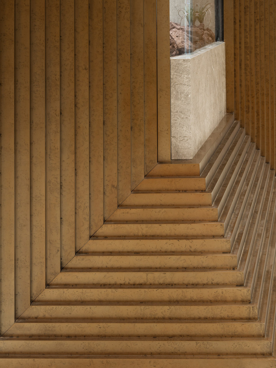
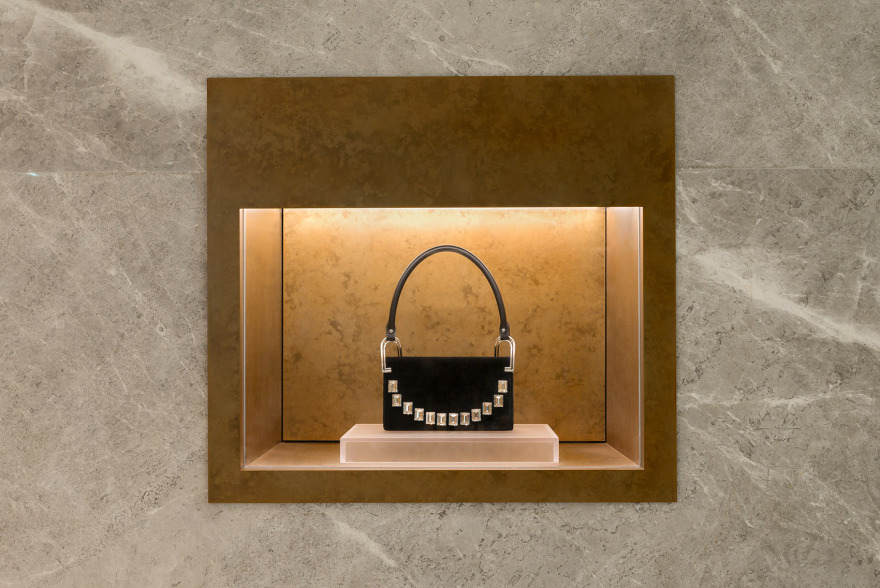
▼立面局部,details of the facade ©汪敏杰
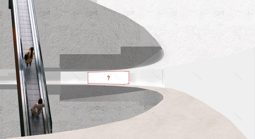
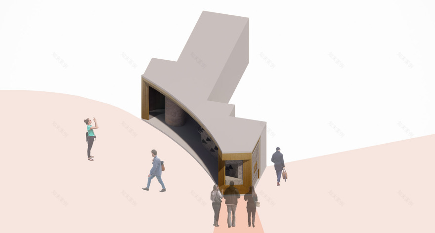
不规则的场地形态,面宽极大,进深接近9米的落差,在狭窄的空间中突出产品陈列是这个项目最大的挑战。 Irregular site shape, great breadth, and a depth of nearly 9 meters highlighting display the product in a narrow space are the biggest challenges for this project.
▼解决场地落差,diagram ©Say Architects
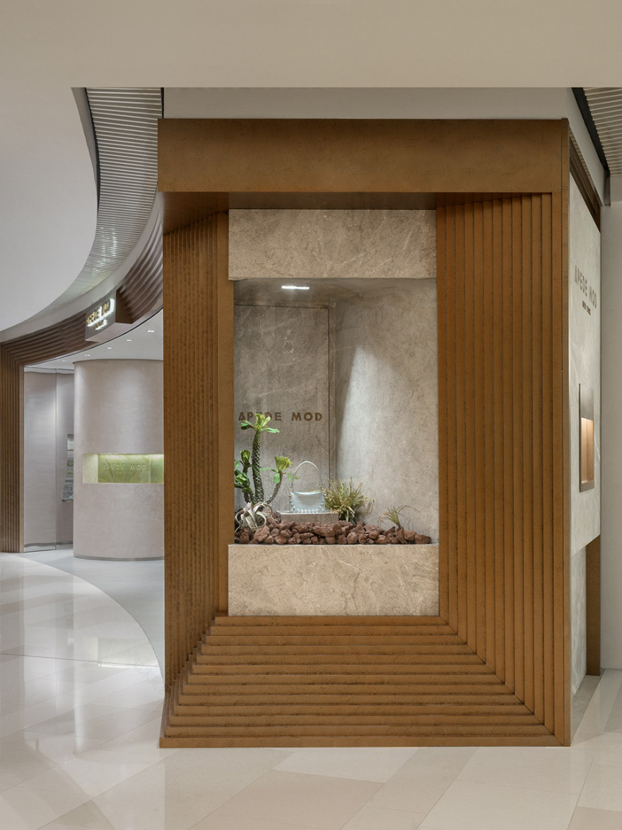
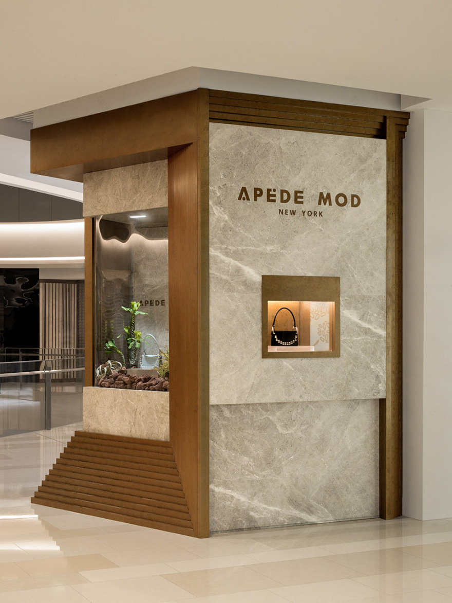
巨大的黄铜画框面朝来自三个不同方向的人流,根据场地面宽,三联画分别承载着入口、策展、橱窗三个功能。
The colossal brass architrave looks towards the flow of people from three different directions. According to the width of the ground, the triptych carries three functions, including entrance, curation, and window.
▼入口处的黄铜画框,the colossal brass architrave at the entrance ©汪敏杰
IAPM的公区地面、吊顶和周围的店铺均为浅色质地,从中庭向场地看去像一面巨大的美术馆展墙,作为时髦又艺术的摩登品牌,品牌性格的表达在线下店中尤为重要。APEDE MOD被视为一幅三联艺术画作,而IAPM(International AM+PM) 此刻由不受时限的商业综合体转变为一家美术馆(International Art Pavillion Museum),每一位消费者同时也是观展者。
IAPM’s public area floor, ceiling, and surrounding shops are all light-colored textures. From the view of the atrium, it looks like a vast gallery wall. As a fashionable and artistic modern brand, the expression of brand personality is significant in offline store. APEDE MOD is regarded as a triptych art painting, and IAPM (International AM+PM) is now transformed from a timeless commercial complex to an International Art Pavilion Museum. Every consumer is also a visitor at the same time.
▼展示区,the exhibition area ©汪敏杰
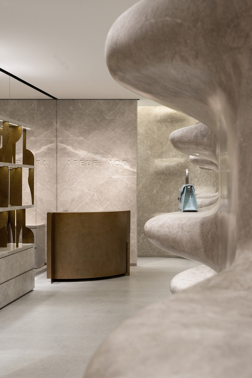
▼服务台,the counter ©汪敏杰
▼服务台细部,details of the counter ©汪敏杰
富有层次橱窗立面灵感来源于品牌旗下‘LE BOOK’的开合方式,橱窗位置对应的则是铜质五金开扣。
The façade of the fully layered showcase is inspired by the opening and closing method of the brand’s “LE BOOK”, and the location of the showcase corresponds to the copper hardware button.
▼富有层次的展示空间,spaces for displaying bags ©汪敏杰
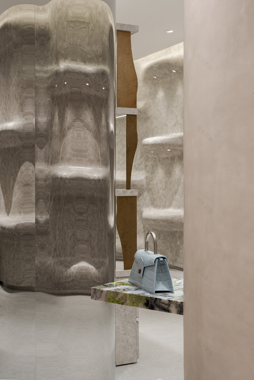
▼石材展台,display table made of stone ©汪敏杰
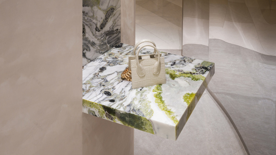
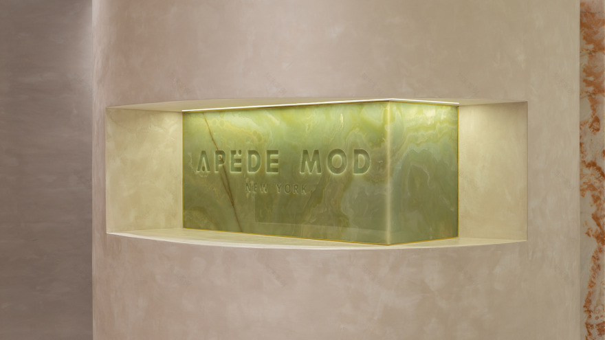
原场地中存在一根巨大且承重柱,其所处的位置距离墙面不足一人通过,say顺势将其用一张大号的“布料”包裹,并精心挑选了三色玉石,分别赋予店招、镜子、置物功能镶嵌其中。
There was a vast and load-bearing column in the original site, and its location was difficult to pass by the people. Say took advantage of the situation and wrapped it in a large piece of “cloth” and carefully selected three-color jade to give the shop signs, mirrors and storage functions are embedded in it.
▼多功能承重柱,multifunctional load-bearing column ©Say Architects
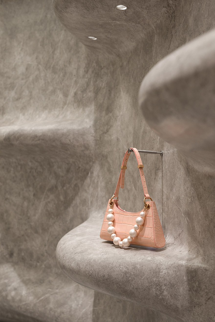
艺术品吸引人之处可能是笔触、色彩、形态,或是背后的故事,而画作通常是艺术家内心索求的外化。20米长的参数化展墙被赋予石材肌理,作为品牌的外向表达,同时规避了原场地弊端,加以置物功能,将功能主义融入装饰艺术。
The attractiveness of artworks may be brush, colors, shapes, or the stories behind them, while paintings are usually the externalization of the artist’s inner desires. Therefore, the 20-meter-long parametric exhibition wall is given a stone texture as the outward expression of the brand while avoiding the disadvantages of the original site, adding the function of placing objects and integrating functionalism within Artdeco.
▼参数化展墙细部,details of the parametric exhibition wall ©汪敏杰
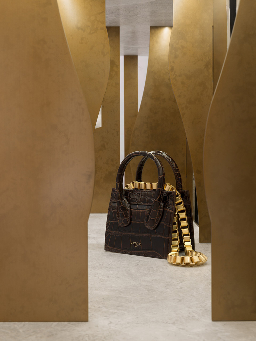
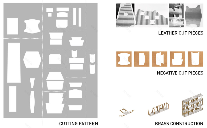
天然皮革作为包的主要原材料,每一块都有各自的形状,这也导致每生产一个包都会伴随30%皮革损耗。因此定制柜以铜板为结构,而每一块结构则取自损耗皮革的形状。say希望以低碳可持续的方式向消费者传递品牌文化,同时借此呼吁行业重视合理的剪裁,降低损耗率。
Natural leather is the primary raw material of the bag, and it has its shape, which also leads to 30% of leather loss when producing a bag. Thus the custom-made cabinet is structured with copper plates, and each piece of structure is taken from the shape of lossy leather. Say hopes to deliver brand culture to consumers in a low-carbon and sustainable way, and at the same time invoke the industries to pay attention to good tailoring and reduce the loss rate.
▼金属与石材制成的展架,shelves made of metal and stone ©汪敏杰
▼铜板结构取自损耗皮革形状,the structure taken from the shape of lossy leather ©汪敏杰
▼方案概念,concept © Say Architects
▼平面图,plan © Say Architects
客服
消息
收藏
下载
最近


