查看完整案例


收藏

下载

翻译
Workplace Solutions Sp z.o.o. were tasked with another phase of design for the Nordea IT offices located in Gdynia, Poland.
The architectural icons of Scandinavia have taken over several floors of the Nordea headquarters building in Gdynia. Bike paths, the vivid Superkilen city square of Copenhagen, the famous opera house in Oslo, and the Temppeliaukio church of Helsinki – all of them served as inspiration for the Scandinavia Office. Across the 5 floors and 5,500 sqm of the Scandinavia Office, we recall the spirit of Nordea’s origin.
Urban planning involves the creation of places where people can build relationships. The elements shared by urban planning and work environment design are helping to bring people closer, connecting them, skillfully mixing functions, eliminating barriers and creating spaces that have an extrasensory impact on the user. Through all this, we wanted to create a unique, vibrant place full of life, akin to a multi-functional city square. An office space where the user remains relaxed and comfortable.
The goal set by the Management of Nordea, which guided us from the very beginning of the design process for the company’s premises in Gdynia, was to create an office that could attract and retain the best employees, and become the company’s brand image. Fortunately, we did not have to seek far for inspiration. To continue the trend of local design, as well as the urban and coastal references used in the Seaport Office project, we decided to recreate the atmosphere of Nordea’s places of origin. Scandinavian cities were an obvious point of reference for us.
The themes involve the architecture of four Scandinavian capitals, which together form the basis for the arrangement concept of the Łużycka Office Park. At Scandinavia Office, the narrative design fulfills both the non-material and psychological functions. The very identity of the organization is engraved into the office space, bringing associations and emotions to mind and the desire to be there.
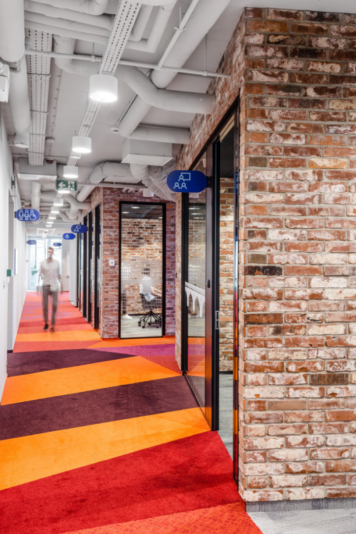
The “Copenhagen” floor welcomes employees with its colorful common space located right at the entrance, inspired by Superkilen Park. The Park is a public realization of the Bjarke Ingels Group which is the meeting spot of many cultures. In this zone there are informal meeting areas and conference rooms of various sizes, which greatly facilitate both spontaneous and planned cooperation, just as in the actual square. The bicycle path, which defines the thorough fares, introduces us to different themes of Copenhagen and leads to a large networking space connected with the kitchen. In here can be found the daily zones, used for all kinds of stand-up meetings. Further on is the common zone, where apart from a kitchen there is a conference and networking room. The latter room, thanks to the flexible furniture solutions, facilitates any kind of meeting, formal or spontaneous, to exchange ideas over a cup of coffee, or when coloring a mural inspired by Christiania – the cradle of Denmark’s alternative culture.
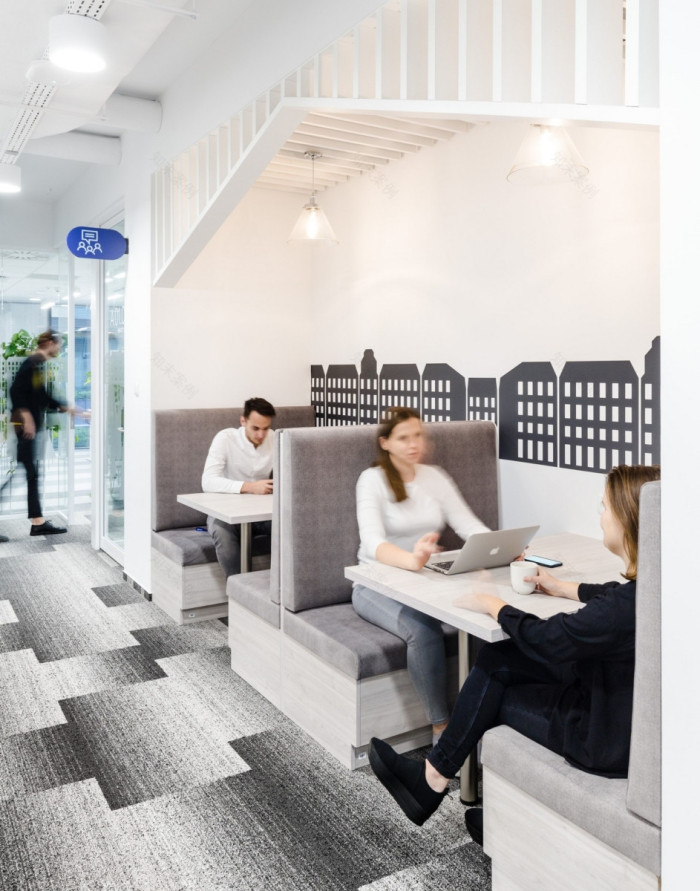
In the “Stockholm” section we find classic Swedish houses, painted the traditional Falun Red. These are focus rooms, for meetings involving 2 to 4 people, as well as video conferencing. The social kitchen, an ideal place to meet and organize a meal or simply to relax is a comfortable place where anyone can truly feel at home.
The characteristic elements of the floor inspired by “Helsinki” are the essential intricate details and consistent space branding, clearly dividing the space into individual zones according to their function. The most important area is the spacious, multifunctional meeting room, inspired by the monumental and modern design of the Temppeliaukio church. It is a flexible zone for organizing a town-hall meeting, a workshop with clients, or an integration meeting for employees. It also serves as an internal co-work space, where people from other cities can pursue their tasks in comfort. The other meeting rooms and work zones are full of greenery, reminiscent of Finnish pine forests, with the potential for encounters with Moomins or even…the Groke!
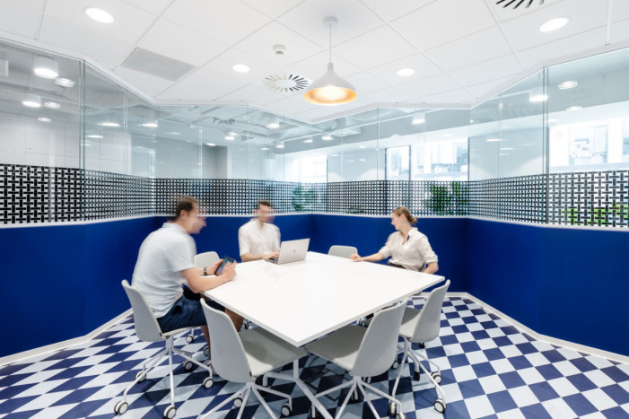
A strong architectural accent is already visible at the entrance to the floor inspired by “Oslo”. It consists of a common zone with a transparent conference room, the design of which was inspired by the award-winning Opera building project by Snøhetta studio. The calm atmosphere of Scandinavian design dominates the entire floor. White and other bright colors illuminate and visually enlarge the space, creating a feeling of lightness and freshness, while the deep-blue floor creates a perfect contrast. Skillfully selected environment details, such as cut mirrors, geometrically arranged cork, carefully selected greenery and lightweight furniture together form a coherent design. Thanks to this, we achieved an interior to soothe the senses, while at the same time providing space for organizing various activities, ranging from creative to individual work, requiring concentration.
At Scandinavia Office, design follows on from functionality. In this office, we have combined the knowledge gained from our research on working environments for agile teams with the conclusions from previous projects for Nordea, and designed a workplace in which as much as 40% of the space consists of informal areas supporting spontaneous meetings and knowledge exchanges. This idea is in line with the Nordea Unlimited concept, developed and implemented in the Scandinavian branches of the organization. It is based on the flexible use of the workspace, according to the types of activity undertaken during the day. It is an adaptation of a modern work environment model known as the Activity Based Workplace – one that is flexible, based on numerous interactions and cooperation.
Together with programmers, we developed the Agile workplace concept, the primary elements of which are home zones – work zones, tailored to different types of activity: daily team stand-up meetings, work which requires focus, video conferencing, brainstorming, as well as ad-hoc meetings. Thanks to the versatility of the solutions created for the Seaport Office project, we were also able to implement them into this project easily, while expanding the design to include the previously described common zones, which are necessary for employees in building relationships and generating new ideas. Thanks to this, every employee can find a place for themselves. This is a place that, first and foremost, allows us to answer the question “Why do we want to work?” instead of just “Where do we want to work?”.
Designer: Workplace Solutions Sp z.o.o.
Design Team: Bogusz Parzyszek, Dominika Zielińska, Paweł Kołodziej, Marzena Bednarczyk, Ewa Jędras, Agnieszka Ulatowska, Daniel Dziczek, Urszula Dziedzic, Małgorzata Romanowicz, Damian Bieniek, Anna Rzeźnik, Kasper Skirgajłło-Krajewski
Photography: Adam Grzesik
19 Images | expand for additional detail
客服
消息
收藏
下载
最近


