查看完整案例


收藏

下载
本项目的业主是一家专门从事染发的美发沙龙,主要服务内容为灰发漂染与修饰发际线。如今,越来越多的顾客开始寻求一种简单又经济的染发方式,店铺服务的质量、价格以及速度都是必不可少的。为了能够使该店在今后发展成连锁店,FATHOM事务所认为设计本身应该是系统化与机械化的。
The color specialty store specializes in coloring among hair salons, and its main menu is gray hair dye and retouching of hairline. Customers are looking for a cheap and easy way to get their hair colored, so it is essential to have quality, cheapness, and speed. For these reasons, we thought it would be necessary to mechanize the design itself in a systematic way.
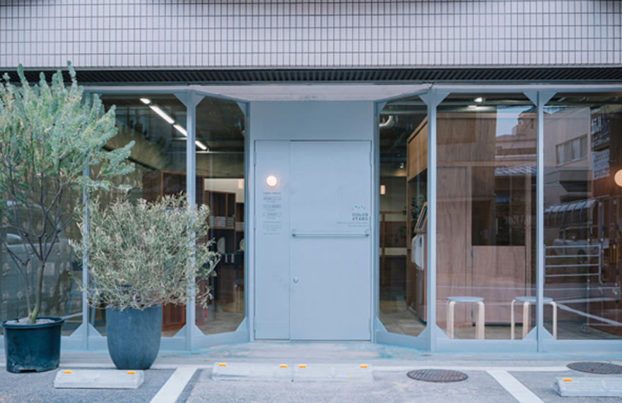
▼店铺外观,exterior of the project ©Tatsuya Tabii
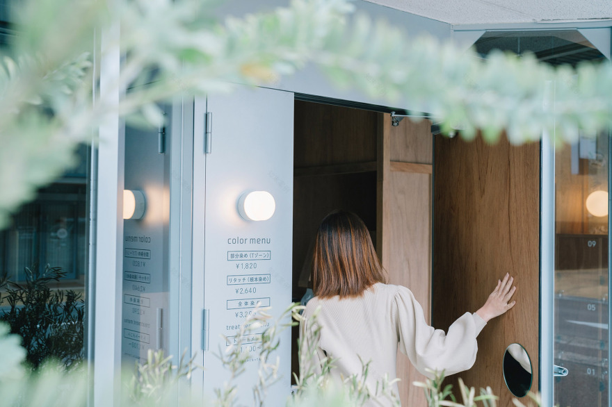
▼店铺入口,entrance of the project ©Tatsuya Tabii
设计师希望该染发店能够适应任何地点,同时也能彰显出该地点的特色。因此,设计阶段的过程必须简单,以应对有限预算的挑战。在方案的讨论过程中,设计师在染发店的店名“Color stand”中找到了灵感。
We wanted to create a shop that would fit in with any location, but would also be unique to each location. The process had to be simple at the design stage to meet the challenge of a limited budget. In the course of our discussions, we found a hint in the color stand of the store name.
▼理发站台与入口形成45度夹角,The barber stand forms a 45 degree angle with the entrance ©Tatsuya Tabii
▼入口空间细部,detail of the entrance area ©Tatsuya Tabii
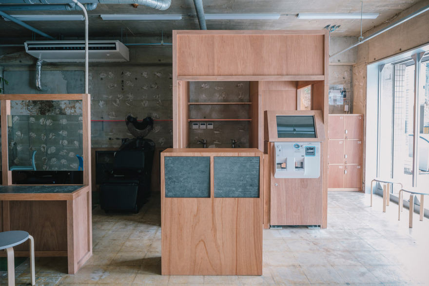
▼接待台与收银台,Reception desk and cashier desk ©Tatsuya Tabii
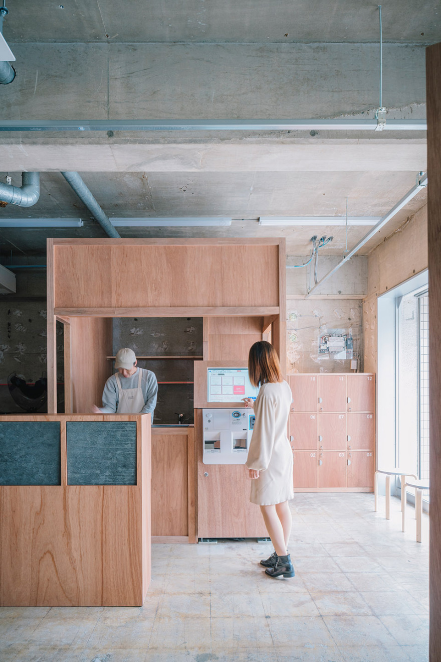
▼自助收银系统,Self-checkout system ©Tatsuya Tabii
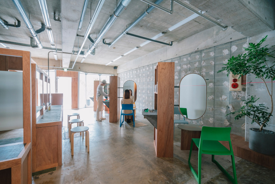
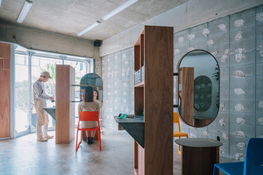
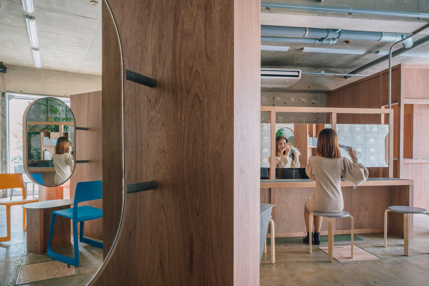
设计理念是“像加油站一样的染发店”。就像加油站中的机器一样,通过将功能集成到一个单体设备中,可以在不浪费空间的情况下最小化空间,并使流线更加简单。三个固定染发站台在店铺空间中等距放置,并在平面上旋转了45度。悬挑的椭圆形镜子如同红绿灯一样,从站台的背后伸出来。五颜六色的沙龙椅对称地排列在镜子周围。
The concept was “A color specialty store like a gas station.” By combining all the functions of a gas station into a single device, space could be minimized and the flow of traffic could be simplified. Three color stand fixtures were placed diagonally and evenly spaced in the space. A cantilevered oval mirror juts out from its back like a traffic light. Colorful salon chairs are arranged symmetrically around the mirror.
▼店铺空间概览,overall of the interior ©Tatsuya Tabii
▼等距放置的固定染发站台,Three color stand fixtures were placed diagonally and evenly spaced in the space ©Tatsuya Tabii
▼五颜六色的沙龙椅对称地排列在染发台周围, Colorful salon chairs are arranged symmetrically around the color stand ©Tatsuya Tabii
从入口处向内看,镜子是倾斜的,随着视线的移动,镜中的画面时隐时现,而等距排列的木制家具则像巨石一般静静伫立在空间中,以一种不经意的方式划定了空间的界限,这里既有考古遗址的朴素,又有加油站的轻松,这种奇妙的氛围在传统的美发沙龙中是前所未有的。
From the entrance, the mirror is swung diagonally so that it cannot be seen for a moment, and the scenery of the wooden pieces arranged at equal intervals like a monolith has been transformed into a space that combines the austerity of an archaeological site and the ease of a gas station, something that has never been seen before in a salon.
▼倾斜的镜面反射出不同的景色,The slanted mirror reflects different views ©Tatsuya Tabii
▼木制固定家具划定了空间,the wooden pieces has been transformed into a space ©Tatsuya Tabii
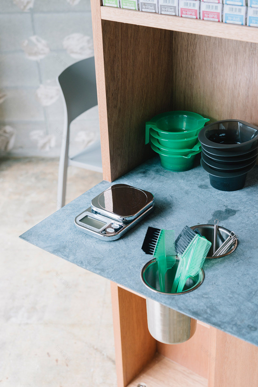
设计过程是基于将空间分解成两种元素来进行思考的,这两种元素分别为:“点”与“景”。在本案中,“点”指的是功能,在细分了所有的功能之后,设计师又将这些“点”集中在一起,每个功能就如同一个精密的零件,经过精心设计,最终组装成一台完美运行的机器。
The design process was based on the idea of separating the space into two perspectives: the point and the scenery. In this case, “point” refers to the function, and after subdividing all the functions, I concentrated them and considered them as a mass of stands, which I designed meticulously as if I were building a machine to complete each concentrated task.
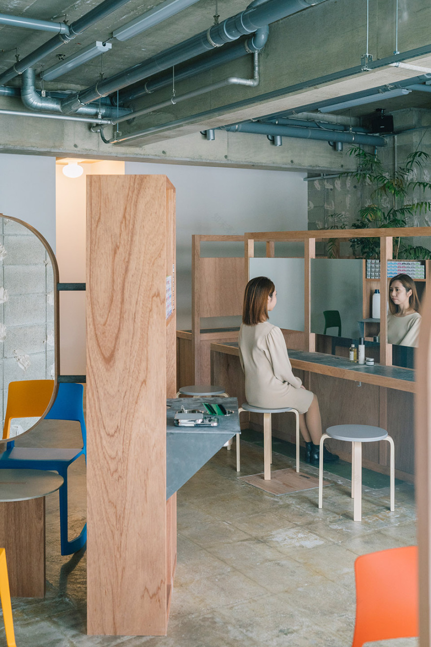
▼连续的镜面反射形成奇幻的视觉效果,The continuous specular reflection creates a fantastic visual effect ©Tatsuya Tabii
▼这里既有考古遗址的朴素,又有加油站的轻松,the space that combines the austerity of an archaeological site and the ease of a gas station ©Tatsuya Tabii
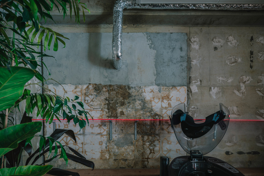
“景”则指代空间,通过空间的拆解将原建筑的结构暴露出来,从而奠定了整个店铺空间的氛围。通过保留与展现原始的建筑结构,营造出有趣的视觉效果,为顾客带来只有这里才能提供的独特体验。这种设计既具有创造力,又削减了建造成本,从而提高了染发店的成本效益。
The “scenery” refers to the space, and we thought to show the frame that appeared by dismantling the space as a finish. By using the individuality of the existing frame, we were able to create a playful space that could only be created in that particular location. The result is a space that is both cost effective and creative.
▼暴露出来的原始建筑结构,The exposed original structure of the building ©Tatsuya Tabii
在未来,随着项目范围的扩大,设计师希望将这种空间拆解的手法运用在每一间连锁沙龙中,使原始的建筑结构成为“风景”,从而使每一间店铺都具有自己独特的个性。另一方面,经过精心设计的多功能“点”,则在不同分店中都保持一致。
In the future, as we expand the scope of this project, we hope that the dismantled space, which is the “scenery,” will have a different frame and specifications in each place, and that it will have its own individuality. On the other hand, the multifunctional stands, which are carefully designed “points,” will be the same in every location.
▼椭圆形化妆镜细部,Detail of oval mirror ©Tatsuya Tabii
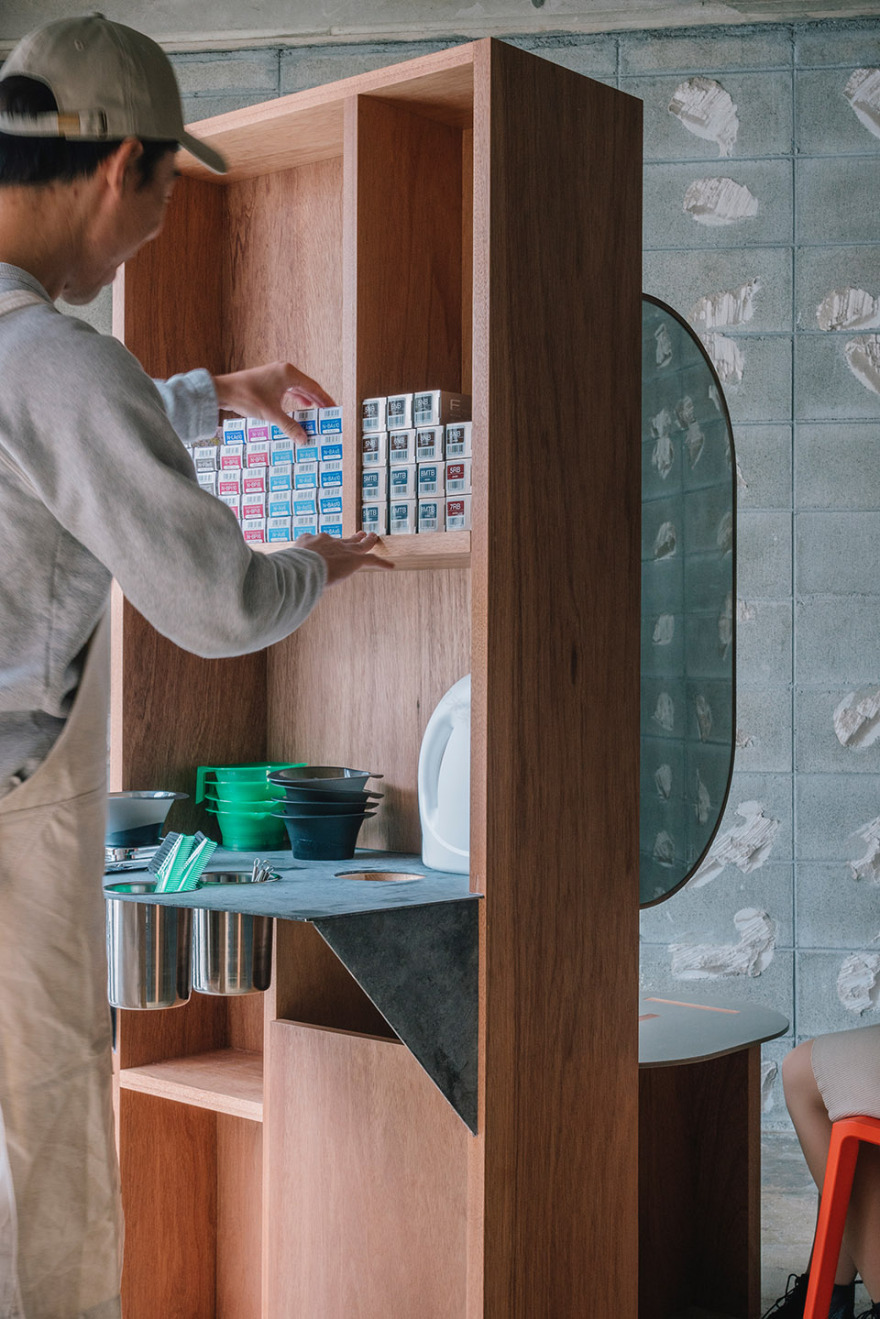
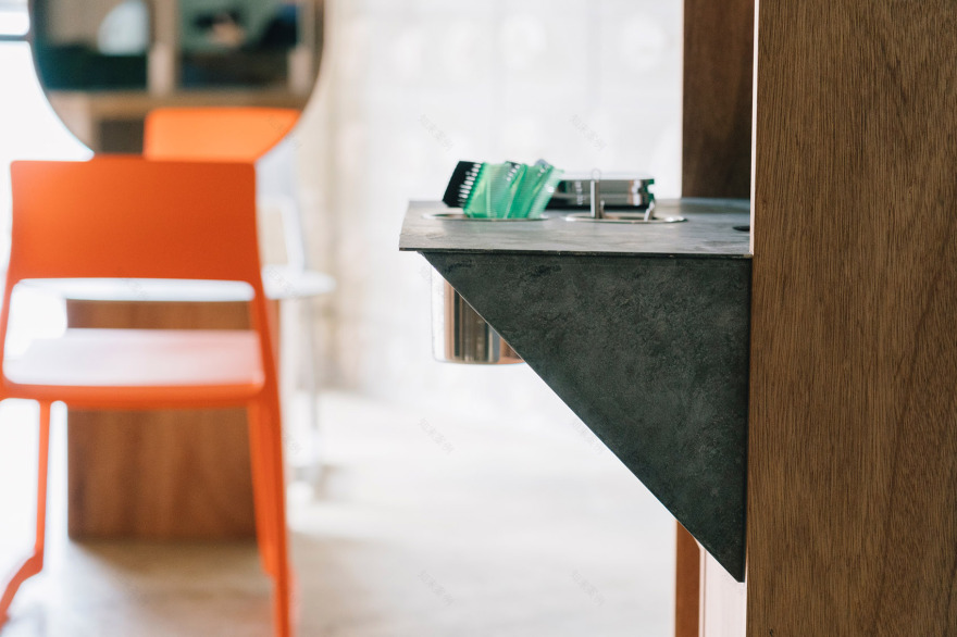
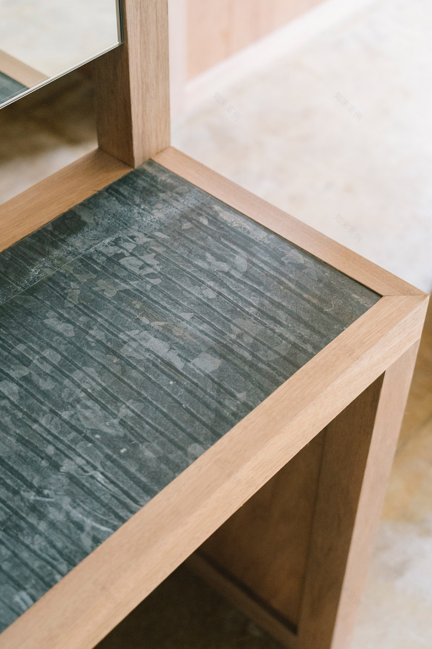
▼染发站台细部,details of the color stand ©Tatsuya Tabii
▼家具的缝隙形成框景,The gaps in the furniture form a framed view ©Tatsuya Tabii
固定而统一的“点”,以及通过空间拆解而形成的个性化的“景”,这两种元素相互对立又相互补充。设计师希望通过这种标准化的设计手法,使“color stand”发展到城市的各个角落,任何人都能轻易找到它们并进来享受一段轻松惬意的时光。
The “point” is produced uniformly as a stand fixture, and the “scenery” is produced with individuality by being dismantled, a phenomenon that is a reversal of the usual meaning of point and scenery. I hope that more and more standard color stands will be created in various cities where anyone can casually stop by and enjoy them.
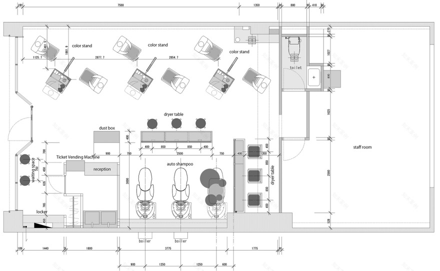
▼平面图,plan ©FATHOM
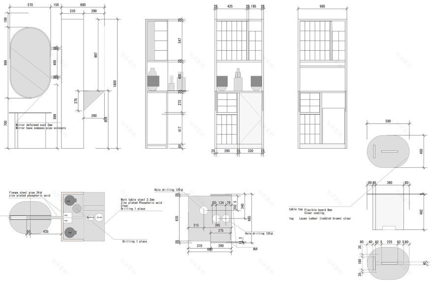
▼镜子与染发台构造,construction drawing of the mirror and the color stand ©FATHOM
客服
消息
收藏
下载
最近


