查看完整案例


收藏

下载
© Kim Zwarts
(C)Kim Zwarts
架构师提供的文本描述。作为一家在航空旅行领域开展业务的公司,Powerhouse公司设计了一个具有流线型曲线和豪华装修的办公室内部。6500平方米的室内设计包括一个有餐厅、大型会议室、健身区、四层办公楼和一层行政楼层的诱人的入口大厅,力求唤起旅行的永恒魅力。材料调色板包括当地天然石材,木贴面,高品质的织物和地毯,玻璃隔断和弯曲的设计线,这给内部一个圆滑,流线型的感觉。无论是在世纪中叶的现代大厅里,还是在蜿蜒的温格楼梯上,空中旅行的黄金日子永远不会遥远。同时,优雅的室内设计旨在可持续性方面达到最高标准,为未来定下基调。
Text description provided by the architects. For a firm operating in the world of air travel, Powerhouse Company designed an office interior with streamlined curves and luxurious finishings. The 6,500 m² interior design includes an inviting entrance lobby with a restaurant, large congress room, fitness area, four office floors and an executive floor at the top of the building, and seeks to evoke the timeless glamour of travel. The material palette includes local natural stone, wood veneers, high-quality fabric and carpet, glass partitions and curved design lines, which give the interior a sleek, streamlined feel. Whether waiting in the mid-century-modern lobby or ascending the winding wenge staircase, the golden days of air travel are never far away. At the same time, the elegant interior aims for the highest standards when it comes to sustainability, setting the tone for the future.
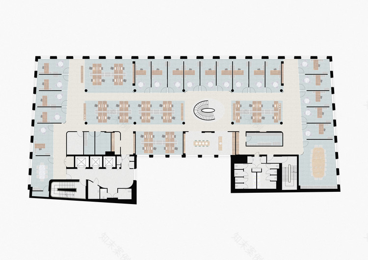
Ground Floor Plan
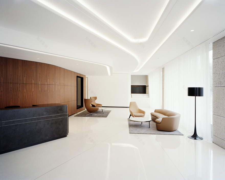
让运动成为可能,与来自其他国家的客户和同事面对面会面,对于一家在旅游业经营的国际公司来说,这是一种罕见和有价值的商品。都柏林的办公室包含许多不同的空间,旨在鼓励互动,正式和非正式;愉快的环境,与同事,外部顾问和客户沟通。该设计的目的是创造一个豪华的空间体验,在一个经典的,永恒的建筑,一个内部,鼓励在整个建筑运动以及交流。为了实现这一点,底层的布局具有诱人的氛围。接待大厅的弧形墙壁和饰面介绍了办公室楼层的审美基调和材料。
Making movement possible Meeting face-to-face with clients and colleagues from other countries, for an international firm operating in the travel industry it is a rare and valuable commodity. The office in Dublin incorporates a multitude of different spaces designed to encourage interaction, formal and informal; pleasant environments for communicating with colleagues, external advisors, and clients. The aim of the design was to create a luxurious spatial experience within a classic and timeless building, an interior that encourages movement throughout the building as well as exchange. To achieve this, the layout of the ground floor has an inviting atmosphere. The curved walls and finishes of the reception lobby introduce the aesthetic tone and materials for the office floors.
© Kim Zwarts
(C)Kim Zwarts
未来的证明,通过灵活性和互动,所有的办公室楼层有细微的差异,以优化内部的空间定位。例如,第一层和第二层拥有部分开放的平面图,而第三层和第四层则沿立面安装了办公室。第五层,面积较小,设有行政办公室,可欣赏邻近公园的壮丽景色。创始合伙人兼建筑师Nanne de Ru:“为了保护大楼的未来,我们使用了几种有效的设计工具,比如连接办公室各层的缠绕通信楼梯,以促进员工之间的互动。我们还选择了可互换的房间设置,以及开放空间和关闭的办公室之间的微妙平衡。这对办事处的灵活性和可持续性具有重要作用。“
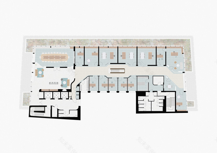
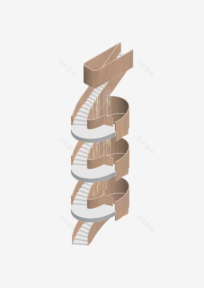
Future proof through flexibility and interaction All office floors have subtle differences in order to optimize spatial orientation within the building. For example, the first and second floor boasts a partially open floor plan, while the third and fourth floor are fitted out with offices along the facades. The fifth floor, slightly smaller in an area, accommodates the executive offices which enjoy a magnificent view over the adjacent park. Founding partner and architect Nanne de Ru: “To future-proof the building, we have used several effective design tools, like the winding communication staircase that connects the office floors with each other to promote interaction between employees. We also chose for interchangeable room settings, and for a delicate balance between open space and closed offices. This plays an important role in the office’s flexibility and sustainability.”
Second Floor Plan
二层平面图
© Kim Zwarts
(C)Kim Zwarts
Fifth Floor Plan
五层平面图
在整个项目的整个过程中,都可以看到细节和工艺,注意细节。办公室的楼层和走廊都铺满了地毯,用几个地毯来测量色调,这与LED灯天花板海湾的流动线条相呼应。椭圆形的通信楼梯有双曲的凹底,用一层翁é贴面完成。这种雕塑楼梯元素的工艺增加了整体高质量。楼梯落在白色水磨石的圆形元素上,周围是一条薄黄铜线,这显示出一个精致的细节。同样的水磨石被用于入口大厅、餐厅和员工咖啡区:所有互动是关键的区域。
Details and craftsmanship Attention to detail can be discerned throughout the entirety of the project. The office floors and corridors are covered with carpet in several made to measure tones, which echo the flowing lines of the LED light ceiling coves. The elliptical communication staircase has double curved soffits finished in a wengé veneer. The craftsmanship of this sculptural stair element adds to the overall high quality. The staircase lands on circular shaped elements of white terrazzo bordered by a thin brass line, which shows an exquisite level of detail. The same terrazzo is used for the entrance lobby, restaurant and staff coffee areas: all areas where interaction is key.
© Kim Zwarts
(C)Kim Zwarts
优雅和可持续的实现LEED白金认证,仔细协调的审美愿望和技术要求是必要的。其结果是一个优雅的,高端的办公室设计,提供一个鼓舞人心和可持续的工作环境,让员工和客户立即感到欢迎。
Elegant and sustainable To achieve the LEED Platinum certification, careful coordination of the aesthetic aspirations and technical requirements was necessary. The result is an elegant, high-end office design that provides an inspiring and sustainable work environment where both employees and clients feel welcome right away.
© Kim Zwarts
(C)Kim Zwarts
Interiors Designers Powerhouse Company
Location Dublin, Ireland
Area 6500.0 m2
Project Year 2017
Photographs Kim Zwarts
Category Offices Interiors
Manufacturers Loading...
客服
消息
收藏
下载
最近


