查看完整案例


收藏

下载
店铺位于建筑的一楼,内部空间呈长方形,店铺入口朝南,最大的落地玻璃面朝西,由于周边建筑都是玻璃幕墙结构,在午后阳光下内部空间会有不同方向的反射光线和树木的影子,店铺外立面可以看到的部分都是透明的落地玻璃,室内的一切都可以直接被看到,这些都是设计开始之前在现场除了尺寸以外所能获取的空间感受。
Situated in the ground floor of the building, this shop has a rectangle inner space, with a south-facing entrance and the largest floor-to-ceiling glass facing west. Due to the glazing structures of the shop’s surroundings, the reflections of light from different directions and shadows of trees will fell into the store in the afternoon sunlight. Everything inside can be seen clearly as all the visible parts of the shop facade are transparent floor-to-ceiling glass. Except the actual size, these spatial feelings can be directly felt on site prior to the beginning of the design.
店主是一个留学英国回来90后女孩,对与烘培所需要的功能要求也很明确,表达对店铺如何经营是一个探索且需要不断完善的过程,在沟通的过程中甜品工作室+店铺的想法变得越来越清晰,相信每一个开店女孩内心的热情就是想做自己喜欢的事情,店铺所传达也是一样。
The shopkeeper, a girl born in the 1990s and overseas returnee from the UK, had a specific requirement on functions required for baking. She expressed that the operation of a shop is a process of exploration and improvement. With the in-depth communication, it become more and more clear that she wanted a dessert studio & shop. As I see every girl running a shop with great passion is just want to do what she likes, and the same goes for the shop.
由于整体空间呈一个长方形,平面布局将空间拆分成两个部分。第一部分是承载着产品制作与研发的甜品工作室,内部有两个功能区厨房和操作间。第二个部分负责饮品制作,产品展示和休息就餐的区域,其中还划分出可以独立使用的休息区,当就餐人数较多的时候也开放使用,也可以作为工作室的组成部分内部使用。
The inner space of the shop was divided into two parts since the whole shapes as a rectangle. One part functions as the dessert studio for making and developing of products, with two functional areas inside, the kitchen and the kitchen operation; the other is the area for drink concocting, product displaying and rest and dining, of which there is a separate sitting area that will open in case of too many diners or is used as part of the studio by internal employees.
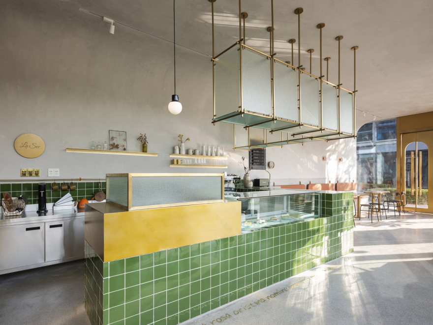
空间中大面积使用黄铜金属框内嵌竖纹玻璃,既可以满足空间分割也起到给操作间辅助采光的作用。材质的贯穿使用,当一种材质被使用在主要立面上的时候,也会在局部设计中去使用,让空间视觉有连续的对应感。
In the entire space, brass metal frame with vertical grain glass are widely used, which can not only achieve the effect of space partition but also provide additional lighting for the kitchen operation. Materials adopted are used repeatedly, namely, once a material is determined to be used on the staple facade, it also may appear in some partial designs, which reflects the sense of continuity in spatial vision.
吧台和休息区的材质使用倾向统一化,同样使用了绿色亮面方砖,在不同的光线下可以呈现不同的反射效果,整体色调在白天日光下和晚上灯光下呈现完全不同的两种感受。在空间中可以看到不同的反射光,比如内嵌在水磨石地面的黄铜图案和拉丁文字符,吧台上方夹丝玻璃吊柜的漫反射,灰色大理石的窗前吧台,还有铜镜明亮的光斑…,店铺空间中反射的是来自不同材质的光芒,其实设计师想要表达的是一家店最好的呈现应该是反射出店主内心的光芒。如暖灰色墙面中不断变化的光影,思想,内心和年龄的改变都会在这样一种反射中被看到。
Tend to be unified in material, bar and rest area adopt the same green glossy square bricks which will show different reflections under a variety of lights. The overall tone may be totally different in daylight and night light. You may see different reflections of light from various objects here, such as the brass patterns and Latin characters embedded in a terrazzo floor, wire glass ceiling cabinet above the bar, window bar made of grey marble, as well as the bronze mirror. In the shop, reflected light (diffuse reflection) from different materials gives off different rays. The reason why the designer accommodated so much light in the shop is that he wanted to express the passion and an invisible sun within the shopkeeper. For example, changes in thought, heart and age will reflect on the changing shadows on the warm grey wall.
整个店铺的区域在大面积的暖灰色基调下使用不同的点缀色,以不同的方式介入,黑色的椅子,橘色的皮质靠背,粉色水磨石壁灯,让整个空间丰富的同时也不失掉年轻的随性。
Under the sheme of warm gray, different colors are used to decorate the whole shop in different forms, such as black chairs, orange leather backrests and pink terrazzo wall lamps, which not only enriches the whole space, but also shows the feature of casual young.
模糊的内外界限,在外立面设计上做的是减法,除了需要被强化的入门外其它都被弱化处理,反之内部立面和灯具的布置都需要考虑在外立面的呈现,是内部的也是外部的。
The boundary between internal and external space is blurred; subtraction design is employed onto the exterior facades, except the entrance need for intensive decoration. On the contrary, presentation effect, on the exterior façade, of both the interior facades and the lighting arrangement need to take into account. Thus they are not just inside the shop; they’re outside the shop, as well.
夜幕下,店铺内部球状的灯如金鱼的气泡,像是被慢慢凝固的样子,整个玻璃窗仿佛一个巨大的鱼缸壁,此时垂挂的灯管字亮起了橙色的光,la ser在法语中的解释是永远。
Under the cover of night, bulbous lights inside the shop look like bubbles in the goldfish’s mouth, seeming to have been slowly solidifying. The whole glass window seems as a huge wall of a fish tank while at this very moment the bright orange light is shining from the hanging lamp letters. The French la ser means forever.
▲立面图
▲平面图
▲轴侧图
项目信息——
项目名称:LA SER 甜品店
室内设计:静谧设计研究室
项目拍摄:稳摄影
项目地点:滨江 寰宇天下商务中心
项目规模:面积80平方
完工时间: 2018年10月
项目类型:轻餐饮
主要材料:黄铜、水磨石、手工砖
客服
消息
收藏
下载
最近


