查看完整案例


收藏

下载
Bellini 生活艺术家是南京的原创家居品牌,提供包括家具、柜体、房门、橱柜、电器等整体家居服务。
此次位于南京金盛国际家居的二层展厅迎来全面升级,同时也是一次品牌形象的升级。
结合未来 5 年的发展战略,新的展厅将品牌经营的多种产品梳理整合,展现多种场景的家居氛围设计。
用设计赋能,提升整体的品牌价值。
Bellini Life Artists is an original home furnishing brand operated by Nanjing designers, providing overall home services including furniture, cabinets, doors, cabinets, appliances, and more. The second floor exhibition hall located in Nanjing Jinsheng International Home has undergone a comprehensive upgrade, which is also an upgrade of the brand image. Based on the development strategy for the next 5 years, the new exhibition hall will organize and integrate various products operated by the brand, showcasing home atmosphere design in various scenarios. Empowering with design to enhance the overall brand value.
外立 | 秩序&脱颖
Facade | Order&Emergence
Bellini 的品牌命名源自意大利知名建筑设计师马里奥·贝里尼,他设计中的“意大利语言”,以及“重视设计功能性与精致性”的理念,引领着意大利建筑和家居设计的时尚潮流,也深深影响着贝里尼家居的设计方向。
Bellini 展厅上下两层六个外立面,建立起了统一有序的整体形象,通过特殊的材质、造景,让 Bellini 展厅在同类竞品展厅中脱颖而出,建立品牌清晰的辨识度。
Bellini’s brand name originates from Mario Bérigny, a famous Italian architect. The "Italian language" in his design and the concept of "valuing design functionality and refinement" lead the fashion trend of Italian architecture and home design, and also deeply affect the design direction of Bellini’s home.
The Bellini exhibition hall has six façades on the upper and lower floors, establishing a unified and orderly overall image. Through special materials and landscaping, the Bellini exhibition hall stands out among similar competitor exhibition halls, establishing a clear brand recognition.
包裹黑色砂岩涂料的外立面,做了体块化处理,充满建筑的力量感。错落有致的开窗增加了对内部场景展示和路人视野的考量,艺术化的视觉对话,引人入胜,让人们的注意力被设计师精心预设的细节所俘虏。
The exterior facade, wrapped in black sandstone paint, has been treated with block like elements, exuding a sense of architectural strength. The well-arranged windows increase the consideration of internal scene display and passersby’s view, creating an artistic visual dialogue that captivates people’s attention by the designer’s carefully designed details.
主题 | 场景叙事
Theme | Scene Narration
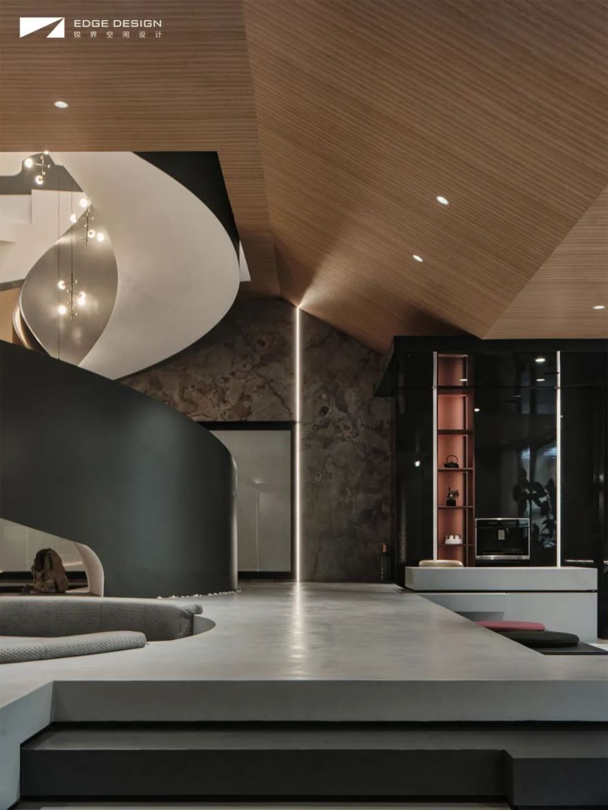
从一层主入口进入展厅,第一视角是接待中心,这里高度上整体做了抬升,设计圆形下沉式会客区和旋转楼梯,透过落地橱窗,别具场景化叙事的艺术表达,也起到吸引来往顾客的商业效应。
Entering the exhibition hall from the main entrance on the first floor, the first perspective is the reception center. The overall height of this area has been elevated, and a circular sunken reception area and rotating stairs have been designed. Through the floor-to-ceiling display windows, the artistic expression of a unique scene narrative also plays a commercial role in attracting customers.
在这个特别设计的空间内,设计师用方和圆两种元素构建了人置于展厅内丰富的场景体验,同时也完成了对品牌内核与品格的陈述。
不规则的方形步阶搭建起了整体的“舞台”,两个圆形区域——下沉式会客区和旋转楼梯,结构错落有致、藏风聚气,不仅拉伸了纵深层次,也创造了一种向下深耕、向上生长的力量感。
In this specially designed space, the designer used square and circle elements to create a rich scene experience for people placed in the exhibition hall, while also completing the statement of the brand’s core and character.
The irregular square steps form the overall "stage", with two circular sunken reception areas and rotating stairs. The structure is well arranged and windy, not only stretching the depth of the layers, but also creating a sense of power that cultivates downwards and grows upwards.
这里虽然形式上独立,却又与周围的空间保持着恰到好处的尺度和对话,空间内气裕流畅,让各个区域保持距离又彼此联系,既有艺术的高度也有生活的温度。
Although formally independent, this place maintains an appropriate scale and dialogue with the surrounding space. The space is abundant and smooth, allowing various regions to maintain distance and connect with each other. It has both the height of art and the temperature of life.
体验 | 细节无小事
Experience | No Detail Is Small
随着家居生活美学的日趋成熟,单纯的产品陈列展示的方式越来越少,将产品和设计以场景叙事的形式展示更具体验感。贝里尼展厅里的诸多细节,无一不是产品前沿设计的集中展示,迎合当下及未来都市生活需求。
With the increasingly mature aesthetics of home life, there are fewer and fewer simple ways to display products, and presenting products and designs in the form of narrative scenes is more experiential. All the details in Bérigny’s exhibition hall are concentrated on the cutting-edge design of products to meet the needs of current and future urban life.
英国建筑师 Norman Foster 说过:细节无小事。定制空间的展陈,不断更迭的新型材质和传统材质,以创新的组合和形态出现,给到访者一种新鲜的感官体验,每一处细节都经得住推敲,也是品牌极致的产品设计和精耕细作工匠精神的集中展示。
British architect Norman Foster once said: ’Every detail is small.’ The exhibition of customized spaces, constantly evolving new and traditional materials, presents visitors with innovative combinations and forms, providing them with a fresh sensory experience. Every detail can withstand scrutiny, and it is also a concentrated display of the brand’s ultimate product design and meticulous craftsmanship spirit.
高定 | 生活的艺术
Structure | Upscale Customized
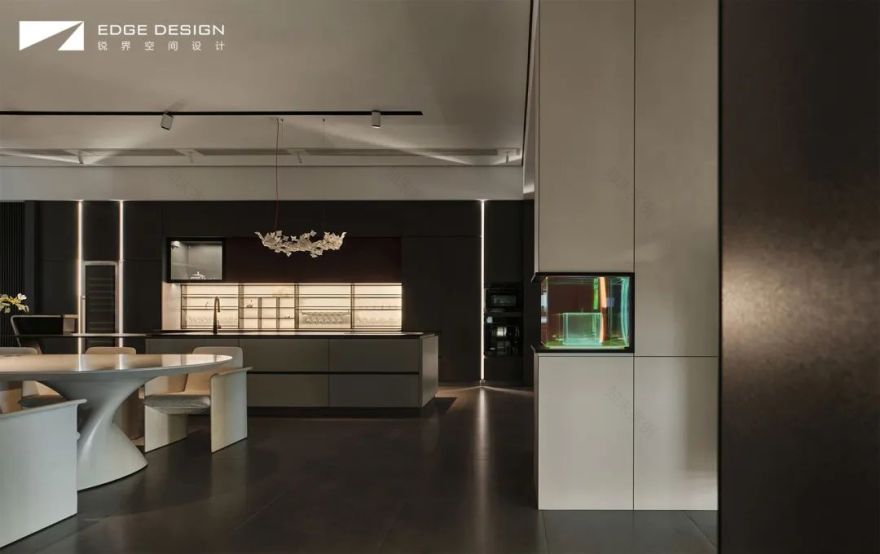
对居住空间的理解,Bellini 品牌认为质感与舒适缺一不可。在餐厨高定区,设计师将意式美学带入产品展示中,利用光线强化细节的质感,吸引用户探索隐藏的设计惊喜,着力打造一个纯净而奢适的生活体验空间。
Bellini brand believes that both texture and comfort are indispensable in its understanding of residential space. In the high-end dining and kitchen area, designers incorporate Italian aesthetics into product displays, utilizing light to enhance the texture of details, attracting users to explore hidden design surprises, and striving to create a pure and luxurious living experience space.
设计的任务就是改善人的生活质量。作为以设计见长的家居品牌,Bellini 从未停止过对新材料和新形式的探索与研究。展厅设计中,融入了木、钢、石材、玻璃、皮革等几十种材料,以及他们创新的组合形式,寻找生活美学的新灵感。
The task of design is to improve people’s quality of life. As a home furnishing brand that specializes in design, Bellini has never stopped exploring and researching new materials and forms.
In the design of the exhibition hall, dozens of materials such as wood, steel, stone, glass, leather, and their innovative combination forms are integrated, seeking a new sense of life aesthetics.
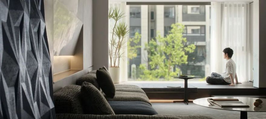
从旋转楼梯或者商场的入口都可以来到二层展厅,这里规划展示的是相对私密的睡眠区、书房、儿童区和茶室、衣帽间,以及员工办公区等,满足顾客的个性化产品体验需求,营造一种沉浸式展厅空间。
From the entrance of the revolving staircase or shopping mall, you can come to the second floor exhibition hall, which is planned to display relatively private sleeping areas, study rooms, children’s areas, tea rooms, cloakrooms, and employee office areas to meet customers’ personalized product experience needs and create an immersive exhibition hall space.
布局 | 用户体验
Layout | User Experience
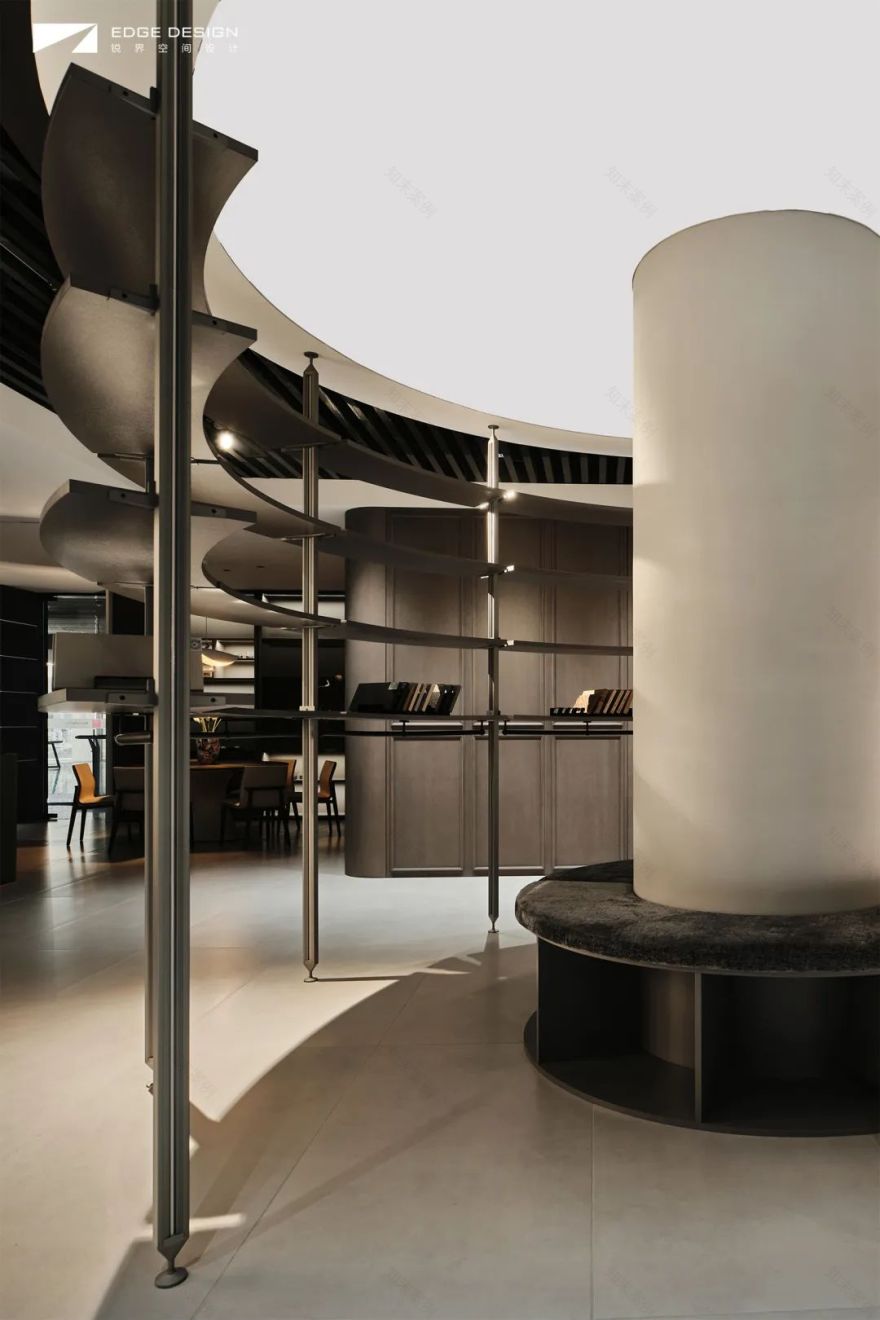
二层在展区的中心区域,搭建了一个圆形的开放式选样区,保证从任何一个展区到选样区都是最短动线距离,同时通过这个区域,展厅内形成”∞“的参观动线,丰富提升用户的参观体验。选样区本身没有采用传统的陈列形式,而是用一种通透的展架搭建,用户选样视角比较舒适、自由,最大化满足空间展陈的需要。
On the second floor, a circular open sample selection area is built in the central area of the exhibition area, ensuring the shortest distance from any exhibition area to the sample selection area. At the same time, through this area, the exhibition hall forms a "∞" visiting route, enriching and enhancing the user’s visiting experience. The sample selection area itself does not adopt traditional display forms, but is built with a transparent exhibition rack, and the user’s sample selection perspective is relatively comfortable and free, maximizing the needs of spatial exhibition.
解构 | 平面的逻辑
Deconstruct | Plane Logic
这是位于南京金盛国际家居的品牌家居展厅,展厅共分两层,总共 600 平米,这次是品牌展厅的一次全新升级,更是品牌的一次系统升级。平面布局中需要有能吸引用户进店的设计亮点,也要能满足全面展示品牌产品设计的需求。
① 一层最醒目的位置,规划了体量比较大的品牌主入口,搭配绿植端景和 logo 墙,展示品牌形象。主入口旁边规划落地玻璃,展示展厅内最有亮点的设计场景,吸引顾客进店参观。其他次入口旁边设计产品陈列区,陈列展示品牌最新热款的家具。
② 一层主入口进来是展厅接待中心,这里规划了一个圆形的下沉式会客区和通往二层的旋转楼梯,旁边是茶水间,方便招待。
③ 一层的其他区域为公共性质的客餐厨展区,各个功能区之间没有完全独立,相互交错延伸,中间用定制柜隔断,让定制、家具、电器等不同类型的产品都能在空间内得到最好的展示效果。
④ 二层主要布置的是卧室、书房、儿童区、茶室等展区,员工办公区也设计在二层。二层的中心区域是一个环形选样区,方便不同展区看样选样。
△一层平面布置图
△二层平面布置图
△楼层区位图
△一层外立面图
△二层外立面图
PROJECT DATA
IENTIANESKIRT 项目名称:BELLINI 展厅
NAME / SEE MICRO·PRIME ORDER
项目地址:南京·Bellini 生活艺术家
ADD / NANJING·ZHONGYE JINXIUTIANXI
项目面积:600㎡
AREA/ 200㎡
项目类型:商业空间
TYPE/ FLAT STOREY
主案设计:锐界空间设计-胡飞
DEPARTMENT/ EDGE-HUFEI
竣工时间:2023·06
COMPLETION TIME/ 2023·06
主要材质:砂岩涂料、木饰面、实木板、不锈钢、玻璃、五金、灯带等
MATERIAL/ SANDSTONE COATING,WOOD VENEER,SOLID WOOD BOARD, STAINLESS STEEL,GLASS, HARDWARE, LIGHT STRIP,ETC
ABOUT EDGE
锐界空间建筑设计由青年设计师胡飞创立于 2021 年,坐落于江苏南京。专注于私宅别墅,商业空间,办公空间,产品家具等设计服务。
期望用我们对生活和细节的洞察,将情感和生活于空间结合,为客户带来极致创新的,独一无二的空间感官体验。通过全方位量身定制的设计,投射一种新的生活方式,从而让业主更多的发现自我,愉悦自我。
在设计中坚持为每一个空间环境找到合适的物料,从功能、美学和预算等多个维度考量,追求极致的设计效果与空间体验,“设计创意”-“施工执行”-“软装陈设”,提供全方位的设计和施工落地指导服务。
AWARDS
2022 金腾奖 年度办公空间设计大奖
2022 金堂奖 年度杰出住宅空间设计
2022 江苏星空间杯大奖赛 住宅工程类 银奖
2021 南京家居平台 南京十佳设计师
2021 红棉奖 最美极简空间设计奖
2021 江苏设计星 冠军
2021 中国设计星全国 32 强
2020-2021 中国设计头条年鉴榜 Top Design 100
2020 金堂奖年度杰出商业空间设计
2019 金腾奖 TOP100
2019 金堂奖年度杰出住宅空间设计
2019 我要去米兰 中国设计力青年榜 全国十强
2019 40 UNDER 40 中国(江苏)杰出设计设计青年
2018 新浪室内设计新势力榜 南京榜 TOP10 青年设计师
2018 红星美凯龙 M+创客空间南京创始会员
2018 第八届筑巢奖 年度住宅公寓类优秀奖
2017 国际空间设计大奖--Idea-Tops 艾特奖年度优秀奖
2016 第七届筑巢奖 住宅公寓类提名奖
2016 金堂奖 年度优秀别墅奖
2015 永隆星空杯 陈设设计大奖赛 住宅空间工程类 银奖
EX·CASES
SEE MICRO
PRIME ORDER
见微·质序
中冶·锦绣天玺
Source
源
锐界·办公空间
Living·In
Living·In
中冶·锦绣华府
Leisurely circles
逸·界
溧阳·天隽半岛
Time & Breeze
time&breeze
中海·桃源里
Laminated wood
叠木
尼克生活家
Imperial state
御·境
藏龙御景
Beyond light
光影之外
景枫·法兰谷
B & W & K
Black&White&Kaws
天正滨江
L&S·Blues
光影·Blues
颐和南园
Interpose·Material
介·质
傅厚岗 1 号
Vientiane·traceless 万象·无痕 世茂外滩
Puyue land
璞悦之境
天正滨江
客服
消息
收藏
下载
最近


