查看完整案例


收藏

下载
艺术,是凌驾于现实生活最为崇高的产物,而我们要做的便是将属于星空的东西带回地面。
––尼采
Art is the most exalted product of life and what we have to do is to bring back to earth what belongs to the stars.
——Nietzsche
企业特质、产品属性与低碳环保汇聚于此,是一种文化的缩影。以“文化元素与空间设计”融合作为切入点,作为本案文化输出及精神记忆的创作核心。
Enterprise characteristics, product attributes and low-carbon environmental protection converge here, which is the epitome of a culture. With the integration of "cultural elements and space design" as the entry point, as the creative core of the cultural output and spiritual memory of the case.
通过文化元素的植入,强调元素与空间的共生关系,以此来提升产品记忆。项目地址在沈阳市经济技术开发区,主营项目为高品质不锈钢垫纸,也是其他金属及非金属行业衬垫纸的重要供应基地。
此次设计以展示中心设计为主,宣传公司品牌及发展历程,让前来参观的合作商、采购商、供应商可以更容易、更深刻地了解企业品牌,同时以更清晰及独特的方式展示公司产品,方便客户可以以看、听、触的方式多角度全方面地了解感兴趣的商品。
主设计元素考虑以不锈钢垫纸或食品包装纸为主色调进行演变,将低碳环保意识汇聚其中,以不锈钢卷的圆柱形元素作为空间元素变形,为初入空间的人营造丰富的视觉焦点。
The main design elements are considered to evolve with stainless steel cushion paper or food wrapping paper as the main color, which brings together low-carbon environmental awareness. The cylindrical elements of stainless steel roll are used as space elements to transform, creating a rich visual focus for people who have just entered the space.
01概念方案
Concept plan
━
选用不锈钢卷垫纸作为主要设计元素,以纸张形式进行变形融入到设计空间中,整个空间采用纸原始色调作为大空间色系基础。
Stainless steel cushion paper is selected as the main design element, which is deformed into the design space in the form of paper. The original color of paper is used as the basis for the large space color system.
展示中心·方案一
方案一将食品包装纸的牛皮纸颜色与不锈钢垫纸的颜色作为主设计元素,采用装饰墙板与木质结合的设计手法,弱化视觉感受上的空冷感。整个空间配色既体现企业发展创新的优秀科技,又用严格的对称手法表达严谨与秩序。
In the first scheme, the color of kraft paper and stainless steel cushion paper of food wrapping paper are taken as the main design elements, and the design method of combining decorative wall board and wood is adopted to weaken the sense of empty and cold in visual perception. The color of the whole space not only reflects the excellent technology of enterprise development and innovation, but also expresses the rigor and order with strict symmetry technique.
展示中心·方案二
空间平面采用游园形式设计,将空间分成四个单元,分别代表公司的四大重要板块:企业文化、发展历程、环保理念及产品展示。园中园的动线形式既方便游览介绍,又便于客人随意游园在空间中。
The space plane is designed in the form of a garden, and the space is divided into four units, which respectively represent the four important sectors of the company: corporate culture, development history, environmental protection concept and product display. The moving line in the garden is not only convenient for sightseeing and introduction, but also convenient for guests to enjoy the garden in the space.
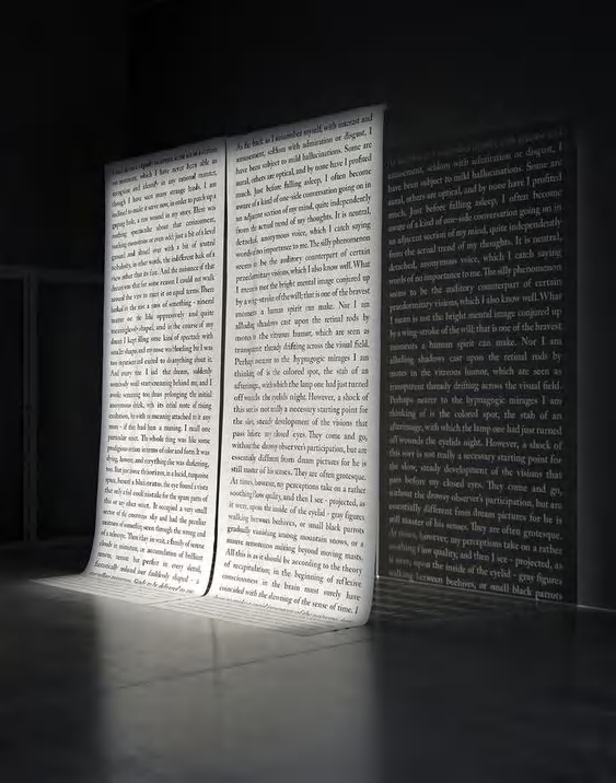
方案二设计仍然以纸作为焦点触发,入口处采用耐用装饰材料杜邦纸作为迎宾标识,上面有空间分布的基本信息介绍和企业标识,纸张与地面空出一部分空间制造空间透气感。空间中心处利用公司主营材料包装纸作为元素,做出规律性的阵列设计,形成振翅上升形式的艺术造型。同时利用灯光设计形成光影变换,加深企业产品印象。
In Scheme 2, paper is still used as the focal point to trigger the design. Dupont paper, a durable decorative material, is used as the welcoming sign at the entrance, which contains the basic information of spatial distribution and the corporate logo. The paper and the ground make a part of the space to create a sense of air permeability. In the center of the space, wrapping paper, the company’s main material, is used as an element to make regular array design, forming an artistic shape in the form of flapping and rising wings. At the same time, the use of lighting design to form light and shadow transformation, deepen the impression of enterprise products.
项目信息
Information
━
项⽬名称:思特雷斯纸业展示中心
Project Name:Systls Exhibition Center
项⽬地点:中国沈阳
Location:Shenyang China
项目面积:600㎡
Project Area:600㎡
室内设计:SKD(香港)设计事务所
Interior Design:Shao KuanXu Design Limited
设计时间:2022 年 04 月
Design Date:April,2022
【文中有部分图片为网络素材,如有侵权请联系删除】
SKD ShaoKuanXu+Design 徐少宽(香港)设计事务所(SKD)致力于为不同行业的前瞻性顾客提供高水准的商业设计。SKD 从自身定位和实践中探索出“全程设计”模式,以营销策划为龙头,以设计与技术为中心,以项目实施为保障,将产品、空间、人共融,让三者重新获取联系,“打破界定,去风格化”作为设计理念,帮助产品在空间中寻找属于它的灵魂。
客服
消息
收藏
下载
最近


