

创作上传
VIP
收藏下载
登录 | 注册有礼
查看完整案例

收藏

下载

分享
翻译
Save this picture!

iginally published on ArchDaily, this article by Camila Prieto discusses the use of the color wheel to create color schemes in design. The article emphasizes the importance of understanding color theory and how different colors can work together harmoniously. It provides practical tips and examples for creating effective color palettes using contrasting, complementary, and analogous colors. By using the color wheel as a guide, designers can create visually appealing and balanced compositions in their projects.
Even though Isaac Newton’s experiments and observations led to the development of the color wheel during the 17th century, his revolution in the understanding and application of colors continues to influence the creation of architecture and design projects. Arranging colors in a circular format, Newton mapped the color spectrum to create the first color wheel. As a visual representation of how colors relate to each other, it has been a fundamental tool for artists, architects, and designers to understand color relationships and therefore create appealing palettes for each space. Beyond merely “eyeing” color combinations, applying the color theory based on the geometric relationships in the color wheel helps designers determine which colors are suitable together. Color has the ability to play with spatial perception, create a sense of atmosphere, and evoke emotional responses, making it essential for design. By exploring the multiple possibilities of the color wheel, we create a guide to enhance architectural design through three color combinations: monochromatic, analogous, and complementary.
Monochromatic: Using shades, tints, and tones derived from a single color

Monochromatic Color Scheme. Image © Camila Prieto (ArchDaily)Besides distinguishing primary, secondary, and tertiary colors –and how are they created– the color theory also involves color darkness or lightness. In monochromatic palettes, a single color can have differing degrees of white or black, creating variations in their shades, tints, and tones. In this regard, monochromatic color schemes are those that are defined by a base and dominant color from which all of the derivatives –by adjusting brightness and saturation– complete the color palette.In both interior and exterior spaces, this approach aims to achieve a cohesive visual effect that creates a unified aesthetic appeal. Even though it is based on one color, these designs can incorporate neutral or accent colors to add variety and balance, while still maintaining an overall monochromatic look. Also, lighting and material choices complement these schemes by enhancing the variety of shades and adding different finishes, textures, and patterns to the space.In addition to highlighting the form and texture of a building, monochromatic color schemes are a great strategy for making smaller spaces appear larger and more spacious. By using shades of a single color, it creates a visual effect that utilizes simplicity and continuity to add depth to the space, giving the impression of a more expanded and open area.Enhancing a green environment by using deep red-tinted materialsSave this picture!

Refuge / NWLND Rogiers Vandeputte. Image © Johnny UmansBalancing dominant grey open blocks with complementary elementsSave this picture!

Shreyas Retreat / The Purple Ink Studio. Image © Shamanth Patil JClean and minimal common residential areasSave this picture!

Jorge Newbery 3136 Apartments / MoGS. Image © Javier Agustin RojasExploring green shades for a vibrant roof gardenSave this picture!

Co-build Roof Garden "Green Cloud Garden" / 11architecture. Image © Siming WuHarmonizing pink brick tiles with concrete wallsSave this picture!

Lula Hair Salon / YYA / Yusuke Yoshino Architects. Image © Takumi OtaTotal Lapis Lazuli blue interiorSave this picture!

Aera Bakery / Gonzalez Haase Architects. Image © Thomas Meyer / OstkreuzAll-white house for calm and illuminated spacesSave this picture!

Mar Vista House / Part Office. Image © Naho KubotaAnalogous: Embracing neighboring color relationshipsSave this picture!

Analogous Color Scheme. Image © Camila Prieto (ArchDaily)Often seen in nature, analogous color schemes are known for incorporating colors that are next to each other in the color wheel. Just like the color palettes of natural landscapes, which are composed of similar hues, these schemes usually integrate three to five adjacent colors. Starting with a dominant color, it continues by identifying an adjacent color, followed by one or more colors to establish accents in the space. As its name suggests, analogous refers to having an analogy, or corresponding to something in particular, in this case, to its contiguous colors. Within the creation of an analogous color scheme, incorporating varying shades and tones of the chosen colors is key for adding depth and creating dynamic designs. Black, white, and grey tones can also be present to complement the analogous colors’ roles. While still offering a variety of tones, analogous color schemes aim for a balanced style that enables a sense of visual unity and harmony.Warm tones for exterior pavilionsSave this picture!

The Red Shed / Social Studies Projects. Image © Leela CydHarmonizing materials and textures in adjacent colorsSave this picture!
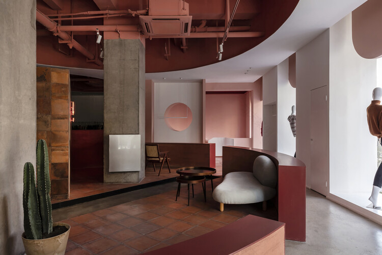
Cactus Fashion Store / Boundary Space Design. Image © Qiang ShenSerene coolness Save this picture!

DRM Psychological Counseling Kunshan Center / SWOOP STUDIO. Image © STUDIO FANGSalmon, soft pink, and ruby tonesSave this picture!

NEXUS8 Traumatology Clinic / Estudio de Arquitectura MAGICARCH. Image © Jonathan BernaLively hues for child-friendly environmentsSave this picture!

Kindergartens Treperka and Waldorf Semily / MTa. Image © BoysPlayNiceBeaming shades for theaters and performance spacesSave this picture!

Théodore Gouvy Theatre / Dominique Coulon & associés. Image © Eugeni PonsComplementary: Contrasting colors for dynamic and energetic spaces Save this picture!

Complementary Color Scheme. Image © Camila Prieto (ArchDaily)When deciding which colors are best suited for pairing with each other, choosing opposite locations on the color wheel is a striking decision. Within these opposite colors, complementary color schemes create high-contrast color combinations, typically involving warm and cool colors. Examples of complementary pairs include red and green, yellow and purple, as well as orange and blue. Depending on the proportion of these colors, these schemes can have varying effects. They can be used in equal proportions or be divided into a dominant color with an accent color. Although the basic concept revolves around two colors, these schemes can be expanded by adding shades with varying saturation and intensity.By playing with contrast and balance, the use of complementary colors allows the creation of highlights that draw attention to specific areas or architectural details. Architecture also has the power to integrate a material approach, enabling the use of not only plain colors but also different materials in these hues to enrich the textures of the space.Velvet and glossy textures in complementary colors Save this picture!

Trianglo Lounge Bar / Maden Group. Image © Leonit IbrahimiRed-colored steel structure contrasting with vibrant blue wallsSave this picture!

Papyrus Flagship Store / WGNB. Image © Yonghoon ChoiUsing lighting techniques to enhance color contrastSave this picture!

BAU Rooftop Lounge Bar / Rabih Geha Architects. Image © Tony Elieh, BAUA colorful cinema for an immersive experienceSave this picture!

Beta Cinema / Module K. Image © Do SyContrasting mosaic tiles and plain wallsSave this picture!

Bun Milan Restaurant / Masquespacio. Image © Gregory AbbateSalmon and light blue to evoke distinctive vibesSave this picture!

Doctor Manzana’s Second Store / Masquespacio. Image © Luis Beltrán Dive into more articles related to color theory, exploring color blocking strategies , playing with hues and shades , and using colors to accentuate architectural design .

 57
572020/09/29 16:34:55
252020/08/28 15:38:23
1062021/03/16 19:36:45
1442017/04/11 16:11:37
802020/12/15 12:24:43
562016/10/08 03:26:11
1542019/01/18 02:00:00
1002016/07/13 05:00:00
1212016/05/17 02:00:00
392016/03/07 00:00:00
3702020/03/19 14:41:00
16622021/08/13 07:31:10
南京喵熊网络科技有限公司 苏ICP备18050492号-4知末 © 2018—2020 . All photos and trademark graphics are copyrighted by their owners.增值电信业务经营许可证(ICP)苏B2-20201444 苏公网安备 32011302321234号
苏公网安备 32011302321234号客服
消息
收藏
下载
最近